A breath of fresh oxygen-less air
From time to time I get bored of Oxygen, perhaps because it has been mostly the same for a long period now. While Oxygen itself can be tweaked it will never end up looking really that different from how it looks by default (differences will mostly lie in colors). So today we’ll take a look at some alternative widget styles available.
You can change the style by going to System Settings > Application Appearance > Style, and to change the window decoration you need to go to System Settings > Workspace Appearance > Window Decorations . Most styles can be further tweaked by clicking Configure.
Oxygen Transparent
A few years ago I installed modified version of Oxygen that supported transparencies, and as far I remembered it used to look good. Although, as it sometimes happens in the open source world, I pretty much assumed the project was dead. I was wrong and much to my surprise the project is still active. Let’s try it out.

Before installing it we need to make sure all dependencies are met.
sudo apt-get install build-essential cmake kdelibs5-dev kdebase-workspace-dev libxrender-dev libx11-dev git
Now we need to download the following script and run it. Before running it, we need to grant it the right permissions (make sure you’re in the correct folder).
chmod 755 oxygen-setup.pl
Time to execute the script by running, where x is your installed version of KDE 4.
./oxygen-setup.pl –branch KDE/4.x
If you’re unsure run the following command:
dolphin –version
Check what version KDE Development Platform is, in my setup it looks like this:
Qt: 4.8.4
KDE Development Platform: 4.10.2
Dolphin: 2.2
So in a case like mine x should be replaced by 10.
By default Oxygen Transparent looks just like the regular oxygen. To change the opacity you need to go to Systems Settings > Application Appearance > Oxygen Transparent > Configure > General > Background Opacity.

To get better results you certainly need to enable blur, to do so go to System Settings > Desktop Effects > All Effects > Blur. Otherwise it will be hard to distinguish text.
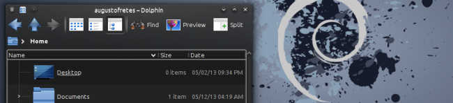
By playing around with the opacity you can get different results, specially since you can detach the decoration opacity from the window opacity, although I’ve not been able to find a combination that looks good. For example:

Granted this is not the most oxygen-less widget style out there! But the addition of transparency makes it look different enough to be worth mentioning, I personally like it, but keep in mind that it makes no sense whatsoever on a laptop, as it will definitively have some impact on battery life.
Bespin
It was originally destined to become Oxygen, but after a few disagreements between developers it became its own project. It still has some resemblance to what ultimately ended up being Oxygen but confusing them is impossible. Unlike Oxygen or its transparent variant Bespin is incredibly customizable, although not exactly user friendly, one thing to keep in mind is that it doesn’t seem to support the new menubar style.
You can change pretty much every detail. Instead of going to System Settings > Application Appearance > Style > Configure its to run the command
bespin

Why? Because you can preview settings without actually applying them, which is a fairly useful feature not available if you access Bespin’s settings in the usual way.
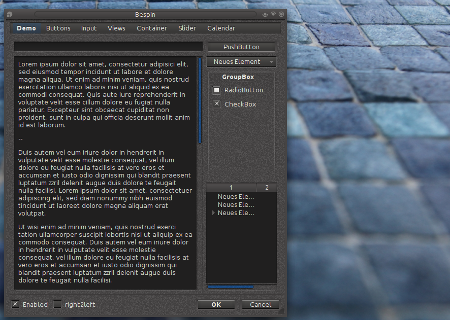
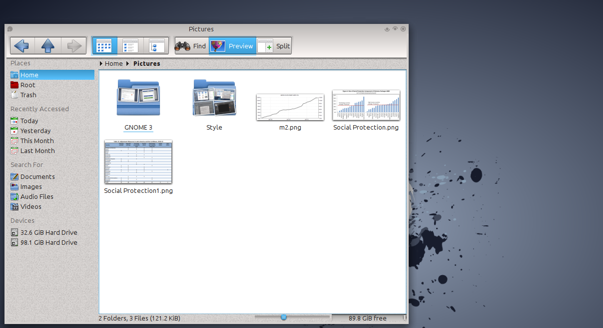
One of the coolest features is the ability to change the window background to a titled structured, there’s a few different ones (including the classic Mac OS X-style brushed metal), in the last screenshot I’m using “Stone”.
Thanks to raw amount of settings and variety Bespin is also very sensible to color schemes, in fact, it can look completely different depending on the selected colors
Since you can import and export sets of settings there’s a few Bespin files available for download at KDE-Look, in fact two of the highest rated presets were uploaded by myself a few years ago (I also made a GTK theme… 6 years ago, I’m getting old), and it goes to show how much times change, as I don’t think any of them looks particularly good today.
QtCurve
This engine is probably the one with the most “themes” available. All of them look like GTK2, but some are decent. Also worth mentioning is that QtCurve is fairly customizable too.
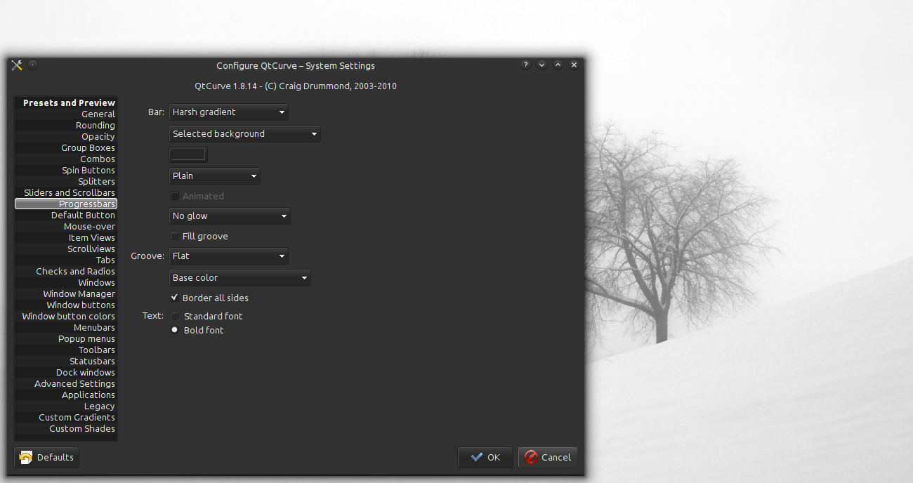
If you’re into super minimalist design then it may be for you. As most good looking presents for QtCurve fall into this category, like Calm by lgsvalti.

Conclusion
It seems like the age of changing themes faded away a long time ago. Most people,even Linux users, seem to stick with the default and many people actually complain whenever a distribution decides not to use the default settings. In some ways this is similar to what is now happening in the Android space and it’s a good sign: It implies that the default settings are strong and well designed.
But things eventually get old, and sometimes is not even the fault of developers but just people getting impatient while waiting for the new big thing. At the end of the day, after testing the three main alternative styles available for KDE, I ended realizing once again that Oxygen is, overall, better than the alternatives.
So what did I do? Well, I decided to use Oyxgen Transparent, with the bundled color-scheme Krita-darker and Opaquity as my Desktop Theme.
Will it last? I don’t know yet. At the end of the day I ended up preferring breathing the same old Oxygen, albeit with a few changes, but perhaps some of you will find the right alternative that fits your taste. But the sooner I come back to it, and the sooner anyone does, the better for Oxygen designers (like Nuno) and developers, they should be proud of what they’ve achieved.
I can’t wait to see what the next generation of KDE, the mythical version 5, will bring to the table, but I rest assured knowing that the people behind it are really talented.