More or less features?
Many projects and software developers want their applications to be aesthetically pleasing and simple to use. Both imply uncluttered interfaces. Others want their application to be as useful as possible. These two are good goals that most software developers should include in their check-lists. The problem starts when developers and designers confront with the how to accomplish it.
Bad reasoning type 1: Less is more
We want our program to be simple to use and one less feature means less clutter. If there’s some function that 90% of users don’t actually use then is better to remove it.
The problem with the argument presented above is it only really works if your application has only two features. Most modern applications include way more features than two.
Removing a feature 90% of users don’t use can somehow be terrible for an application? By itself, it may not have much of a consequence, at most, you may lose 10% of potential users. Yet, when an application is designed with this in mind, you may end up losing every single user. Let’s create a hypothetical scenario to illustrate this point.
Say we have a set of 10 features that 90% of users actually make use of and a set of 10 features 90% of users don’t use. According to the line of reasoning expressed at the beginning, we then should remove or never implement the second set.
However, this could mean our application ends up being useless to all users in our hypothetical scenario. The second set contains 10 features, 90% don’t use it, but we don’t know if the 90% that don’t use it are the same users across all features. It may very well be that feature one is used by the first decile of users, feature two by the second decile, and so on until we reach the tenth feature used by tenth decile.
The end result is that for every user the software lacks one feature they use constantly, all because we removed the features 90% of people don’t use.
Bad reasoning type 2: MOAR
We want as many users as possible and that our piece of software is useful for as many as possible, therefore, we will include any feature any user may possibly want.
The problem with this kind of reasoning is it assumes stuff like good aesthetic design and simplicity to use are not valuable features by themselves. There’s a trade-off, the more features you have the harder it is for your program to be easy to use and good looking. Not to mention other technical problems such as a more complex code base, harder to maintain, harder to document, etc.
Many users will simply not use applications that don’t meet a minimum requirement in the easy to use and aesthetic departments, in other words, you could end up losing most of your users in your quest to get them all.
The problem
Both approaches are misguided, yet they both contain some truth. The intuition from the first is that people won’t like your application if it’s too complicated and ugly, the intuition from the second one is the more features your application has the more likely it is to appeal to more people.
What we want is a piece of software that is good looking, easy to use and has many features. Duh!. Of course everyone gets that. The problem is stripping functionality away as in 1 and adding functionality as in 2 both lead to undesirable outcomes.
Good reasoning
The defect of both thought process lies in their reductionist approach. They consider features individually instead of as parts of a bigger system. Both ignore Aristotle’s maxim: The whole is greater than the sum of its parts. The question we need to ask is not if a specific feature is used or not by some percentage of users. Instead what we should ask is what percentage of users have their needs covered by some set of features.
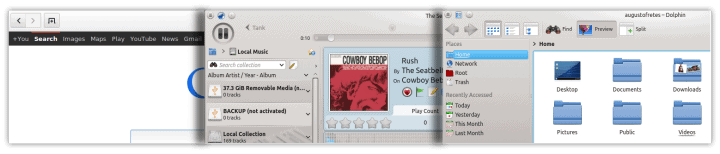
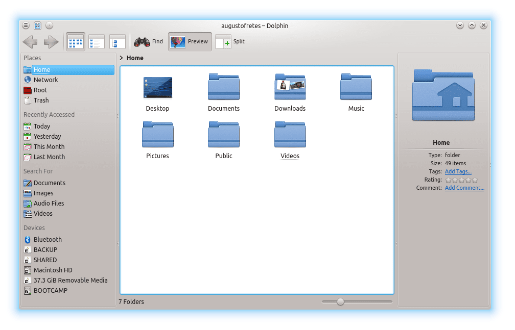
An application that seems to have been developed within the lines of good reasoning is, for example, Dolphin. It’s a good looking very functional file manager. It has a feature set that covers most of what any user needs from its file manager while still looking easy to use,well designed and offering a ton of customizability.
The question of adding or removing features becomes a systemic question, regarding how much it would affect the number of users our current feature set covers. If removing one feature reduces the number of users by a negligible amounts but increases the easiness of use and the aesthetic appeal considerably, then it’s worth removing. If adding one feature increases the number users who find our application useful by a decent margin, then it’s worth adding.
Conclusion
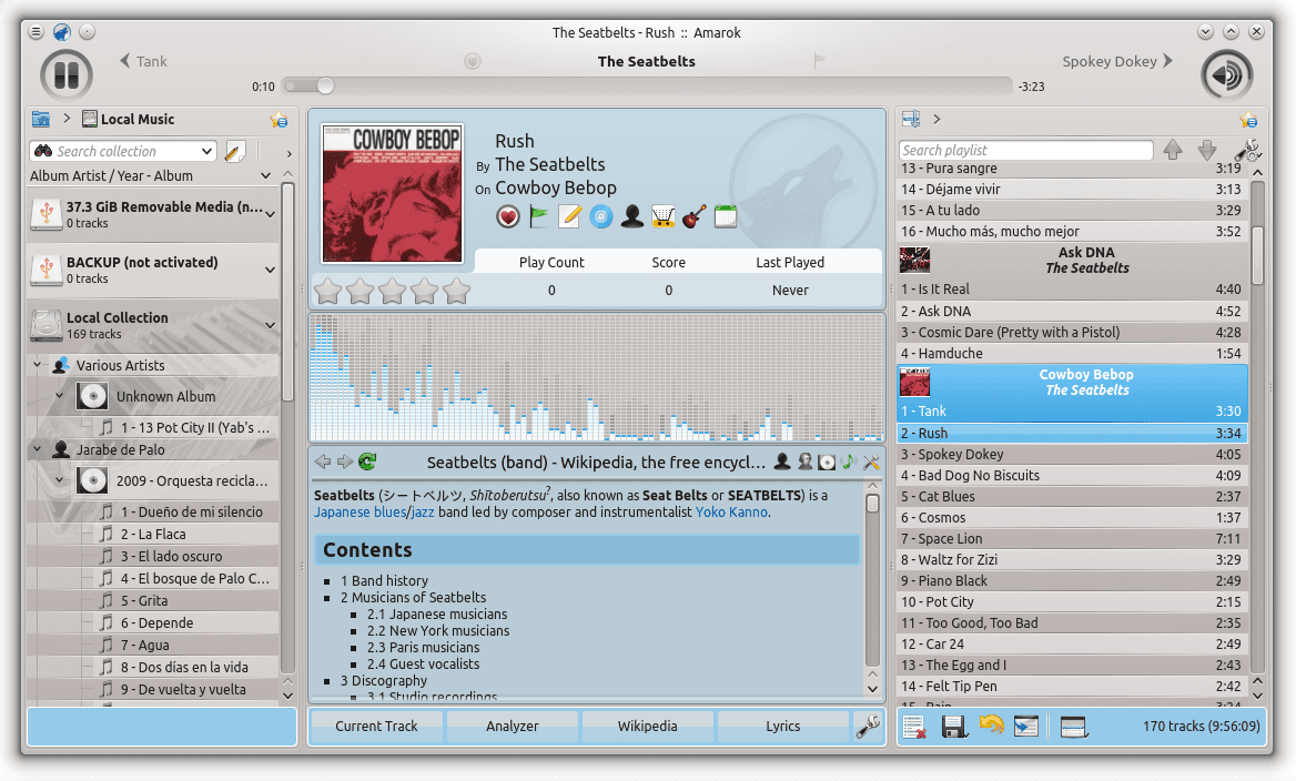
In other words, the MOAR approach to software development is flawed as is the one expressed by the motto “less is more”. These two approaches are exemplified by applications all over the place, Amarok is clearly an example of MOAR and many pieces of GNOME are examples of less is more. What we need is a more systemic approach.
I think the issue can be solved by considering a tiered approach and this is my dead pony to flog, I know. The idea being that features that 10% of users use combined with the reasoning that these 10% are “power users” should be hidden away by default. Not removed, hidden away.
The reasoning is that the power users will find them none the less and use them, but for everyone else it will simply be a way to avoid the “spaceshuttle interior” sensation.
Dolphin, with the right tweaks is an awesome example of this. You can create a layout for dolphin that essentially makes it sleek and perfect for the casual user but the power user can without ANY hassle simply add features so that it fits his or her needs.
At the same time another issue must be considered: technically producing something with “every feature known to man and then some” is a technically complex issue as that may be problematic for stability. Or rather if the demands on the team is that every feature known to man must work, you might find yourself doing bugfixes for something that less than a percentage of users use or even care about and that way madness lies.
Its a tricky issue thats for damn sure
I mostly agree. Except I think we should be careful with the line of reasoning “If it’s no used by 90%, then its users are power users”. It’s probably true more often than not, but we may end up stripping away 10% of users from a feature they need (because they can’t figure out how to get it). I think the correct way of framing it is: “If a feature is not used by 90% and its users are power users, then you can hide it”.
True “If a feature is not used by 90% and its users are power users, then you can hide it” is probably more precise
“The idea being that features that 10% of users use combined with the reasoning that these 10% are “power users” should be hidden away by default.”
That is a false conclusion. Many features that are used by the proverbial “10%” are used by people who are not power users. The fact is that the use cases of any given typical user do not map 100% to the use cases of another given typical user, given a broad enough sample set and comparing members statistically (which is to say: you can find 2 users with the exact same use case requirements, but this does not hold for the whole population.)
Conflating “only used by 10%” with “they are power users” is a m istake.
“The reasoning is that the power users will find them none the less and use them,”
Again, no. You’d (evidently) be surprised by how many power user features that are already hidden are not known to the majority of people who would use them. I know this from years of real world experience .. and it matches the theory too:
A power user is not a divine being with the ability to clairvoyantly determine what features exist or where they are. Combined with the reality that the days of “before I use a piece of software, I read the manual” are long, long dead .. assuming that power users will find features is a badly broken assumption.
There _are_ sane approaches to this problem, and they are to be found in a few KDE applications already .. I’ve blogged about this extensively in the past, it’s too bad KDE as a community didn’t hold on to this as institutional knowledge.
So let me balance that by saying “Compare Amarok to any other modern music player”.
Thats about it – the “sane approach” in comparison with my obviously insane one (and cheers for that), seems to be lacking. I seriously know of very few applications that can be said to have a “sane approach” except perhaps Dolphin which really is the perfect example of what I’m referring to.
You can set it easily to be the perfect version of an easy to grasp file manager for 90% of all people and then simply assume that “power users” will understand how to set the file manager to more easily show the features they need.
The features are snap-on products which gives the user control over what he or she wants without being essentially murder to everyone else.
So what is your “sane approach” (I’m wildly guessing its not Amarok)? Lets face it the current method isn’t working because you are telling a majority of users its not for them – but those 10% are happy as nothing though.
It should also be noted that using an intelligent layout that considers the user’s workflow can be a big improvement even with the exact same set of features. If you have clear organization within an application, you’ve automatically reduced the initial confusion someone might feel, while also giving yourself a clear idea of where things should be and how to make further improvements.
Bolting things on or dismantling them without conscious awareness of what a fresh mind would assume at first sight is a surefire way to get a complicated interface. Even Amarok, with all of its buttons and configurable areas, could benefit from restructuring the same information and functionality.
And, of course, taking some makeup off of the pig may make it easier to look at- making separations clear and distinct between major areas of focus is one thing GNOME does very well at the moment.