Ubuntu for phones: Teaching the tech giants how is done

Is probably no mystery by now that I follow the mobile industry closely so I was naturally very excited when Ubuntu for phones was announced back when the year was one day old. Much has been said in those days, mostly about what a fierce path is ahead of Canonical if they want to impact in any significant way the market and while I have a lot to say about that I rather write today about something happier, namely that Ubuntu for phones has done what Apple and Google couldn’t: Designing a button-less touch interface.
Before getting into the praise and comparatives with its competitors I need to point a couple of things, or rather, companies. First, Nokia and MeeGO with their swipe-UI are undoubtedly direct predecessors of Ubuntu’s interface, and second, RIM is moving towards a similar goal. With these out of the way:
The rise of smartphones
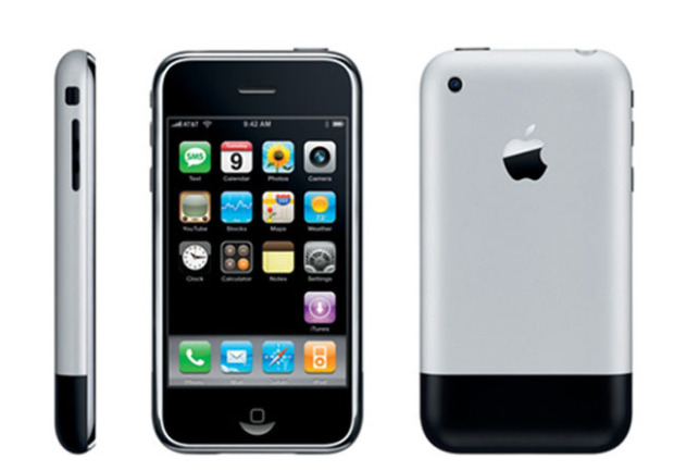
No one can deny the revolutionary impact the first iPhone had in 2007, it changed the landscape of the technology industry and to an incredible degree it has changed the way we communicate with each other. I’m not saying the first iPhone caused all of this alone, rather I’m saying the invention of the iPhone and with it the creation of the modern smartphone served as the spark that got the engine going.
The iPhone itself may not had seem like a big deal if you were only watching each piece separately, after all I’ve argued before that Linux was home of the modern way of distributing software. But as the old phrase goes the whole is greater than the sum of its parts.
Without question the most important part of the whole was the new “touch-centric” paradigm and that revolution is still far from complete… while the iPhone and later Android contributed to this paradigm it was not them who closed the last ties with the old fashioned buttons. Let’s talk Ubuntu.
Swipe, Swipe, Swipe and Swipe: Ubuntu’s approach.
If you want to play a song in any smartphone, what are the steps to accomplish it? You touch the music player icon, you look for the song by touching and scrolling the list with your finger, and then you touch the song you want. What if you want to visit netrunner-mag? You touch the browser icon, then you touch the URL bar, then you touch every letter in netrunner-mag then you touch go.
But what if you want to go back to your homescreen? If you’re using an iPhone you press the home button. Isn’t that weird when you think about it? You touch the screen for almost every conceivable thing you want to do with your phone, why is this action any different?
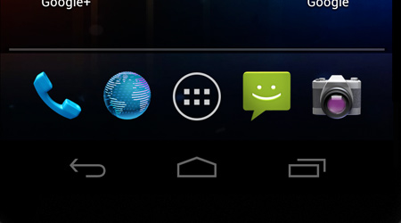
It really isn’t. Apple simply didn’t find a way to do it in a consistent way with touch. But what if I have an Android? Well, you may need to press a home button depending on your specific phone but vanilla Android is designed to be used with touch only and not with buttons. So you indeed touch something in the screen, but what is that something? A drawing of a home button that is always there (except for a few trivial cases) defeating the whole purpose behind using touch screens instead of buttons.
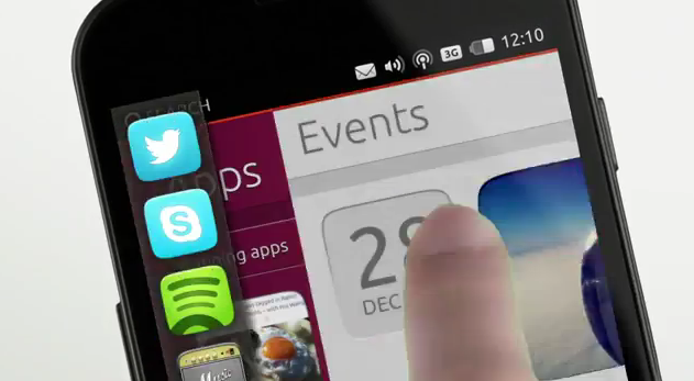
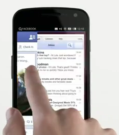
In Ubuntu for phones all these issues are eliminated. Instead of merely drawing a button in your screen or putting a button below your screen, on Ubuntu you make a long swipe from the left edge to bring the home screen.
You may think this is not a big deal, after all, hitting a hardware or software button is pretty easy, right? Except that’s not the only issue. If you own an iPhone think for a second how many things you do with that home button, it’s not really just a home button, it’s also your multitasking button, your music controls button, your orientation button and your Siri button.
What if you want to switch between apps? On iOS you need to double press the home button and then you can switch between recent apps, if you want to change the volume or lock the orientation you also double press the home button, despite this three actions being completely unrelated with each other, and none having anything to do with taking you home. Is a workaround. On Android the issues are the same as with the home button but is worth mentioning it is much better than iOS’ approach. On Ubuntu for phones you simply swipe from the right edge to move through a carousel of your recent applications.
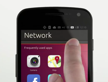
All major mobile operating system use the same gesture to access the notification shade and Ubuntu for Phones is not different in this regard, rather, is a refined version of the same idea. When you swipe down from the top edge the notification shade starts appearing but as it goes down you can select by moving your finger horizontally if you want to access specific settings by selecting the corresponding statusbar icon that gets highlighted as you move your finger. This is a tremendous improvement over what’s available in all other platforms.
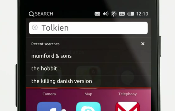
However, the most surprising development is that Canonical figured out a better way to implement an always visible universal search than Google itself: You swipe down from the top edge and simply select search by moving your finger horizontally.
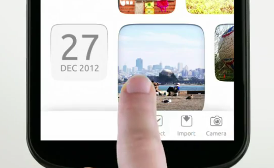
The last swipe is obviously from the bottom edge to the top and it brings the corresponding menu of each app. This approach allow developers to create application that focus as much as possible in the content.
Canonical has indeed figured out what is in many ways a definitive improvement in some areas, but is it perfect? It’s clear as water that its notification shade and app switching mechanism are superior, but what about the menu or the idea of swiping itself? Is there any trade-offs?
Is swiping better in all respects?
No. For example is easier to discover that by pressing the home button you get home than it is discovering you get home by swiping from the left edge, on the other hand, pressing it twice for recent apps and long pressing it for voice commands are hardly any easier to discover than is swiping from the right edge to change among recent apps. Android however is very straight forward: You get persistent buttons, one for home, one for going back, one for recent apps. So those are certainly easier to discover. On the other hand, as I previously mentioned, to get to Google Now (Search) you need to swipe from the home button up which is not as good as Ubuntu’s search implementation.
Accessing the menu is another arguable point. Hiding the main menu of an application is not a good policy because the user has no way to know if there’s indeed a menu unless he specifically tries triggering it, moreover, the menu may change contextually so he may need to swipe from the bottom many times just to learn if there’s a menu there to begin with. This was a major problem on Android and it was corrected in +4.0 by removing the menu button and replacing it with a standardized on-screen three-dotted icon on any application that has a menu. This is the same approach Microsoft has taken and Apple uses a similar (if less standardized) approach. Another thing that may be hard to overcome is accidentally swiping from the edges while gaming.
Despite its flaws, still the best
Most flaws can be avoided with a very simple user guide, moreover, it can be used as a selling point: I can imagine a newcomer trying to do something by finding some sort of button and asking its friend how to do it, and the owner then proceeding to show how to move around with swipes… I think the newcomer would be pretty impressed. The issue regarding the menu button can be solved by a small gradient at the bottom of the screen that only appears when there’s a menu to be pushed up.
All in all the community should be excited about this new branch of Ubuntu, the source code will soon be available for all of us to see and play around with, and it’s not just a platform catching up, it’s really bringing new ideas into the table, ideas that I believe are closer to the future of touch screen devices than our current modern smartphones are.

Sounds a bit like Android’s gestures, which I keep turned off because I find them annoying. It’s too easy to accidentally swipe when just handling the phone.
You’ ve convinced me! I´will try it! besides I miss ubuntu, it was goooood, (not the laptop I used to have but the system XD).