Tomahawk: One music player to rule them all

Honoring the net in Netrunner, new applications are always considered in the context of our current world, our cloud connected world. Starting from 13.06 onward Amarok will cease to be Netrunner’s default music player and will superseded by Tomahawk, a relatively new comer to the scene of open source applications developed using the marvelous “Cute” toolkit.
Tomahawk’s has one big goal: Merging your local music and your cloud music experience into a single frictionless whole. Let’s dive in.
Greetings, pick your favorite web services
A breath of fresh air: The very first screen asks you to tick your favorite services, setting them up never surpasses more than a few clicks. Once you’re done it will automatically search for local music in your Music folder, add it, analyze it, find album arts, and put your cloud playlist right there in the same sidebar your local music lives on.
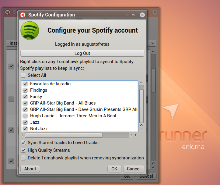
For example using Spotify is as easy as it gets, tick it, click the wrench, log in, and select your playlists. Note that to use Spotify or Grooveshark you need to be a Premium user (Spotify, although it works under a freemium model, doesn’t support third party application for non-Premium members).
Tomahawk officially supports the following “resolvers” (streaming services):
- Spotify, as previously mentioned, requires Premium account.
- Grooveshark, ditto.
- SoundCloud, finds playable tracks stored in SoundCloud, including mixes, live performances and covers.
- Last.fm, finds tracks playable for free and supports scrobbling.
- Jamendo, a copyleft store, any song that is available for free personal usage is accessible.
- Dilandu, uses an mp3 search engine with the same name.
- Official.fm, looks for tracks available for free.
- 4shared, finds files to play at the famous (and some say infamous) 4shared.
- Ex.fm, searches for tracks.
- Amapache, you can connect to your OwnCloud (including Runners-ID) and play your files.
- Subsonics, searches on your subsonic server for music.
- Beets, connects to beets server and resolves tracks.
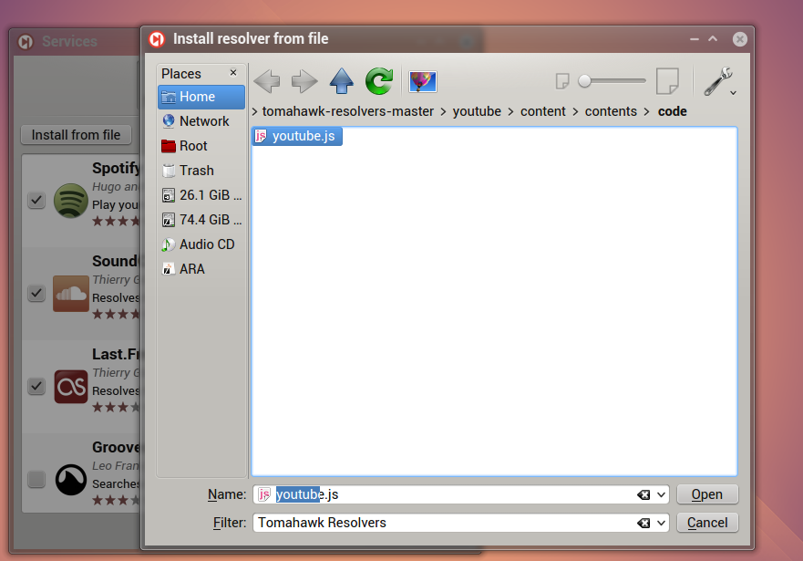
Not too shabby. Moreover, not content enough with being open source and offering quite an attractive set of services, in the latest version they added the ability to install third party resolvers easily, just click install from file and select the corresponding resolver.
Once you’ve finished picking your favorite services, which shouldn’t take more than a couple of minutes, you can connect Tomahawk to your social networks, Twitter is supported, surprisingly, Facebook and Google+ are missing.
Tomahawk’s interface
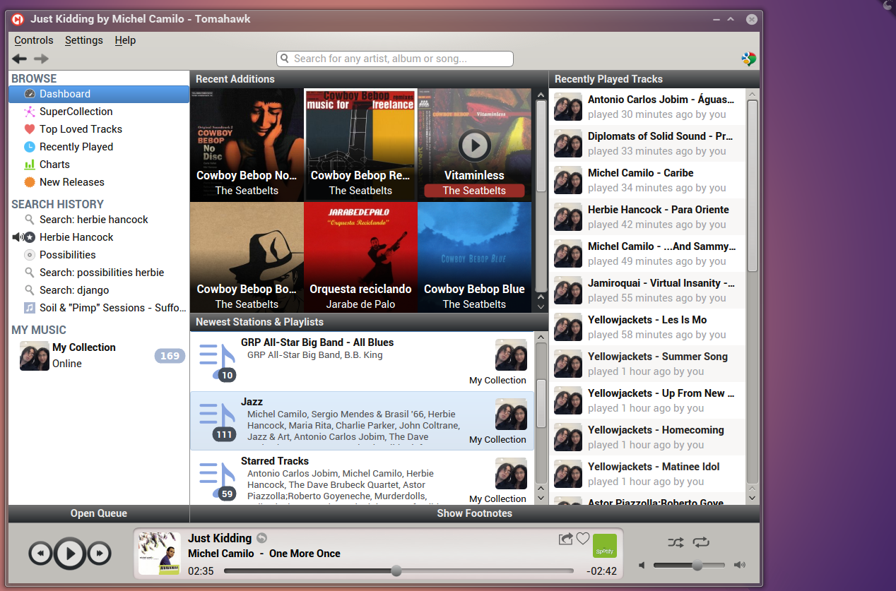
All the ubiquitous support of cloud services would be rendered to uselessness if the interface destined to play music was awful. Thankfully Tomahawk, in my opinion, mostly shines in this department, easily taking the crown home. Here’s Tomahawk first screen when launched, called Dashboard.
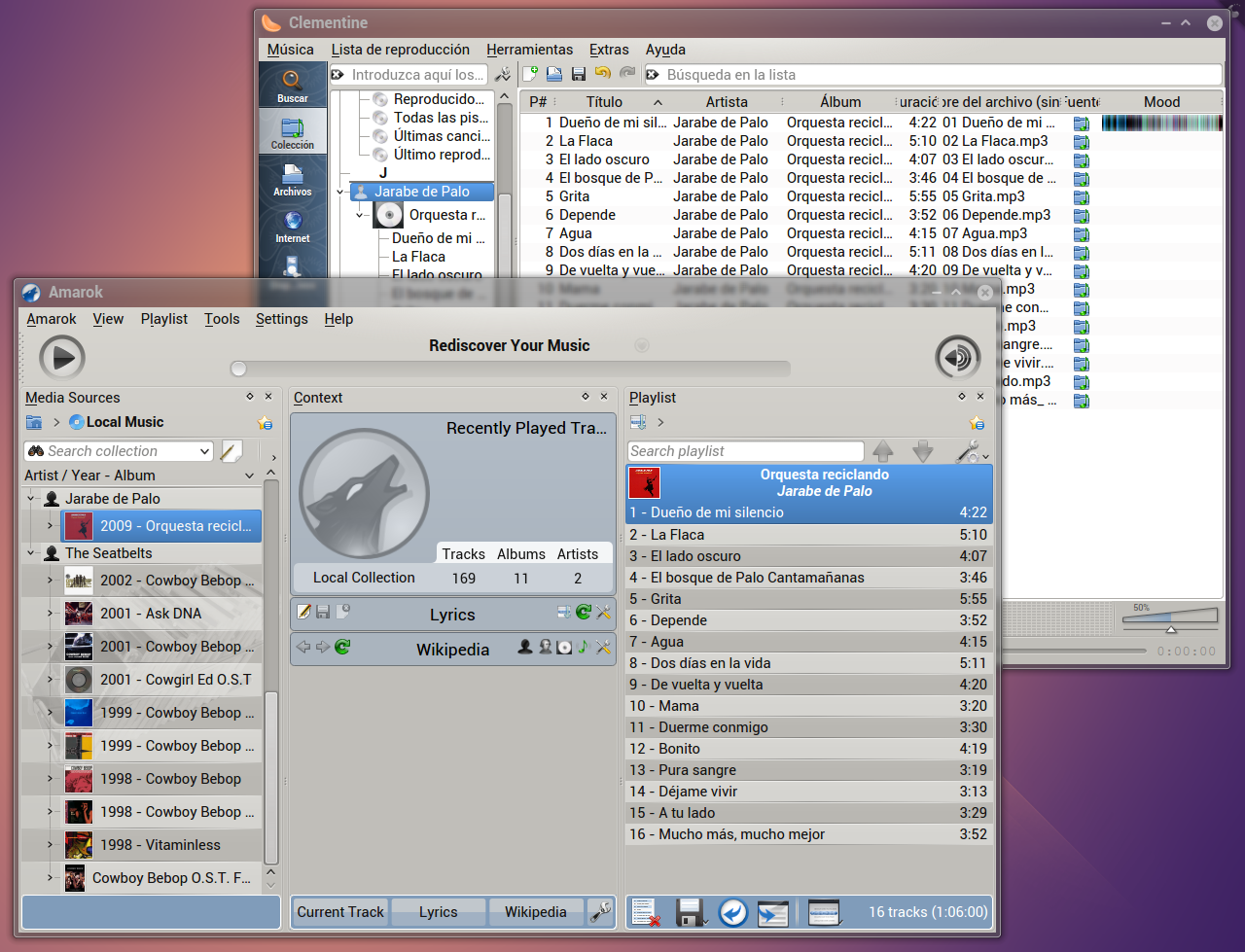
For comparison sake here are Amarok and Clementine displaying the same local catalog.
Two things I believe are clear from these screenshots: Amarok has a cluttered interface beyond repair (without going back to the drawing board and starting from scratch) and Clementine looks absolutely outdated (naturally, Clementine was designed to bring the old Amarok interface from the KDE 3.x days into KDE 4.x, it has an appeal to some nostalgic that remember when Amarok was the best thing since slice bread, I remember those days, but I’m not the nostalgic kind of guy when it comes to technology, I probably tend to the exact opposite).
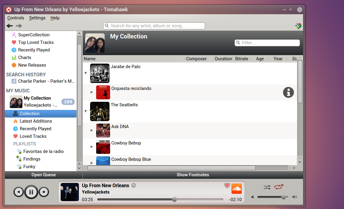
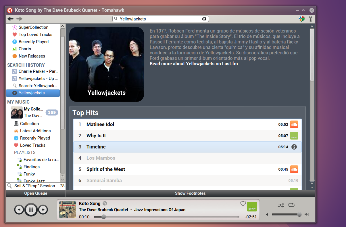
Tomahawk, despite the number of features has a very simple interface: A slim menubar that you can hide (and you should hide it, since it gets replaced by a wrench), a sidebar with different sections including your local collection, online playlists. radio stations, and your playback controls at the bottom. Inside the sidebar there’s a small bar with your current Queue, depending on the situation it reads Open or Close Queue, as soon as songs are queued it automatically expands, it will show the number of songs queued if closed. Much to my liking you can remove songs or change their order by simply drag n’ drop. Inside the main view, which changes depending in what is selected in the sidebar, there’s another expandable window called Footnotes, it shows the top hits, related artists and a mobile version of the Wikipedia. One thing that annoys me to no end is that these two windows are not aligned, but that aside it works as intended.
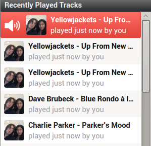
Let’s take a quick look at Tomahawk’s sidebar sections all of which you can hide by clicking them (all elegantly show hide on hover), starting by Browse. The first screen from the main interface was from the so called Dashboard. It shows recent additions to your (local) catalog, your newest playlists (both local and online), stations and your recently played tracks. It works well enough, my biggest gripe is that it doesn’t recognize if you play four times (or n-times) in a row the same song, so it’s annoyingly useless if you, like me, usually listen to the same song many times after discovering it.
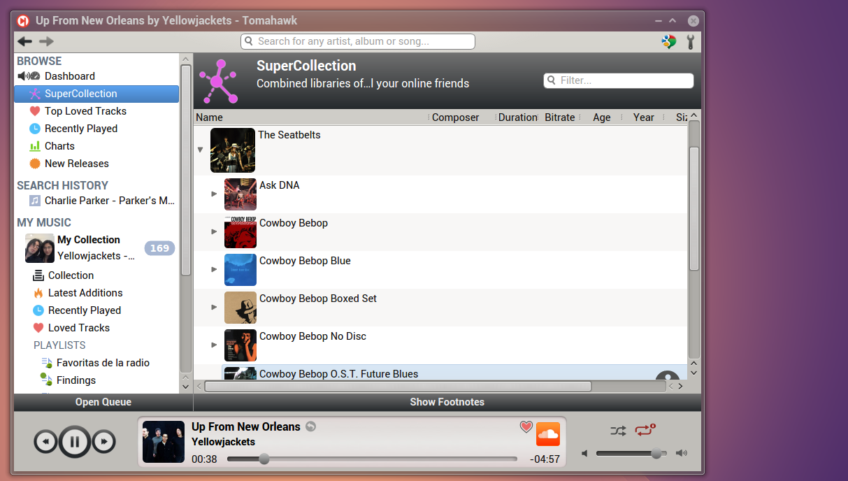
Next is SuperCollection which combines the local libraries of all your online friends, sadly, I can’t really test this feature since I don’t have any friends (sobs) whom use Tomahawk, but it sounds cool. However, I do have a few friends (cheers) that use Spotify and sharing playlists, working on playlists together, as well as checking their public playlists is a regular Spotify feature that is still missing from Tomahawk (you can enable collaborative playlists from the interface, but you can’t actually manipulate other people’s playlists from Tomahawk), this seems like a weird omission, considering they’re obviously thinking big with stuff like SuperCollections, still it should be noted that Tomahawk is still a young project, and all of the aforementioned features are probably in the works.
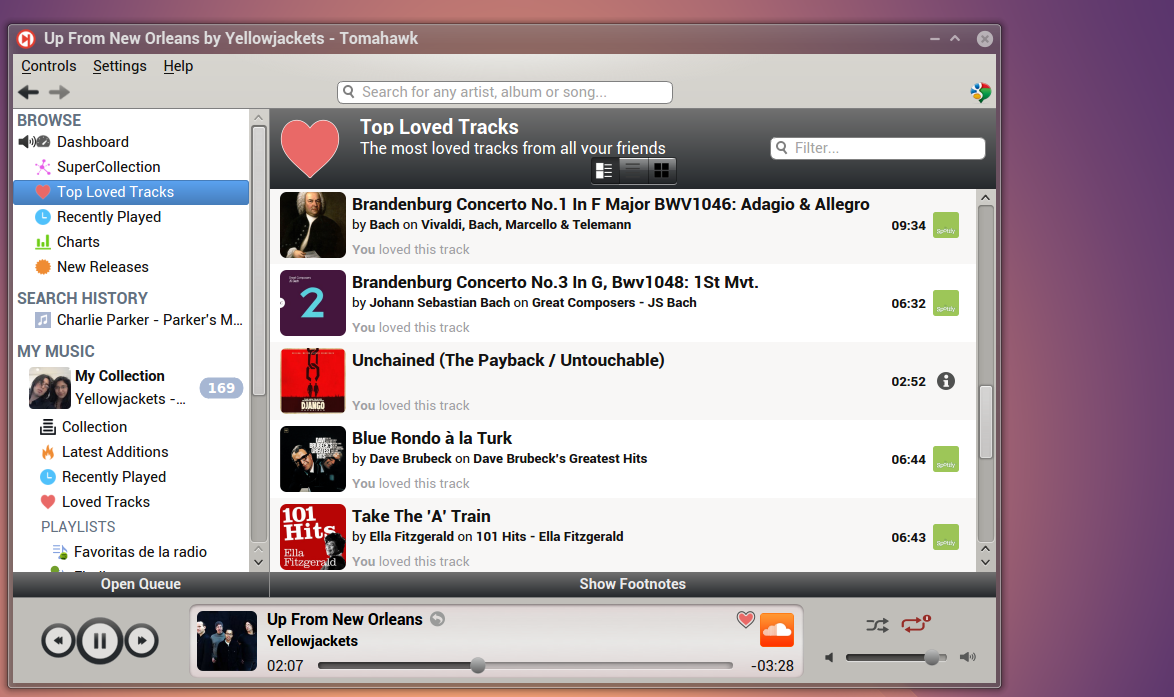
Top Loved Tracks and Recently Played Tacks are next, the former shows the tracks loved the most by all of your friends and the latter the last tracks they’ve played (annoyingly, is still list the same track multiple times, which makes this annoying behavior grows exponentially to the number of your friends using tomahawk), again, I can’t really test this feature, the lack of social integration with Spotify is mystifying considering how connected this player is and how social is trying to be.
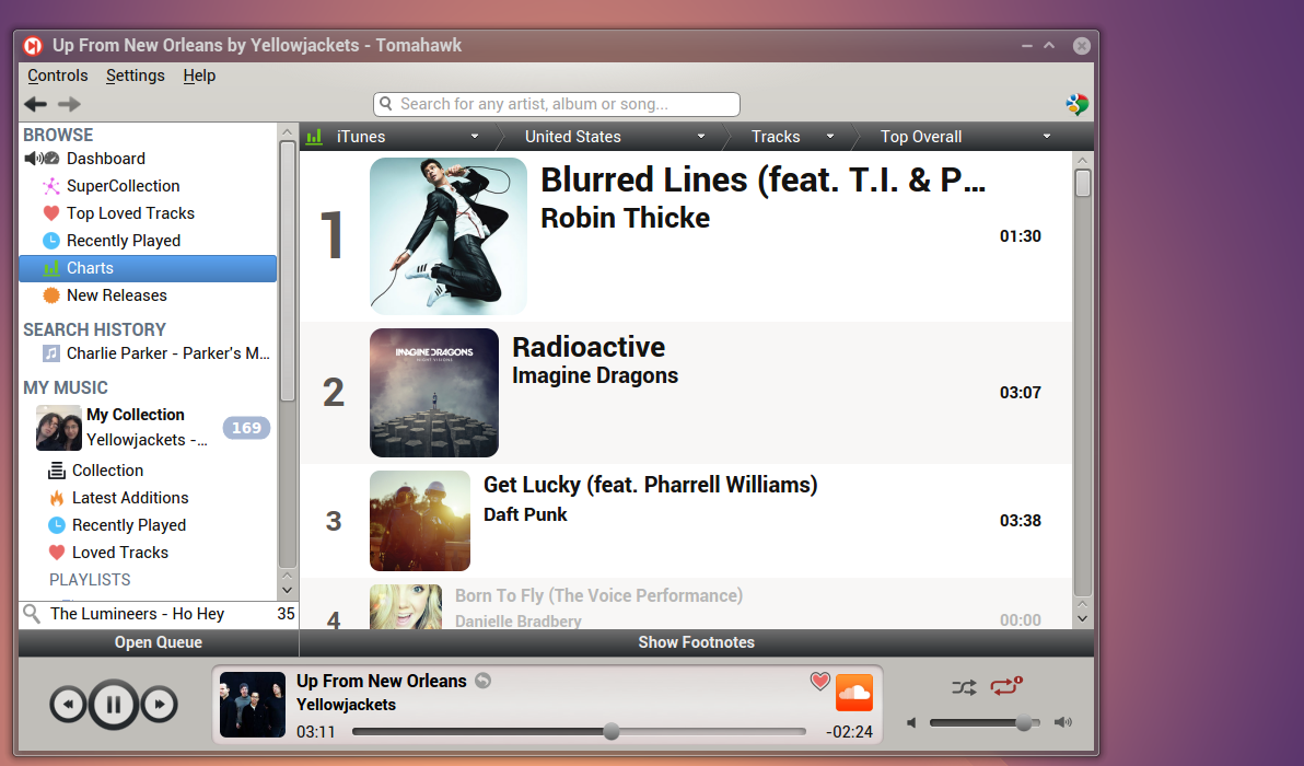
Charts shows the currently best selling songs, you can even pick different services or stores, ranging from Last.fm and Metacritic to Spotify and iTunes. It works exactly as expected, if you’re into listening whatever other people is listening to or buying this feature works as expected (I’m not a hipster, I swear!).
New releases surprisingly shows recently released albums. The next section, that appears after a search is appropriately called Search History, we’ll save the best to the end and skip it for now.
Under the section My Music and My Collection is where all of your local music and playlists appear, weirdly, clicking on My Collection simply collapses everything in the section My Music, something that makes no sense whatsoever considering it doesn’t look at all like a button to collapse or expand anything nor it shows any clue as to how it behaves, it already says My Music, why exactly do I need a useless button labeled My Collection too anyway? These small mistakes are not too relevant in the grand scheme, but annoying nonetheless.
The next section is called Collection (yeah, that’s right, there’s a My Music, followed by My Collection, followed by Collection, you can see where my gripe is now) and shows your local collection, this section should be labeled My Local Collection since it doesn’t show music from the cloud and this player is connected to the cloud at all times. It looks and works well.
Latest Additions shows the music recently added to your local collection. There’s not much to say, other than it works as expected. Next is Recently Played that does exactly as the name suggests, keeping with the recurrent theme, the same song is still shown multiple times if it was played more than once.
Tomahawk’s incredible playlists
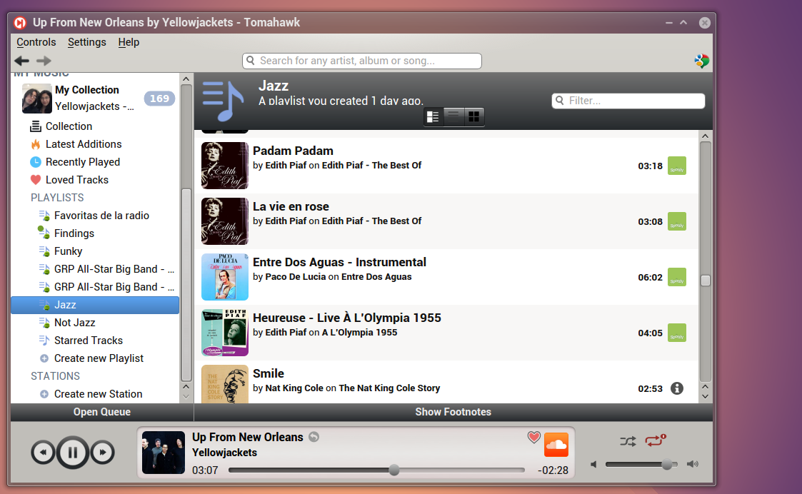
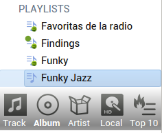
Next we have Playlists, and this is when things get interesting again, your online playlists (from Spotify and Grooveshark) will show here and sync with your services, so you can add and remove songs from them and it will be reflected on the cloud. Take, for instance, my Jazz playlist from Spotify.
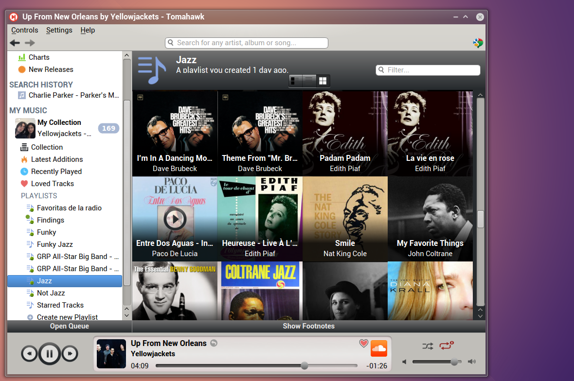
There’s three different views which can be selected by picking one of three button under the name of the playlist, the one above shows album arts alongside the basic metadata of each song, the second view is a traditional list view, and the third is an album art wall.
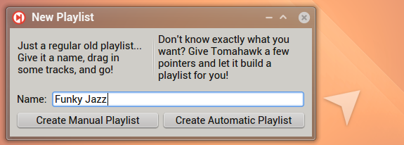
Creating new playlists is as easy as it gets, just click on Create Playlist. Two different options are offered Manual Playlist and Automatic Playlist.
Let’s check the former option first. As expected you get just a playlist on your sidebar and you can add songs to it by drag n’ drop. However, Tomahawk takes it a step further, when you drag a song you’re offered a few options:
You can add only the track you dragged, every song in the album to which that track belongs, every song by the artist, only local songs or the top 10 songs by the same artist. This feature is absolutely great. Tomahawk’s awesomeness starts showing when you can add the whole album or songs or top 10 songs of any artist even if you don’t actually know the name of the album or know the artist previously to hearing that song, it’s frankly one of my favorite features ever in a music player.
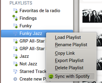
Better yet? Right click and sync your newly created playlist with Spotify.
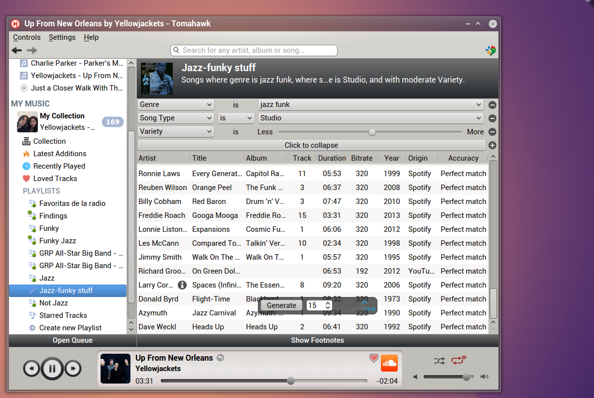
Automatic playlists are not an unprecedented feature but Tomahawk’s cloud connections take them to a level not too common, in a way there are not different from automatic radio stations based on a song or album or artist, except it can actually combine different services into a single stream of songs. Moreover, you can fully manipulate the stream (change the order of songs, remove them, or generate new ones on demand). moreover, unlike automatic radio stations you can set multiple criteria.
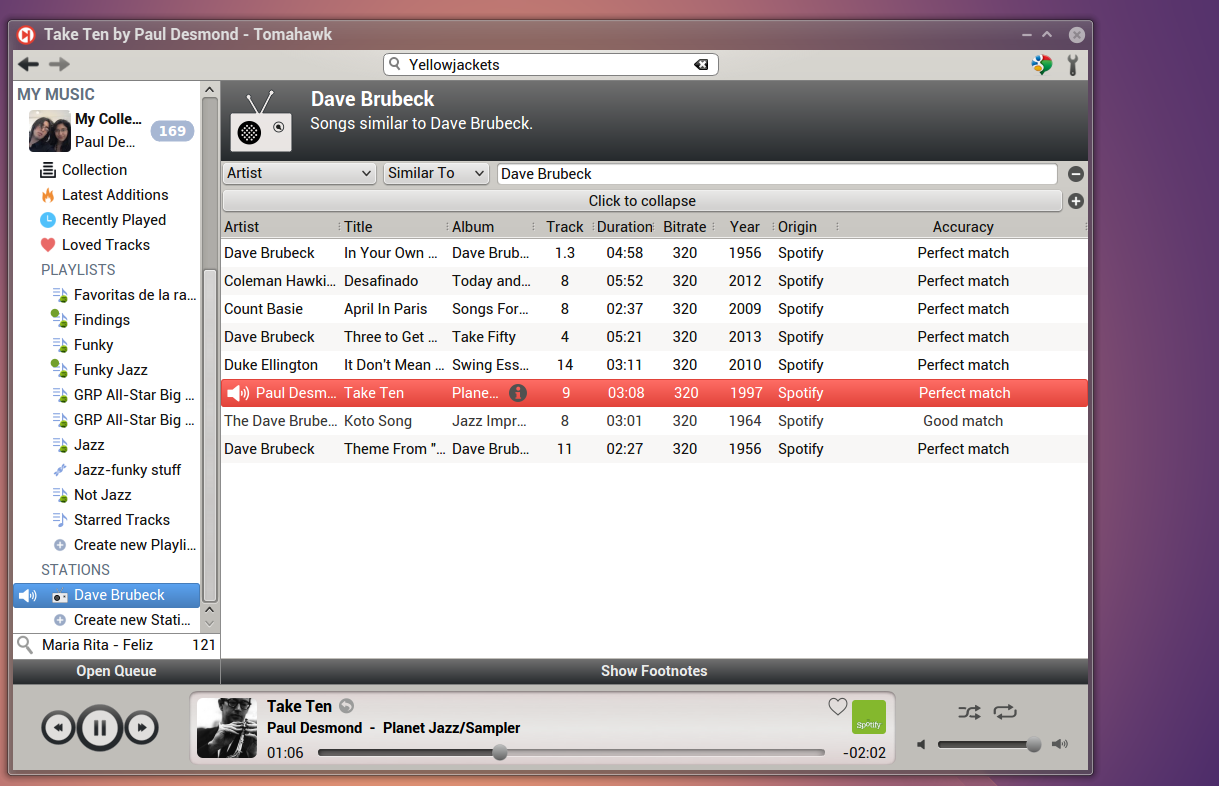
Radio stations are very similar to automatically generated playlists, and are equally awesome.
But as I said, the best for the very end.
Tomahawk’s amazing search experience
By far the most impressive and useful feature offered by Tomahawk is how seamless, almost spooky, searching is. Tomahawk will simply search in every service you’ve enabled and call it a day. The first screen shows artists on the right, albums on the left and songs on the bottom, it should be noted that the songs specify the source.
If you double click in the artist you get a complete overview with a biography and the top hits first.
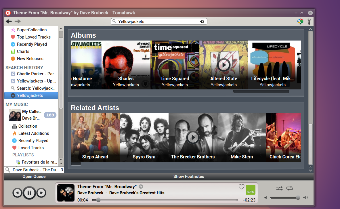
Followed by albums and related artists.
Select an album and Tomahawk will do its best to find the content of it. For example, this particular album is not available in Spotify, but almost every song is right there to stream from YouTube.
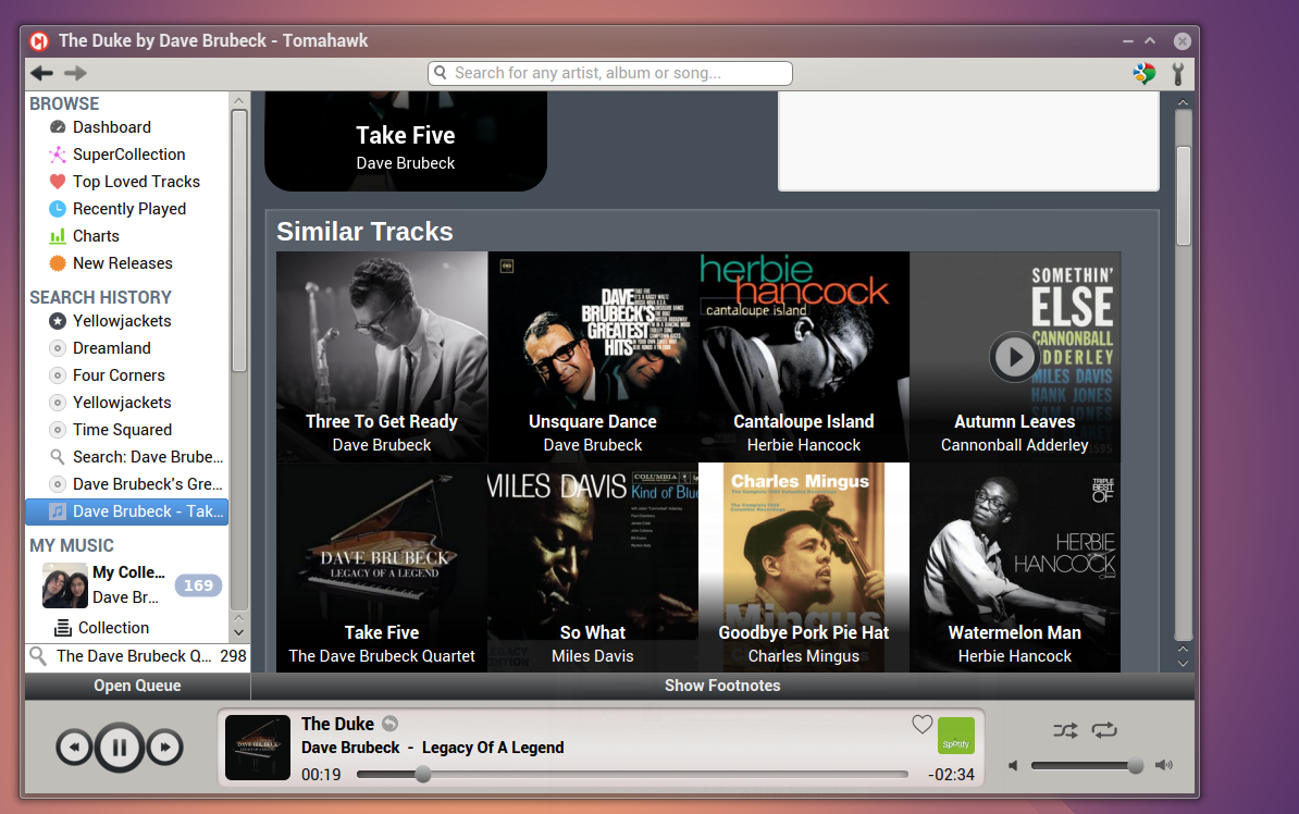
By clicking the “i” icon that appears on hover on any track you can get to its information, which will show some statistics (how many times you’ve listened to a specific track or album and how many times you’ve listen the artist) and similar tracks.
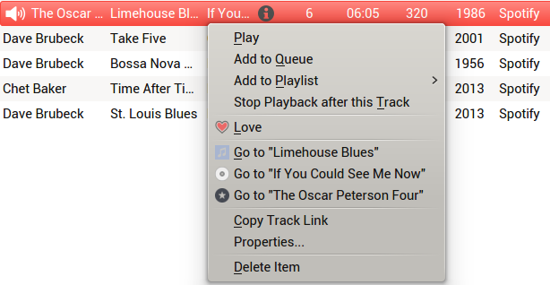
By right clicking on any track you can always select to go to the artist, album or song information. If you’re using the classical list view you can directly click on the information icon on hover on the artist, song or album column.
Better yet? You can drag n’ drop from anywhere in search to any playlist, this includes dragging entire artists or albums right from the cover art or artist picture. Tomahawk’s amazing search capabilities mixed with its superb playlist support are its strongest features by far, and combined they make Tomahawk a tough competitor to any music player, regardless of how many billionaire companies are behind them (the experience is especially hard to match for them, since they will always limit their features to their own services).
Conclusions
Is Tomahawk as close to perfection as it gets? No. As I’ve pointed there are a few annoying things that need to be worked out, there’s also many other small UI changes that I think are needed to make the interface better, It also lacks integration with Facebook and Google+ and doesn’t support all of Spotify’s social features. Regardless, all of my problems with Tomahawk’s design (beyond that I tend to nitpick a lot), and social features you naturally expect but don’t find, are completely eclipsed by how well it generally works.
Is it truly a seamless experience? Well, yes and no. It can be very slow at finding sources from time to time, but that depends on many variables, including your internet connection (I’m currently away from home and the internet connection is many things, but fast is not one of those, download speeds are around 0.35 MB/s), but it mostly works very, very well. I won’t repeat everything again, but the condensed version of all the previous text reads: Great GUI design, innovative all-in-one local and online access, superb playlist features and the best searching experience of any music application out there.
I can only give my most sincere congratulations to the developers behind Tomahawk, they’re really creating one music player to rule them all. And picking it as Netrunner’s default music player is, in my opinion, one of the best decisions the team behind Netrunner has taken, and they’ve taken quite a few good decisions!






Is there a way to get this program to display the local collection as a list of albums, rather than as a list of artists?
Not that I can find. And is one of the things that I dislike about it.
I still prefer Guayadeque.