Review: Kubuntu 13.10

The new version of Kubuntu has arrived right on time. Since is probably the most popular distribution out there after Ubuntu, it’s the vehicle in which most newcomers get to experience KDE. Unlike some previous releases 13.10 doesn’t make many user facing changes, most of them are pretty small, yet is always wise to remember that tiny changes add up over time.
Whats’ new?
Revamped Network Manager
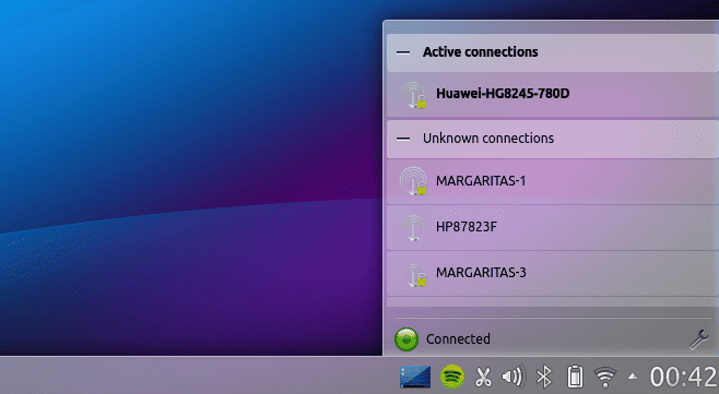
This is perhaps the first thing users upgrading from Kubuntu 13.04 will notice. The old interface was a bit clunky, it showed information most users don’t care for and wasted quite a bit of space in the process.
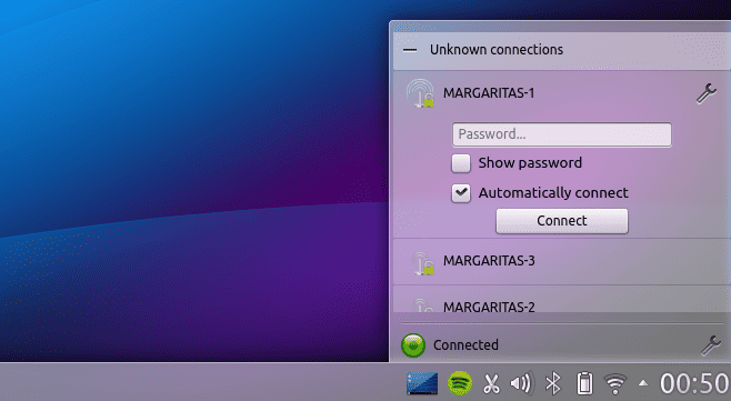
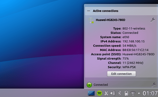
The new interface opts for simplicity, a simple list showing active connections and one showing available spots as unknown connections, the latter is a rather poor choice of words for an otherwise good idea. If a network needs a password instead of asking for it on a pop up window the new network manager just expands and asks for it:
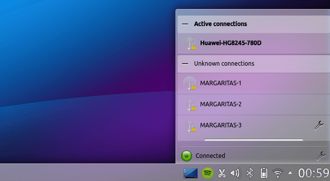
It works fairly well, my only criticism is that when you select a network it should scroll automatically (and ideally resize itself if necessary) to avoid situations in which the user is forced to manually scroll.
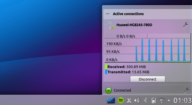
The interface is much improved, but not all signs of the old clutter are gone, click on any of your active connections and you’ll get a graph showing network activity as well as the amount of data received and sent.
I’m sure somebody spent sometime coding these features and now (s)he wants to show them but the truth is they don’t belong there, most users don’t want or care about them and those who do are perfectly capable of finding it by themselves. On the flip side, if you click the wrench you get seriously useful information and quick access to any network’s specific settings.
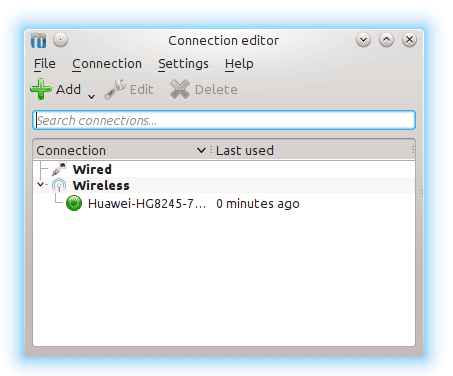
If you click the wrench besides your current status it expands and lets you enable/disable network connections, enable/disable WiFi or open the Connection Editor, which also has been simplified. Configuring network connections is otherwise unchanged, only the interface to select them has been modified.
Revamped Battery Applet
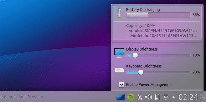
Laptop users are probably going to notice it immediately, the much improved battery applet let’s you control your display and keyboard brightness with a couple of sliders, it also displays your laptop’s remaining battery and the remaining battery on any wireless keyboard or mouse that you’re using. If you click in a given device it will expand (and automatically resize the applet, just like the network manager should) and show your battery’s capacity as well as its vendor and model (although Kubuntu fails to recognize the vendor and model of my battery, that’s a rather small bug specific to my hardware, and is not a bug in the battery applet itself).
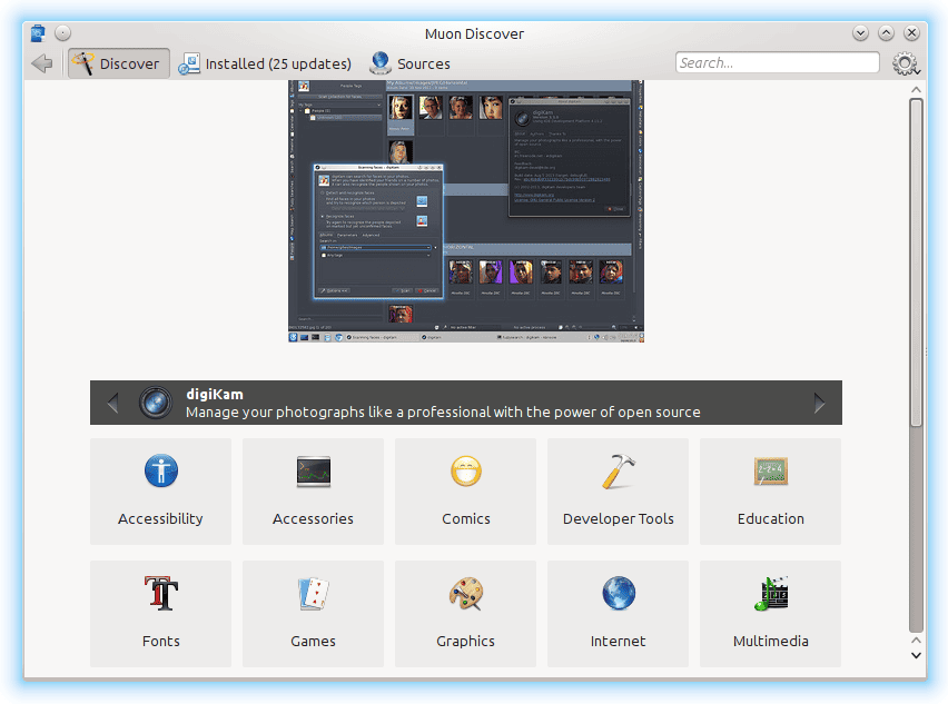
Muon Discover: Kubuntu’s Software Center
We’ve covered Muon Discover in the past, and its time to debut on Kubuntu has finally arrived. This is a massive improvement and automatically makes Kubuntu more user friendly than ever.
User management
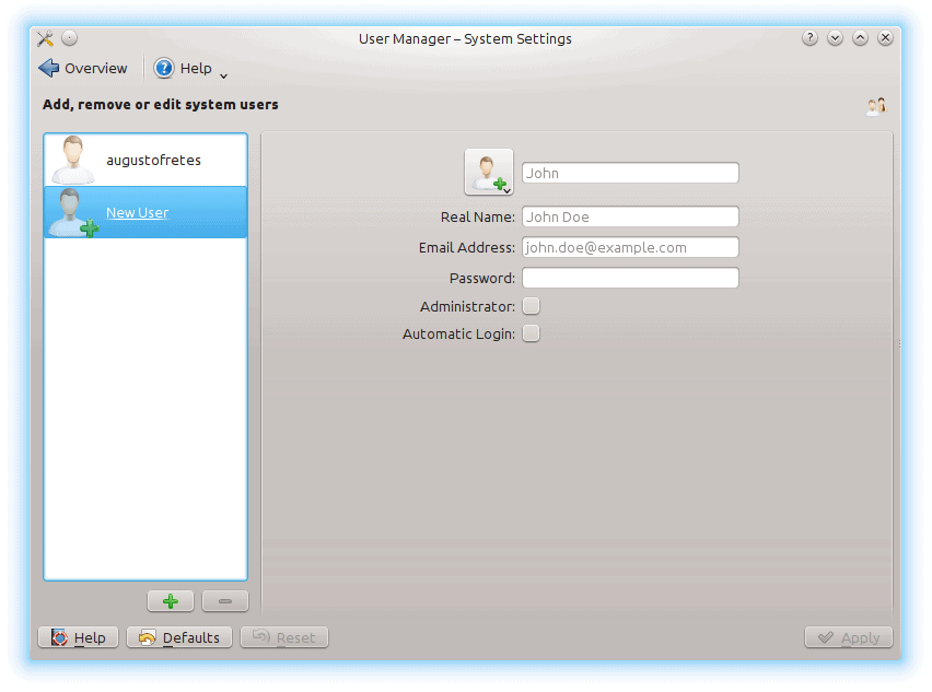
There’s a new entry on System Settings > System Administration called User Manager. It has a very simple interface that lets you create and remove users, making them administrators or automatically log them. There’s not much to say about it, which is probably a good thing.
KWin: The same but smoother
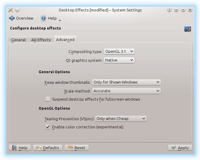
KWin now supports OpenGL 3.1 and OpenGL ES 3.0, although they don’t seem to be enabled by default. This improves performance noticeably and it also paves the land for Wayland in future releases. You can enable it by going to System Settings > Desktop Effects > Advanced > Compositing Type and selecting OpenGL 3.1.
One small yet appreciable detail is the addition of a glow for hot corners.
One recurring mistake
Perhaps the most important application is the web browser, there’s companies like Google that think is so important that it could replace almost everything else. Getting it wrong is therefore among the things that you surely want to avoid at all costs. How could a Linux distribution get this wrong? After all Gecko and Webkit are open source, two of the most popular browsers in the world, Firefox and Chromium/Chrome, are also open source. The answer is Rekonq, instead of shipping a browser that is widely popular, full featured, open source and tested against, Kubuntu ships with Rekonq.
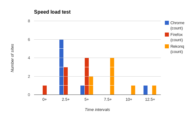
Much to its developers credit Rekonq has been improving and increasing its feature set consistently (I’ve been trying Rekonq since version 0.0.4, and I would love to see a competitive KDE browser), of course it’s still miles behind Firefox, Chrome, Safari and even Internet Explorer. But the worst part is just how slow it is. To exemplify this I compared loading times of various sties on Chrome, Firefox and Rekonq.
To better show how slow it truly is I created another graph divided into intervals:
Firefox never took longer than 7.5 seconds to load any of the sites, Chrome actually loaded every site but Netrunner-mag in under 6 seconds. Rekonq didn’t load a single site under 6 seconds, in fact, the only site it loaded under 7 seconds was Engadget.com (6.988). Even worse, Rekonq took to around two times (or more) as long on every site as the fastest of the trio, loading PlanetKDE took 3 times as much as it did on Firefox. In summary, Rekonq is pretty bad compared to its contemporaries. Kubuntu still includes a menu entry to install Firefox in one click, which is bizarre to say the least, as it suggests that they know Rekonq is inferior but insist on using it before its ready.
Conclusions
If you knew Kubuntu or KDE you know Kubuntu 13.10, the differences between this and previous versions aren’t too pronounced, under the hood there’s plenty of bug fixing, improved drivers, improved performance and Linux 3.11 brings many positives like proper Haswell support (but for most users that simply doesn’t matter). What does matter is the arrival of Muon, as it makes Kubuntu far more user friendly and easier to recommend to new users. The battery and network manager applets have been improved immensely, and while these changes represent only a handful of MB, these two updates change two of the most critical aspects of using a laptop: network and battery management.
Rekonq may be a terrible choice in a terribly important spot, yet since it can be replaced so easily it barely detracts from the experience of an otherwise well done distribution. It’s akin to the old joke about Internet Explorer 6: its only use was to download Firefox. Rekonq doesn’t even gets that honor because Firefox can be installed without ever opening it.
I wouldn’t hesitate to recommend Kubuntu and its vanilla KDE experience to anyone, however, I think other distributions with a better and bigger set of default applications and pre-installed codecs (with a more pragmatic and less KDE-centric approach) are still a better choice for newcomers, because they provide a better out of the box experience, especially since new users aren’t familiarized with Linux alternatives to Microsoft Windows applications.



Enjoyed the review, thank you
Nice review. Indeed Rekonq is not there yet, to say the least.
I prefer arch, which does vanilla kde very well too and uses systemd, but kubuntu is great for a quick install on friends’ computers.
I gotta say I kinda disagree – installed 13.10 a few days ago on my laptop and as usual I was about to install Firefox (which is faster according to most counts than chrome, but wth YMMV) and thought that I for funsies should stray and try out Rekonq. Haven’t changed yet. It lacks Disconnect.me support, its adblock doesn’t block ads in Facebook and all but its well integrated in the whole desktop experience (like using the xbar plasmoid (or menu in buttons/top of screen option) which never worked well with Firefox.
Still its faster for me than FF and definitely faster than Chrome (although thats horribly subjective I guess)
That’s a valid point, if a minor one. Regarding speed I’ve measured it many times against a lot of sites and is just slower. I’ve yet to find a site it loads faster.
Yeah like I said probably subjective for me :)
New network manager is really ugly