Review: Calligra Stage

Stage is Calligra’s presentation app. Thanks to the fact that it supports ISO standards presentation can be opened and edited by all popular applications.
Dockers
As all other members of the suite its UX design is build around dockers. As a big example of how integrated Calligra’s app are, Stage’s main dockers are shared dockers, and therefore we’ve covered it in our opening article regarding Calligra. That said, Stage does have a few dockers specifically designed for it.
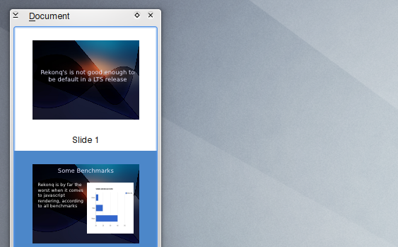
Document
Shows a list of all slides. You can easily add and remove slides. It has three different view modes: Thumbnail view, Detail view and Minimal view.
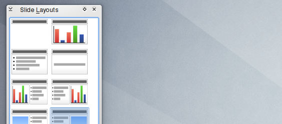
Slide Layouts
Exactly as it name describes it offers a fast way to change the layout of the current slide. As simple as it sounds (and is), it’s really useful to have this docker enabled.
Main Interface
Stage is not a mature product. It still lacks many basics, for example, it has yet to implement transitions or sounds. In other words, I don’t think is ready to replace any of its contemporaries. On other hand, what is available works well and is easy to use.
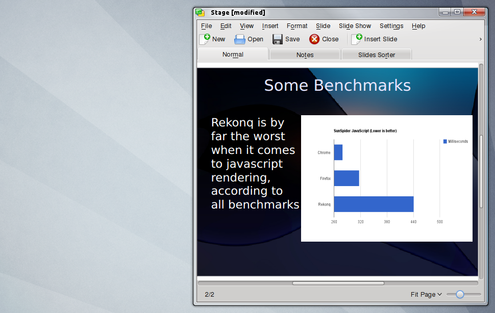
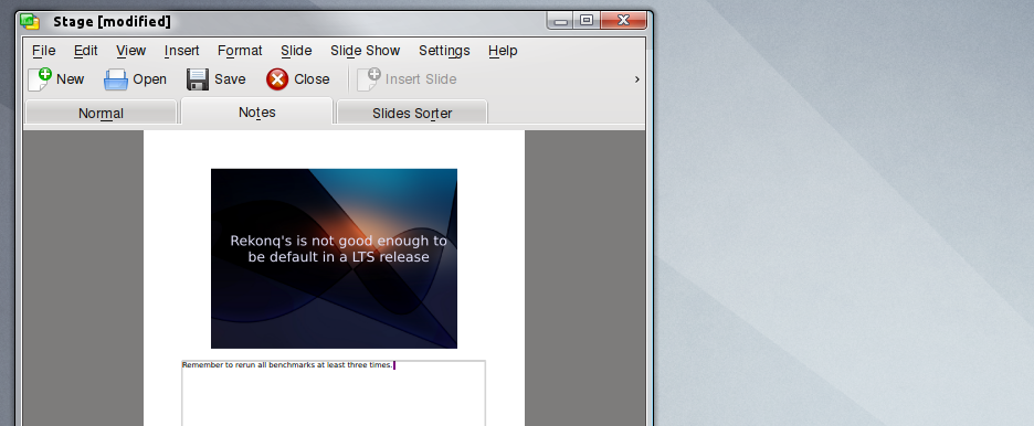
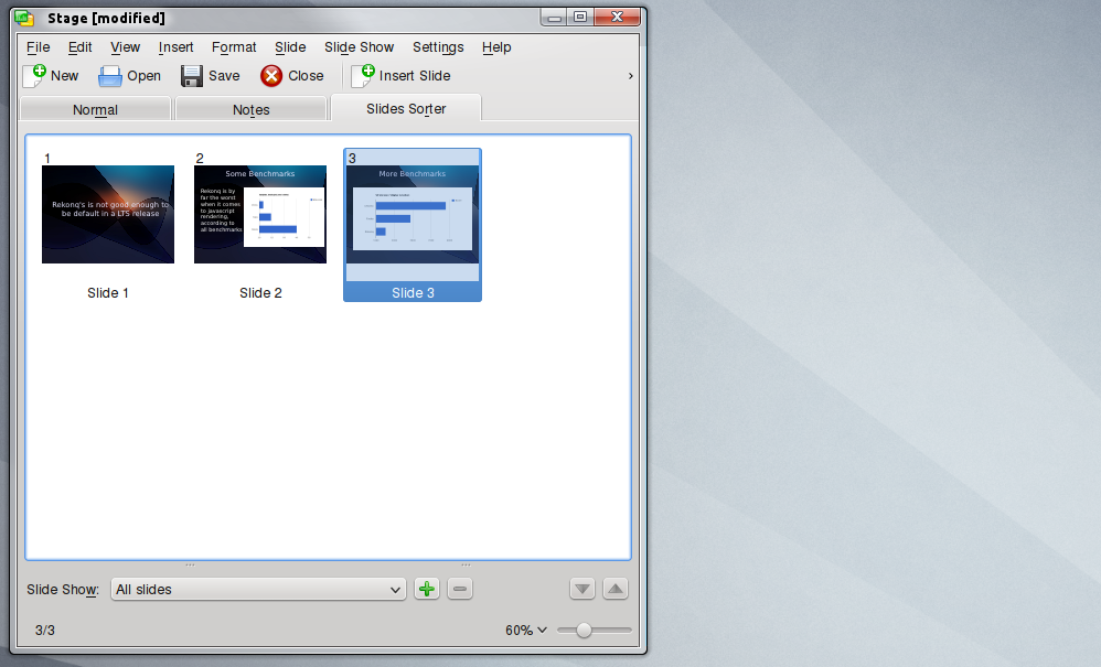
The main interface is simple enough, just three tabs: Normal, Notes and Slide Sorter. The first tab is were you modify each slide.
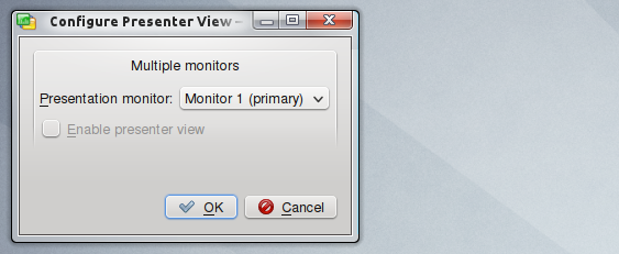
The next tab offers the option to add notes to any slide. This notes won’t be shown when you play a presentation, but are rather intended to help the writer, for example, you set the presentation to run in another monitor, while you still get to see the regular interface, in this way you can use notes about your speech in each slide.
The last tab, as it’s clearly described by its label, serves to change the order of the slides, this can be accomplish by simply dragging any slide to the desired place a menu will pop-up offering to copy or move it there.
Other Settings
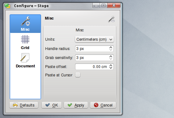
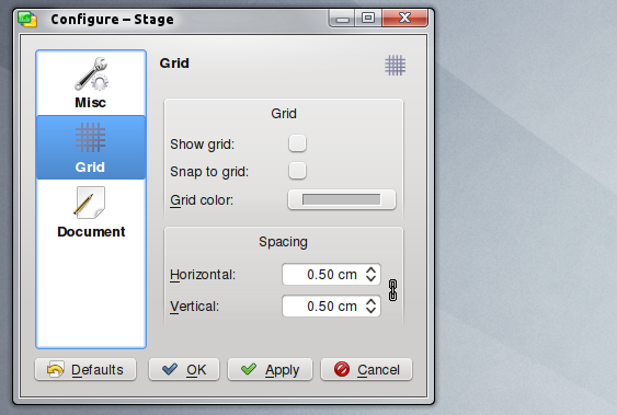
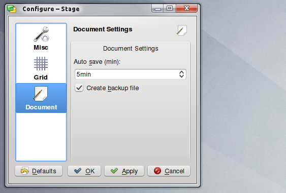
Because of its still non-mature state Calligra’s presentations app is not crowded with settings, in fact, it barely have any, and all of them are completely obvious and require little or no description at all.
As we mentioned earlier, you can set it up so the presentation plays in a secondary monitor, this can be enabled by going to Slide Show > Configure Presenter Viewer.
The remaining settings are all self-explanatory, useful and not very numerous, as it can be seen, Calligra closely follows KDE’s Human Interface Guidelines.
For the vast majority of users, and certainly for serious users, Stage is probably not ready to replace any of its contemporaries. For curious users it’s worth trying, since it has a different vibe to it than major competitors (its interface is closer to Apple’s solution than Microsoft’s). If you don’t need many features (not even transitions) then you may try Stage based on how lightweight it is on your system compared to LibreOffice or similar alternatives.
In any case, Stage is on the right path, the interface is easy enough, the features will eventually come, but for the most part nailing the interface is never guaranteed, in this regard, Stage developers have little to worry about.

