Wish-fix it list: Plasma 4 edition

Wish-fix-it is a series of things I would like to see improved in “KDE 5”. As I will point out in the future, many of my wishes will soon change their statuses to fixed, which excites me a lot.
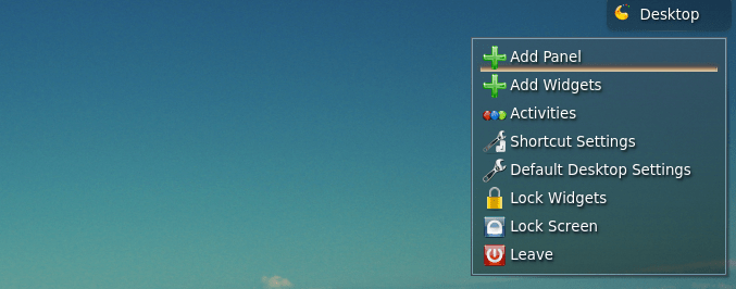
No matter how good a piece of software is, it can always be improved upon. After years of using KDE as my main desktop I came up with a few suggestions regarding Plasma’s user interface. My first idea is nothing new: To get rid of the cashew. This has been suggested ad nauseam, but ignored for the most part. Why does Plasma needs a Cashew? No other desktop environment has anything like that, why is Plasma different?
Why I think the cashew is there
Since many widgets make use of right clicks, it becomes a possible scenario that a user may be deprived from access to Plasma’s settings because widgets are taking all clickable space. This is true for both the panel and the desktop. Moreover, since right-click actions are customizable, it’s technically possible for a user to end with an empty desktop without access to right clicking it to get into settings.
These motives sound reasonable, but are they enough to justify it?
Why I think the cashew shouldn’t be there
The first issue can be solved by adding the basic options to any right click on any plasma element, including widgets. This actually exists, it has been added to Plasma already, so it’s not even a suggestion. Its consistent and intuitive. The second problem has an obvious solution: if the desktop is empty display the options on the desktop itself (default settings, add widgets, etc). These alternatives make sense on both the panel and the desktop.
The cashew is just a small detail that doesn’t really affect the user experience much, I think Plasma’s biggest possible improvement isn’t related to it. In fact, Plasma could keep the cashew but I think it really needs to fix the following. It’s worth noting that the cashew can be removed by using other modified containers, for instance, Netrunner’s default desktop lacks a desktop cashew, but conserves the cashew on the panel.
Adding widgets
Plasma has an horizontal interface to add widgets, that by itself is weird.
The big problem though is the same interface is used for adding widgets to the panel and to the desktop. I’m aware of the technicality behind it, however, users aren’t nor should be familiarized with it. Moreover, there are many widgets which simply do not work well on the panel or vice versa. Users should only be presented with widgets designed with the panel in mind when picking widgets for the panel (it doesn’t matter if the widget works on the desktop too). Moreover, desktop widgets should probably show a preview instead their name.
In other words, the interfaces should be different for each use case, so new users don’t get confused. Some users may want to add widgets that aren’t really designed for the panel, this can be easily implemented by adding an option to display all widgets.
The panel isn’t a good sidebar
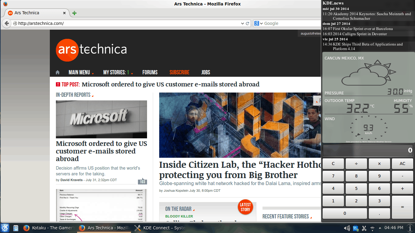
The panel can sort of emulate a sidebar or a dock. The problem is it isn’t particularly good at emulating either of them. Not even the sidebar, that seem like it should be straight forward. For example, while a panel isn’t scrollable a sidebar should totally be scrollable. Widgets for a panel, desktop or sidebar shouldn’t look the same either. Simple ones, such as the weather or a calculator, work fine. But others, complex ones, require to be designed with sidebar use case in mind, including vertical scrolling (they can expand their widgets vertically as much as they wish, instead of requiring scrolling inside the widget).
The panel isn’t a dock
KDE is famous for having a lot of options, having a dock isn’t one of them. You can try to emulate one using the panel, but as with panels the use case and the design of widgets isn’t the same, so it feels subpar. Even if a container was designed, widgets should be modified or designed specifically for a dock setting.
Notifications
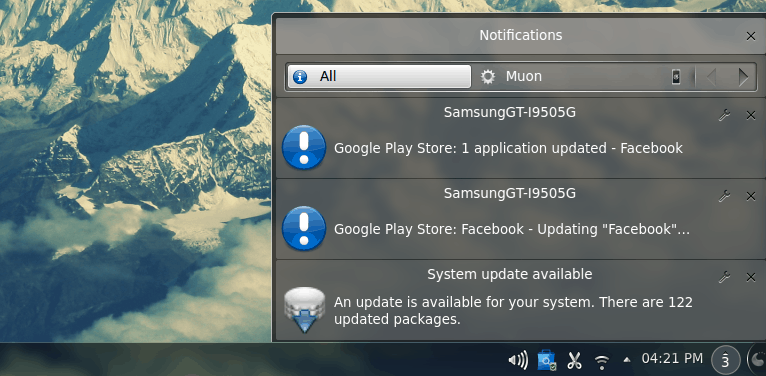
Notifications on KDE are handled incredibly well. I just think the aesthetic design could be greatly improved. Somehow, it feels cluttered. One idea I came up with is clicking on the notifications could show a sidebar with all your notifications, categorized as they’re now, vertically scrollable. This is just about the presentation, functionally wise I think KDE handles notifications better than any other Linux environment I can think of.
Miscellaneous
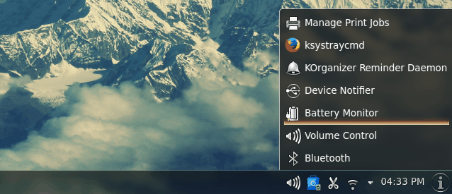
I think some widgets could be improved. Especially the latest (on Plasma 4) WiFi manager. It feels too cluttered. I recently gave my thoughts on how the already good main menus of KDE could be improved. Perhaps the most important usability point is that there is an inconsistency regarding hidden system tray icons, some can be activated by clicking on the text, some can not.
Of course, I think all should react to clicking on the text, which is moreover where people is more likely to click (it’s an easier target).
Conclusion
Plasma on KDE 4 is really good. And I’m really excited about the future of KDE. I was obsessed with KDE 4 when the transition from 3 was happening, I’m feeling as excited about the future as I was back then. Moreover, I think this time around developers are being more careful about certain style of design decisions, perhaps influenced by the great group behind the Visual Design Group.


To be honest I do not see any sense in this article. Since most Plasma developers are now sponsored by Blue Systems: Marco Martin, Sebastian Kugler, David Edmundson, Martin Gräßlin, Martin Klapetek, Eike Hein to name a few. In Plasma 5 you can simply create new shell, and switch between them in runtime, and this plan for new Netrunner, so I’ve heard. So please do not
criticize hard work of your co-workers (since you are also working for Blue Systems) ;p
I love Plasma and KDE. But I don’t think they’re perfect. I don’t think constructive criticism is bad. For example, I wrote an article about system settings a while ago, and it’s getting redesigned in the future (and the mockups and ideas offered were fantastic), of course it’s not getting redesigned because I wrote about it, is probably because developers themselves think it can be improved as well as user feedback.
Defaults are every bit as important (if not more so) than having many options (after all, people may not stick together long enough to discover the options – this is not a problem with Plasma, obviously, as it’s pretty good “out of the box”).
I really like Plasma 5 too! From the visual presentation (Breeze is really good and I love how the panel looks on the dark version) to more technical things (yet user facing), like changing activities based on hardware (if a keyboard and are mouse plugged in vs touchscreen only).