Introducing Plasma 5
I started writing about KDE a long time ago, I was still on high school. All of my articles were about “Introducing” new things of KDE 4, like Dolphin or Amarok 2.0 or Rekonq. With all the new exciting stuff in the pipeline, I thought it was a good idea to resurrect the idea of Introducing new KDE sofware. What better place to start than the shiny new Plasma?
Breeze
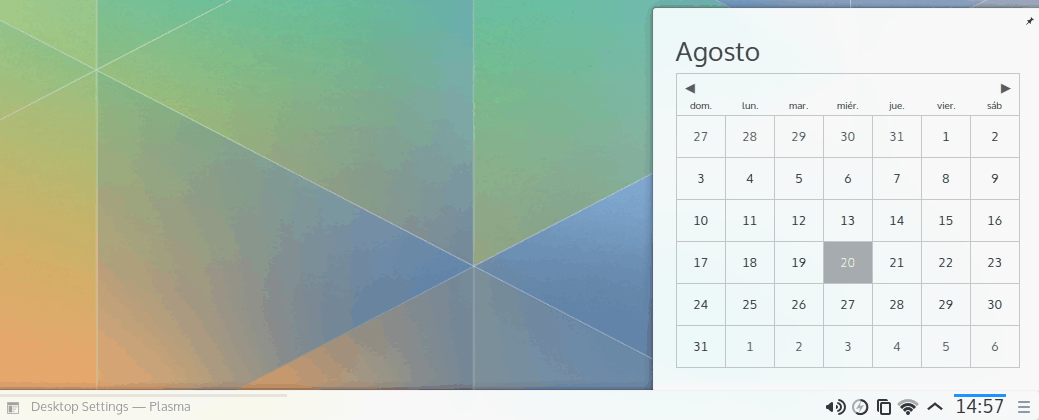
Plasma’s new artwork is undoubtedly what users will notice first. Just keep in mind Breeze goes beyond Plasma (e.g. window decorations, iconography). The successor of Air goes for a much flatter style with a frosty-looking translucency. It looks like a mix of Apple’s post-iOS 7 design and Google’s material design. The Visual Design Group has done a great job with it. It’s not that they copied Apple or Google or anyone in particular, rather is that Breeze feels very modern in the sense that it seems to fit the current aesthetic trend. For example, one consistent well thought out detail is how elements in the panel are highlighted by using a bold blue line on top of the active element.
Moreover, the new GUI design decisions mixed with Breeze make all Plasma elements feel far less cluttered. It’s a big improvement over Air, which was pretty good to being with. In other words, Plasma 5 with Breeze is beautiful.
Kickoff
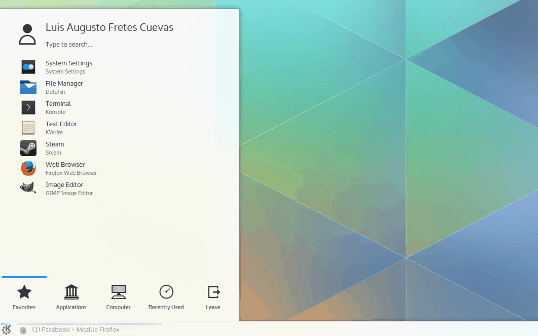
KDE’s default menu has seen some changes in its latest iteration. Most noticeably the search field has been removed in favour of searching as soon as the user starts typing. To avoid any obscurity, the message “type to search” is displayed at the top. I prefer this style to a search field.
Kickoff is a perfect example of how big of an impact Breeze has on Plasma. Kickoff didn’t change much, yet it looks and feels far more modern.
Kicker
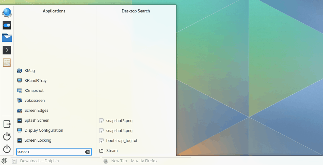
Just as with Kickoff, Kicker’s biggest change is related to its search functionality. I think Kicker is among the best, if not the best, main menu out there. The way searching was handled however, was not is forte. Combined with Baloo and a new multi-pane interface Kicker now handles search in a very thoughtful manner.
Kicker is yet another part of Plasma that looks far better just because of Breeze and the new iconography.
Alternatives
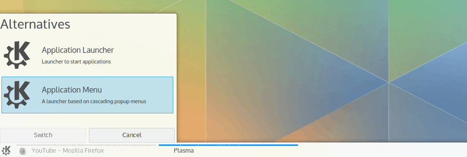
KDE is known for being as close as infinitely customizable as desktop environments get. Figuring out how to present all these options to the user is not easy, especially when it comes to discoverability. One of the major improvements in usability in Plasma 5 is the ability to right click on widgets, select Alternatives… and be offered a list of widgets with similar functionality. In fact, I think the idea, although simple, is absolutely brilliant. It will very likely increase how many users, even not so tech savvy ones, tinker with their desktop layout.
Adding widgets
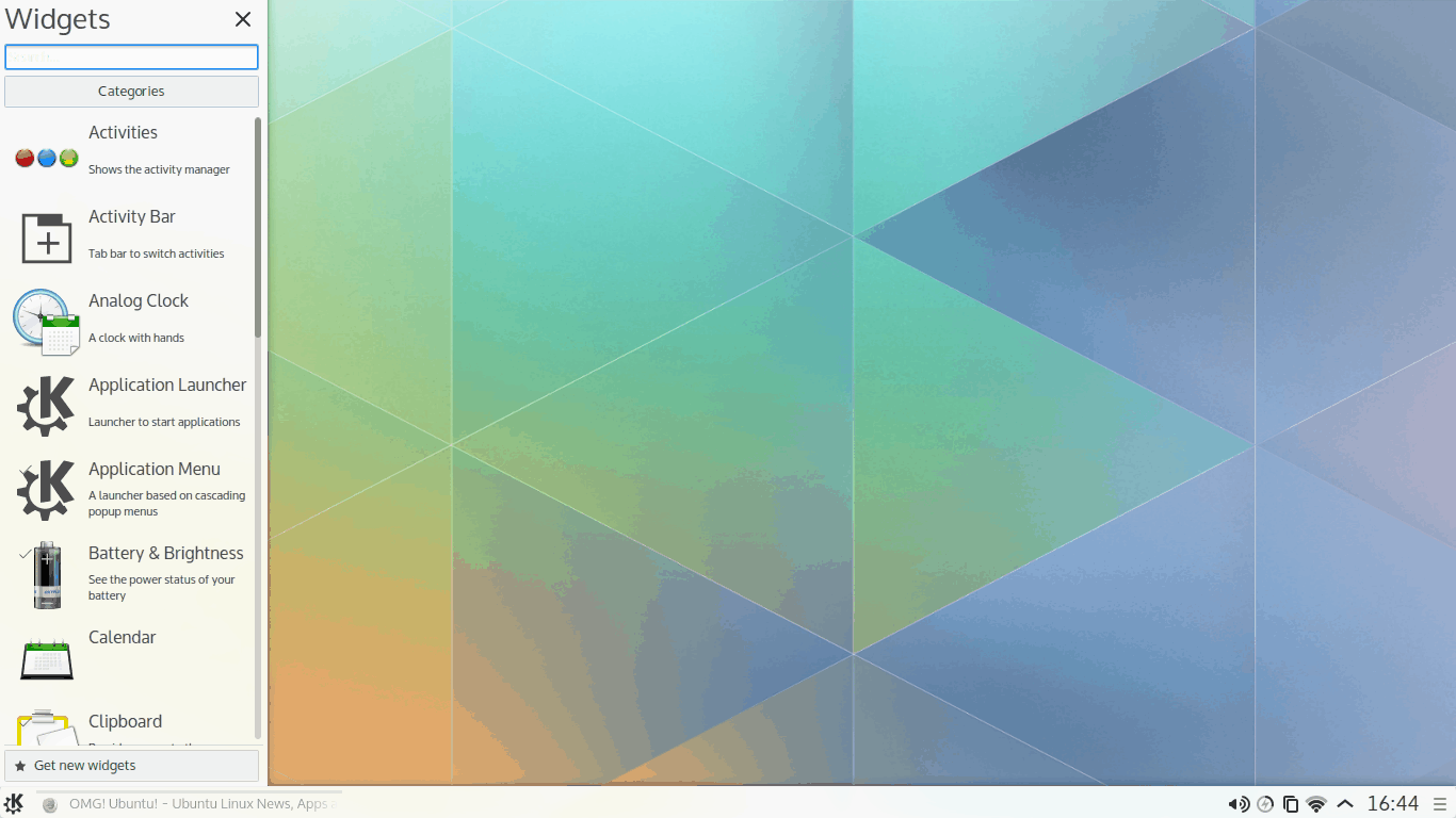
In the latest wishfix I mentioned that listing widgets horizontally was a pretty odd decision. It seems like its developers and designers probably felt the same way and switched into a vertical list.
The way options are distributed combined with Breeze results in an interface that feels very clean, despite condensing more information in a smaller area (most screens have wide aspect ratios).
Redesigned alt+tab
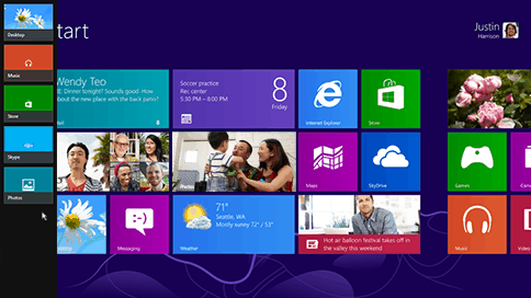
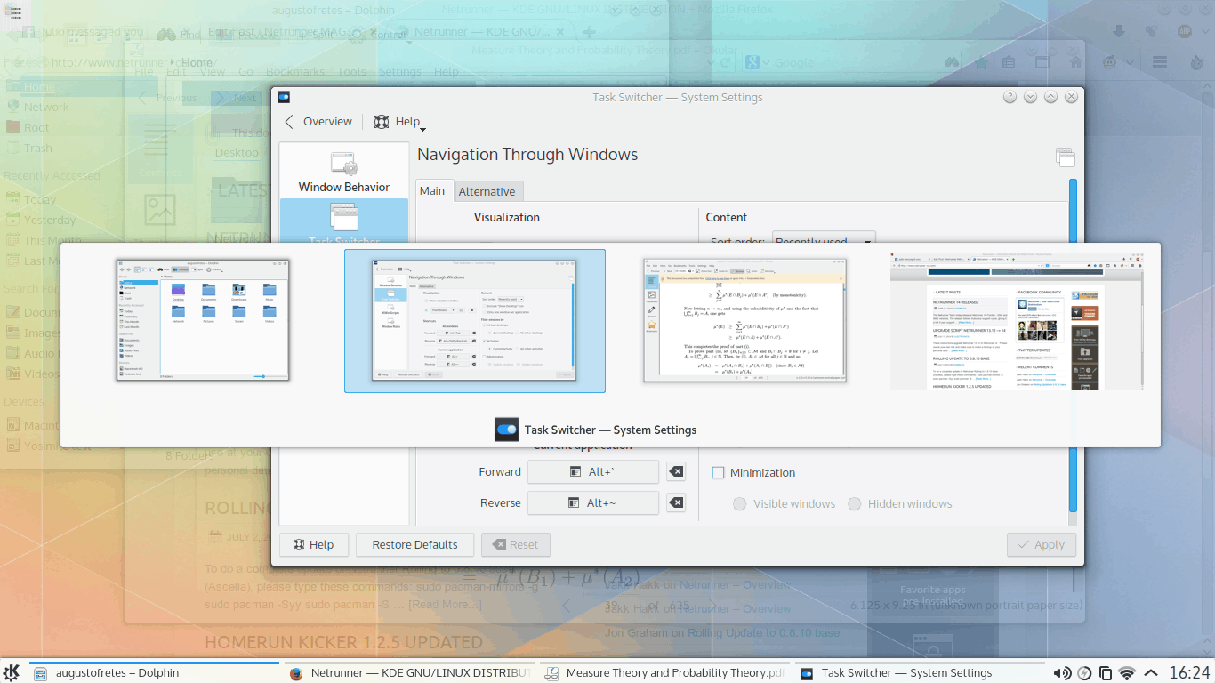
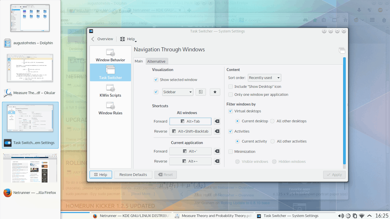
The list of widgets isn’t the only to go vertical, windows are now displayed in a vertical list too when switching between them (although this is a change in KWin, I think including here is fitting because it uses Plasma elements). The interface is in fact similar to Microsoft Window 8.x’s interface to switch between “modern applications” and the desktop.
Why change this? Some could argue it is because of familiarity, windows users will get used to Windows 8.x’s interface, so they won’t find anything odd about it (although the functionality isn’t exactly the same). However, I don’t think the rationality behind it is deeper. After using it for a while I’ve arrived to the conclusion that this approach is simply better.
When switching between windows the selected window gets highlighted while the others become partially translucent, with the regular horizontal interface placed in the middle of the screen. This creates a very busy image, as the window selector itself is translucent to allow you to see behind it. So you end up with a translucent switcher on top of translucent windows on top an opaque window. Moreover, most applications are text heavy, so little dark points cluttered the entirety of the view and the switcher itself blocks the view of the windows.
This is completely avoided with the new design since most windows tend to gravitate towards the centre of the screen. Moreover, it gives a sense of consistency mixed with the vertical list of widgets.
But worry not, if you prefer the old style, you can change it back or switch to any of the other 8 styles on System Settings > Windows Management > Task Switcher > Visualization.
The new system tray
KDE created a specification to replace the old system tray standard (xembed) when KDE 4 was introduced. This specification was later implemented in Unity. With KDE 5 the legacy support for xembed comes to an end. Moreover, all of Plasma’s system tray widgets have been redesigned. Every single one of them is a major improvement over their Plasma 4 counterparts.
GNOME 3 implemented a sort of consolidated system tray that shows things like brightness, available connections, battery status, volume, among a few more, all in one single menu. Plasma 5 seems to be moving in a somewhat similar direction. The presentation is different, but the idea of the system tray behaving as a single consistent element is there.
At first glance, the system tray looks the same. Active or relevant icons are shown by default, click the arrow to expand and show all others. Click on the system tray and the differences start showing. First, there’s a sidebar on every widget. This sidebar displays the system tray icons that are currently hidden.
Second, all widgets are the same size and the transition between them is animated inside the canvas. This gives the impression that the system tray is a single entity and you’re just switching among options offered inside it. I really like this new approach.
Network Manager
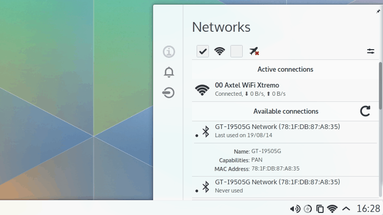
In the last iteration of Plasma 4, the network manager was too cluttered. It displayed way too much information for such an small area, moreover, it had a few issues with resizing elements inside the widget without changing the size of the widget itself (which causes usability problems). All of that is gone. The new interface has more breathing space, the size of the widget has been increased without increasing the number of options (it’s less dense now). If you click on a connection it still expands to show more information, however thanks to the increase in area it no longer feels like a nuisance. Moreover, you don’t need to expand a connection to be able to connect to it, the option of connecting or disconnecting to any network now appears on hover.
As it can be seen, it also looks very elegant.
Klipper (clipboard)
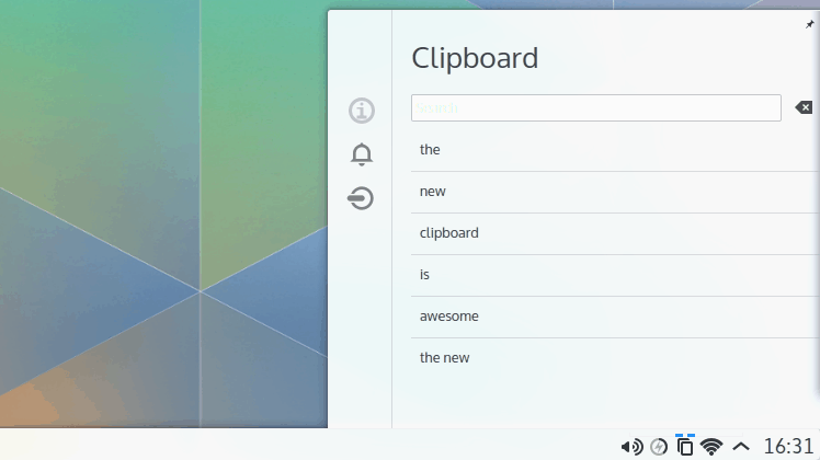
I love Klipper. With it KDE offers the best clipboard on any desktop or mobile environment I’ve ever used. It’s such a neat useful little tool. Not to mention that combined with KDE Connect, it can now manage the clipboards of both your Android device and your KDE desktop. Since I think it was so good to begin with, I never dedicated too much time thinking how it could be improved, so I was pleasantly surprised with its new interface.
Aesthetically, the difference between a context menu (right click menu) and a Plasma widget is night and day. Its Plasma incarnation looks so pleasing, clean and modern. Even better? It’s more functional than ever thanks to the addition of search.
Battery & Brightness
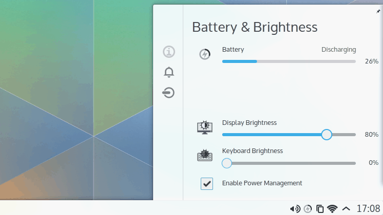
The new battery widget is spot on. It shows exactly what I expect it to show in a very pleasant manner. I know it seems like I’m repeating the same over and over, but I can’t help it. Improvements in GUI design and aesthetics are everywhere.
It makes perfect sense to put the screen and keyboard brightness controls there, as these two are the most important user controllable variables affecting battery life. Of course, it also makes perfect sense to include power management there.
What about other applications?
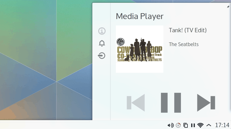
Just as an example, this is how Clementine’s system tray icon currently behaves:
Once applications start getting ported to Frameworks 5, I think we can expect further GUI refinement. For example, the system tray for a music application could display the current playlist.
Activities
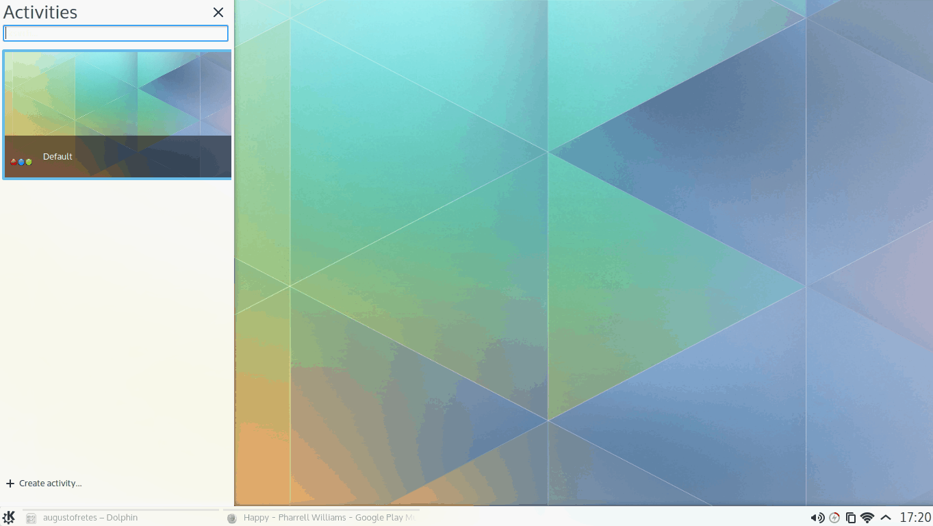
As of now, the biggest user facing change is the redesigned activity switcher. Following suit, the list of activities is now vertical.
The most exciting aspect, though, is the addition of changing activities based on hardware. Right now only the desktop layout is ready for daily use, but more are in development and it’s reasonable to expect even more in the future.
KDE’s vision of convergence, something if my memory serves me well they started discussing before anyone else did, is a smart environment that changes based on the input mechanisms, instead of trying to create a single interface for completely different input methods (not to mention different usage scenarios), i.e. KDE doesn’t want to build an interface that is at best a jack of all trades, master of none (for an example of how disastrous this approach can be, take a look at Windows 8).
Conclusion
I don’t have much to add here. Only that if Plasma 5 is an omen to what the entirety of KDE will be in the future, refined, beautiful, polished, smart, modern, then “KDE 5” will be absolutely stunning. I have a feeling it will be.

So boring and unexciting, symbolic icons, flat design, pastel colored, looks like made for tablets. Such stuff happens when ‘professional designers’ run out of idead and copy stuff from tablets, smartphones and other DEs.
I don’t think “symbolic icons, flat design, pastel colored” have any relationship with touch input. It seems like you have a rather superficial idea of what makes a touch centric interface a touch centric interface or what makes a desktop interface good with mouse and keyboard, is definitively not the color selection.
Plasma 5 (the desktop layout) has not changed anything in a way that deteriorates or devalues using it with a mouse and keyboard. In fact, beyond the colors and the aesthetics of Breeze, there’re many usability improvements (i.e. it’s easier and clearer to use on your PC than it was before).
The first impression can never be repeated, Plasma5 with Breeze is looking unattractive, flat, uninspiredly boring and tablet like, sorry, you had your chance, but your design team spoilt it.
I’m not at all fond of the out-of-the-box look of KDE 4: Too shiny, too many gradients, too many transparencies, too much of too much. So, when I use it, I change it.
I like the new look: Open, bright, better use of space. And, not dark!!
But, changing it back to the look of its predecessor is a matter of of a minute or so and a few clicks. The old themes, styles and color scheme haven’t gone anywhere, so you can make it as 2011-style gltizy and shiny as you want.
Looks have nothing to do with the platform an interface is intended to run on. Anything with panels, menus, virtual workspaces, activties, widgets, etc., is clearly not intended to run on either phones or tablets.
So why mimic a tablet OS look with that awful flat symbolic acessibility breeze theme?
You seem to be making assumptions based on personal preference and taste, and then projecting them on everyone else.
I don’t think the new theme mimics a tablet, or that it’s “awful”. (I don’t understand what’s meant by “flat symbolic acessibility”.)
As I mentioned, I’ve never really like the default KDE 4 look, or gradients, or dark themes, etc. But, those are just my own preferences. No reason for anyone else to care.
Designers and developers, like chefs and musicians, make things for people to use. It’s always a gamble if any given individual will like the results.
And, after all, it is just a theme. What’s really significant is that KDE has decided to get serious about design.
No, they just followed and copied the boring dumb, flat webdesign and mobile UI trends instead of creating an own style. But that happens when so called professional designers decide. I wonder if they get payed for that.
Heh Alternatives is feature form Plasma 5.1 ;) It seems someone is running neon repo ;p
I know that actually :P. And yes, I’m using the neon repo. Back in the days of KDE 4, I used to build it from the source once a week, then I remember switching to OpenSUSE because Build Service was awesome.
Great article thanks, just wish that all the apps was already ported and one could start using it [KDE 5] as the default install for everyday use :)
Fantastic first impression! Thanks so much, KDE team, for not making the default theme dark!
Blekh… Plasma 5 makes kde 1 look good.