Muon Discover, taking a cue from mobile

I’ve argued in the past that it was on the womb of Linux where the “App Store” model first kicked, not on the iPhone or the iPad or Symbian. However, sometimes in typical Linux’s fashion it was never given the importance it had, yes people argued some distributions were easier than Microsoft Windows because of it (and they were right) but very few seemed to identified this ingenious feature as potentially revolutionary for the entire world.
In the long run, this meant that it was not out of our stadium that the ball first hit the head of consumers, it was a homrerun from Apple’s, a company that had refused to allow third party software just a year earlier. In spite of its countless defects, they were the pioneers in creating a package manager with the end user in mind from conception to execution, the result was an application more user friendly than Linux’s GUI package managers. Ubuntu had tried not long before making its then known as “Application Installer” more user friendly, but it didn’t reach Apple’s levels of easiness of use.
Five years have passed and the world has been taken over by the App Store model: Windows 8 adopted it, Mac OS X adopted it, Windows Phone adopted it, Android adopted it, and the list goes on and on, from thriving companies to fallen ones (like Palm’s WebOS). Linux ironically, after setting the foundations of the model, was forced to play catch up. Muon is KDE’s answer, long needed answer, to the need of not only a good native package manager but also a user friendly “App Store” like interface.
Meet Muon Discover
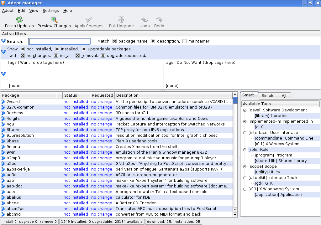
I remember the days of Adept, which had a very draconian interface, relative to today’s standards of course, although one could argue that it was not user friendly even back then compared to Synaptic, we’ve come a long way!
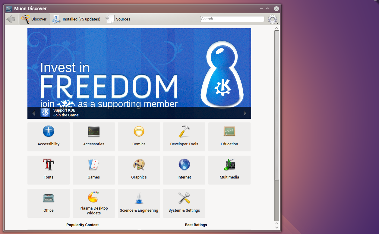
Just glancing at the main interface is probably a breath of fresh air for many, and it will be a lot easier to figure out than a full on package manager, even compared to previous versions of Muon it looks way better, less cluttered and to the point. The header image recommends you apps, it’s not a perpetual pledge to support KDE.
The toolbar has four basic uncluttered straight to the point sections: Discover, Updates, Sources and Search.
Discover is the what was shown in the first screenshot you get a banner with displaying popular apps, categories and if you keep scrolling down you’ll find a bit social integration: The most popular applications and the best rated applications.
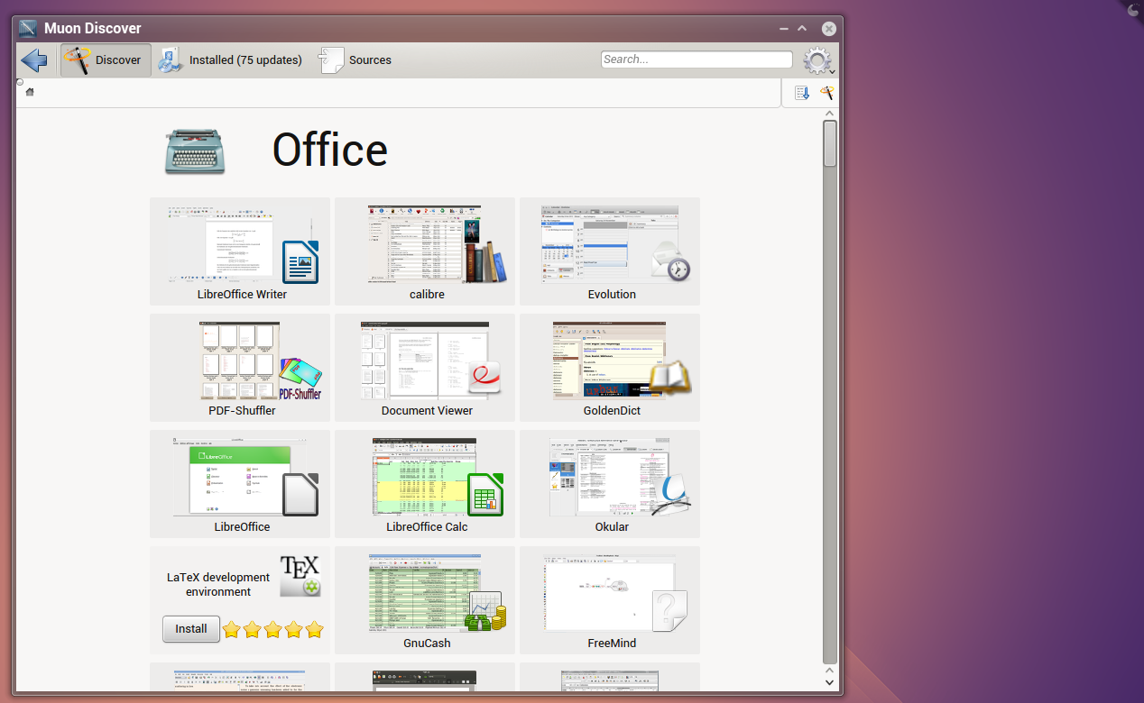
Clicking any category shows the corresponding applications, you can sort them by name, popularity, rating, buzz and origin . A small thumbnail is shown as well, on hover the average rating and an install button appear.
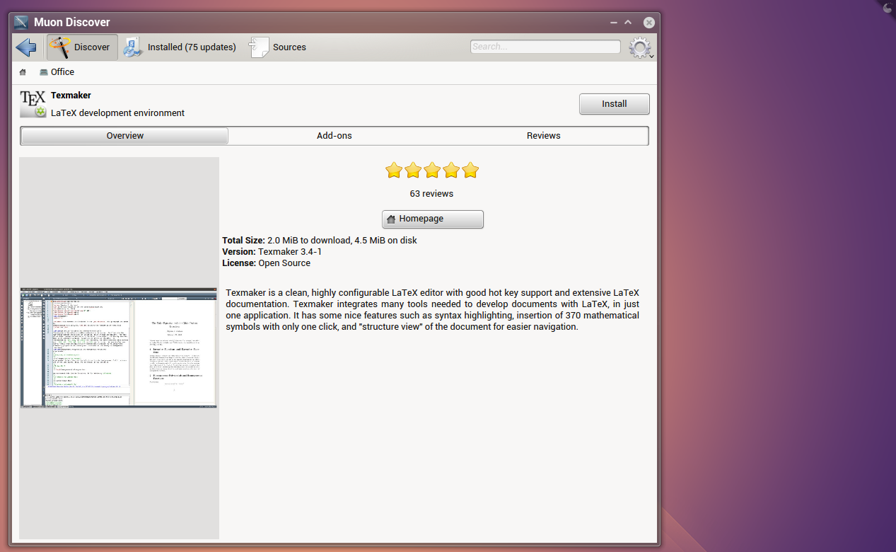
Click on an app and you will be presented with three different tabs, all let you choose to install or remove it. The main tab, overview, shows a description, size and screenshots. Clicking on any screenshot expands it with a smooth animation.
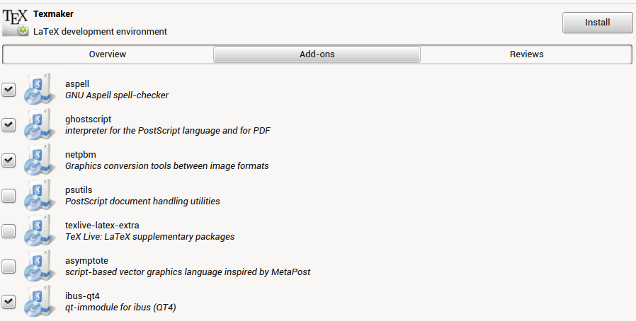
The second tab is Add-ons and lets you choose extra plugins or features you may want to enable. It’s one of the most useful features on Muon.
The third tabs shows reviews from other users, always a good thing to have.
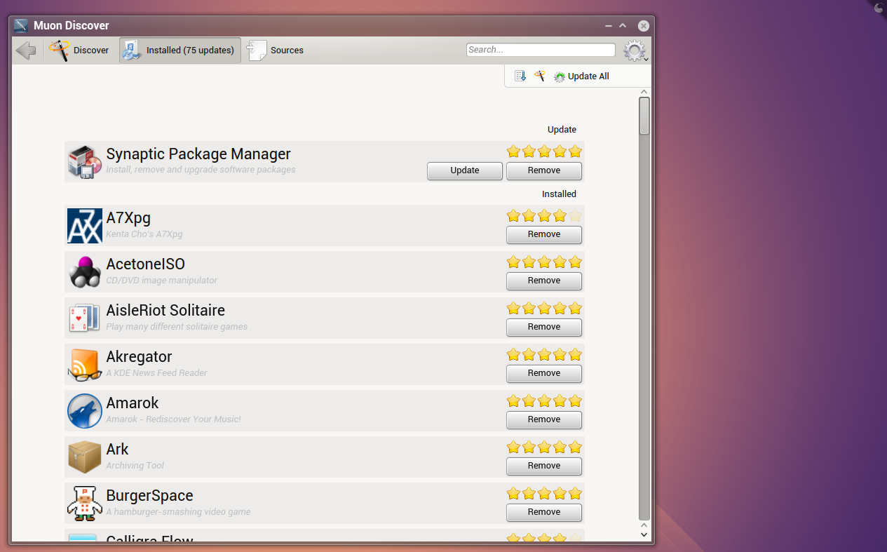
The second section shows your installed applications, you can remove or update your apps from here, or just hit update all to install any updates available (including non-applications, like libraries).
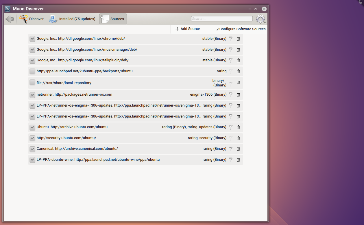
Next is sources – which needs a new icon – which shows your repositories, let’s you enable or disable them by simply ticking them.
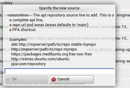
Also you can add new ones by merely clicking on Add Source.
And you can configure your sources.
Finally, we have Search, and it works just as expected. Just write what you want and Muon will find it for you.
Did KDE catch up?
I think so. Muon is not only very user friendly and fast, it’s also a well crafted application with tons of attention to detail, in a sense, is the first of a new wave of KDE applications: subtle animations everywhere, very minimalist, self-explanatory and designed with average users in mind. It’s not perfect and I would change more than one element of the interface, however, it’s on right direction. This doesn’t imply that power users will be forced into living in a less powerful world, Muon as well as Linux, we’ll continue to offer options for all us. But there’s no doubt that this is a step forward in making migrations to Linux not only easier but also more pleasant.






Is the
Is a stable version of Muon Discover ready for Ubuntu 12.04 (running on KDE)?
The one issue I see with these ‘app stores’ is that they don’t have or hide items that Synpatic and similar managers show. Arguably we probably don’t need every single item shown but when looking for DEs or some alternate applications, they won’t show. In Ubuntu, some of these you can find by searching on it but then you might as well fall back to Synpatic or similar manager…
I don’t think this type of App Store-like software manager is designed to cover the needs of the more tech savvy users. I, personally, use Synaptic, but for the majority of users (who are just searching for apps, not entirely different DEs, or for specific libraries) I believe this approach of “App Stores” is far superior and more user friendly. Moreover, it protects users from potential mayhem.
Muon isn’t just Muon Discover, I believe its developer recognizes this, and that’s why he offers a full fledged package manager too.