Review: Calligra 2.4

As we reported earlier this week Calligra 2.4 was released. The majority of users probably don’t know what it is, the reason is a mixed of two things: A change on branding and LibreOffice.
Formerly known as KOffice, Calligra is KDE’s new and shiniest suite of productivity applications. All applications are designed following the same set of guidelines such that a lot of the knowledge obtained by the user while using one of the apps is transferred to other members of the suite.
Moreover, all members are coded to improve interoperability, in other words, all applications integrate with each other. Calligra is, in my eyes, closer to iWork than it is to Microsoft Office or LibreOffice. This can be seen as disadvantage or an advantage depending on one needs, however, my personal opinion on the matter is that is beneficial for most users. Most users would benefit more from a streamlined easy-to-use, light, suite of productivity applications than they would from a less easy, heavier, full featured one.
In my experience, most people only use word processor for relatively basic stuff, don’t get even close to use Excel to its fullest, or any other application found of Microsoft Office. There’s a place for applications of this type, but for the majority of the users this apps are unnecessarily hard to use while wasting their resources. Calligra is here to fill the void.
We’ll take a look at every member independently soon, but to avoid repetition, in this article we’ll revise Calligra’s design elements common among all of its members.
Start Screen
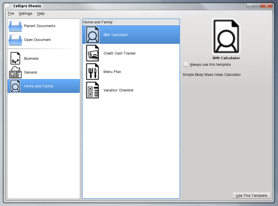
All applications show a similar start screen when launched, these screen are mostly composed of different templates available for each application (of course, you can pick a default set of options and never see it again by checking Always use this template), for example, the following is Sheets’ start screen.
Dockers
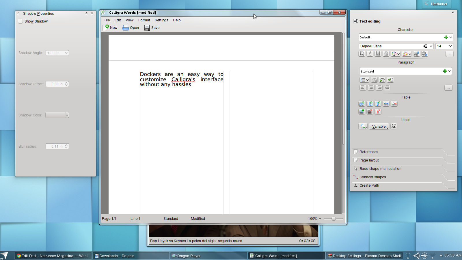
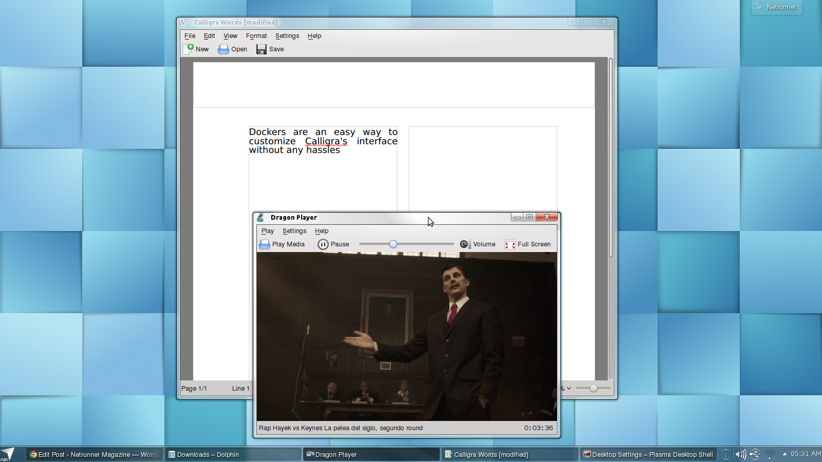
Although Dockers seem to lack any formal definition among the KDE community, they’re quite easy to spot. Dockers are basely sidebars that can be docked into any border of the interface, left floating (most of the time), or closed. Perhaps the most broadly known docker is Dolphin’s.
This approach gives user freedom to easily tweak the interface to their lacking, turning on dockers and dragging them around is all is needed. It’s possible to let the dockers floating around, as in the previous screenshot.
This approach is one I personally like, superficially one may think it would make for a less clean interface however this isn’t the case because as soon as the application loses its focus floating dockers disappear.
Moreover, some dockers are shared among different members of Calligra. All dockers among all of Calligra’s app are enabled/disabled in the same place: Settings > Dockers.
Menubar
All menubars are arranged in the same way: File, Edit, View. As the first three elements, and Settings, Help as the last two. Any other menu needed is in between. This consistent five menus are almost the same across the board (there are some differences in edit, view and settings that change according to the app, as they should, we’ll talk about these differences on each app article).
File:
- New: Creates a new documents.
- Open: Select what document to open.
- Open Recent: A list of the last documents worked on.
- Save: If the file has not been previously saved, will ask for a location, name, and extension, otherwise, it overwrites the current file.
- Save as: Always asks a name, location and file extension.
- Reload: Does precisely what it says.
- Versions: Change between different snapshots.
- Import.
- Export.
- Mail.
- Google Online Document: One of the coolest features on Calligra, you can download any document stored on Google Docs by just providing your username and password, not setup involved.
- Print.
- Print Preview
- Document Information: Name, comments, data about the author, etc.
- Close.
- Quit.
- Undo.
- Redo.
- Cut.
- Copy.
- Paste.
- Paste as text.
- Select All.
- Select all Shapes.
- Delete.
- Find.
- Find next.
- Find previous.
- Replace.
- Select Bookmark.
View varies more depending on the application, so we’ll left it out from here. As he previously outlined dockers can always be found under Settings.
Shared Dockers
Some dockers are all of Calligra’s applications.
Add Shapes
Many dockers change their default content depending on the application, but all action are across the board. For instance Words doesn’t display Charts by default, you need to click at the icon on the right to see it among other options. Shapes are all kind of elements from images to mathematical formulas. As expected all of this components are shared among all applications. In a way, Add Shapes allows the user to create and use images, artistic text, etc, on a sheet in the same way they would on text document, conversely, users making text documents can expect to make tables and graphics as they would do a sheets.
Statistics
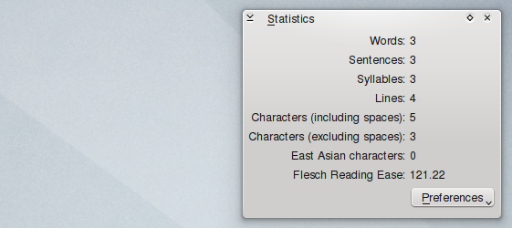
As its names suggests shows a set of relevant statistics. Preferences allows the user to choose what information to show, in the screenshot all possible fields for Words are shown.
Stroke Properties
Controls line’s look. From top to bottom: Style allows to choose between different patterns, mainly different dotted lines. The second is used to set the Width of lines. Calligra offers three different types of Caps, butt cap, round cap, square cap, analogically it has three different kinds of Joins, miter join, round join, bevel join. Our fourth option sets the limit of the miter join. At last, we can set if we want purely straight lines, or if we want some kind of figure at any of the ends (as it can be seen in the screenshot).
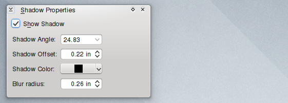
Shadow Properties
Shadow properties is incredibly self-explanatory.
Tool Bars Docker
This docker is a little bit different, as it can be set to float. Its designed to offer an alternative to users who feel more comfortable with a more traditional interface. By default not all applications show any content in their respective tool bars dockers, this can be changed, as can any default set of actions, on Settings > Configure Tool Bars.
Flexibility
Many users, perhaps most users, are used to Microsoft Office’s interface, Calligra’s programs behave and look a little different, but up to certain point you can reproduce some of Microsoft’s designs here. For example, you can create a ribbon-like arrangement by dragging dockers to the top, as dockers will automatically set themselves as tabs. If any user doesn’t like the idea behind dockers, these too can be turned off by going to Settings and unchecking Show Dockers.
This article covered most of what is shared between Calligra’s members, the following articles we’ll deal with each application in detail.





I find it better than LibreOffice but it still doesn’t have good support for Microsoft Office Formulas. The same history with LibreOffice…
Microsoft or not, This has now become horrible and next to impossible to use. The koffice was perhaps the first office suite we used back in late 90s or even till Redhat 7.3 or somethnig which shipped openoffice, It was quiet workable then, God knows why Linux desktop developers create more and more hurdles for users, High time someone built another FOSS O.S so that we can leave linux to where it fits. In server rooms, Both KDE & GNOME are competing to confuse users, Kde tatill somewhat works, Gnome is like driving a tractor trailer, with it’s developers all seen to be smoking weed. The we have every Tom, Dick and Harry and also Goofy deciding what is best for users, The tools which worked well in old Distros are being removed in each new release by the like of Fedora and I was surprised to have to configure my old mouse and display by editing confi files manually, The same computer which ran Linux perfectly just three or four years back wont even start a display now !!! And trust me both Opensuse and Fedora removed their graphic X configuration tools, Now Fedora removes their network conf tool, God knows how long will GNU/Linux dream on desktop will survive