What KDE can learn from: GNOME

KDE is my favourite desktop environment but as everything in this life it’s far from perfect. In this series we will simply check what KDE can learn from other desktop environments, starting by KDE’s longstanding “competitor” GNOME. Similarly there’s stuff GNOME and everybody else could learn from KDE. By the very nature of the topic the article may read too negative regarding KDE, but remember is my favourite desktop environment, the only reason it may read negative is because we’re explicitly talking about the things other environments do better.
1. Consistent and beautiful application design
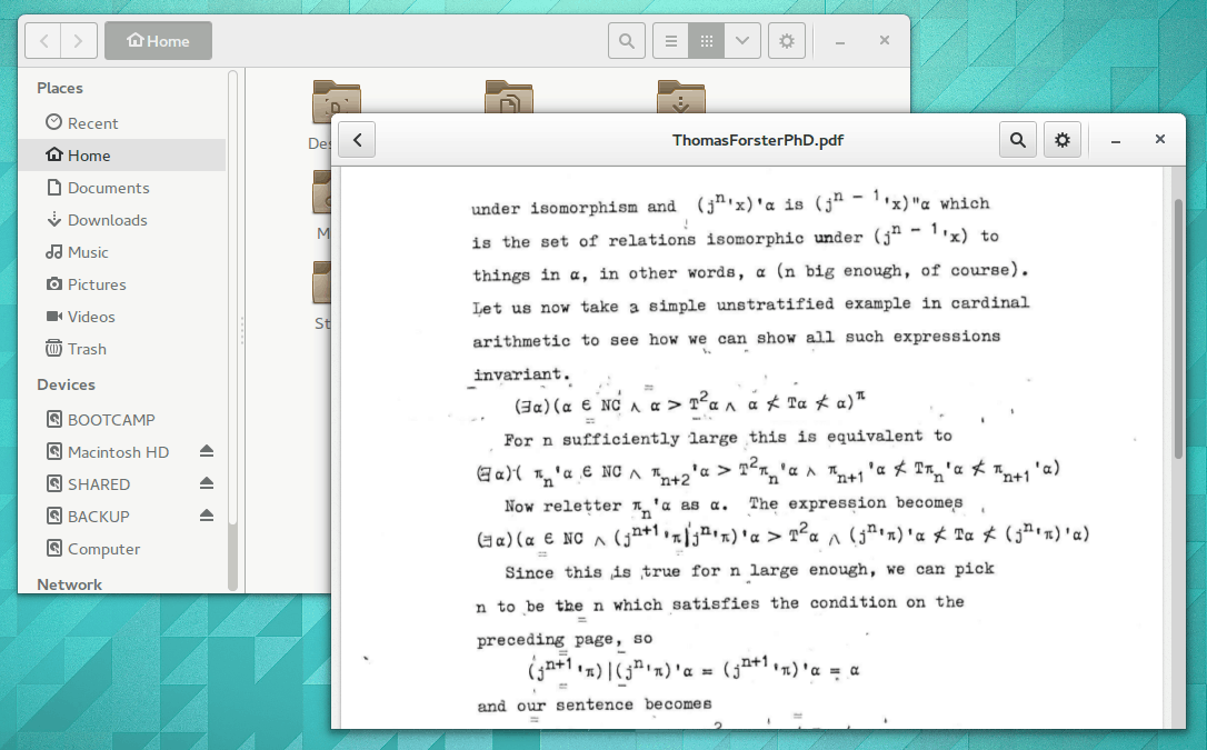
Say what you will about GNOME 3 applications, one thing I think nobody can reasonably deny is how well designed their new applications are. It’s not just that some programs are good looking, they all clearly share the same design language.
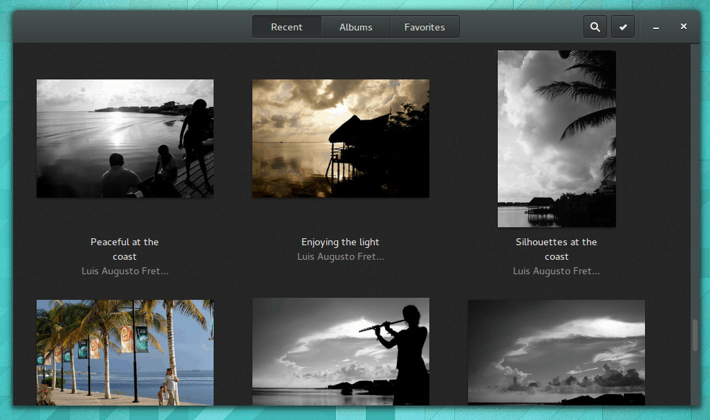
Documents and Files are two very different applications, yet, we find all the main interface elements in the same place in both. Regardless of the application, if you want to search you will find the button in the same place across the board, just as you will with navigation and settings. Take a look at yet another different application that follows the same guideline, Photos:
All three of these applications also showcase a gigantic care for aesthetics. The interface design clearly took into account the balance of icons, the size of the window (which is probably why they don’t offer a maximize button by default) and an intent to keep clutter at the bare minimum. This isn’t accidental.
2. They explicitly take into account modern trends and take inspiration from others
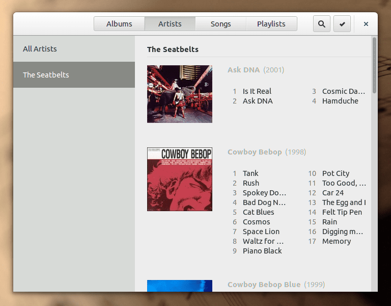
Let’s take a look at GNOME’s new music application.
While it doesn’t look like a copy from any other music player you can clearly see that is has been inspired by many other modern applications, web, mobile, or desktop. This isn’t because of subconscious influence, the design entry for GNOME’s new Music player has a category listing relevant art of modern programs on a variety of platforms:
This an incredibly positive thing to do, applications and desktop environments don’t exist on a vacuum.
3. GNOME 3 is a thing, while KDE 4 and 5 aren’t
The reason GNOME can manage to build a coherent family of applications is precisely because the people behind the GNOME Project are committed to GNOME as a real thing that is built by all of them together. GNOME 3 is the result of their combined efforts to achieve a single goal: making a good desktop environment. The people behind the Music application aren’t just coding a new music player, they’re building a new music player to enhance the GNOME 3 experience.
This means they can achieve a level of consistency and design standards that are not feasible for KDE. This happens because KDE is explicitly a compilation of software, but as any scientist could tell you there’s a difference between a set of things with a few elements in common and a system composed by many pieces.
The reasoning behind the software compilation motto is also very weak. In fact, to be absolutely and brutally honest, it seems merely a decision taken to avoid the added complexity that comes with the extra coordination that a system requires. Similar to my opinion on GUI and visual design, cooperation is harder than everybody doing as they please but the results are be better because of it.
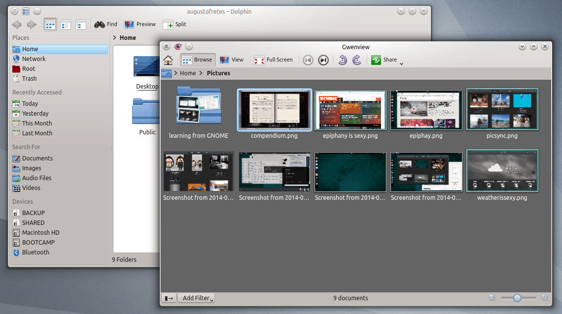
Of course, there’s still a lot in common between KDE applications, mostly because applications are built using the same components, but building using the same pieces isn’t the same as building a coherent system and it shows.
4. Dynamic virtual desktops
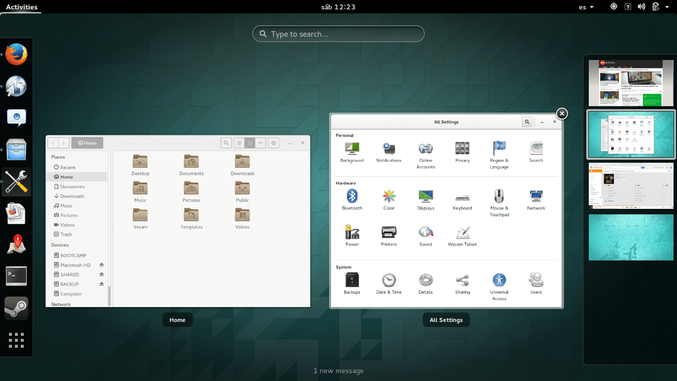
I’ve yet to find any use for activities. I’ve yet to met anybody who does. GNOME’s approach to virtual workspaces is far better than KDE’s approach of setting a fixed number of virtual desktops. Moreover it offers a very simple interface to create and manage them.
Much like OS X, GNOME opts to let the user manage them on the fly by a mixture of a workspace overview and a exposé-like feature. That said, I still believe workspaces have yet to be used by most users, because it still involves manual sorting (in this sense, GNOME and OS X are just a very minor improvement). One of my first articles was about how to make better use of them by combining them with KWin’s extensive customizability. With KWin you can set them up once and enjoy a fully automatized sorting of virtual desktops.
The potential is there, dynamic virtual desktops + KWin’s power + Activities + sane defaults is waiting to happen and it could be what finally makes virtual desktops part of the workflow of regular users, something everybody is yet to accomplish.
5. More integration with the cloud
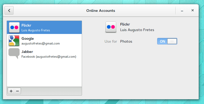
Netrunner actually addresses some of this points by offering Web Accounts, but it can’t single handedly turn around something that requires integration on some applications themselves. Like with Web Accounts, you can connect your GNOME desktop with a variety of cloud services, it will automatically sync your e-mail, your contacts and pictures, among other things. You only need to add your accounts once and it will work across all your GNOME cloud-connected programs.
An example of KDE’s limited cloud awareness is Okular (one of my favourite applications), it doesn’t connect at all to services like Google Drive or Dropbox, while the still young (and not nearly as functional) Documents on GNOME 3 does. I’m sure this one will get addressed over time, but is still something many KDE applications lack.
And that’s about it
When you think about it is rather impressive that I can’t think of any more important things KDE should learn from GNOME. Since I’m not a heavy GNOME user, there are probably some things am missing. If you think there is more KDE should learn from GNOME you can leave your thoughts in the comment section, I’m sure it could make for a very interesting discussion.


One thing KDE could copy is Gnome screenlocker with notifications that is nice.
Well, Gnome is “connected” with some online accounts but it doesn’t do a simple thing that is synchronize with Google Calendar.
That simple thing works fine in KDE.
That’s true. They still don’t have a modern calendar applications (they’re stuck with Evolution).
Design, unfortunately Gnome 3 is just focussing on design, functionality is not their main focus. If I plate a piece of crap with gold, what will it be? Right, shiny crap. and thar’s what Gnome3 is. I will not further mention the massive damage Gnome 3 has done and still is doing to desktop Linux in detail here.
I disagree that GNOME 3 has done any massive damage to Linux environments. I agree, however, that most of their core applications lack many features. I hope they add more as time goes by, although I don’t they will (it seems to go against their philosophy, they seem to think good design can only be accomplished if you have the bare minimum set of features). However, it would be great if some of GNOME’s care for design, consistency and aesthetics reached KDE.
And functionality should not be your main focus, it’s not a simple case of maximization (more features, more features, more features) nor of minimization (as GNOME seems to believe), it’s a case of non-trivial optimization (multi-objective), in other words, the best is somewhere in-between.
Oh no, Gnome apps are not really functional. I’d rather have something that works over something that’s shiny.