What KDE can learn from Cinnamon

Well, this ought to be interesting. Battle royale, except we have no gentry, just the two seemingly and arguably dominant desktop environments for Linux. In my humble and narrow perception, there has been a dramatic shift in the Linux desktop usage in the past several years. Come the season of Gnome 3, a split happened in the community, breaking the decade old Gnome-KDE dominance. A whole generation of desktop environments was born, forked and knifed. Unity took its own path, Gnome 2 returned as MATE, and Gnome 3 was eclipsed by Cinnamon. Only KDE remained as it was, and now it was facing a new rival.
Let’s introduce the players
Most of you need no lengthy words, as you are well familiar with both environments. Still, some verbiage is in order to create a boundary to our discussion. Let’s begin with KDE. We have an old veteran here, having undergone four major revisions and 10 minor ones. Long, long time ago, I can still remember how … No, wait, that’s a beginning of a different tune. As a software project, KDE was mostly born to address the simple question of aesthetics, which did not seem to have been a major focus of software development till then. One design to rule them all, and KDE took on shape, growing to become a cross-distro leader. Indeed, pretty much any Linux flavor out there has an edition or two running KDE, just for good measure.
On the other hand, in the beginning, Cinnamon was mostly a Linux Mint endeavor, created specifically for the said distro, after the developers realized they would not be able to tame Gnome 3 to their liking, even through a liberal use of extensions. What the team did was a rather cunning coup d’etat. They kept the Gnome Shell underpinnings, knowing they would not be able to sustain the entire stack on their own, and made some changes to the upper layer, the desktop and desktop controls, as well as the window manager. From there on, the effort expanded and bloomed. The rest is history, or rather, the future, as they say.
However, Cinnamon is not just a Mint project. In fact, it is a very decent and useful alternative for other distributions. Almost naturally, Ubuntu instantly benefits from using the framework. Even Fedora gets a nice boost of shine and class when graced with Cinnamon. Subjective, mileage may vary, as well as the quality of the roads.
Now, let’s see what KDE, the old guy can learn from the new kid on the block.
Speed
It is always easier for young startups to dictate a brutal pace of development. Cinnamon is no exception. Only two years since its launch, the desktop environment has gained quite a bit of popularity, having been received positively, both by Gnome 3 rejects, as well as the wider community looking for some fresh blood. While the actual revision figures do not signify much, Cinnamon is making steady progress in adding new capabilities and features, merging more and more of the desktop functionality into its own tree.
For example, Linux Mint Olivia with Cinnamon version 1.8 now contains all of the system settings under its own umbrella, and there’s no need for two or three different, conflicting menus to do that anymore. The desktop is getting richer, more colorful, with extra customization options, more themes, more applets, desklets, and other interesting features. With KDE, one might claim the well-established, almost laid back reputation to be almost detrimental to its growth. For instance, KDE4 took quite a few revisions to reach a stable and mature form, mostly because there was little risk to the project core. Cinnamon does not have that luxury, and has to adapt fast. So far, it seems to be working quite well.
Non-GUI control
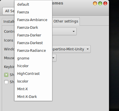
All Linux desktop environments can be controlled and tweaked from the command line, or by editing configuration files, to some degree. With KDE, you have the plasmarc files. Cinnamon has the gconftool-2, which is a familiar carryover from the earlier editions of Gnome. That said, if you want to manually add new or custom KDE themes or icons and similar items, you will probably struggle a bit doing that without having to refer to the system settings UI, especially if you’re not exactly a command line ninja. With Cinnamon, the changes are much easier. Just grab the desired content, and extract the archives into specific folders in your home directory, and Bob’s your uncle. The changes will reflect immediately in the GUI drop-down menus, and you will be able to use your own additions easily. This way, you get the best of both worlds: command-line usage to get non-default content, and the menus to use them as if they were an organic part of the framework, without having to be familiar with tricky utilities and their syntax.
Desktop restart
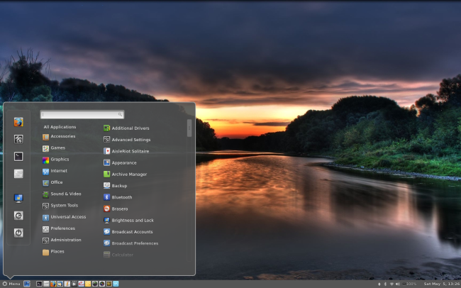
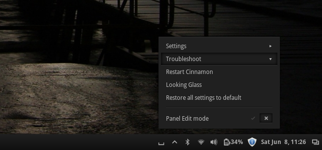
If you’re a Linux oldtimer, you might find this item laughable. You might say, Ctrl + Alt + Backspace. For any desktop environment. But what if you’re not an oldtimer, and you have made a change to your system, which is not reflected in the current layout? You may want to restart the session. Easy, log out, log back in. Is there a simpler way, though? Well, with KDE, it’s the matter of Alt + F2, then typing killall plasma && plasma. With Cinnamon, you have the magic button integrated into the bottom panel, so even newbies can find their way around without fiddling with unfamiliar commands. In this regard, Cinnamon takes the average user control of the desktop environment closer to the said user. This specific item may be a very limited use case, but it emphasizes the development and usage paradigm that imbues and drives the Cinnamon framework.
Simplicity
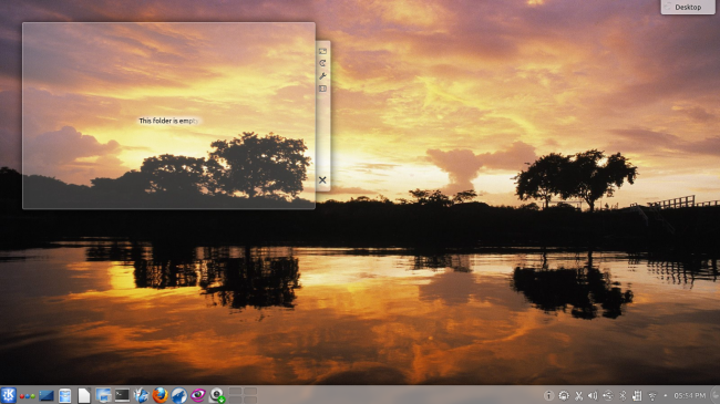
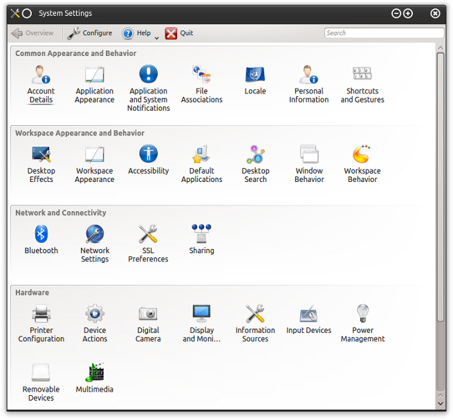
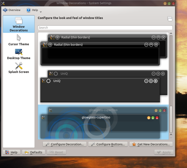
While we’re on the matter of accessibility, KDE has always followed the mantra of exposing all its features and options to the user, on an almost psychotic level. For example, if you’re not an experienced user, you will find the task of changing your desktop look & feel somewhat difficult. Possibly very tricky, even. The abundance can be overwhelming, despite significant progress throughout the 4.X family. Regardless, you will have to know the subtle difference between application appearance and workspace appearance, and then the meaning of desktop theme versus windows theme and how they affect one another.
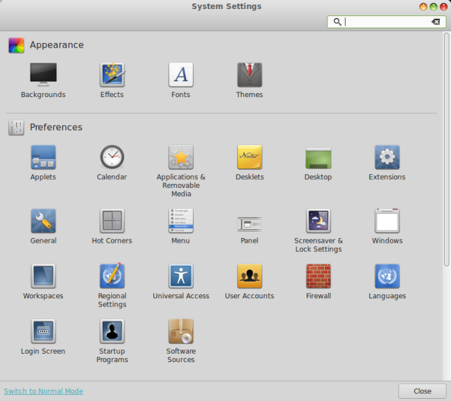
This same problem is present in all system functions and tools, and even some of the native KDE applications, with the variety and range of options being detrimental to immediate user productivity. In spirit, Cinnamon does follow the Gnome KISS principle, and most of the stuff is kept away. Best of all, you get the normal and advanced presentation modes, which offer a lesser or higher amount of options, menus and sliders. If you’re not comfortable with too much tweaking, you can avoid the unnecessary torrent of information, and if you need the extra granularity, you get it.
Sense of belonging
When you get a mule for free, you shouldn’t complain about its teeth or whatnot. However, the sense of belonging is an important part of the Linux desktop equation, at least in year 2013 and counting. Quite a few users are disillusioned with some of the bigger distributions over the ideological changes making way into the software. Indeed, this is one of the reason why many Ubuntu consumers, at least the more experienced ones, have decided to step away from the parent distribution and embrace Mint. The feeling of being listened to, even if it does not have any real, deep market impact, can be a crucial factor, especially since there is no money involved to forge entitlement or fanboyism with the clients.
Because of its size, age and well-established reputation, KDE has become an amorphous, international entity. You can probably influence the shape and direction of the project to some extent, but the chances are your voice will be lost in a sea of opinion and ideas. With Cinnamon, there is still a close-knit brotherhood, a-la King Henry V on the eve of the Battle of Agincourt, and you are most welcome to read the speech as Shakespeare wrote it down. The intimacy may yet vanish should Cinnamon grow to gigantic proportions, but at the moment, it’s a clear advantage to all of those dabbling in Linux, who do not see market share, growth or Windows takeover as their primary goals. From the technical perspective, it means the software mimics the mood and taste of its operators. And it seems to count, a lot.
KDE could benefit by going back to being a people’s desktop environment, using Linux Mint and its success with Cinnamon as the case study in user experience. It’s not an easy task, but there’s an important lesson to be learned out there, somewhere, from this.
Conclusion
Both KDE and Cinnamon are viable, successful, handsome choices for your Linux desktop.You will not go wrong if you choose either this or that one, so it’s the matter of taste and preference really. Still, it is possible to learn from and build upon each other’s strengths, or use them as inspiration for future development.
As far as KDE is concerned, it can gaze at its spicy little brother and scribble a few valuable lessons. Cinnamon is a fast, agile, nimble, lithe project, as my mastery of Thesaurus just shows. Cinnamon also tries to cater to a wide range of users, with a clear separation and minimalistic aesthetics as the leading ideals. Moreover, Cinnamon happens to be that much easier to tweak and tune, as it has a friendlier, simpler, user-oriented stack. Last but not least, Cinnamon is the darling desktop, because it cares about its users, and in return, the users care about Cinnamon. Love all the way, an unexpected turn of fate in the sarcasm-laced Linux world.
Next week, we will discuss the other side of the coin – What Cinnamon can learn from KDE.
Be excellent to each other and party on.



Dear Dedoimedo:
I don’t think you can find a more dedicated reader of your words than me. Yet, I disagree this time. You, who seem so proud in your multiple digit IQ, fell into the simplest of traps: There are simply things you can’t bend to make it more like the other. Just because they are both software, doesn’t mean you can. It’s like comparing wood and bricks because they are used to build houses, and trying to make one more like the other.
I don’t see how KDE users might want KDE to be like Gnome, Unity, Cinnamon or Mate in any way whatsoever. KDE caters to a very different demography.
We prefer strong leadership that heads, consistently, in a direction we like, rather than a leader who stirs the ship in the direction of the latest wave of comments.
We want more and more configuration options available to us, because it’s our computers. It’s the same reason we got into Linux in the first place! We want to control them! It’s either ours, or not. In that light, doesn’t it make sense to have more options available to you? The more options you have, the freer and in control you are.
KDE is the oldest surviving, and yet thriving, environment because It has kept its philosophy untouched. It’s got a big organization behind it not because it wants to, but because it needs to. And in a big organization there are ways to do things that might involved a bit more time, but that’s a tradeoff worth taking.
There’s nothing, absolutely nothing we envy or want from those other environments.
I might end with something Dedoidemo might say, something like: They can take their minimalistic ways and ugly looks and shov#@%&#!!!!
Do not mistake plain for minimalistic. There’s a difference. I think most people do not like this word, not because of what it represents, but because of how it is used. But for all fairness sake, wait till the next week to see the other side of the coin. Then, you can crucify me.
Cheers,
Dedoimedo
I agree with KingTooth on this one.
The great thing about KDE Always has been, is and will be exactly that it exposes all customizations. That being said, it doesn’t mean they can not improve and streamline various parts as long as all customizations are available and the philosophy stays the same.
I would say the only thing done better by others is the DEFAULT icon theme. On the other hand the icons that come with Cinnamon and Mint are great and Faenza is just gorgeous.
Other than that it is as KingTooth said, there is nothing KDE users envy or want from other environments.
On another note, I would really like to see two articles from you.
One would be a retake on OpenSuse 12.3 KDE compared to Linux Mint. These are the only two major distros that use the color green and by far the most stylish 2 distros.
The other would be a full review of Arch Linux. The guys at the Linux Action Show had a similar opinion of Arch. But after one week with it they wouldn’t switch back. I do believe in the end all Linux users will wind up on Arch after sufficient experience with the others.
As a long term user of KDE3, I agree with this blog post completely. KDE4 was unstable for years, and even now the interface is an eye bleeding mess of small fussy controls, poor contrast, and occasional crashes. Cinnamon is a much need alternative to the we-know-what’s-best attitude of Gnome3 and Unity and the button-for-everything hysteria of KDE.
What Cinnamon can learn from KDE: Beauty. Without massive tweaking, Cinnamon is (to my eyes) “unfinished” when compared to KDE’s aesthetic beauty.
KDE’s aesthetic visual apperance and maximum configurability comes with minimal system resource. cinnamon cannot touch that level.
Klyde
Review this please.
I am one of those for which the Cinnamon team cared….and for whom fought long (?) and hard.
I appreciate Clem’s steadfast focus, and quick turn-around to give those of us who appreciate making/keeping the pc desktop familiar, and not being forced to change for “touch” sake. (Although I have liked what I have seen of the ubuntu environment for phone/tablets!)
Thanks Dedo, for your words and critical eye!
What you don’t talk about is Cinnamon falling increasingly behind the times with supporting only older versions of Gnome3 to the extent that distros have been switching away from it.
As a response to the KDE fans: I find KDE less beautiful than Cinnamon (and I don’t even like the looks of Cinnamon that much!). More importantly to me, in spite of the famed KDE customization options, I can’t find ways to make standard KDE work more like I want or look more like I want. I switched to Gnome after having used KDE2 and have never felt inclined to switch back until Gnome3. But I still prefer other options over KDE4.
PePas – The Mint devs are currently moving Cinnamon away from having dependence on a certain version of Gnome 3 so that Cinnamon can work on any version of Gnome 3. The nightly builds of Cinnamon have already replaced “gnome-session” and “gnome-settings-daemon” with “cinnamon-session ” and “cinnamon-settings-daemon” which is already a significant step forward.
I’m a KDE fan.. but you’re totally right in the need for a improved theme setup… For example, in KDE, if you want totally change your theme, you have to, individually:
– CHange the desktop theme
– Change your windows theme (if you want other than oxygen, for example, a qtcurve theme or bespin theme)
– Change your icons theme
– Change your colors scheme
– Change your fonts
– Perhaps change the Gtk2/gtk3 theme
Ok, you don’t have to edit any file, all in System Settings.. but individually.. Ther’s no way to change everything at the time.. And if the author of the themes didn’t think in an apropiate icon, color scheme.. well, congratulations, you’re going to have a perfect Frankenstein KDE desktop!
KDE has to work out and improve the management of the themes without any doubt.
Hi,
This is a well written article. Helped me to understand better about the genesis of both KDE and Cinnamon. However, I am using XFCE so far, it is the best compromise I found between simplicity and usability. I found most of KDE settings superfluous. Too much settings might be good for flexibility but may be this also means the authors were not sure of their design an leave the finishing touch to the users?
I dunno, as an Xubuntu user I have yet to find anything more simplistic, easy to configure and highly adjustable to anyone’s liking; than XFCE. Granted, I disagree with current philosophy that XFCE is ‘light’ when benchmarks have shown it’s just as memory hungry as KDE or Gnome.
Best thing about XFCE, if you liked Gnome 2x, you’ll feel right at home since XFCE uses GTK. Of course this is just my opinion.
Used to use Gnome 2 – went to Mate for a while but it was too unfinished. Tried to like Cinnamon but no matter how nice it looks being Gnome 3 the underbelly is crippled (multiple x sessions? multiple graphics cards?). Ended up on XFCE. It seems the future for the linux desktop really is the past.
If I want to own my PC or Labtop only KDE. KDE is like water it can take any shape in my computer. Thats what make it so great.
Is this thing serious? Are you serious Dedoimedo?
Why not? What is missing?
Dedoimedo
Are you serious with this comment? Or are you 12 years old?
“We few. We happy few…”.
Dedoimedo. Only you would dare reference/quote from both Shakespeare’s “Henry V” and “Bill and “Ted’s Excellent Adventure” in the same article. I admire you for both your audacity and bravery, sir, although I fear for your sanity in this matter.
As far as my opinion on said article is concerned, since it only holds one side of the argument and the other side has yet to appear, I shall wisely withhold my judgment. As such, I await your next installment with great anticipation.
And don’t forget to wind your watch…
I love the Cinnamon UI. I find KDE looking and feeling like the old Netscape Navigator… almost like a native Java interface where everything feels like it is not meant to run in that environment.
Cinnamon is everything I thought Gnome 3 was going to be. Clean, simple, organized. I love it. The fact that I can run a script in the command line to get everything exactly like I like it makes me very happy.
I have to use Fedora + Cinnamon because Mint is based on Ubumtu. I don’t like the Windows-like direction and control that Balmer… (I mean Shuttleworth) throws at Ubumtu, so I won’t use Mint because of that.
If mint was based on a Red Hat variant, I would fully use Mint. I just like the philosophy and attitude of Red Hat… So, until that day, I will gladly use Fedora + Cinnamon.
Full out respect and thumbs up to Clem for giving us the “REAL” Gnome 3.
:)
I disagree with most of your thoughts this time, but I’m here just to make a little clarification, running: “killall plasma && plasma” doesn’t do anything, it’s been a long time since it doesn’t, you would need to write “plasma-desktop”.
Even so, it’s not the correct way of doing it, you should use “kquitapp plasma-desktop && plasma-desktop” instead.
Kudos, Luis.
I don’t think you got the point…
https://plus.google.com/u/0/107970213369875035288/posts/D4MvVCEP55c
Aaron’s Comments from my G+ post – I think it is worthwhile to share here…
Not sure what to take from that article, actually, mostly because the author guesses at things like why “KDE4 took quite a few revisions to reach a stable and mature form” and gets them rather wrong.
It is indeed always easier for a new project to add the first 80% of functionality. That is hardly difficult. It is the remaining 20% and being able to do it all well.
When a project is small and has a new user base, the users are both more forgiving and less demanding. If Cinnamon succeeds, don’t worry, that will change.
The non-GUI controls are bizarely wrong. The only thing that doesn’t have a button that brings up a file dialog and lets you install from a file on disk any of the things mentioned is desktop SVG themes .. and even that has a Get New Themes button that does the downloading for you.
The author claims that you can just “extract the archives into specific folders in your home directory”. Well, yes, same with Plasma Desktop. We also provide a tool called plasmapkg if you really want to do it from the command line and not worry about where those locations are.
The reference to the plasma*rc files is also baffling: you never, ever, ever have to go rooting around in there. If you must, there is the Plasma Desktop Scripting console: http://techbase.kde.org/KDE_System_Administration/PlasmaDesktopScripting
So then there is “simplicity”. Yes, it is challenging to balance features and simplicity. The one example the author notes is desktop look and feel. We agree it could be betterm though somehow all those people do manage to figure it out .. could it be people are not idiots?
Plasma Workspaces 2 will have the Look and Feel packages that will make this simpler and make it easier to keep things coherent and unified.
As for the claim that all KDE desktop settings are confusing and overly difficult and that most KDE applications are as well is rubbish. Numerous examplesl abound.
The part at the end about Cinnamon caring about its users is nice; I don’t like how it reads almost like the hint is that KDE doesn’t.
I also really don’t like the framing in the opening paragraph where it says, “Only KDE remained as it was, and now it was facing a new rival.” Rival? Really? Ah, right, we can’t all just get along or co-exist or heaven fucking forbid see other projects as opportunities to push Free software forward together.
I find these projects, rooted as they are in discontent and forking, express themselves in such “us and them” ways a lot.
Really, the big question is this: Will Cinnamon be actively developed at the current or better pace in 5 years? To be honest, the answer to that is: doubtful. Which puts it all into perspective a bit. Free software’s “scratch your itch” is sometimes engaged without thinking about the bigger picture.
I have KDE on my desktop and Cinnamon on my laptop. If I could only have one, it would be KDE, hands down. There is no way in which I would wish KDE to be more like Cinnamon. I don’t see why any desktop should want to be more like any other. What would be the point of having multiple choices? I, for one, am glad we do have those choices, because we don’t all like or want the same thing.
Cinnamon was what Linux needed in my opinion. The reason being… We as Linux users, are trying to get Linux to the next level of acceptance. Cinnamon is a far easier switch from Windows then KDE.
Hi Igor, check what i wrote here on this topic, if you like.
http://circlesoftrust.blogspot.be/2014/08/why-i-hate-mint-and-love-opensuse.html