Wishfix part 2: Amarok.

Once upon a time Linux had what I think was the best music player/manager, its name was Amarok and people even brought it up as a way to try convince others to move to Linux, intelligent playlists, auto fetching of cover arts, lyrics, last.fm integration, etc, and it was great. Fast forward a few years (almost a decade to be fair) and now Amarok and all KDE music players seems to be lacking, with KDE 5.0 maybe this is the time to fix it.
A cluttered mess.
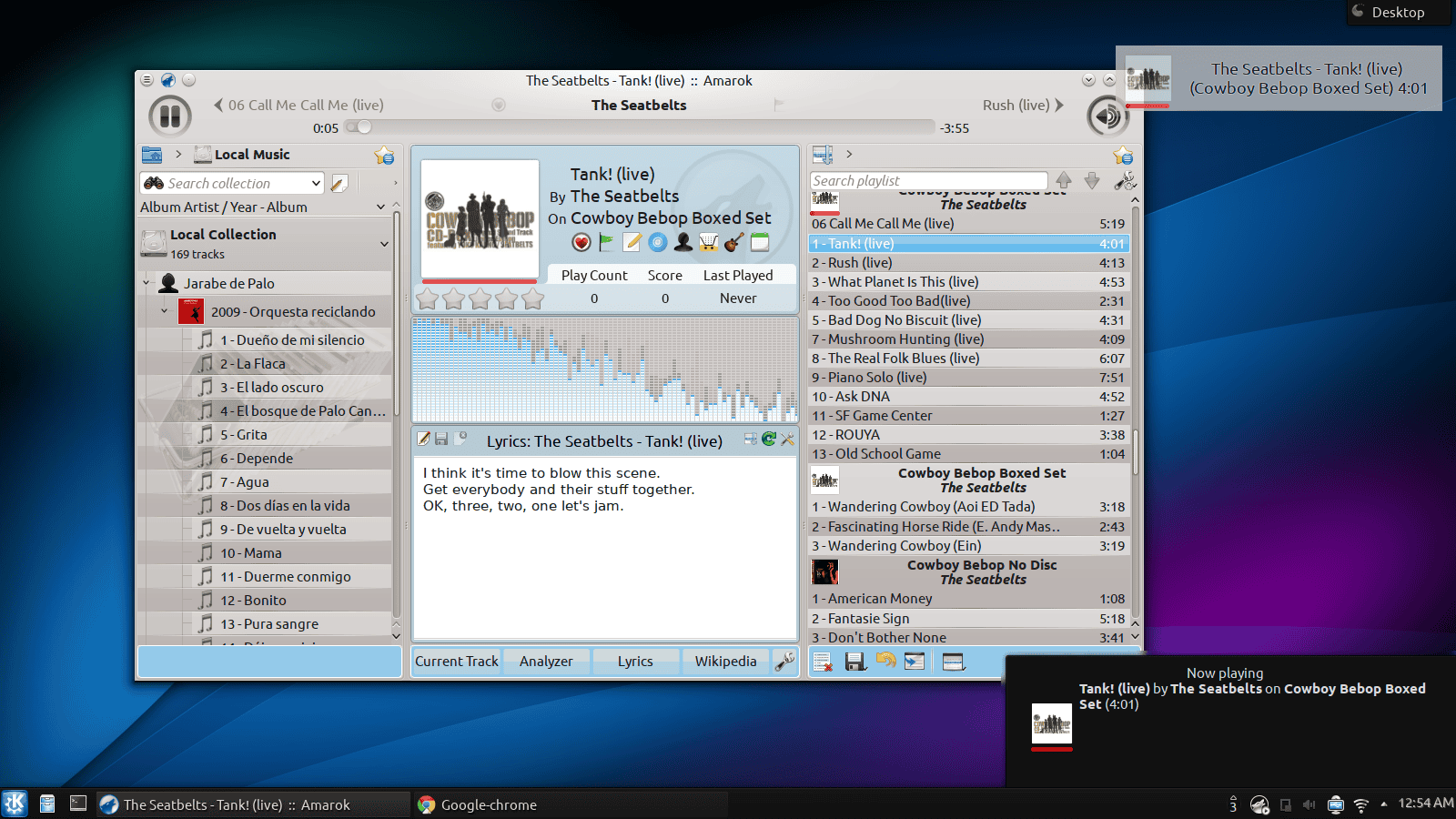
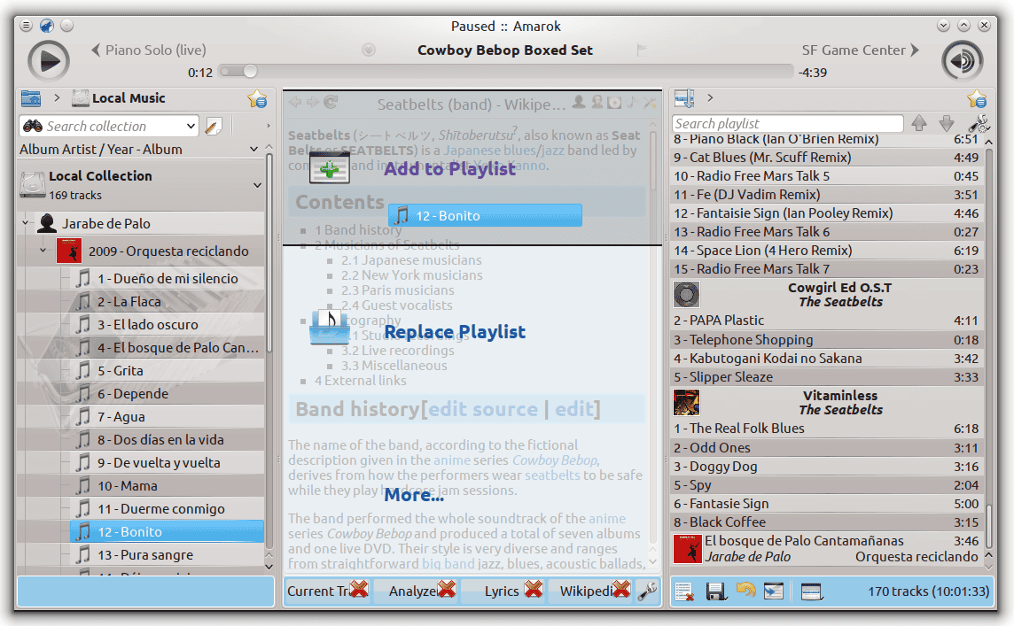
Look at the following picture. Is super cluttered, but what always catches my attention first is the amount of album arts, is worth mentioning that Amarok 2.x has improved in this regard (there used to be more).
I’m fully aware I could change Amarok’s default behavior however the question is why is this the default behavior?. Even if albums arts were reduced to a reasonable amount the sheer amount of options and letters and icons on screen is overwhelming.
What about the currently playing song?
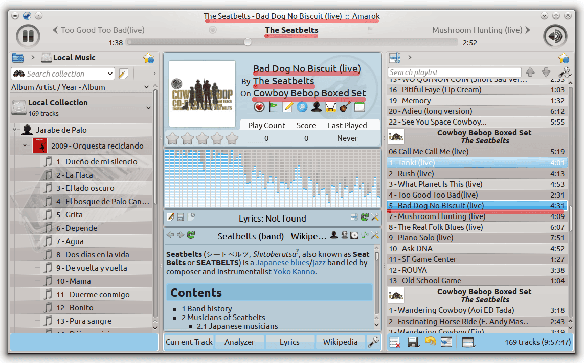
I’m not saying that every repetition is a sign of a problem, but it seems reasonable that a clean well designed interface will have at most two instances, the current playing song marked in the playlist and the current song in the main interface. That’s it. Amarok is just showing too many (and one of them takes too much space). Even little things like Love on Last.fm and Add position marker are shown twice by default.
Context Panel: A good idea gone bad.
One of the coolest things about Amarok in the past is how aware it was of the internet, it helped you find new songs, metadata, lyrics and album arts. So the Amarok developers when making the jump to KDE 4 decided they will focus more on those features. This may seem like a good instinct but part of why it worked so well on Amarok 1.x was because those features were additions that didn’t take the focus out of the main function of a music player.
If I were to analyze the success of those features, regardless, I wouldn’t put the weight into how well designed the were but rather how “futuristic” they felt by making good use of new technologies available, we knew lyrics were online, so Amarok looked for them automatically, while other players at best showed us a blank page for us to copy and paste it, unlike most Amarok was aware of the internet and its capacities, that’s was one of the most attractive things about it.
Amarok’s context pane fails on both accounts, it totally misses the latest developments on the web, it seems unaware of the ongoing streaming revolution and it gets in the way of Amarok’s main function.
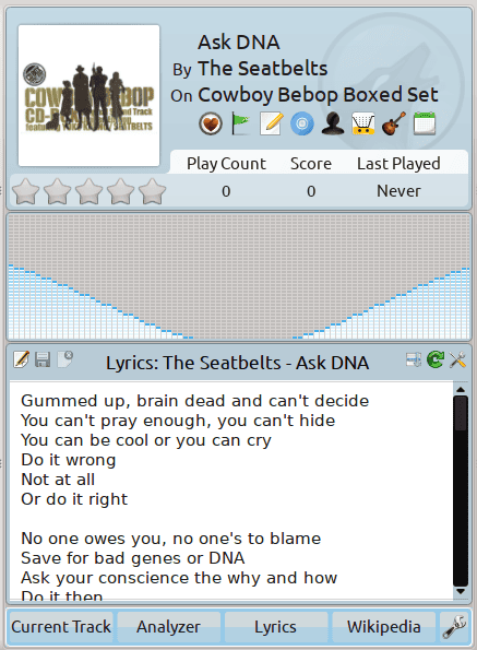
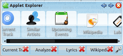
It clutters the interface, it puts too much emphasis on the non-important things (e.g. the name of the song and album), it tries to fit more information than it can (multiple totally unintuitive “tabs”), including the ability to add more using a very weird ugly interface (which is meant to look like Plasma’s interface, as is built around it).
How does it get in the way? Well, there’s one more thing Amarok does differently than other players: Most show your library and playlists on a sidebar, you create new playlists by hitting an icon (usually a plus sign), then you go to your library and drag’n drop songs from your music to your new playlist. Not so on Amarok, here you have your library on a different panel from your current playlist (not your playlists), the way you create new playlists is by clearing the current playlist, dragging songs from the library to the panel and then hitting save playlist (this goes to show how unlike what some seem to believe Amarok’s style requires more steps).
However, that’s not a problem per se as it was a great experience on Amarok 1.x. I’m sure smarter people than myself could make it work out, however, the problem is it doesn’t work very well on the current Amarok and the context panel is right there getting in the way, drag’n dropping requires a longer movement as a consequence too. Its developers kinda recognized this issue so instead of fixing the problem they added, in my opinion, a pretty poor workaround:
Missing cutting edge features
Amarok became a big deal among Linux users because it was cutting edge and its playlist management was top notch, the cutting edge now are music streaming services. Not all of them have APIs available but many do, there’s no reason for Spotify not to be available, take a look a Tomahawk for a player aware of the future. Amarok merely keeps doing what it did ten years ago but arguably in a poorly manner compared to many of its contemporaries.
Conclusions
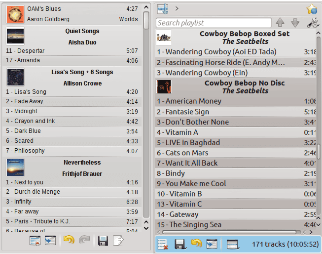
Yes, it’s possible to configure Amarok in such a way that’s more acceptable, but in many ways Amarok has moved back not forward, for example, here’s a screenshot I took years ago of the playlist compared to the most recent one:
So I hope KDE 5 is the time when Amarok developers take a deep breath and reconsider their priorities, I’m sure they can bring back the old-school Amarok playlist management, cutting edge features, and yes, keep the contextual information in a much more elegant functional way. My main recommendation is to eliminate the absurd amount of redundancy and reduce clutter as much as possible and to put the contextual information somewhere else.

Banshee does just what I need it to do, but it’s gtk. Loading both qt and gtk isn’t a problem on my desktop, but a major hurdle on my net book.
Not a big fan of Amarok but it’s rich of Netrunner to talk about cluttered messes. I think that distro’s UI fits the bill perfectly. It’s horrible.
Anyway didn’t read the rest, sorry.
Amarok sure is a confusing mess and I’m anti-mono so Banshee is out but there is of course Clementine, it’s solid as a rock on gtk or kde.
I have been using Clementine on Linux for a couple of years and when I recently had to move to Windows 8 for work purposes, I started using it there. I really like it and recommend others try it.
I was on Amarok until the developers decided to make it an annoyance. I have been on Clementine since. Multiple tab playlists and a simple straightforward interface and a rich playlist of Internet radio stations sold me.
I occasionally check Amarok once in a while, and I must say, it still annoys me.
Great, another article from this serial whinger.
I’m sorry that’s your impression. I’ve been criticizing a bit more lately, but I’ve published more positive articles many times (including this week, regarding Clementine), and even wrote one about how the free software movement could end up changing the world by giving us better democracies.
I’m deeply into (F)OSS, but I’m not into the “no criticism is allowed because this is OSS” mentality.
Cluttered? Excuse me? You are aware that you can fully configure the layout and show only what you want to see, do you? Or is this just a complaining for the sake of it? You don’t like the Context View or parts of it? Remove it, it’s only a click away. You don’t like the arrangement of the panes? Move them, remove those you don’t want to see. But really, what you do in this article is complaining for the sake of it, you didn’t even bother to check the “View” menu, obviously.
As for Tomahawk integration: this was a GSoC project which unfortunately did not come to fruition (yet!) if you really want to know about the why them please ask the mentor of this project, Domme which happens to be a Tomahawk developer. He will certainly explain to you why the project is not ripe yet, and it currently is completely out of our hands to make this go further. Maybe asking the SoC student why he did take the path he did might also be a good idea…
FWIW: this is Free Software, much unlike other projects sponsored by money Amarok is not, none of our developers is payed for working on it.
The problem is that most users like the idea of the context view, just not how it is implemented. removing it would be the same as moving to a music player that does not have that feature at all. That was Amarok’s greatest selling point!
I think you also miss the point that the author is making. The arrangement of the panes are hardly the problem, it is the panes themselves.
I keep trying Amarok and keep returning to Clementine. The Ui change lost me somewhere along the way. I will keep trying it with every new version, and keep hoping that the Ui will be made into something beautiful and efficient.
I’m fully aware of it. I mentioned it at the end: “Yes, it’s possible to configure Amarok in such a way that’s more acceptable.”
And even if I were not, defaults are way more important than being able to unlock the layout and move things around, my grandfather and my girlfriend don’t care about tweaking stuff, they’re not particularly interested in technology and they don’t want to spend 20 minutes fixing their music player’s layout.
I think all constructive criticism is good even if I don’t agree with it. You’re gravely off the tracks on some points, though. Just a few of them:
1. “there’s no reason for Spotify not to be available” – there actually *is* (or was) a licensing reason for Spotify to be unavailable: http://mail.kde.org/pipermail/amarok-devel/2012-November/011135.html . The plugin was actually developed as a part of Google Summer of Code 2012.
2. Why would you set both system and Amarok’s OSD notifications to show, and then complain about the “amount of album arts?” This is certainly not set in Amarok by default.
3. Regarding your “comparison” screenshots at the end, it’s actually your fault that the screenshot on the right looks much more cluttered. Or, more specifically, it’s your system’s settings fault. Amarok uses KDE theming which includes colors and fonts used in the application throughout the system.
And I still can’t wrap my head around the concept that title, album and artist of the currently playing song are “non-important things.”
1. I’m aware of the licensing issues, but both Clementine and Tomahawk manage to support it anyway (Clementine downloads it automatically).
2. I didn’t set them, that’s how it behaves by default.
3. It looks clutter not because of oxygen… But rather because they put everything they can think off on there.
4. The title, the album art and the artist are important… But do not belong to the context pane, as that just achieves cluttering the interface with redundant information