What’s on the menu?
You’re walking down a street, with one of your significant others at your side. You pass by a restaurant, and it looks like a nice place to continue pursuing your infidelity. Then, you glimpse at the menu, and you decide whether you want to stay or not.
Just like restaurants and bistros, operating systems have their menus. For a lot of people, they are the gateway into the operating system. You use them to explore the options, to peruse the variety, to make the right choice of software and usability before you take a proverbial bite. Indeed, let us explore some of the popular options available. We won’t test them all, but it ought to be interesting. In no particular order.
Cinnamon Menu
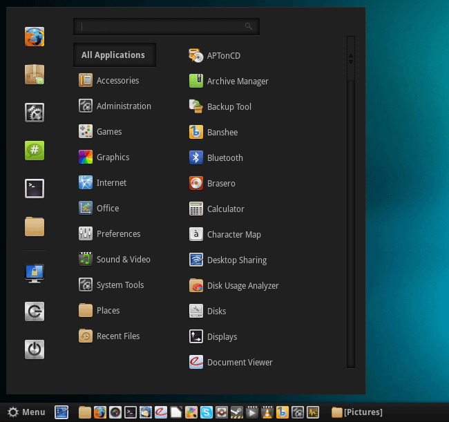
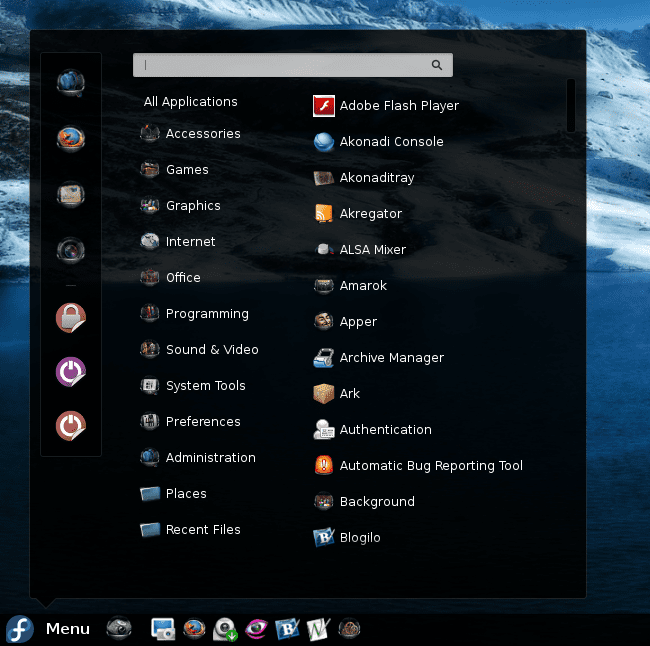
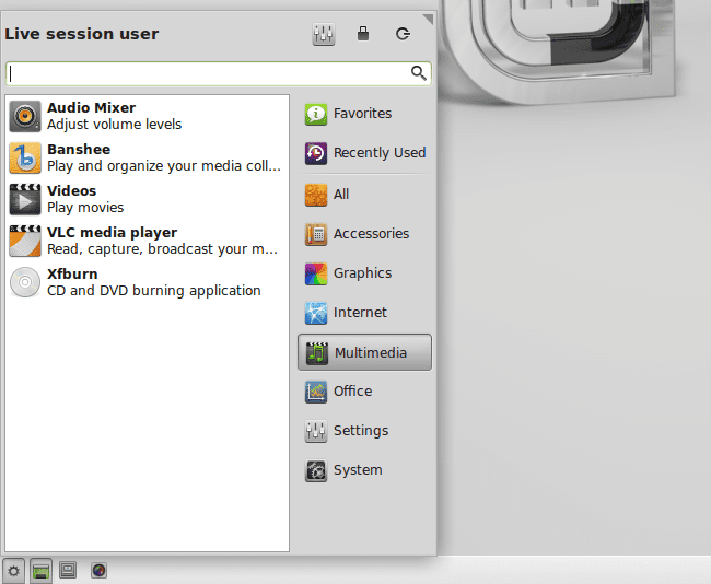
If you’re using the Cinnamon desktop, then you will find this thing opens up when you click the appropriate icon or keyboard shortcut. By default, Linux Mint ships with this fairly simple and functional system menu. It offers a non-tabbed interface with a vertical sidebar for quick-access to your favorites, as well as integrated search. You can pin applications to desktop or the panel, if you want. The Cinnamon Menu looks great across various desktop, like for instance Fedora, and it supports new icon sets without any problems.
Mintmenu
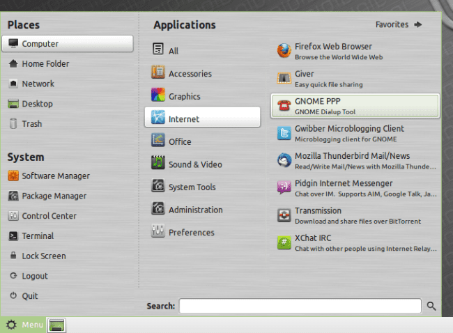
Yet another utility used chiefly in the Linux Mint family, which you will most likely encounter if you try the MATE flavor or the Debian edition. Visually and functionality, Mintmenu behaves a lot like the Cinnamon version, and it is somewhat reminiscent of the good ole Gnome 2 days when distributions started tweaking the classic three-column setup into something more posh. The scent of nostalgia notwithstanding, Mintmenu is a capable tool. You have a very decent visibility of your software, you can browse through categories, and the search is reasonable. Best thing? You can uninstall apps through the menu itself.
Whisker Menu
This funnily named menu is implemented in the Xfce version of Linux Mint. It is similar to the Mintmenu and Cinnamon Menu, with some small exceptions in the visual layout. You still have favorites and application categories, but the left-right order is reversed. Moreover, Whisker can be freely resized. The search functionality is decent, since you can both use description words as well as actual application names.
MATE menu (and Gnome 2)
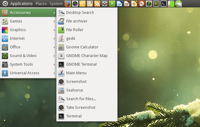
After the Gnome Foundation axed its version 2 in favor of the new and bold Gnome 3, the old user interface, still present in some of the more conservative slash enterprise-oriented distributions, was forked to create MATE. To wit, the old three-column menu we just nostalgialized about. It’s a very clean and practical kind of layout, provided you know where to look. A lack of search functionality is evident, and it’s probably the weakest link of this software.
Gnome 3 menu
This is a tricky one. Gnome 3 comes with an interactive screen rather than an isolated application and search entity that we’ve seen so far. Start typing, or slam your mouse cursor into the right corner of the desktop area, and the Activities menu will popup, offering a sidebar with most popular programs pinned there, the aforementioned search box, as well as a bunch of categories separating your applications, utilities and files. Some distributions may offer enhancement to the basic menu, including Web searches. Unlike the other menus, the Gnome framework covers the whole desktop. The search functionality can be improved, especially when search for items hidden deeper inside the menus, like proxy, for instance. Regular expressions are also not the brightest side of this tool.
Unity Dash & Launcher
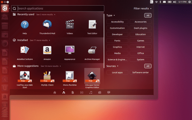
An almost sister idea to the Gnome 3 thing is the interactive menu used in the stock Ubuntu releases called Dash with a sidebar called Launcher. For those trying to figure out the concept, think of Mac, turned around 90 degrees. The Launcher can be resized and icons freely moved about using drag & drop. The Dash acts like a very powerful search, with tabs called lens, where you can scope your applications, files, media, with an additional questionably useful wealth of suggestions and recommendations, online and offline. The default inclusion of online queries has been heavily criticized as a potential privacy issue.
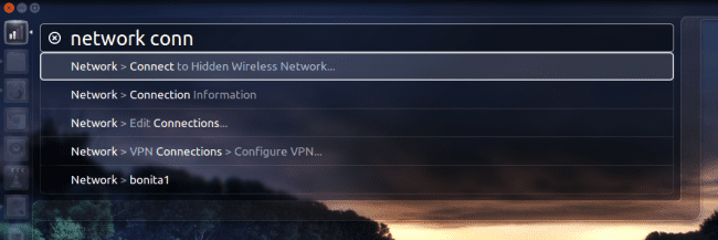
The Dash also comes with HUD, which is surreptitiously activated using a quick Alt button stroke. At that moment, Dash becomes a would-be intelligent search, allowing you to find functions rather than content. For instance, you might want a specific program to do some action. A young and not yet mature concept, still there if you need it.
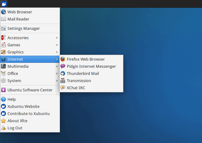
Xfce menu
While you may find Whisker quite useful, most Xfce distributions come with a very simple linear list, akin to Gnome 2 and MATE, albeit with a single column. A lack of search is quite evident, and you cannot add applications to the panel, desktop, favorites, or the startup list using the right-click either. Again, this kind of implementation favors power users, those who keep a clean and tidy system, and generally know where to find what they’re looking for.
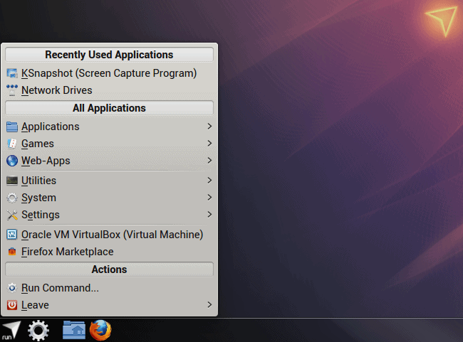
KDE Classic Menu
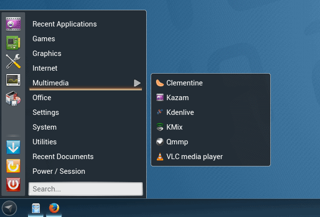
The KDE frameworks comes with the most colorful assortment of menus available to its user base. By default, depending on the distribution choice, you will get either the Classic Menu, which is very similar to the Xfce setup, or the Kickoff Menu, which we will discuss shortly. The former is a standard linear menu you’ve seen for the past decade, with a hierarchical tree of sub-menus opening to the right. You do have the ability to add icons to the desktop or panel, but you do lack a nice search functionality.
KDE Kickoff
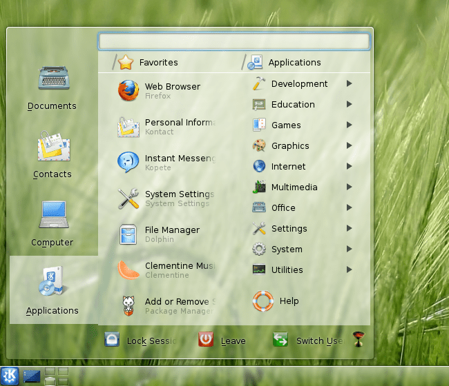
With a single click of the mouse, on the K Button, you can switch back and forth between the Classic Menu and Kickoff. This menu comes with a search box, and it’s more powerful than the Gnome search, because it does utilize limited regex support, but it may sometimes be slow to index new applications, or it might show double entries. You also have tabs, akin to Unity, and you can switch between different categories, and then dive deeper into each section. This way, KDE allows both linear left-right navigation, as well as a vertical stack using its tabs. You can drag & drop icons, or add them to the favorites, the desktop or the panel.
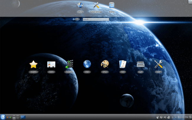
KDE Plasma
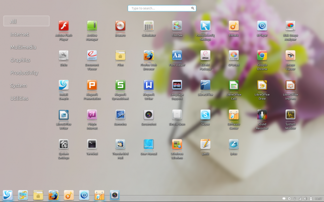
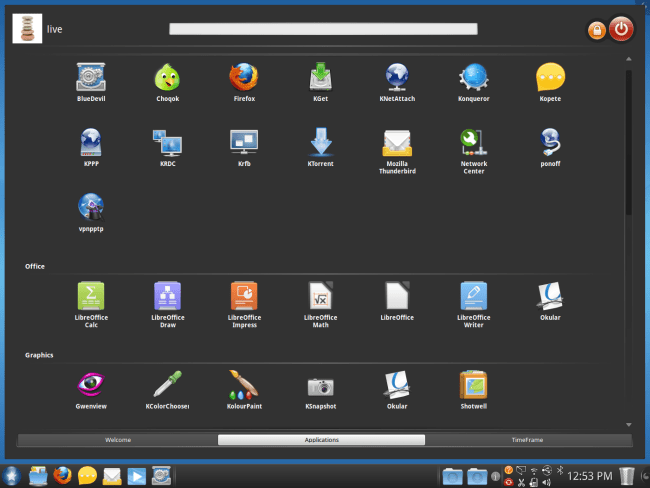
Envisioned as all-powerful menu slash desktop for netbooks and touch devices, Plasma offers a full-screen interactive board with icons and integrated search. You can explore each category individually, and you can also add permanent shortcuts for your favorites. In a way, it’s Kickoff expanded in a flat manner over your desktop.
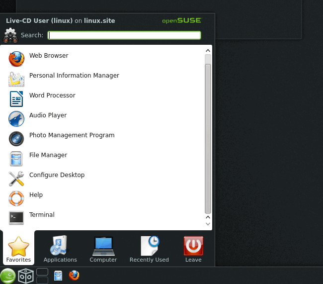
Kicker
This new menu is kind of a hybrid solution utilizing good concepts from the existing KDE implementation, as well as borrowing from Linux Mint. There’s a sidebar with favorites and quick-access buttons, plus an inline search. You still navigate left to right, however when searching, you must be precise, because this menu will only consult the actual application names rather than description fields. Take Konsole, Terminal as a good example. Nevertheless, it tries to improve the classic layout with a fresh new approach.
Openbox menu
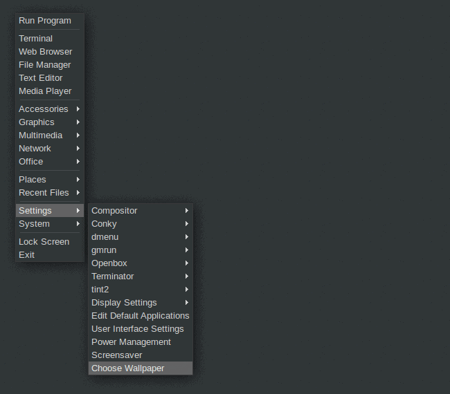
Less typical for mainstream use, but should you choose a desktop that is blessed or burdened with this desktop environment, either a left or right click of your mouse on the desktop will invoke a simple, linear menu. It’s rather similar to Xfce and KDE Classic, except that it can be invoked anywhere on your work area. Finally, it favors power users, due to the inherent limitations in knowing what to look for before you do.
Others
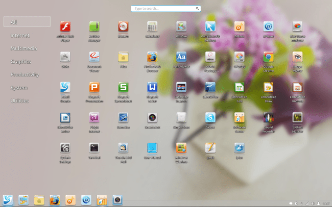
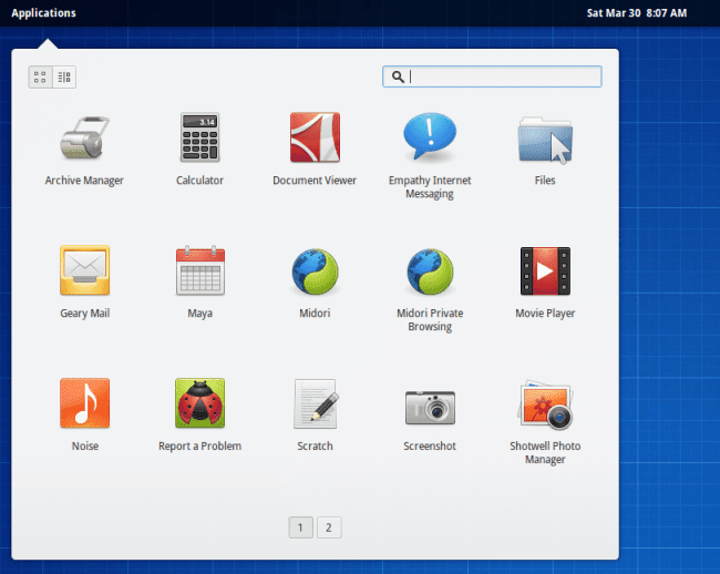
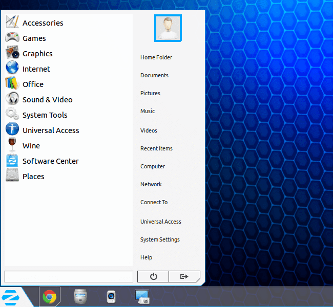
There’s a whole bunch of variations to the above, especially the Gnome 3 menu and KDE Plasma. For example, if you try the likes of Mandriva, ROSA, Linux Deepin, elementary Linux, or maybe Zorin, you will find a variety of available implementations, with more or less similar functionality. Feel free to explore these, but they will most often be restricted to their particular distributions.
Finally, once upon a time, there was also Lancelot for the KDE desktop, a concept similar to Kickoff, with some additional features. Lancelot offered tabs, in a vertical manner, integrated search, as well as categories expanding linearly to the right. Overall, it tried to encompass all of the stuff we’ve seen earlier, but it did not seem to have taken roots in any of the major distributions. I have not see this menu/launcher around recently, and the last distro to feature it was Pardus, but it may yet come alive again.
Which one is the best?
All right, now that we have this very long and colorful and indecision-inducing list, let’s try to figure out the best option, if possible. We’d like a simple and clear menu that offers the most functionality at a first glance. Then, we want a powerful search that will take us where we want to be, including browsing through the recent documents. Tabs are good, as they can store a lot of information, and they hide away clutter, but they add some complexity in finding the right thing. We want quick access to our favorites, and we want to be able to pin new icons easily. And we want the menu to be unobtrusive.
With all these in mind, then I guess, the winner of this tight competition is the Cinnamon Menu, with a whole crowd tightly packed just behind, nudging and bustling. The differences are so tiny really, it’s almost unfair to proclaim any one specific product as being superior to the rest. But given the rather stellar behavior of the Mint family recently, then it also makes sense that you try the Cinnamon desktop environment and its associated menu. Should you venture elsewhere, there’s a lot of good choice, and luckily for you, they will also kind of restrict your choice of the desktop, and vice versa. MintMenu is also great. For KDE folks, Kickoff does a decent job, tailed by Kicker. Whisker is a very good alternative to the classic Xfce menu. Then, everything else. Now, at this point, you should start writing your comments.
Cheers.


I am rather surprised you haven’t mentioned Cardapio. I remember it was a really well known menu alternative. Right now I think it is in a similar state to Lancelot
KDE Homerun is a really good menu too, somewhat similar to ROSA’s “Simple Welcome”, only much more configureable, from the tabs on top to the contents of each of the tabs.
You mention that the Whisker menu reverses the usual left-right order. (The developer has said that this is to put emphasis on the Favorites panel.) Very oddly, if you install Whisker toward the right-hand end of the Xfce panel, it flips to the normal left-right order.
Also, the ‘funny’ name Whisker is, no doubt, a tip of the hat to the mouse mascot of the Xfce environment, and that mouse appears – with whiskers – on Whisker’s icon,
e17 has interesting ideas about menus.
At least in Enlightenment one can perform the simple and elegant inline file rename using a slow double-click. Something which no other Linux distro desktop does. A basic feature in both Windows and Mac.
Try the Classic Shell menu on Microsoft Windows.
@Dedoimedo
Well I don’t know where to post comment for “The essential openSUSE pimping guide”….
So I’m writing here. I have read ur whole guide but is there any way to improve fonts in opensuse. I’ve checked various forums but doesn’t got any correct replies….
with any DE or OS using Openbox (crunchbang, LXDE, Lubuntu, etc) one can create multiple custom menus with xml docs, that can be binded to keys or the mouse with Openboxes RC file.
If you prefer using menus, that can be customized on the fly, and if you have a bit of experience with Linux desktops, try Openbox. Its a lot of fun.