Diverging paths: KDE v. Unity
Unity even 2 years and a half after it was introduced remains a contentious feature and source of constant debates. It seems like there’s no middle ground, either people love Unity or hate it. In this sense, and not in many others, Unity is like KDE 4.
To better represent how these two compare we will try to explore them like a new user would, starting with KDE followed by Unity.
KDE
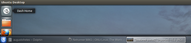
An empty desktop with a cashew and single panel containing a menu button, a system tray and a clock. Seemingly as straightforward as it gets. The only apparently weird thing for users coming from other operating system or environment is the cashew, so maybe they will first click on it out of curiosity.
I got to admit that I do not consider Plasma’s interface to be intuitive at all, some will complain that no interface is more intuitive than other but that’s a patently false extravagance not worth discussing (some interfaces are definitely easier to figure out than others).
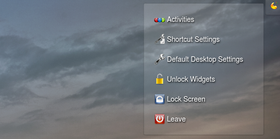
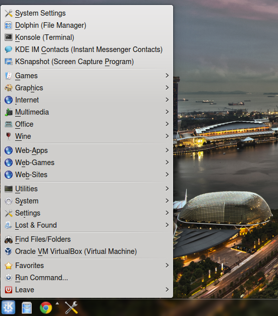
The first entry in the cashew is Add Panel when you click it the user is offered three options deprived from any description.
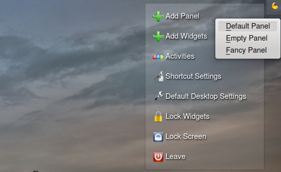
While two of these descriptions are understandable enough the last one is just cryptic for the sake of being cryptic, moreover, users are most likely to click on it because it has a fancier name (see what I did there?) and the fact of the matter is that is just a lame attempt at a dock and to make things even worse it tends to be unstable if you try to move around or play too much with it. Stay away from it, the regular panel is incommensurably superior.
The second option is to Add Widgets, but again, the interface is not easy to figure out if you’re not familiar with it.
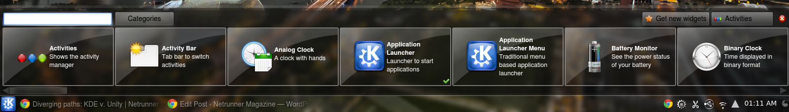
You can either double click or drag widgets to add them into the desktop. Instead of showing a preview of the actual widget you get a name and a description. That enough is a valid criticism but we’ll see soon why that’s wrong twice.
The third option is managing activities. I think the set of users that make any use of this features tends to zero, so I won’t dedicate it much time, but essentially you can use different layouts, it’s useful to have more than one layout, but I’ve yet to meet anyone that needs two different layouts, they just pick the one they like and that’s it.
The Fourth is to customize shortcuts, is that the right place? Do users seriously change their shortcuts so often they need to have access to those settings straight from the desktop?
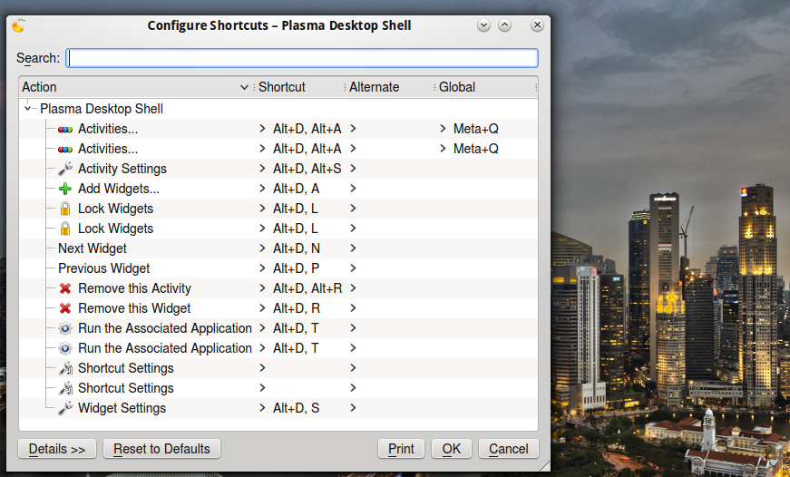
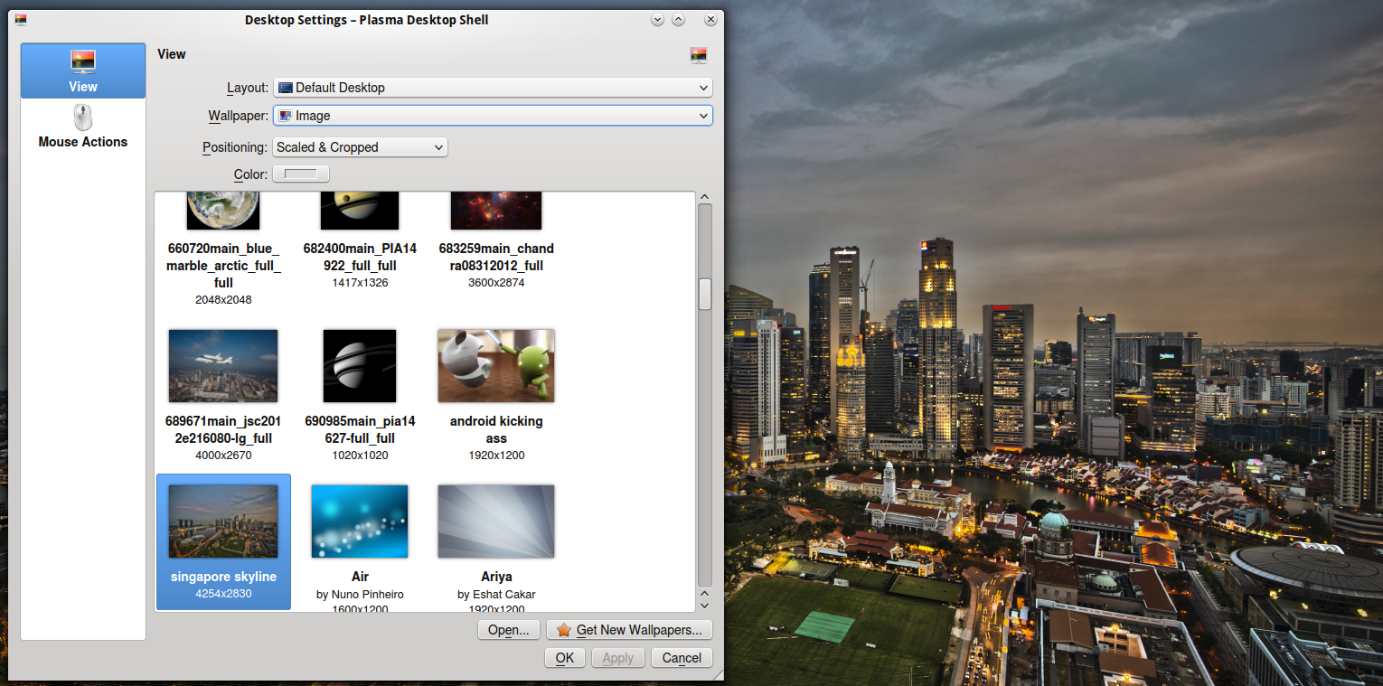
Next we have Settings. From here you can change the wallpaper, change the layout and set mouse actions. Isn’t this a better place to put the shortcut settings?
You can unlock and lock widgets, which serves to lock their position and it also hides Plasma’s widgets on-hover menu. Finally you get Lock and Leave to manage your session. Again, is that the right place for that? All application menus available in KDE provide these options, accessible almost always, while the cashew is only available when you’re looking at the desktop without any app covering it.
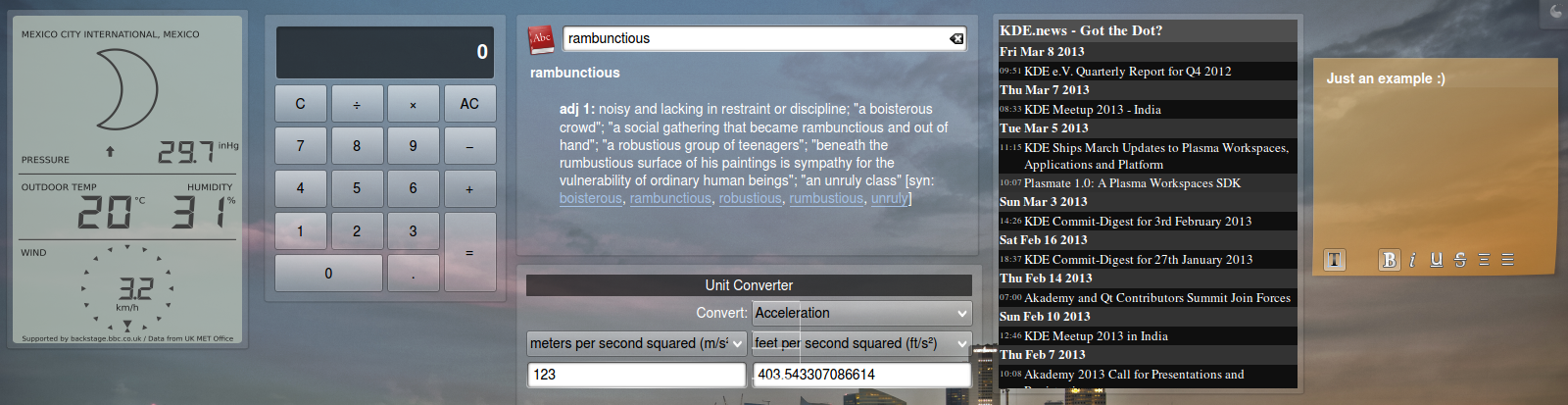
Don’t take this the wrong way. While I think KDE is a great desktop environment some things could definitively be easier and better designed. Regardless the stiffer learning curve is not without its rewards. Unlike GNOME or Unity you can add all kind of widgets to your desktop (I don’t personally put anything in there, but many people love them!) or dashboard.
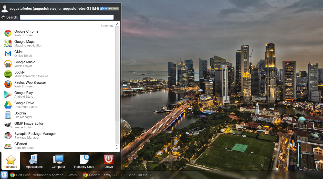
Next there’s the default menu. KDE opts for a tabbed menu showing your favorite apps in the first section. All apps categorized by type in the second one, in the third you can access System Settings, Run Command and Places, fourth tab is recently used and the last one is session and system management.
Next KDE chooses by default an old fashioned taskbar with the application icon and the window name followed by a system tray and a clock. In this regard KDE is alone among the big players, GNOME 3, Unity, ChromeOS, Microsoft Windows and Mac OS X all use a dock-like interface. I’ve written before about my quest for a decent dock for KDE before, I find the regular taskbar to be extremely efficient, but there’s some good docks out there, like Chrome OS’ dock.
At the end of the panel if widgets are unlocked a fancy cashew also appears. I’ve explained in the past how to use it, and is actually nice. The problem, I think, is again adding widgets, look at it:
Does it look familiar? It looks exactly the same as when you try to add widgets to the desktop the only difference is double clicking adds widgets to the panel. Another problem is that most widgets are either designed for the desktop or the panel but not both. Users have no way of confirming which ones are which other than trial and error. I’m perfectly capable of understanding the idea behind, that widgets change their form, but users don’t need to know this, they just need to add stuff to their panel or to their desktop and this makes things unnecessarily complicated.
But once you know your way around it things get very good. You can change the behavior of the panel very easily, change the old fashioned taskbar for a Windows 7-like dock-taskbar hybrid using a widget called smooth tasks.
Or my favorite old-fashioned-Windows-7-hybrid taskbar, with a couple of clicks using smooth tasks:
You can also change the main menu very easily, Netrunner for example opts for a classic style menu:
But there are also menus like Lancelot with the capacity to display a wider range of information:
Or something entirely different like Homerun:
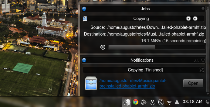
Notifications are unified in KDE. Unlike most other desktops, notifications are stored so you can check them later, all kind of process such as transfers, video encodings, downloads, etc, are displayed in the same place, you can even pause, resume or stop these processes.
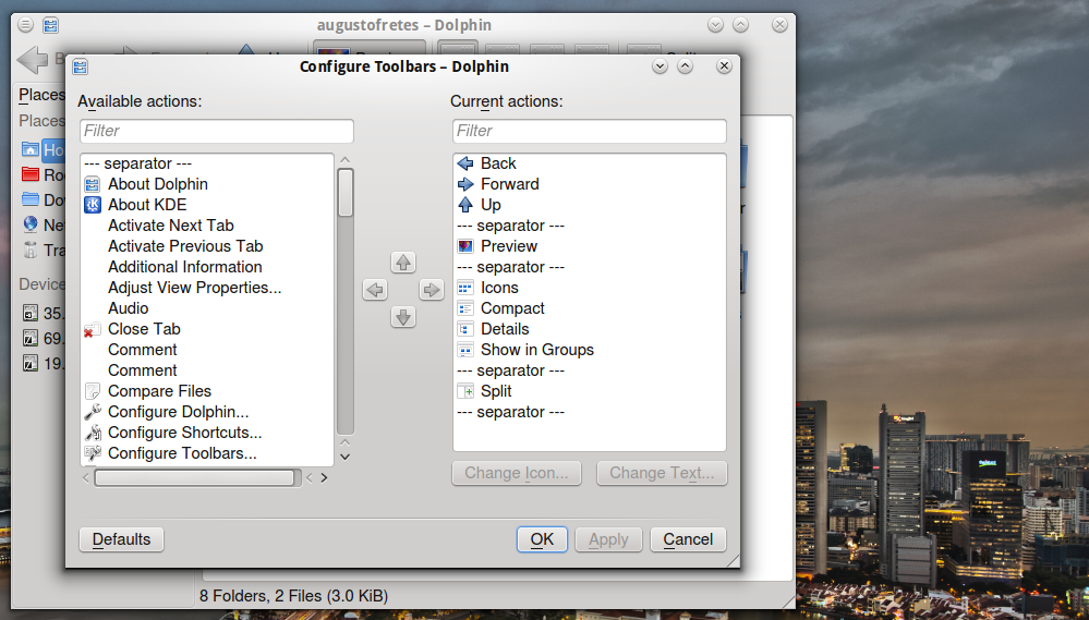
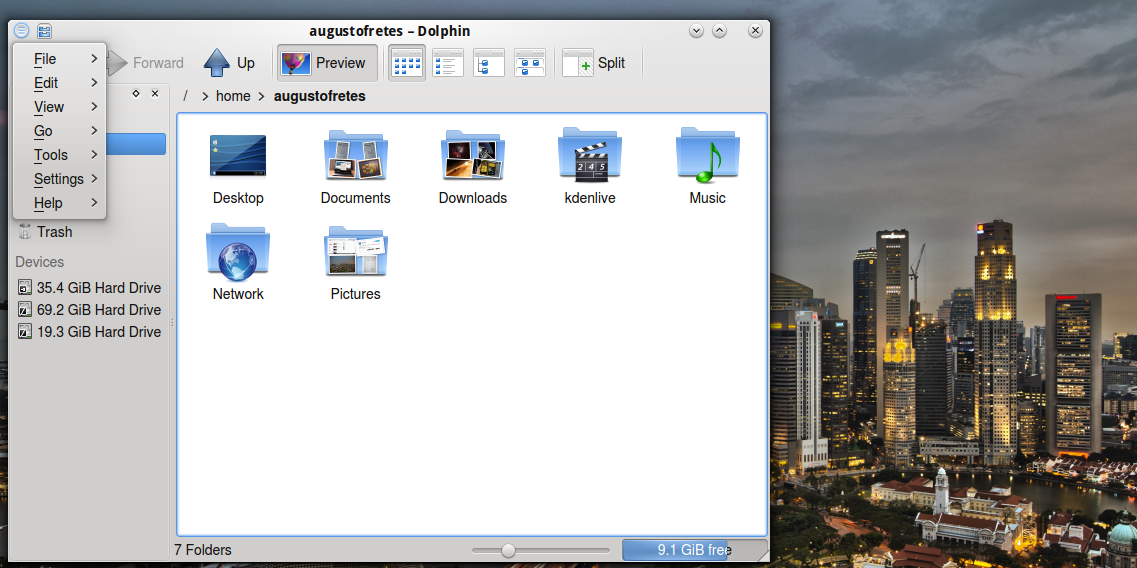
While KDE clearly has a bigger learning curve in some regards than I think it needs to accomplish most of what it does, is definitively a power user paradise as exemplified by how flexible the desktop is. The same pattern observed here is replicated all around KDE’s experience in stark opposition from Unity’s. Take, for instance, Dolphin. You can change every single icon in the toolbar with very little effort, just a few clicks, some drag and drop, and hitting ok is enough.
The path users have to cross before using KDE, although bigger than I would like, is rewarding and makes the user feel in control of the experience.
KDE applications and settings are for the most part incredibly well designed and simple. Unlike Unity or Mac OS X, and like Windows, on KDE the menubar is displayed as usual: in every window… although KDE created a new way of displaying it a few weeks ago (not to mention you can also set it up to work like it does on Unity), and I love it:
But lets save what’s new in KDE 4.10 for another entry.
Unity
Canonical decided not to use GNOME 3’s shell on Ubuntu instead they created their own desktop environment. Canonical has announced Unity, just like Ubuntu for Phones, Ubuntu for Tablets and Unity 2D, will use Qt in future versions, why is that important? Because I like Qt, moving on.
This is Unity’s look by default. How much can you change it? Well, you can change the theme, wallpaper, pin and re-arrange application icons and… oh, auto-hide the dock. I’m not being facetious, that’s literally the extend of Unity’s customization options, if you want to personalize your desktop environment Unity is not for you. The same thing can be said more often than not about GTK/GNOME applications.
On Windos 7/8 if two instances of the same application are open it will show you a single icon in the taskbar and preview of each window on hover. KDE by default won’t group them unless the taskbar is full, and if it does, it will just show a list of windows or windows previews (depending on whether composition is available or not). Unity takes a very weird stance when it comes to Windows management: if there’s more than a single instance it will throw you into an exposé-like view with the corresponding windows (the rest fades out).
It’s a very disorienting interface that requires to travel long distances with the cursor. Why is it disorienting? The position of the window preview you selected in the exposé-view is not entirely related with the actual position of the window, moreover, all other Windows pop back adding even more noise. It may work better in a touchscreen device but that’s irrelevant because Unity for tablets is a beast of its own.
Remember I mentioned Unity’s approach to menubars being like Apple’s?
So where’s my menubar? Hidden, of course.
It only appears on hover. Isn’t that a little cryptic? Moreover, it automatically makes it impossible to know if there’s a menubar to begin with. Anytime a user installs a new application he/she is forced to check manually if there’s a menubar. It also makes it impossible to aim for the desired menu, you got to move your mouse to the top, wait for the menubar, and then visually search for the menu you want, then move your cursor again and then click on it.
Why hide it? Is not like Canonical is doing something with all that space:
![]()
It also cuts down the name of the application. Considering there’s no visual link between the menubar and the app it corresponds to (let alone the window), isn’t that just the exact opposite of what makes sense?
Click on the maximize button and prepare yourself for more needless cryptic hidden stuff.
Of course. When you maximize a window its controls disappear and merge into the hidden menubar and only appear on hover.
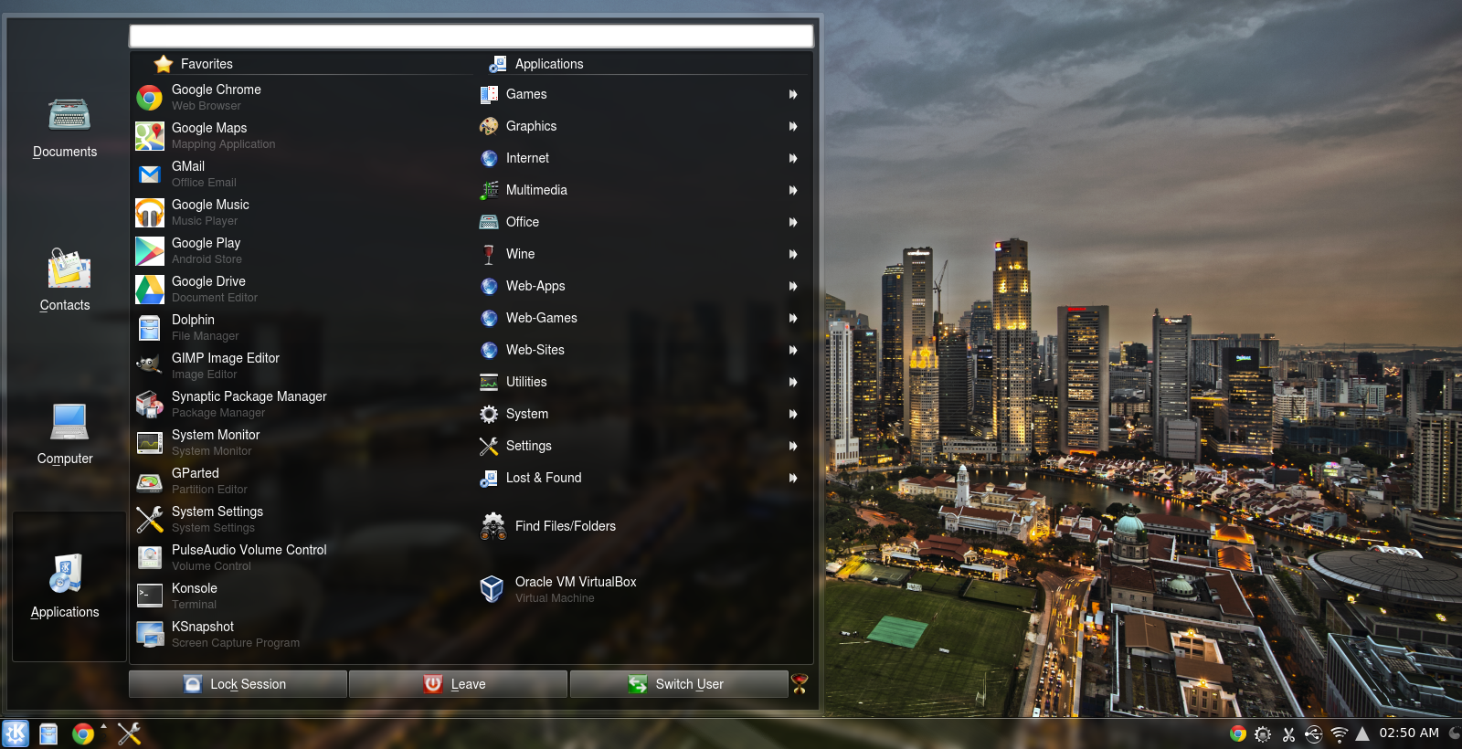
Unity’s main menu is also very different from KDE’s default menu. It’s called Dash and you can always find it at the top of Unity’s dock.
Divided in several sections, by default you will greeted by recent apps and documents (known as “Home”).
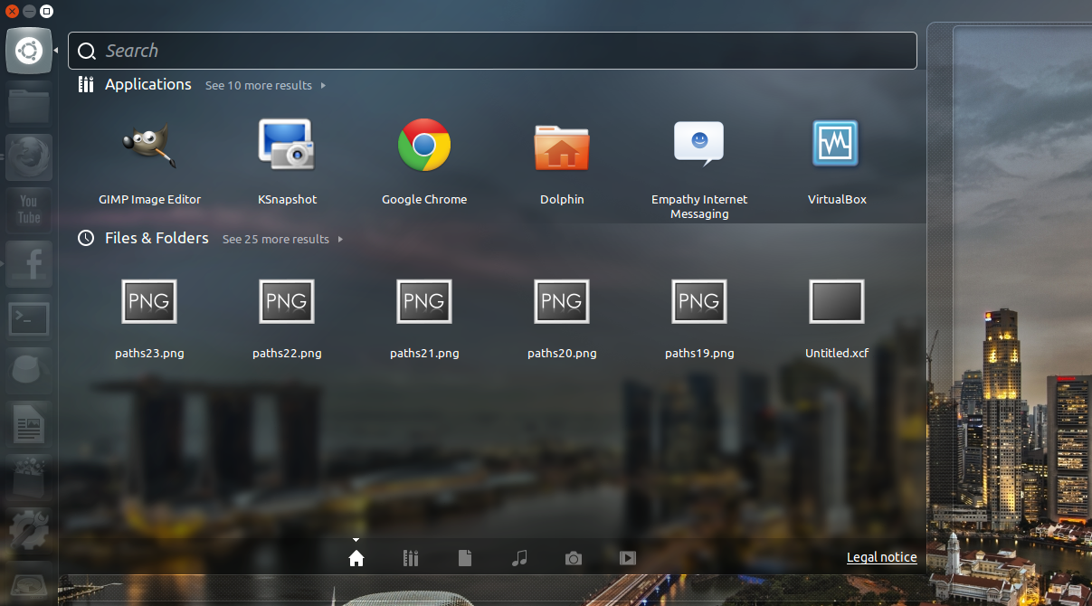
The second section shows recent apps and all applications. It’s worth mentioning that the menu is not really designed to browse through all your catalog, it just doesn’t work. If you want to find a particular app is better just to write its name and search for it.
The third one shows recent documents, the last elements in your Downloads folder and some of your home folders. You can expand each category, but again, I don’t think it’s well designed to actually find anything, just use the search functionality.
The fourth tab shows your songs. Fifth, your pictures and the sixth recommends you stuff to buy or download. I don’t think users will make use of any of the sections in the Dash, I just expect people to simply use search. You can drag applications to the dock to pin them.
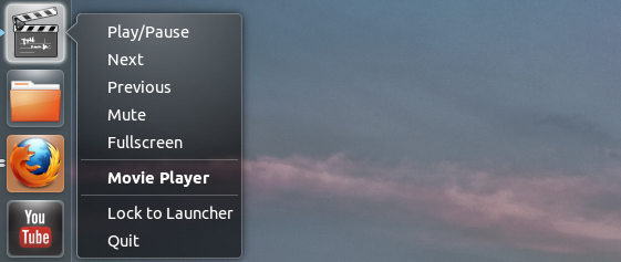
Not everything is negative. Some apps integrate in a very neat way with Unity, take Totem for instance, playback controls appear when you right click:
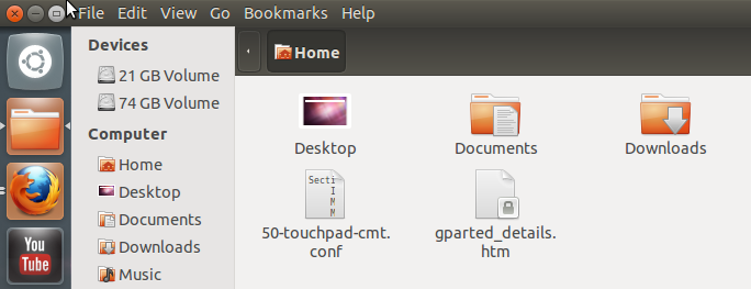
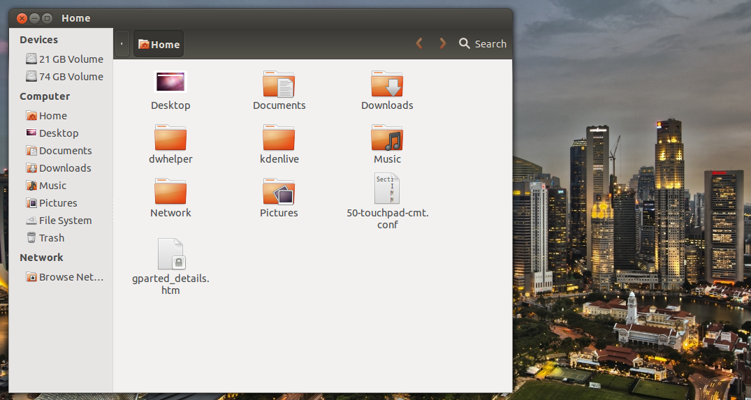
Applications are far simpler. As exemplified by Dolphin’s counterpart: Nautilus. Aside from a few basic tweaks it will never look or work different from its default behavior, so you better like your file manager and the rest of your applications as simple as it gets:
As a general rule you can expect GNOME/GTK apps in Unity to look clean. Most are also easy to use. On the other hand you shouldn’t expect to be able to change settings much if it all. GConf-editor offers more options (although still not nearly as much as KDE’s) than are available through the regular interface but not in a user friendly way.
Conclusions
While is true that some options in KDE are not as easy to figure out as I would like them to be, the undeniable fact is that Unity barely offers any such customization options. The question then is if Unity manages to be easier to use than KDE is out of the box. And the answer is no. If you don’t touch KDE’s default interface it doesn’t surprise the user with any form of cryptic basic interface design choices. In some ways Canonical seems to have decided to change things for the sake of changing them.
Canonical has also chose to hide settings from users or just plainly chose not to offer any. In this regard is where the difference in the paths chosen by KDE and Unity is mostly found. The people behind KDE wants to offer as many options as humanly possible in the simplest way they can think of, Canonical wants to offer the simplest interface possible, and that includes removing what they deem may confuse the user. Ironically, Unity mostly fails in this regard, and while it certainly lacks options it doesn’t come out as simple to figure out.
Is Unity a bad experience? No. You get used to its ways, but it will slow you down. When it comes to KDE’s interface issues, they seem to only show up when you want to tweak your desktop, if you don’t want to customize something it won’t get in your way and will be happy to work in a very reliable, efficient and intuitive way.
Basically Unity is unusable crap (like Windows 8).
KDE is the most usable desktop for any OS.
i do every day
Don’t use either, and find neither very attractive.
KDE is certainly configurable. But, for me, that amounts almost entirely to turning off things I do not want. KDE does a lot that I don’t need to do. Plus, the standard KDE menu is annoying and a pain to use. Finding anything requires moving the cursor hither and yon, with no discernible pattern or logic. To be fair, all menus suck when they grow too big. KDE’s menu is way too big.
Unity delivers an ugly, unshrinkable, dock and a cluttered busy hard-to-read HUD/Lenses/Whatever.
Now, I have my own tastes, and they do not lean to dark themes, icons on the desktop, or white on black text. But, tastes or no, I’m not prepared to look at either KDE or Unity all day long. Or use them.
Ever since I started using computers with OS/2 Warp 3 in 1995 I’ve used all the biggest OSes and desktops. And I have to say that KDE easily comes out as the best desktop ever created. I love it how modular the desktop is and how I can reconfigure it to fit my personal favorite workflow (which also depends on the current activity I do). KDE is way ahead of anything else currently available.
I switched my Ubuntu to use KDE desktop in February and I couldn’t agree more with this article. I’m really falling in love with KDE and this menu in window titlebar thingy is just genious. And there are many gems like this in KDE. Just fabulous.
Extremely biased article, especially on Unity.
Unity is all about simplicity as in lack of functionality that is mostly not needed and hiding things so they don’t get in a way. For people that prefer job done, Unity is awesome. It does not slow them down.
However, for people who want to create own desktop, KDE offers nice sandbox with lots of options. Those people tend to waste several days to form own concept and *then* start to get job done. Well, I have nothing against this approach, in fact I tend to belong to this category of people.
But when such person tries to review completely different desktop, articles as those appear. Useless and biased in every single sentence. Stuff like “intuitive” aka “got used to, everything else is now not ok”, followed by various subjective claims and recommendations.
My opinion is this: Do KDE and Unity fullfill different segments of desktop users tastes? Yes.
Are they both usable? Yes.
For example, I use KDE, but when I need fast system to do job done installed on bare hardware, I put Ubuntu there and lets-go. Or when I have an old computer-cluess person, I setup Unity for him, not KDE. Because I want this person to start off quickly and not delete all panels or something like that.
So, its a win:win. But author should learn to filter personal taste from usability cases, or many similar trash articles will appear.
I believe you’ve fallen victim of what I mentioned at the very beginning of the article:
“some will complain that no interface is more intuitive than other but that’s a patently false extravagance not worth discussing (some interfaces are definitely easier to figure out than others).”
And the article, although I talk about the differences in the extension of customizability offered by both environments, also reads:
“I got to admit that I do not consider Plasma’s interface to be intuitive at all”
And, more importantly:
“While is true that some options in KDE are not as easy to figure out as I would like them to be, the undeniable fact is that Unity barely offers any such customization options. The question then is if Unity manages to be easier to use than KDE is out of the box. And the answer is no. If you don’t touch KDE’s default interface it doesn’t surprise the user with any form of cryptic basic interface design choices. In some ways Canonical seems to have decided to change things for the sake of changing them.”
So the conclusion is based on how these two behave out-of-the-box, without taking into account how customizable they are.
About that unity menubar “Moreover, it automatically makes it impossible to know if there’s a menubar to begin with. Anytime a user installs a new application he/she is forced to check manually if there’s a menubar”.
If you start an app menubar will fade out only after 2seconds AFAIK.
My opinion about Unity, it is just unusable.
I have been using windows and many linux distributions and some old unix os since long time. Unity is just the most unusable interface I had seen. KDE is really a professional desktop. I have been doing professional work with KDE for sometime. It is certainly the most mature desktop we have in Linux. KDE just works!. If you want productivity just use KDE. Of course, as we all use Linux, we are all free to change the desktop to any one we like, unlike windows….
In my personal opinion: best choice, Debian Wheezy plus KDE.
Greetings to all Linux lovers.
A.
i have the same opinion about kde
I believe most people are just resisting to change. Unity is great.