LibreOffice 4.4 review – Finally, it rocks
LibreOffice is the flagship office suite for Linux. It’s also quite popular with Windows users. As a free, open-source and cross-platform solution, LibreOffice allows people to enjoy the world of writing, spreadsheets, presentations and alike without having to spend hefty sums of money. The only problem till now was that it didn’t quite work as advertised. Microsoft Office support was, for the lack of a better word, lacking.
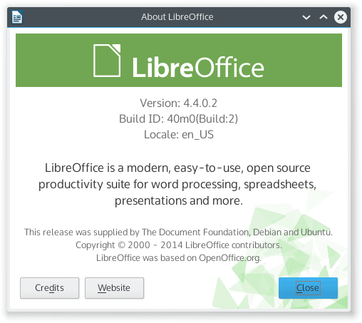
Version 4.4 is out, and it promises a great deal. A simplified interface, new looks, much improved proprietary file format support. Sounds exciting, and as someone who has lambasted LibreOffice for this very reason in the past, I felt compelled to give this new edition its due rightful try. On top of Plasma 5 no less. So let’s see.
Installation
There are several ways you can obtain LibreOffice. Official and unofficial repositories are available for various distributions, self-contained archives, installers in the DEB and RPM format, and best of all, Kubuntu Vivid Beta ships with LibreOffice 4.4 out of the box. It’s Bob’s your uncle and no mistake!
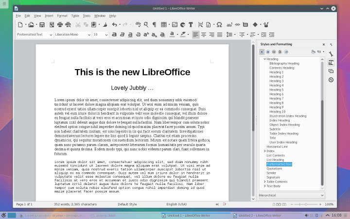
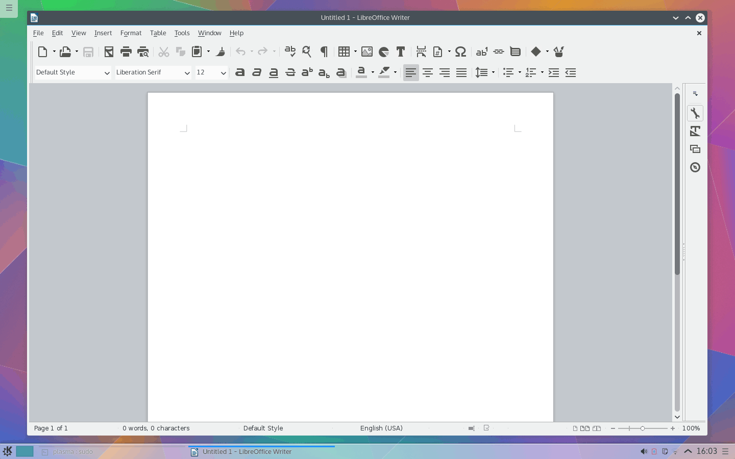
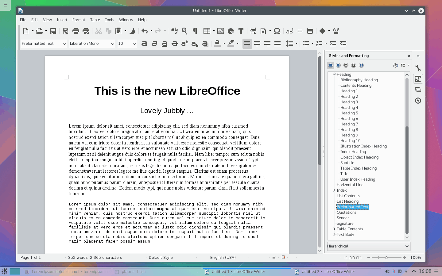
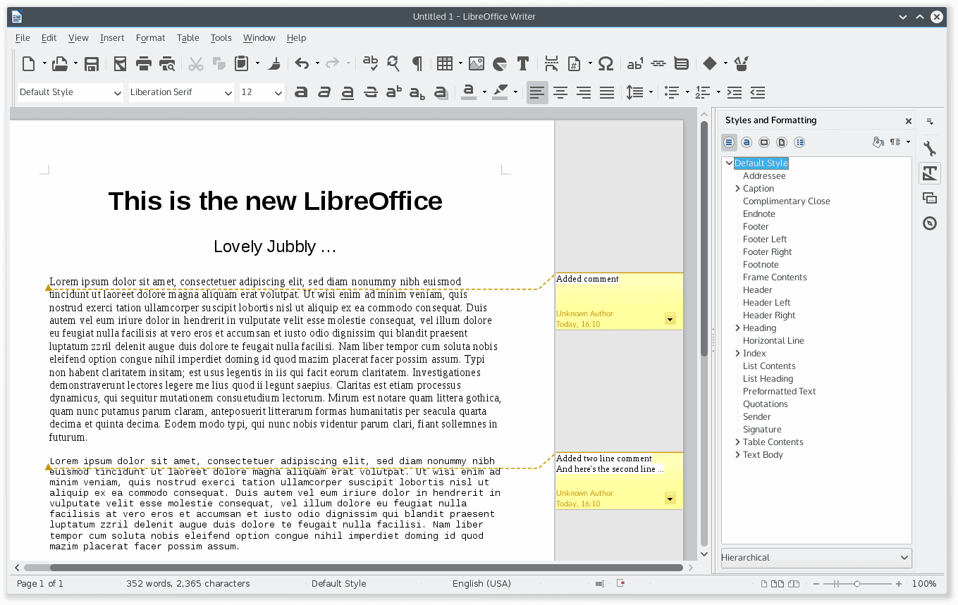
To make my test even prettier, I improved LibreOffice with the Sift set of monochrome icons. Now, I know that everyone’s done this already, which makes my own attempt slightly lame, but you will have to forgive me. Anyhow, the new version of the office suite comes with many improvements. To name just a few, in Writer, you get a smart, quick-action sidebar always active on the right side of the screen, cloud integration, a better way of managing styles, import filters, and more.
Working with LibreOffice, free ride
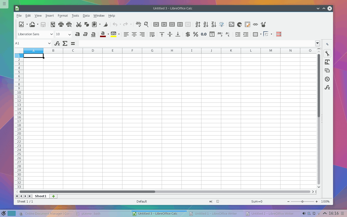
I am slightly ashamed that I used an Alanis Morissette reference, but I couldn’t resist, Dr. Schultz style. Right. The moment you launch any one of the LibreOffice application, you notice the improvements. Immediately. Most of the focus is on making Writer look the part, which is understandable, and it sure does not disappoint. It’s a better product. Period.
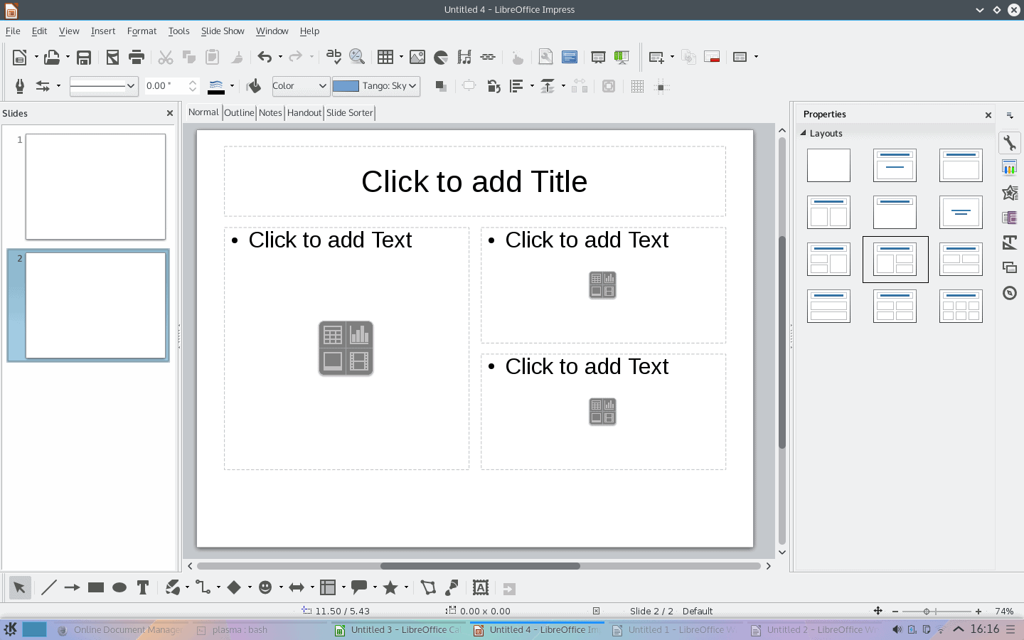
The rest of the suite is also better, more elegant. The programs are simply more modern. Although some of the menus and options swim with unnecessary abundance, and some of the work flow schemes remain distinctly archaic and slow, LibreOffice is more intuitive, and therefore, more productive than in the past.
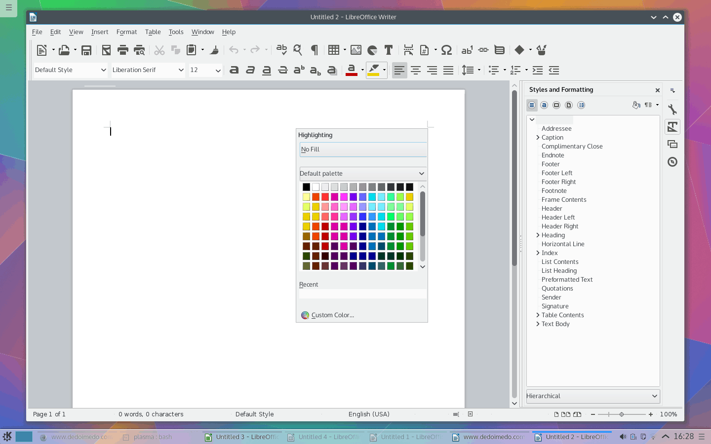
If you activate some of the toolbars and start clicking around, you will notice that the icons and options will change in a contextual manner, similar to how the Ribbon was realized in Microsoft Office. This is not an optimal solution either way, but it’s a nod toward a convention, and may help some of the new users get accustomed to the suite. It also helps reduce the clutter, although the perfect productivity formula lies elsewhere. Not with Microsoft Office, nor LibreOffice for sure, but that’s a completely different story.
Still more fun
I kept on playing and testing, and started enjoying myself more with each new step. The sidebar is highly useful, especially if you like to work with Styles. Previously, this functionality was a little weird, a little clunky, but now, it’s just right. Again, we’re talking about tiny changes, but they make all the difference. A step toward Microsoft Office, two steps away, and you get the right balance. The thing is, if it’s fun and pleasant, it ought to work in the end, and that’s grandma’s hidden ingredient.
The most important part, Microsoft Office support
You may not like or ignore Microsoft, but the thing is, most if not all people out there use it to create and view documents, which means that sooner or later, you will have to send someone a file created in Office, because you cannot afford to have any conversion glitches in your important work. You can use Microsoft Office Online in Linux, and that’s a neat solution, especially since till now, LibreOffice simply wasn’t accurate enough in converting ODF to DOC/DOCX and vice versa, as I have outlined in my comparative reviews and test. That was a pretty big limitation, which essentially made LibreOffice inadequate as the default office suite for the majority of users in the world.
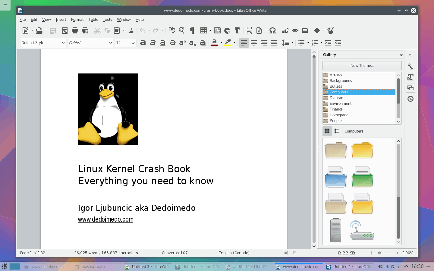
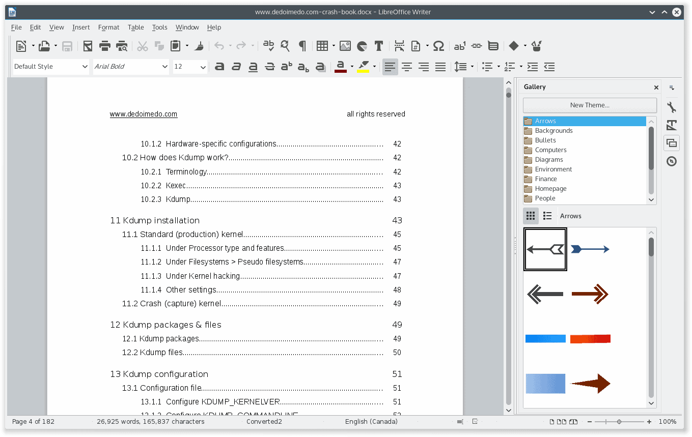
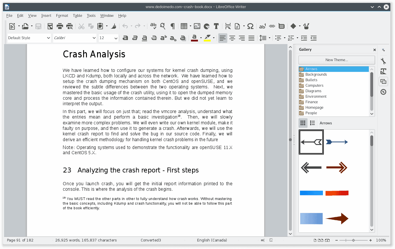
Well, this new version promises a revolution. To see whether it can live up to everyone’s expectations, I decided to run a fairly complex and brutal test. Remember my cometdocs article? Back then, I took my Crash book, in PDF format, and converted it to a DOCX file using this online utility. When I tried to open it in LibreOffice, the results were simply catastrophic.
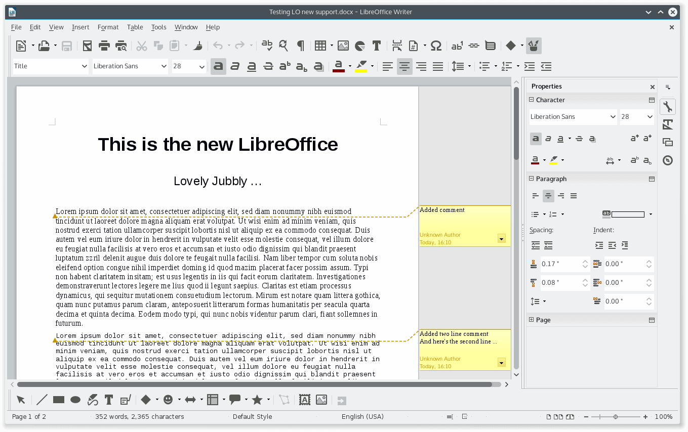
Here and now, the game has changed! Completely! Utterly. The quality of conversion in LibreOffice 4.4 is very good. Perfect? No, not quite. It can never be perfect. But my 182-page document, full of images, references, footnotes, preformatted code, and other cool elements, all of which were initially conceived in LaTeX then transformed to PDF and finally to DOCX looked pretty much spotless. The image quality was a little low, but it has nothing to do with LibreOffice. I was amazed. I had not expected this, and it seems for the first time ever, LibreOffice is a most viable solution for home office use. Blimey.
Conclusion
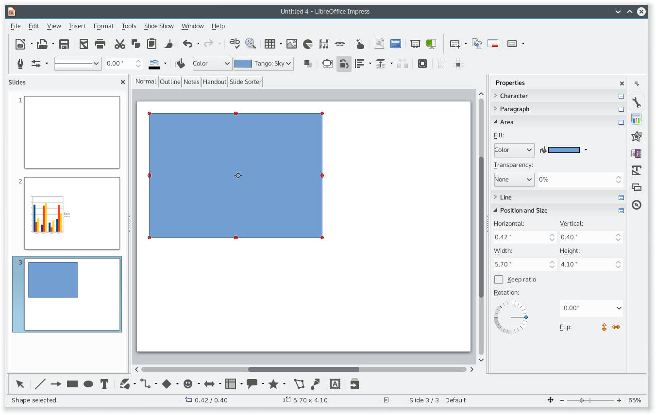
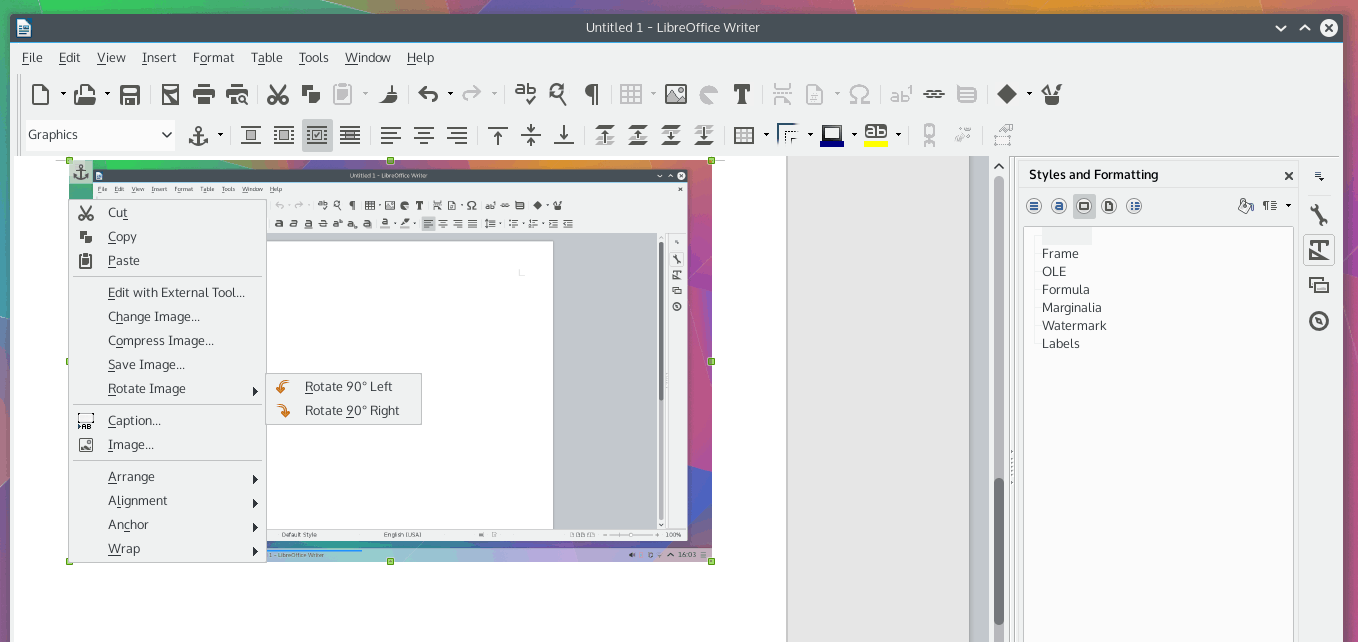
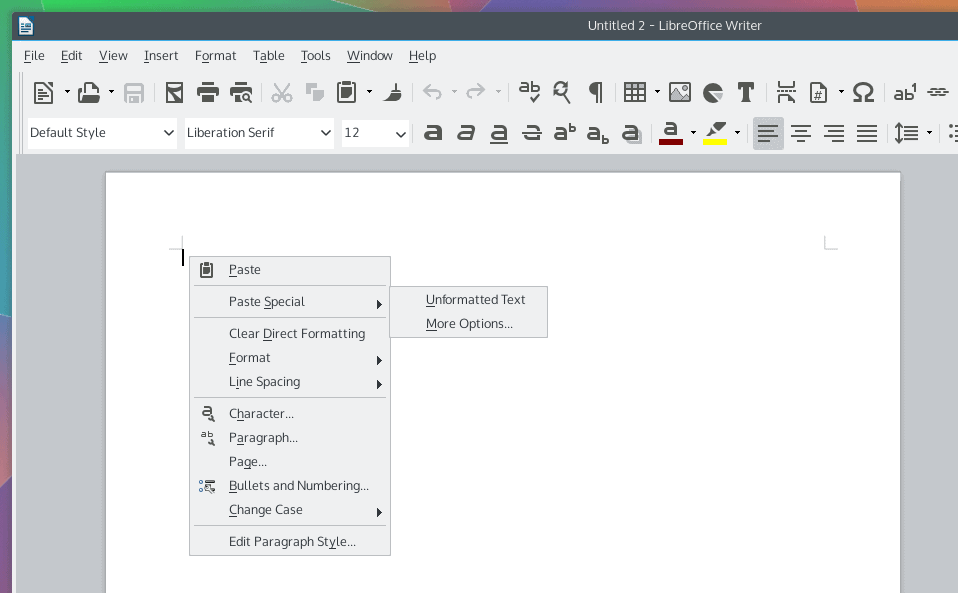
LibreOffice 4.4 is everything you could have hoped for, and then some. It’s beautiful. It’s streamlined. It has an improved UI, which offers much more intuitive work flows, resulting in an immediate boost in productivity. It comes with enhanced menus, a more intelligent way of working with styles, easier graphics, copy & paste options, a simpler method of polishing up presentations. Most importantly, it offers a genuinely good support for the proprietary Microsoft file formats, allowing you, for the very first time, to consider LibreOffice as the one and only office suite you’ll ever need.
I have never quite expected this. In fact, LibreOffice 4.4 should have been called 5.0, because it is that much better. Perhaps grander changes are needed to justify a full new release. Just think of the possibilities, if we got all this in a single dot revision. Imagine what will happen when LibreOffice finally matures toward the next large release. Seriously, the day of testing could not have turned out better. All the little things I wanted are there. Check. Everything purrs like a kitten engorged on baby seal livers. Check. Awesomeness everything, and I am searching for more fanatic wording to convince you that you should abandon all and everything you’re doing and start testing LibreOffice. This is a monumental release, and I only have absolute praise. Well done.


Great review!
How does it compare to kingsoft WPS Office. Which one would be the best option for someone who regularly has to send and receive docx files?
WPS has better docx compatibility. Unfortunately WPS doesnt open odf files, isnt open source, and is reportedly not very stable as its still in alpha.
Enjoyed the article. Would be good to also compare Calligra Words the next time you want to test linux capability of opening docx files.
I use LibreOffice all the time, and really enjoyed your review.
Clearly you did not try to insert and work with a graphic. That is now a royal mess.
I didnt have any problem inserting and working with images. What problem are you having?
I agree with every word the review said. Add to the arsenal Dia, PDF-shuffler, Gimp and Inkscape and you get all the tools you need to deal flexibly with any documenting hurdle. That’s how I juggle docs, pdfs, graphs and what not through copying, cutting, pasting, editing and so on.
Best (non-Burroughs) Crash self-insertion in the canon so far. You stuck your hand under the frontpiece and seem not to have had 8 servers (indexing, various network clients, ledgers and consumables logs, graphic editing state (as alluded to,) etc.) stuck on your nails when you let it fall back in place.
Great article, LibreOffice is the dominant office suite in my household.
Still hesitant to go back to LibreOffice after my bad experiences with it over the years. The last time I tried it was Dec. of 2012 and at that time I was hoping they have ironed out all the kinks. Perhaps they have improved a lot since then but I’ve also given them many chances over the years to change my perception of it, only to be let down time and time again. I’m gonna try their latest release but I’m cautiously optimistic.
I started in 1985 to work with MS Word which replaced Wordstar. With Windows 3.1 I switched to WinWord 2.0. I think I switched then from Office 2000 to StarOffice in 2003. Moved then to OpenOffice and then to LibreOffice. The main reason for my switch was the pathetic stability of Office 2000 with long documents (100+ pages). I always lost documents with MS Office and had to return to backups. I am still working with very long documents and was never let down by Star/Open/LibreOffice. StarOffice I was even using in an X-shell on MacOSX. That worked very well. There have always been some little, annoying issues but the software worked generally very well for me. The complex styles I created 14 years ago are still working – and that with minimal adjustments over the years. Transitioning with all my old documents from release to release was never an issue. I removed in Ubuntu 16.04 LibreOffice 5 and returned to version 4.4 due to stability reasons of version 5. It seems to me that a lot of momentum was lost since Oracle bought Sun. But I can’t imagine a life without LibreOffice and Linux. Already thinking about returning to Windows & MS Office appears like a nightmare to me :-) Then better stop to use computers at all …