My Wish-fix-list: System Settings and GWenview

Some of you probably remember the big transition from KDE 3 to KDE 4, if you were not part of the community back then, put your seat belts on because the next version of KDE will be KDE 4’s last major release. Will try to keep you up to date about a new developments or plans (especially, when there’s something user facing we can show you), on this series though I will just complain about stuff I wish gets fixed by the time KDE 5 arrives.
Wish 1. Fix System Settings
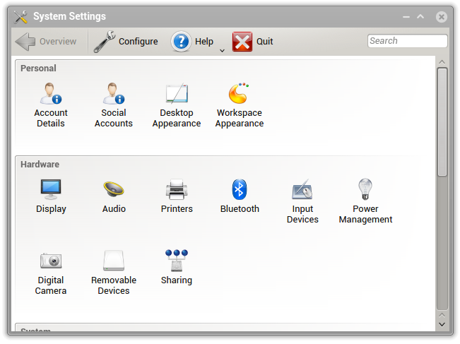
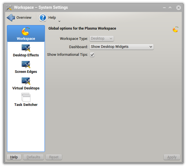
I will beginning by noting that things have improved, yet KDE’s control panel is still a mess that wastes space like there’s no tomorrow (or like if ours monitors had infinite area):
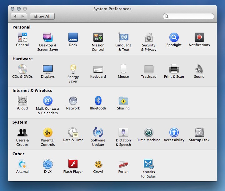
Take a look, for example, at Mac OS X’s system preferences, it’s way tighter, it takes less space and shows more icons, not less. It doesn’t look cluttered or confusing, and is divided in sections too:
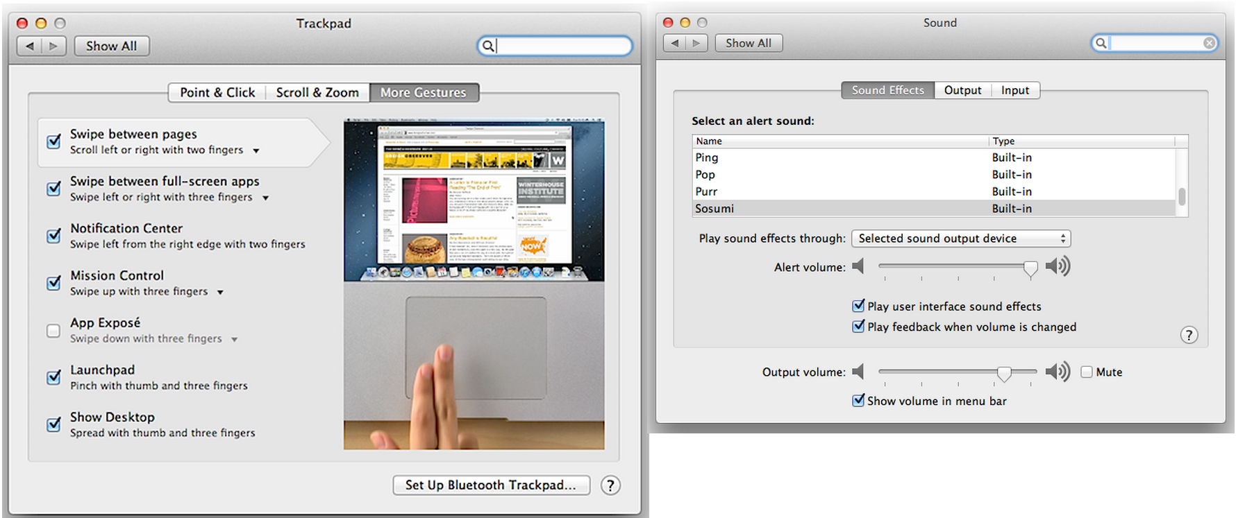
Another cue worth taking from Apple is fixing the windows size, then different sections expand or contract the window accordingly:
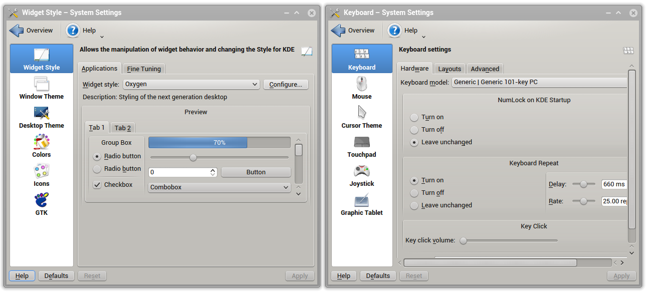
As opposed to the current system which causes countless problems (and I didn’t pick a particularly bad case):
And I would like to give developers a small advice: If a section contains too few options… that section shouldn’t exist:
Also, don’t do this:
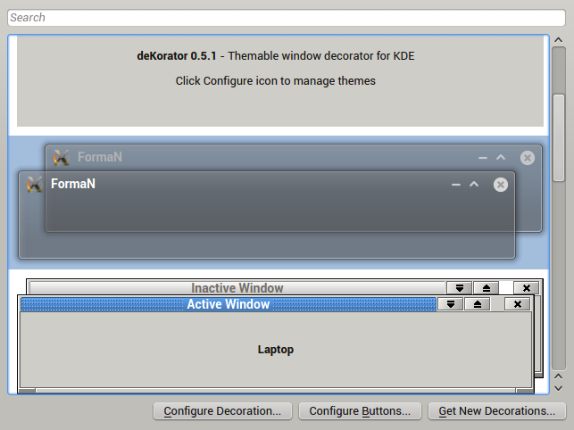
Or, perhaps worst of all, the following kind of menus to select anything. Since only a few options can be displayed at the same time it involves way too much scrolling, since there’s a few items per view scrolling is also confusing, and it looks very cluttered:
Wish 2. Fix GWenview
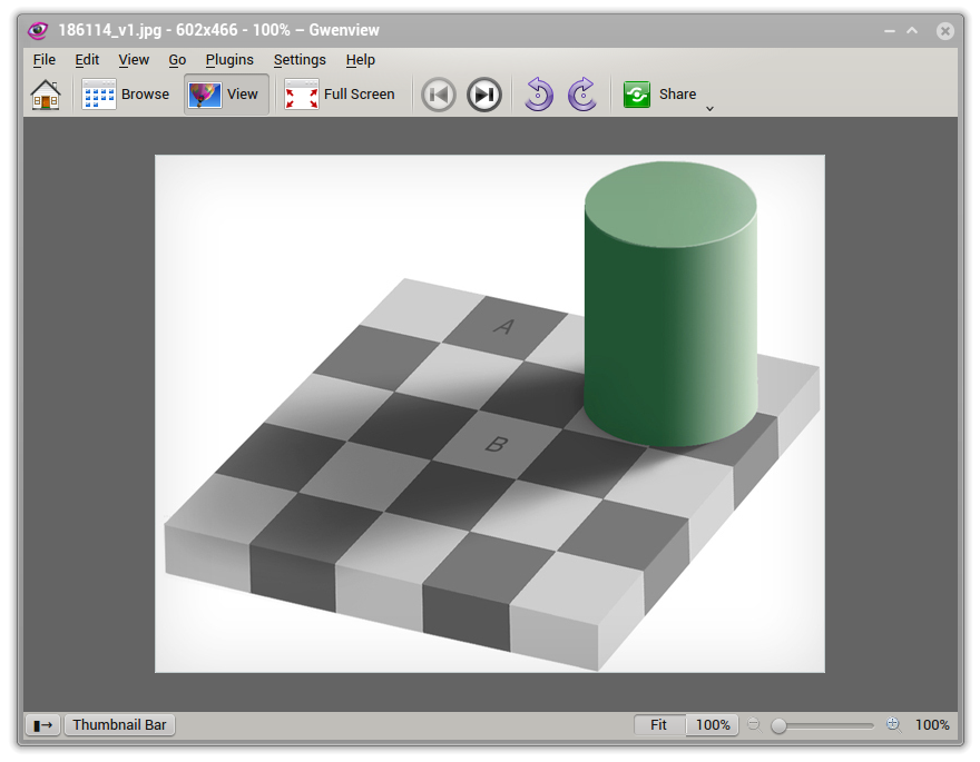
GWenview is a solution to nobody’s problems. As a fast image viewer it’s not particularly fast and it presents too many distracting options, as an application to edit pictures (even as a lightweight editor) it falls short. So imagine you open an image you just downloaded and double click it, you clearly just want to see the picture, so then why does GWenview shows so much stuff:
How many times is someone going to open a picture and then use the menubar? Let me count that for you, zero. In the same spirit, who exactly is opening pictures by clicking File > Open? Nobody is, not a single human being. As an application to show pictures it just adds unnecessary clutter, at most, GWenview (at least when you externally call it to open a picture) should show: Rotation, Fullscreen, Next, Back and Share (Android-style sharing, e.g. opening with other app or upload to Facebook). In the least intrusive way possible.
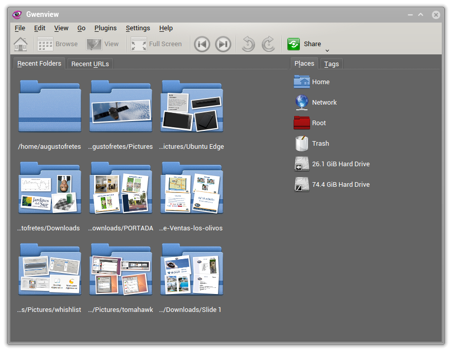
GWenview’s developer(s) invested quite a lot of time and resources making the experience of browsing images enjoyable. There’s only one problem: Nobody is using it like that. If you want to manage your collection of pictures (or if you’re a photographer) GWenview just doesn’t cut it, it’s simply not a Shotwell or DigiKam alternative, just to start with it lacks a library.
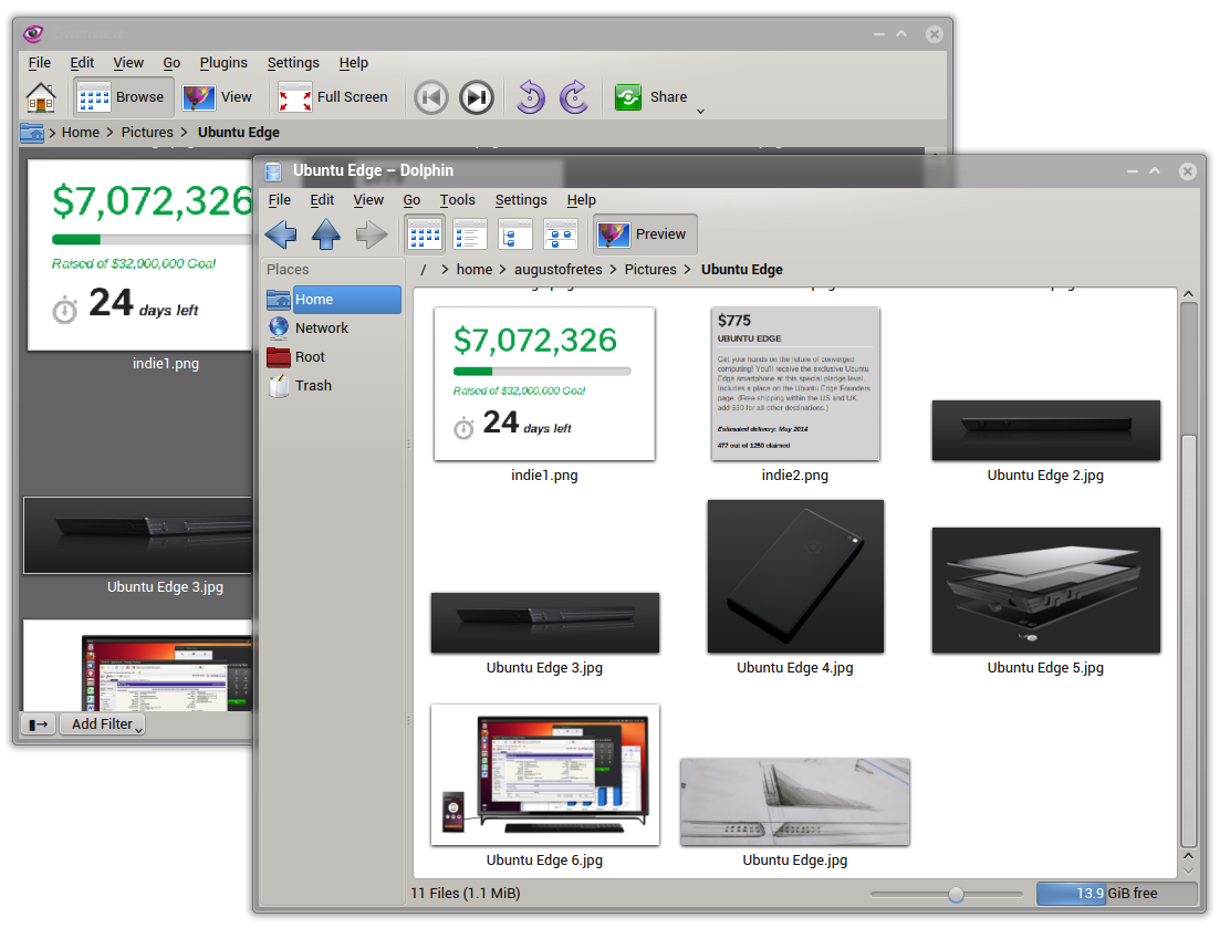
It looks good, but it assumes the wrong workflow, if users want to open one or multiple pictures they first open Dolphin, find the pictures then they open GWenview. Even once they’ve opened a picture I don’t think they will browse for more pictures using GWenview, most users will close GWenview and browse their filesystem using Dolphin again. In other words, it’s completely redundant to have a file browser that only displays images.
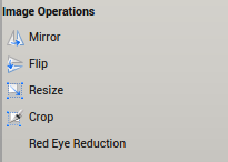
GWenview also offers basic editing features and supports Kipi-plugins. The basic editing features are seriously basic and Kipi mostly adds importing and exporting options.
Besides the fact that using the phrase “export to” instead “share to” is just asking for problems, the ability to import pictures (from different cloud services) will go mostly unused because GWenview lacks a library.
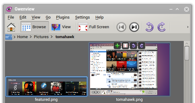
There’s also cases of adding clutter for the sake of clutter, take a took at the options that appear on hover:
I understand the concept, an easy way to turn your pictures, or go fullscreen to that specific picture. But GWenview is already showing an option to rotate pictures or go fullscreen right there on the toolbar, it’s one or the other, there’s no need for both of them. Moreover, there’s a problem of consistency, Dolphin has the plus icon (that appears on hover) to select icons off by default, why is turned on by default on GWenview? (Or better yet: Why isn’t it turned on by default on Dolphin?)
So how do you fix this mess? KDE 5 needs a photo library application (more like iPhoto or Shotwell, and less like the current GWenview) that supports plugging into different cloud services (Facebook, Google+, Dropbox, among other), the best way would be to provide some sort of API so new services can be added afterwards. Here is where most editing options should live on (plugin support would be greatly appreciated), filters, cropping, imaging adjustments, etc, all in a non-destructive fashion.
Then it needs an application to the mere opening of pictures, it should be pretty bare bones and as uncluttered as humanly possible. It could be the same application for both things, but it needs two faces, one for each usage.
So there you have it, the first part of my wish they fix it list (or wishfix). I’m sure some readers also have their personal list of what¡s wrong and needs fixing, if so, please share it with us in the comments.


I think your last image is incorrect. You may wish to update it.
Oh my, you’re right. Thanks :D
I spent quite a lot of time to unclutter KDE apps’ toolbars, removing unused items and button labels.
I think functionality wise, they are usually top notch, maybe trying to do too much where GNOME apps do way too little, but the default interface is way too cluttered for my taste.
I agree wholeheartedly with your wishlist.
Well, I use Gwenview pretty much to browse folders. The main reason is to not change the default dolphin icon size, not view other files and not reopen the app if necessary. But there is years since I started the fullscreen mode last time.
Every persona have different workflows.
I tried Photo (http://photoqt.org/) for a time and like the speed (achieved not closing the main app), but miss a navigation mode.
Maybe Klook of ROSA will be a better solution, but I never tried.
DigiKam have the problem of be too slow to start for a casual browse/view and the collections not reflect on filesystem, but the last is a matter of taste.
I’m sure there’s people that use GWenview as intended, but default applications should be designed to cover in the best way possible the needs of the vast majority of users, GWenview doesn’t meet this criteria.
tip: You don’t need to change the default icon size since Dolphin supports different settings per folder.
Vast majority of users? Sure, but can you support the idea that your view represents the use cases of the vast majority?
I too enjoy Gwenview’s image browser features.
The menu bar has a certain consistency about it (i.e. consistent with other programs)
and I would like to think it is neither too intrusive nor too complex.
Not being library-based is an advantage for me, as I swap drives
frequently enough to make such “virtual folders” impractical…
The cloud issues sound important, but I hope they don’t cost me
my image browser.
Possibly way round this kind of role conflict might be
to have a cloud/library mode for sophisticated users, and a local/simple mode
for looking at folders of images already saved to disk as, say, numbered camera downloads. Yes, I still own & use a camera:) – hence, full screen slideshow mode
is often in use.
@Cochise César – you are making a great point – the compact list view in Dolphin
is a convenience made practical by having Gwenview as Dolphin’s partner application.I never noticed that before.
you’re right ,That’s why I like gwenview.
“In other words, it’s completely redundant to have a file browser that only displays images.” – but this is exactly the way I use Gwenveiw… and lack of these features is irritating in XFCE’s and Unity’s image viewers.
That’s why I like gwenview,