Razor-qt review

A few days back, we reminisced on how KDE changed from version 3.5 into version 4.0, and, in that a great social split was created in the Linux community. The Trinity Desktop Environment project was created to address the gap, and a new desktop was born. Sort of like MATE.
Today, we will talk about Razor-qt, a desktop born with a different mission statement. It does not come to satisfy our emotional needs; instead, it is supposed to be fast and light, while being based on the Qt technologies. In a sense, this makes Razor-qt somewhat similar to LXDE. Once again, it’s no stranger, because we had a brief encounter sometime in 2012, when it was still awfully young. Which makes this article a mirror of the TDE attempt. Let’s see what gives.
The tour begins
Finding the right distro to play with Razor-qt was just as easy – or difficult – as doing the same experiment with Trinity. I tried using various repositories, to no avail. Eventually, I decided to look for a distribution that ships with Razor-qt out of the box. There are not that many, which is not a good sign, almost two years down the road. Still, I did find a likely volunteer in the form of SparkyLinux, a recent veteran of the Dedoimedo cauldron of fun and torture. So, what we have here is also an indirect review of the said distribution. Makes for a doubly intriguing post, no?
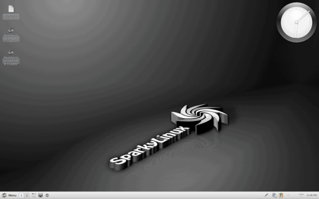
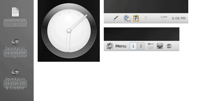
SparkyLinux with Razor-qt is an interesting beast. The dominant colors are gray and white, and then you start noticing all kinds of details: the big analogue clock in the top right corner, the desktop shortcuts with a solid background a-la older releases of Xfce, plus text that overflows the borders, nice icons in the left corner of the bottom panel and ugly, barely visible and inconsistent icons on the opposite side. A mix between lovely and crude, with a touch of fuzzy grayness all over. Let us not forget the digital clock in the system tray that makes the big one rather unneeded.
Connectivity & applications
On the other hand, when it comes to using the distro, or the desktop environment, or both at the same time, as it is hard to distinguish between the two, Razor-qt was easier than Trinity. At the very least, I had instant network connection, which is a bonus in this age.
The variety of application was also rather surprising, but I am not sure whether to blame the distro or the desktop environment. Some of the items do feel like a part of a larger bundle, but while I can relate to software being KDE-centric, Gnome-centric, and maybe even Xfce-centric, I am not really certain how to classify Sparky, or the collection of apps and tools distributed with its Razor-qt edition. For instance, the screenshot program lets you take the whole desktop or selected areas, but not active windows. You have no freedom in choosing the delay other than several presets. The software leans toward the lighter side, but some of the options are clearly crippled.
Ease of use
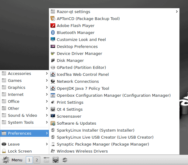
Razor-qt ships with a simple, linear menu and no integrated search. Trinity is friendlier in this regard, although both lack some of the modern quick-fingertip response you expect from the system. We will probably discuss this some more when we give Xfce, MATE and some other desktop environments their own separate reviews.
Furthermore, the menu reveals the overall workflow of this desktop environment. It is a hybrid concept with ideas borrowed from all over the place. You have the system settings menu plus individual options all there, creating a fair dose of clutter. Not as bad as Enlightenment, but still pretty hectic. Sort of where Xfce was two or three years back, kind of a recurring theme here.
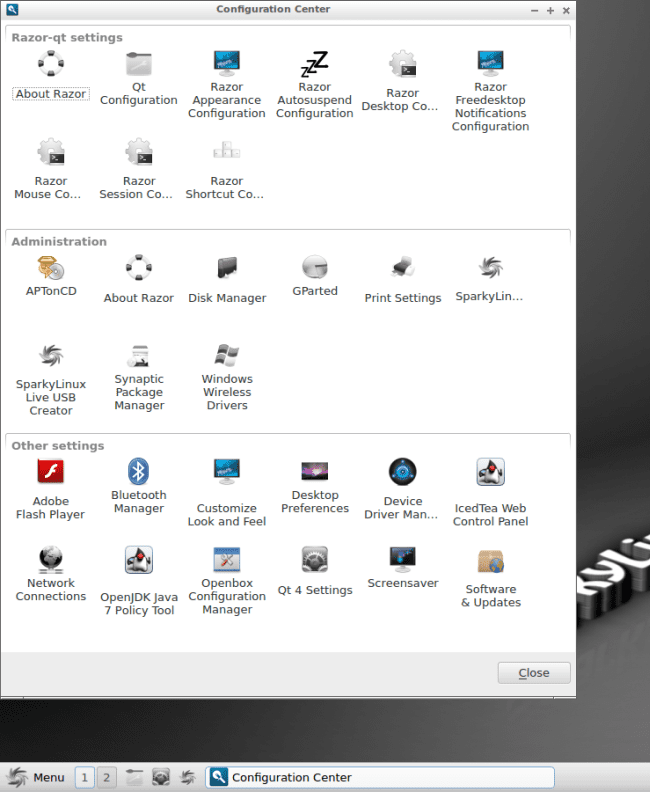
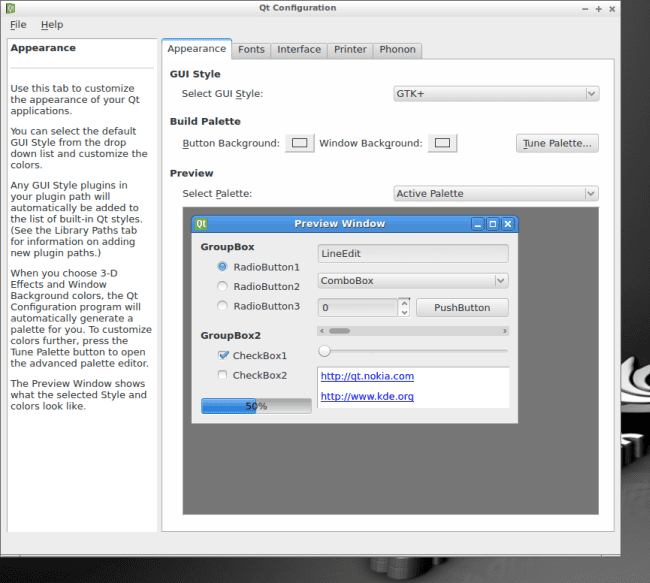
If you’re in a mood for a more centralized approach, you can try the Configuration Center, which includes several categories. You have the Razor-qt specific items at the top, and then everything else below, more akin to what you’re used to these days.
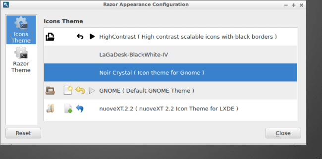
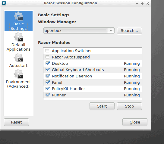
At this point, a subtle tweaking nightmare begins, because you have so many menus where you can change things. The overall consistency of behavior is missing, leading to an emotional jarring experience, even though you can configure everything. Well, almost. I did struggle finding new window decorations, and most icons did not do much, or offered the same looks. I was a little dismayed by not being able to make the desktop session sexier than it was. Then, I struggled adding new icons to the bottom panel, and the file manager was only available deep within the menus, and nowhere easily accessible.
The granularity will please quite a few people, and there’s a marked improvement compared to the early releases, but then, the adoption rates have been lukewarm at best, and it’s hard to find Razor-qt in the mainstream Linux community. And if you’re wondering about its uniqueness, the special angle, you might be left scratching your head for a while.
Final results
Despite having an Internet connection, I struggled finding quick guides for taming Razor-qt, or at least guides that might help me make it more appealing. My biggest contribution was changing the desktop wallpaper, and that’s not a lot. The icons, the solid color background, the overflow, the bottom panel, they all remained a frustrating, alien challenge that I have yet to master. Spoken with a pinch of sarcasm and alike, but it sure does highlight the problems associated with Razor-qt. There were no outright errors like with Trinity, and the desktop environment was more accessible overall, and yet, it gave me a few nasty jolts, throwing me back to the beginning of the previous decade, with an E17 kind of mentality abiding.
Conclusion
Hard to say how I feel. On one hand, Razor-qt is making progress, but it may be the wrong kind of progress, and the lack of wider adoption is just as alarming and condemning as the time passage is ruinous to Trinity. On the other hand, Razor-qt seems to wallow in too much color, too much fragmentation, all the while refusing to don a personality of its own. Perhaps it is getting there, slowly, and the same way I was once skeptical about Xfce, it may flourish into a great mainstream alternative. For now, though, it is clinging too strongly to some ancient and weird concepts of what the desktop should look like.
Razor-qt is not good enough to replace the top darlings, and the performance benefits, while surely nice and impressive, are not orders of magnitude above anything that LXDE or Xfce can provide you, and they sure have a more robust, more well defined experience. So I would assume that Razor is at a crossroads, and this is the point where the future is chosen and woven. It can go down the ambiguity lane and continue using all and everything, without any substantial core idea, or it can shed some of its layers and create a unique, personal message for the users. That would be very interesting to check. But I fear that the same kind of mood that gripped Trinity might transpire here. A reactionary product, with little to no sympathy from the cruel world. We shall indeed see.
Cheers.



Hi I love all your reviews :-)
One comment though I thought that Razor-QT was merging with LXDE to make a LXDE-QT.
http://wiki.lxde.org/en/LXDE-Qt
Chris
LXDE and Razor-QT should, sooner or later, merge into a single QT-based environment, as stated here: http://wiki.lxde.org/en/LXDE-Qt
I hope this happens as soon as possible since they are both an “extra layer” over Openbox.
I agree with your overall impression of Razor-QT: as a KDE user I also tried it some months ago (Ubuntu minimal + Razor-qt from their repo). It didn’t impress me and it also was very buggy. It seems at least Razor gained a little more stability over time.
It’s rather unfair to review just now when it’s merging with LXDE. Atleast you should’ve waited for the 0.60 release, which will be the swansong release for all those distros packaging Razor-qt.
The merger has been steadily progressing, and you can try out LXDE-Qt to preview it. Lubuntu for example will be moving to it from 14.10, and you can expect other LXDE distros to follow suit.
Well, I can test again once they merge!
Dedoimedo
Whike i’ve only just recently found this blog (and the dedoimedo one), i can say i’m very happy i did! Very exquisite reviews righte there pal! I really enjoy reading them.
[…] of Navarre. We have a desktop environment that is a culmination of two separate projects, LXDE and Razor-qt, both of which underwent the Dedoimedo massage treatment in the past. Moreover, we talked about […]