A first look at LXQt
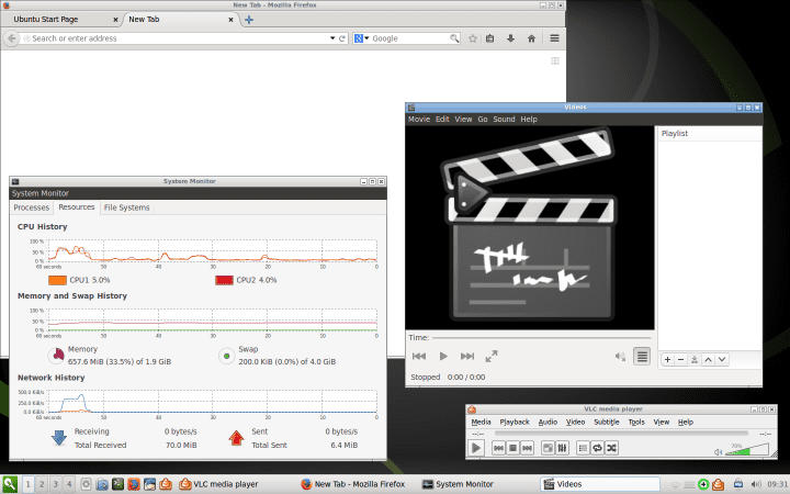
LXQt is the next generation of the Lightweight Desktop Environment, which means LXDE is dead, long live its successor. Yes? Something like that. Perhaps it makes sense. Rebuild the good stuff using a new, efficient framework. But then, reading some more, you will see that the word ‘port’ is used, which could indicate a branching of effort without pruning any old twigs. Hm, interesting.
Anyhow, I’d like to see what LXQt can offer. Is it a viable idea to even begin considering? Especially in a highly saturated sphere of Linux desktop environments, most of which are tightly coupled to distributions and entire applications stacks, making any introductions into the exclusive group as egalitarian as joining your local golf club. My test distro will be Ubuntu, only for the sake of convenience, so begrudge me not. Let’s roll.
Setup
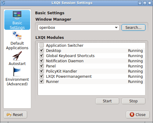
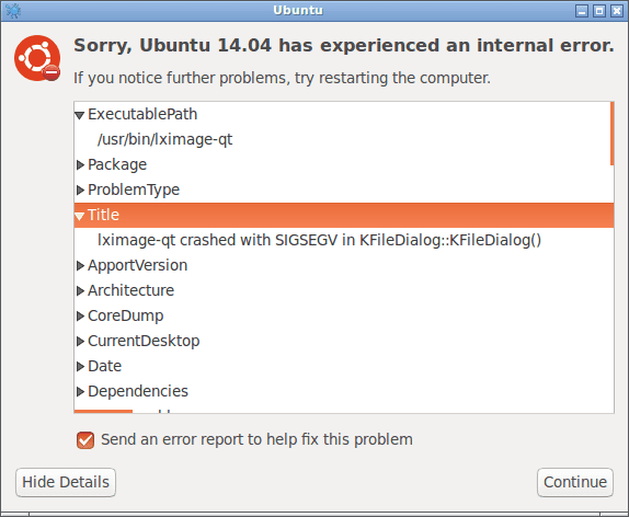
The installation was not as trivial as it seems. Sure, online guides tell you, add this or that PPA, run update and upgrade, then install the lxqt meta package, and you’re all set. This is not correct, and there are several steps missing from all these guides. When I tried to run LXQt the first time, which means I selected this option in the login screen, a window popped up, telling me that I had to choose a window manager. Naturally, after this error, LXQt simply failed to start. Logging back into the default Unity session on the test box, I had this:
The reason for the crash was a segmentation fault:
lxqt-session crashed with SIGSEGV in KFileDoalog::KFileDialog()
I figured that I didn’t have the right window manager. LXQt was missing a key component prevent the session from starting. So I fired up the terminal once again, and installed lxdm and openbox packages. Lo and behold, after this step, I was able to start the LXQt successfully. This is something that should pay attention to before testing.
First looks and hooks
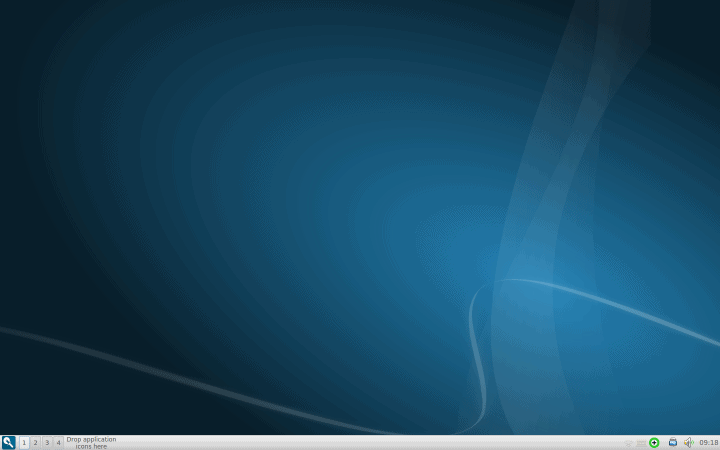
The default appeal of LXQt is a little tricky. You have KDE like icons in the system area, and they are not very pretty or informative, and the contrast is too low for the eyes. It is hard to figure out what the icons are doing, and their symbolic shapes are not accurate. Then, elsewhere, you have a bit of Gnome, KDE and everything else, as far as it comes to icons and shapes. It is as if LXQt is suffering from a mild identity crisis.
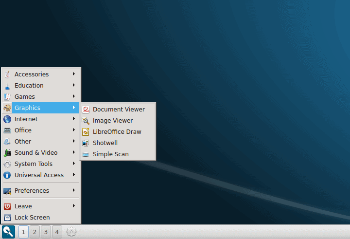
It’s not all bad, though. This is not an ugly desktop, but since we’re doing an early release early review, we might as point out some of the more glaring issues. The system menu is simple and functional, but it can be more engaging, and there ought to be some kind of search in there. Placing shortcut icons in the shortcut area works fine, but then you cant right-click a menu item and add it, or drag & move those already added. You will have to step them left and right one by one, and they come in non-uniform sizes and in different themes.
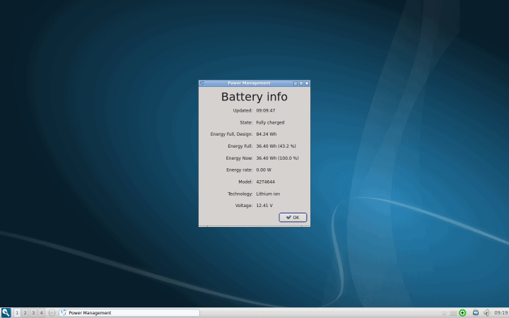
Overall, not bad, but slightly weird. For example, why would the battery applet be so big and why do I need it in the center of my screen? Furthermore, it all has to be uniform and pretty. Consistent colors, font type and size, DPI, shading, window borders and decorations. The underlying Unity DNA is seeping through. Must, not, happen.
Customization
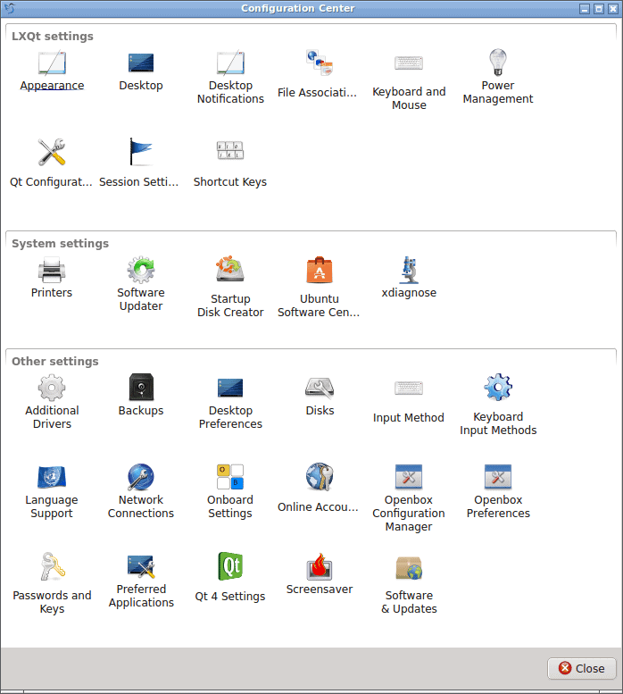
Again, there’s a bit of confusing here. There are two types of settings. Session and system, both available as separate entries in the system menu preferences. The former will do a very limited set of changes, and it’s not what you need or expect. You want the second wizard, and this is where you can put the power of your aesthetic imagination to play.
Icons & Themes
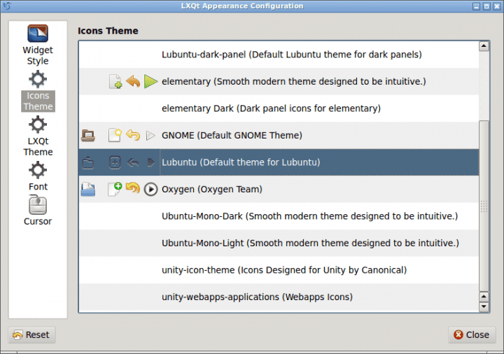
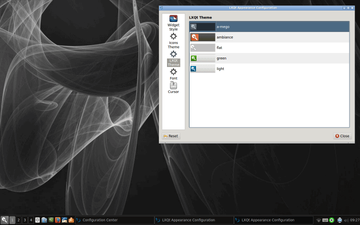
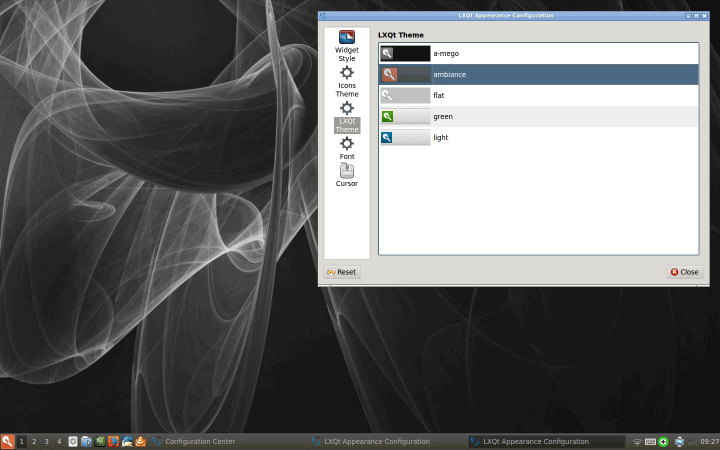
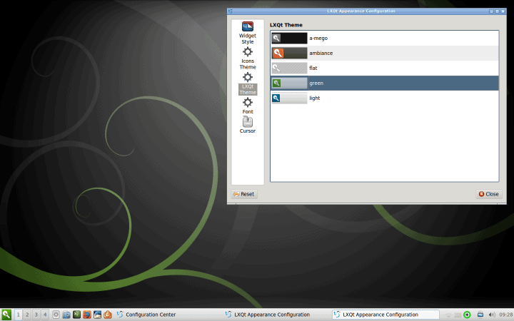
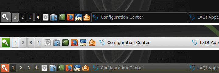
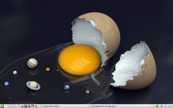
Here, you can finally make LXQt shine. Remember our review of LXDE, well, it’s the same thing really. Once you get past the default boredom, good things start to happen. There are some really nice icons and themes available, you just need to find and apply them. They also come with their own wallpapers, adding to the mood.
After a few minutes of tweaking, you might get reasonable results. The default ugliness factor is important, believe me. It looks too much like Razor-Qt, which could explain the Qt part. Not bad, but it sure don’t win no excitement award. Then, the LXDE legacy is obvious, but again, not quite here, nor there. The non-default themes have their own cartoonish spirit, and it infuses a bit of spice and fun into the desktop. Only the system tray remains untouched by your games, and that’s KDE, weeping in the corner for having been bastardized in such a shameful manner.
Using LXQt in earnest
Once you get past the initial familiarization shock, it becomes more natural if not perfectly settled as you would expect. Nevertheless, the desktop is decent. It’s not the prettiest yet, nor the faster or the most stable. I had some more crashes, a total of three or four in the span of about two hours, which is a darn lot. All of them point to KFileDialog(), so I hope the devs can make sense and fix this.
However, from the performance side, the system is snappy. Memory consumption is less than Unity on this specific test about by a handsome 150 MB less without any applications running, and the CPU activity is also somewhat reduced. Overall, you do feel this is a lightweight, responsive desktop environment.
Conclusion
As far as new desktop environments go, this seems to be one of the more complete ideas, even though the final product has a lot to go before it can become an acceptable – or superior – alternative to the likes of KDE, Xfce and others. Now, if the idea of LXQt is to consolidate all efforts wasted on the less popular choices, like Razor, LXDE and some more, and combine them into a fresh, lightweight concept, then I’m all for it. The basic sketch seems to work fine.
However, LXQt faces a tough road ahead. Can it establish its identity? Can it win over with its beauty? I am impressed with some of the art work done, there’s real potential and understanding on the puerrty side of things, but making everything shine spotless in one tight, flawless package is going to be tricky. Let’s not forget applications, too. Should LXQt focus on its own stack, or just work on offering a lightweight framework, and in that case, is it really needed at all?
I do not have all the answers, but if you ask me, I’d focus on making LXQt brand stick, first of all. Make it into something recognizable, so that people have no doubt what they are using. Every little bit. Everything. Once that is in place, work on stability and slowly expand the application portfolio. And of course, in order to avoid silly fragmentation of effort, time and binary code, kill all the rest. We sure don’t need another desktop environment, but if it replaces another three and offers a superior unified solution, then yes, by all means, WARP 9000. So far, 7/10. Not bad. I’m looking forward to see how this project evolves, and I hope I won’t be disappointed.
Cheers.



Give it a version or two, I guarantee we’ll see some kid coders introduce a spin off of this newly born DE. The messy landscape of open source. I like Linux, but the GUI stack and end-user ecosystem is too messy to be of anything useful.
I totally agree, Dr. Acula. By the way, sorry I missed my appointment the other day. ;)
Nice one, thanks. Dare I say, choosing Ubuntu as a base is a bit of a weird choice though. Surely L/K/X/ubuntu would have been better. Openbox should have been a dependency given that it’s the wm needed to run this baby. Bit of a slip up there at Canonical or who ever provides the ppa.