A new system tray?
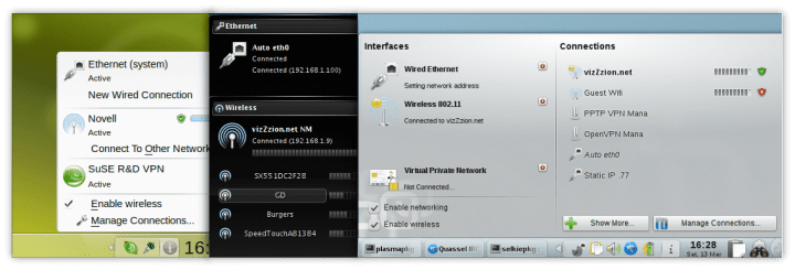
The system tray has remained mostly the same for decades, a few icons sitting on a panel displaying some information about the system and providing a shortcut to some features. In Plasma 5 the system tray has been reimagined to some extent. The widgets that sit on it have been redesigned and improved vastly. If you take a look at the history of KDE or Windows (or more recently Chrome OS) you can promptly some some of these pieces have been redone many times over the years (for example, the network manager). On the other hand, if you take a look at OS X, GNOME, Unity, XFCE, among others, you will barely find any major differences across the years.
Bottom v. top panel
Designing a consistent interface for system trays sitting on a top panel is rather trivial task (at this point, at least). Any simple drop down menu will do.
The situation isn’t nearly as simple if your panel is sitting at the bottom. A simple drop down menu now looks out of place and is hard to order. As an example, these are some of the revisions KDE’s Network Manager alone has gone through:
I’m not trying to argue the panel should be moved to the top. I prefer my panel at the bottom. Well designed top panels tend to only contain a menubar and a system tray, I prefer a regular taskbar. My point is only that in this particular case one faces problems the other doesn’t.
Plasma 5: Facing the challenge
Plasma 5 is taking a different approach than most to try and solve this. The system tray is no longer just a place where some icons sit, their interfaces are all drawn inside the same canvas. In Plasma 5 the system tray feels like an integral part of the system, a part applications may choose to plug in. It behaves a bit more like the notification drawer on Android: Notifications may be shown there, they may include actions (playback controls, archiving email, etc), but they’re all the same size (some can be expanded), have a similar design and display an icon in the system bar.
This brings it close to the consistency offered by system trays at the top. I’d like to contribute a couple of suggestions, which may or may not be good, to improve it even further.
How to handle hidden/inactive icons
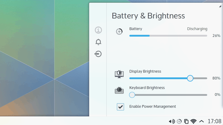
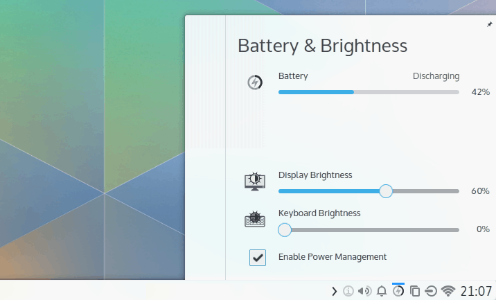
Whenever you open a widget sitting on the system tray, there’s a sort of sidebar displaying the hidden icons. This is, I presume, done to give the user access to every icon once they’re interacting with the system tray. Since transitions from one widget to another are animated inside one canvas it would be jarring having to close the current widget, click the arrow pointing up to show hidden icons, then clicking the icon you want, then watching the pop-up showing hidden icons go away and then your widget appearing.
The reasons I think this approach is suboptimal are the following (i) It’s hard to guess what the icons on this “sidebar” are, it isn’t obvious at all (ii) they look nothing like the icons at the bottom (iii) they’re bigger than the icons sitting in the panel, despite being there because the user doesn’t care much about them or are inactive (iv) the icon to show hidden entries is located at the right of the system tray, the sidebar is located at the left of widgets.
One possible way of solving one of these issues is inverting the position of the sidebar, moving it to the right. However, I think there’s a better way. Instead of displaying hidden entries by clicking the arrow pointing up, the arrow should be moved to the left of the system tray, the arrow should be pointing to the left, hidden entries would show inside the panel itself by expanding the system tray to the left.
Then it could auto expand whenever the user clicks something on the system tray:
This results, in my opinion, in an interface far easier to figure out. It’s also more consistent, the blue bold line on top of icons is always used to indicate what has been opened, the user always switches between widgets in the same manner and since it expands to the left there’s no repositioning of entries.
What about going all in?
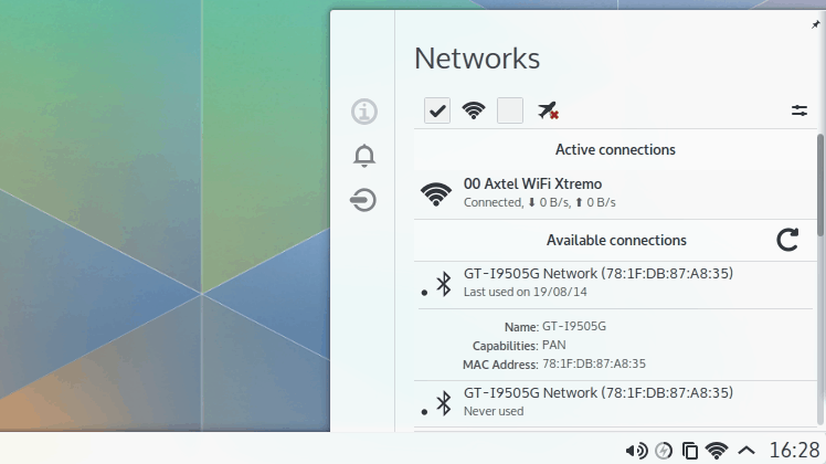
One consistent theme in the latest iteration of Plasma is moving towards vertical lists that are fully maximized vertically (the list of widgets, the task switcher), so why not do something similar with the system tray? An example of a widget that would greatly benefit from more vertical space is the network manager. While I really like how the new one looks, it still shows a very limited number of connections compared to, say, Unity or GNOME 3.
The clock and calendar could become a part of this too. When clicking on the clock it could display the calendar, appointments, maybe the time at multiple locations. A torrent application could show the progress of downloads. A music player could comfortably put playback controls alongside the current playlist. Tons of notifications could be displayed at the same time and sorted without too much clutter.
What do you think?
If you’re reimaginig the system tray, why not go all in and abandon some constrains that seem to be mostly the product of old habits? My last idea would transform the system tray into a sort of sidebar, the old system tray icons would become just the way of accessing it. Do you agree with my suggestions? Do you have some of your own? While I believe the first one is rather uncontroversial, it’s only a minor tweak, the second one could be divisive.



Hola Luis,
¿Puedo escribir en español o es solo en inglés?
Probé el live-cd del proyecto Neon y la verdad es que los íconos de la barra de sistema me confundieron un poco. No sé si es por los colores del tema o los mismos íconos, pero a veces me costaba saber qué era a lo que estaba haciendo.
En lo personal el último administrador de redes de KDE no me ha gustado mucho porque en mi caso tengo más de 20 redes wifi dando vueltas y el control no me muestra una barra de desplazamiento (tal vez hay algo no configurado).
Con las actuales resoluciones de pantalla, no utilizar el espacio vertical para tener un manejo óptimo, es una lástima. El planteo que hace Linux Deepin con su barra de configuración lateral a la derecha me parece muy interesante. No digo que KDE deseche lo que tiene pero creo los íconos de la systray así como los tiene Deepin están muy cómodos.
Saludos
good ideas, can you share itat the visual design group in kde forums?