Firefox Marketplace – A caravan, for me ma!
Gold rush, in the digital form. That is, ladies and gents, what we call the mobile market. A success of one is an indicator of potential success for many. Hence, you get the proliferation of mobile operating systems for mobile devices. You have iOS, you have Android, some others, and soon, you might have FirefoxOS. At this point in time, you might be asking yourselves how the title might be relevant to the story. Worry not, it shall all be revealed soon.
To boldly go where many have gone before
All right, so Mozilla wants a piece of the action, and that’s fine. But having a slim Linux-based operating system compiled for mobile devices with some optimization is not a biggie. Having a decent, appealing application store is what makes ALL the difference. Indeed, if you think about it carefully, it is not about technology, at all. Not one bit. And we will discuss this in the future, in regard to Nokia and Linux. So yes, ahem, Mozilla wants to launch its own mobile operating system. To this end, it needs a centralized application management platform. Enter Firefox Marketplace, the equivalent of the AppStore, Google Play, and half a dozen similar concepts. Y’know, the Linux repo thingie, for the fashionable?
Fashionable, is it?
Yes, so there’s an early alpha-beta release of the Marketplace already available. All you need is the Firefox browser, on any platform. In this article, I will show you how this new product behaved both on a desktop, non-touch platform, as well as on a Samsung phone running Android.
Firefox Marketplace on a desktop
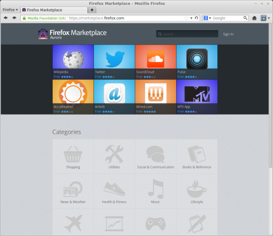
So we have Linux Mint Maya, running on a standard mouse-and-keyboard laptop with lots of cores and memory, at least in terms of mobile optimization, so to speak. The website is fairly modern and sleek, with the now familiar HTML5 appeal. Notice the little Aurora message that tells you’re dabbling in a beta product.
At this point, you can download some of the highlighted tech demo apps, or browse through the categories below and search for something appropriate. The current offering is fairly low in calories, and there are not that many programs available. Do mind this should change, and one day, you will see something like a million apps available, because we know quantity equals quality.
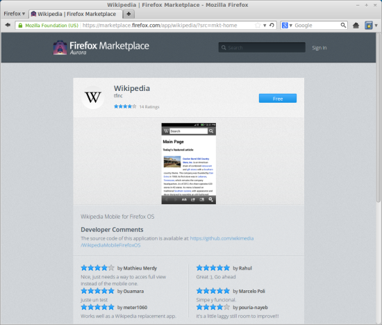
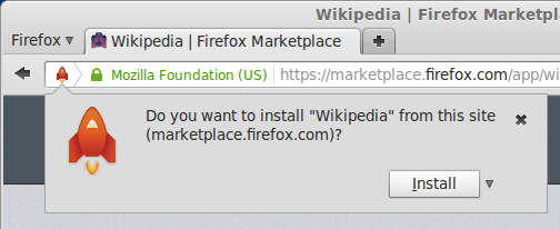
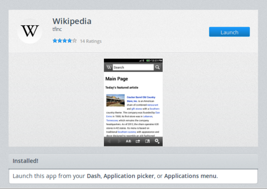
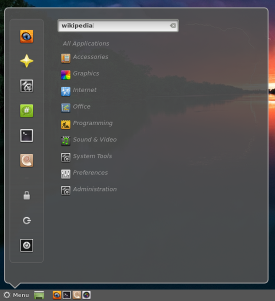
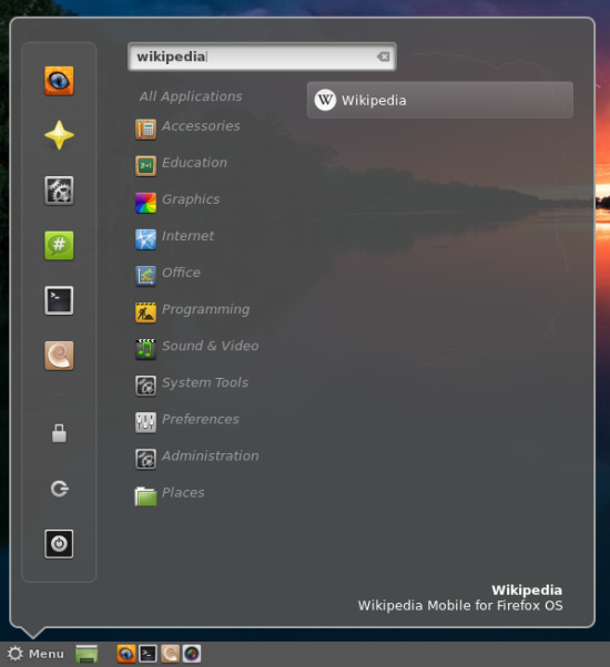
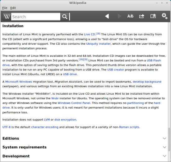
Let’s begin our testing. I started with the Wikipedia app. Download, accept the prompt from the browser, and launch the app. You can do it from within the browser page, or your system menu. I must admit the tiny, centered, vertically oriented screenshot is not appropriate for the desktop platform.
However, in my case, the icon for the Wikipedia app was not available until after the next login.
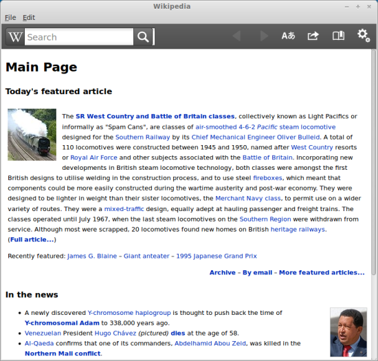
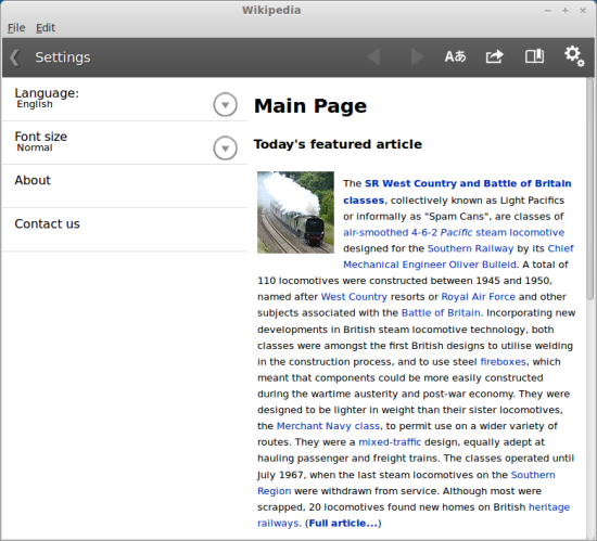
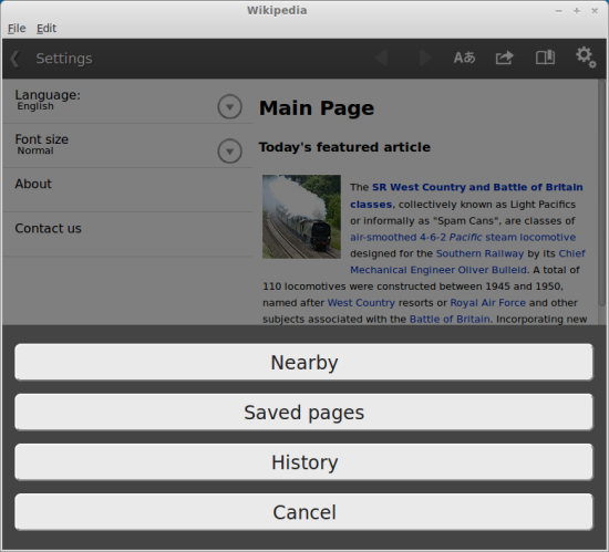
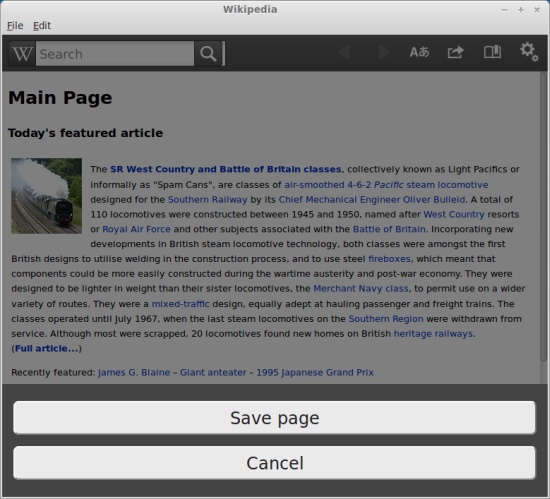
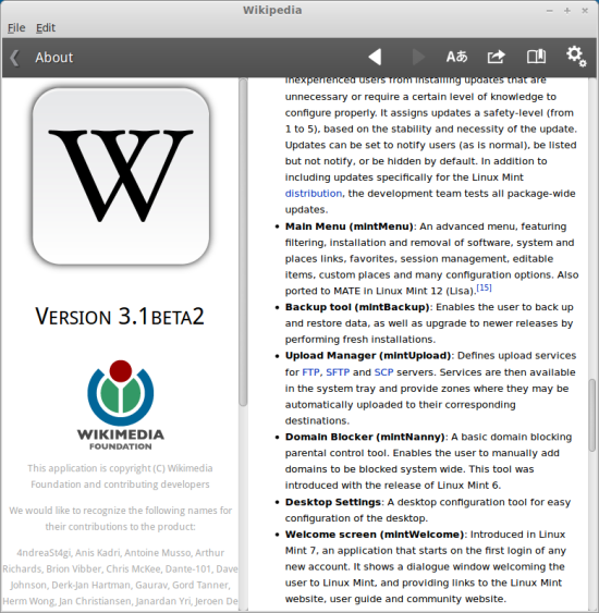
So how does the application actually behave? Well, I must admit, not badly. Better than I expected, for sure. Overall, the aesthetic aspect is fairly decent. The blend of colors, sizes and shapes is well balanced, and you will find your way around easily. The browsing functionality is there, including bookmarks, suggestions, as well as the ability to save files offline for future reading.
However, the search functionality is problematic. You do not get any indication the selected entries are actually clickable hyperlinks, because there are no text decoration and hover actions. On a touch device, this makes sense, but not when you’re using your mouse to navigate.
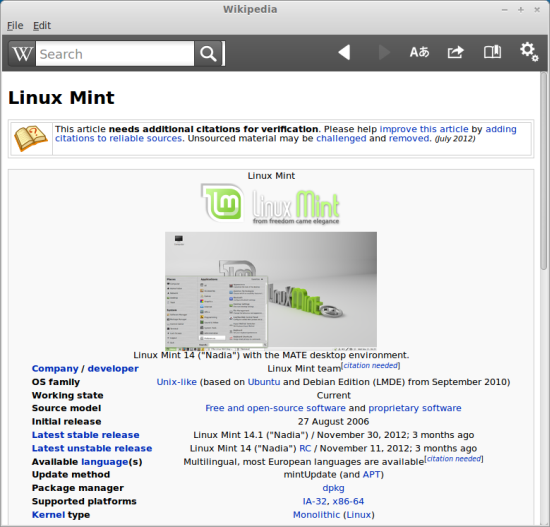
Further searches turned out to be worse. Most of the Wikipedia pages are not designed to be shown on a small screen, so you end up with some jarring, glaring visual effects that spoil the browsing and reading experience. The reduced screen equity also makes for a more difficult navigation experience. You will see less text, and most of the elements will be collapsed, forcing you to click your way through quite a bit.
Additional bugs are revealed with every new menu and page you open. Truncated text that does not fit well within the designed display frames, insufficient margins and padding. All of these might seem trivial, but it feels horrible reading pages that normally render perfectly well in Firefox, but not through this new application-like interface. But then, this could only be this one specific app.
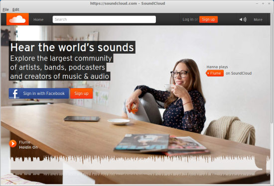
So I extended my exploration. I tested the music and video applications next, as this seems to be the logical step in the casual computer usage. After all, even the hardcore geeks watch movies and listen to music, although their choice might be Lars von Trier and Manga rather than something popular and mainstream.
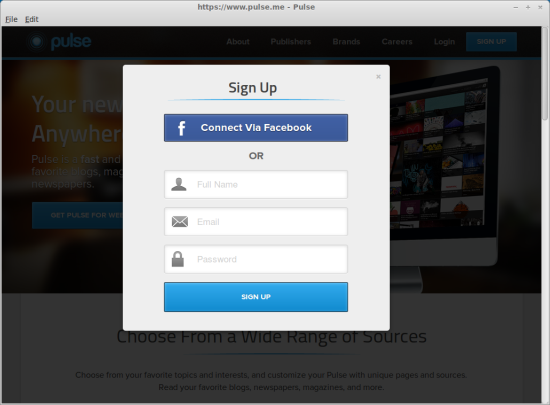
A notable and noticeable deviation from the classic desktop usage is that applications will ask you to sign in to be able to use their services, and without this step, you won’t get anywhere. This is a very frustrating concept, because different programs do not know about their individual login schemes, so in theory, you might end up signing in to a dozen apps, individually. There’s some attempt to centralize the personalization element, as you can use Facebook and such, and this will probably be resolved on the platform level once FirefoxOS gets officially released, but at the moment, it’s annoying.
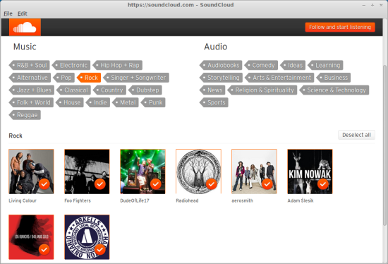
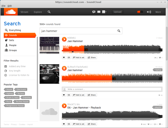
One thing that is common with all these apps is – nice looks, a very stylish main page, and little substance. Trying to find any content of a remotely reasonable value was an exercise in lowering my awesome IQ to a double-digit figure. The offerings seem random and of dubious quality. You mostly get community remixes and spinoffs. I could not find any original, high-quality art.
In this regard, the apps behave much like Youtube, offering a torrent of media spam and a trickle of valuable material. However, Youtube at least offers that trickle. Not so here. In fact, I’m asking myself, why even bother with the recommended programs? Why not go for the applications you know work and offer high-quality results? I’m winging it, but the combination of Grooveshark, Pandora and Youtube will probably satisfy the needs of most people looking for media. Now, probably the only reason some of the apps are featured on the main page of the Marketplace is because they are ready for use, whereas most others are still being baked and polished.
I am not dissing the applications and their developers. Things will get better, for sure. Some will shine and some will crumble to dust. But there’s such a thing as the conservation of quality, and no medium or technology will change that. Transforming the platform will dictate the accessibility, but not the relevance. In this regard, searching for media through a somewhat mobile interface on top of a desktop is a rather challenging experience.
Firefox Marketplace on an Android device
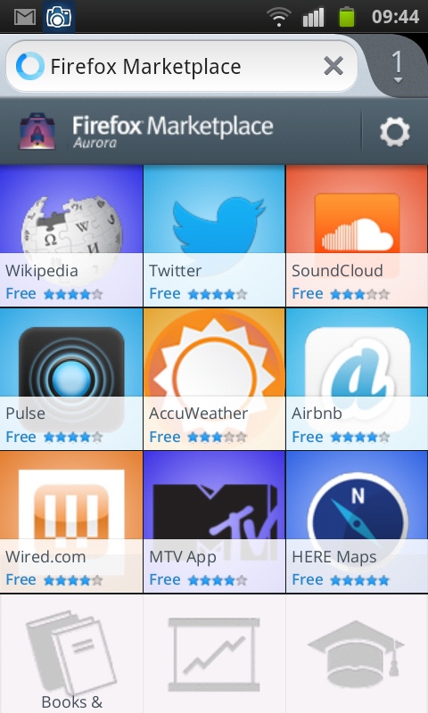
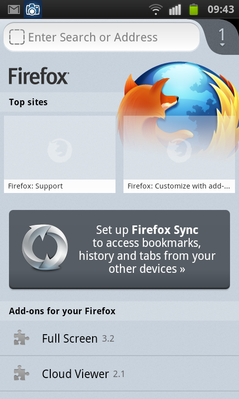
Perhaps I was asking too much by attempting to use the Marketplace on a desktop. Let’s see what gives on a mobile thingie. I installed Firefox, and then began fiddling with the applications. Just like before. I loaded the Wikipedia app, so I could compare it to the desktop version, and then the MTV app, which does not run in the desktop edition at all.
Wikipedia behaved more reasonably on the Samsung smartphone. However, MTV was a curious example. First, the program installed in Spanish for some reason. Then, searching for music was basically useless. Moreover, I was forced to look at some stylish guy wearing a stylish hat while admiring the yellow no search found message in a foreign language extend beyond the borders of the designed app space. Something is rotten in the Kingdom of App.
However, the worst part was performance. Compared to most other Android applications, which are rather fast and snappy, Firefox Marketplace was struggling to do its work properly. Loading times were abysmally long, and the transitions and navigation slow and jerky. Has to do with optimizations and maybe additional factors, but I was not very pleased with the experience.
What’s your point Vanessa?
So the question is, why? Should one bother? The interesting thing is, the desktop experience was better overall, despite not being the intended mode of work for the Marketplace. It was far from perfect though, but at least the form factor and the performance were reasonable, despite some obvious quality problems and visual glitches. The Android apps were flaky, although I am certain things will improve over time. Hopefully.
But there’s an even bigger question of relevance. As a standalone product, Firefox Marketplace brings no value over conventional browsing plus the software management via repositories, or any of the native application stores. Embedded in an operating system, it could be a useful product, but only if the application stack offers relevant, useful, meaningful content to the users. Otherwise, FirefoxOS might fail, regardless of the nice technologies under the hood and good intentions all over the place.
What’s with the caravan?
So we’re getting back to my Snatch analogy. The Marketplace experience is much like that scene where Turkish and Tommy go to the pikey camp site, and then Mickey tells them, I want the hector two roof lights, with the discover cushions and the matching side stripe caravan. Right. And she’s terrible partial to the periwinkle blue, boys. Have I made myself clear, lads? Imagine that in an Irish accent, yes. And then, they go home with a dog, no caravan, and Gorgeous George out of action. That’s how it works here, really. Firefox Marketplace is a jumble of familiar and weird, and it does not leave you with a sense of serenity and completeness that you would expect.
I guess I will have to revisit the Firefox Marketplace if and when I get my hands on a phone or tablet running FirefoxOS. At the moment, in both the desktop space and the mobile space, it offers no advantage over existing solutions. Worse yet, it introduces a handful of new problems, including a problematic UI flow, performance problems, and a not so spectacular first batch of programs as its tech demonstrators. This is the wrong way about it, in my opinion, as the best way to show people that the Marketplace is thriving and that it shines, is to discover some of that digital gold. There you go.





Nice,now tell me how did you get the apps uninstalled from FF on Linux Mint?
I have to admit I did not explore that one.
That’s an interesting one, I’ll check that.
Dedoimedo
Well,I did,manually e.g Wikipedia to be found under : home/.local/share/applications and home/user/.https;bits.wikimedia.org
Cheers.
Brazilian Portuguese, not Spanish ;)
Oops, sorry. Well, you learn something new every day.
Dedoimedo