KDE Search and Destroy, I mean Launch
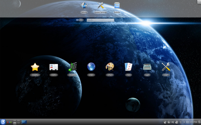
In a galaxy far far away, long before there was Android en masse, long before touch was popular, I mean retro-popular, because we have been using the touch technology for at least two million years, long before there was any modern, simplistic interface for smartphones and tablets, there was KDE.
It’s all in the name. KDE is one of the few remaining staple desktop environments of the Linux world. It’s been around forever, and it does not seem to be slowing down. In fact, it’s evolving and growing. So far so good.
One big thing that sticks to KDE is its spartan name. KDE, as the acronym aptly puts it, is a desktop environment, but this very nomenclature underlines what this graphical computing framework is all about. And perhaps therein lies the rub. Oh, we are getting ahead of ourselves, and you may be wondering what this article is all about. Perhaps I should tell you, it’s about KDE, a desktop environment, being a great choice for non-desktop systems. There, I wrote it.
They shall all be the same
There’s a lot that can be said about KDE. It may be bloated, buggy, changing too much, too often, heavy, and whatnot. I leave all these open to interpretation and personal experience. However, KDE has always had a couple of powerful, undeniable features that put it apart from the rest – uniformity and future orientation.
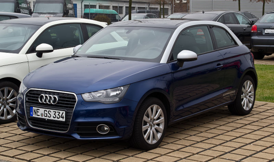
One clear sign of marketing professionalism is brand recognizability. It’s a funny term, but it defines how easy it is for you to identify past and future incarnations of a product using visual clues only. Take cars, for example, my other favorite topic. You can always tell an Audi from the rest of the bunch, even when one barely shows in your rear view mirror. What’s more, all Audi models look the same, in a way, and you can hardly tell two apart, from the front grille at least. And yet, they are not boring, they are exciting and stylish, and the easily recognizable styling is a brand strength. There’s a solid basis of aesthetics, with just minor variations that cater to every soul. Even if you take the badge away, you know an Audi is an Audi, because it looks like one. There’s a certain Audiness to it. As simple as that. Compare that to hundreds of bland, generic looking metal boxes on wheels out there.
KDE tries to practice the same mantra. KDE applications are all designed with the same fundamental elements of layout, usability, functionality, and beauty, which, of course, may be debatable. While most frameworks have a rather loose link between the desktop and the applications, and most applications are markedly different from one another, in look and feel, KDE almost frantically tries to keep commonality in place. You get an aura of clean, simple design that permeates all KDE components, and you can tell KDE software apart just by looking at it. This indirect marketing is a sure sign of good things to come. But we’re just warming up.
When KDE4 hit the market, there was quite a bit of uproar. Most of its was directed toward stability and pure usability, but ten minor revisions later, KDE4 is extremely stable, polished and functional. Most importantly, it retains its core elements, and gradually introduces new capabilities. Approximately three years ago, with a clear vision where KDE ought to be in the next decade, the KDE framework was extended to include a new Workspace called Plasma Netbook.
Enter Search and Launch
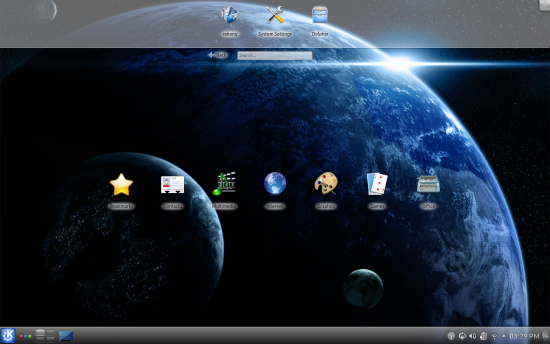
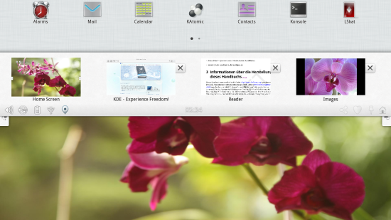
Search and Launch (SAL) is not a military term for an interdiction mission or something like that. Plasma Netbook workspace is a component of any standard KDE installation, and with it, the SAL. When working on a typical KDE desktop, you can switch your activity between several available configurations, one of which is the netbook-oriented plasma, with its integrated search functionality.
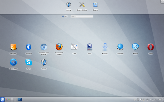
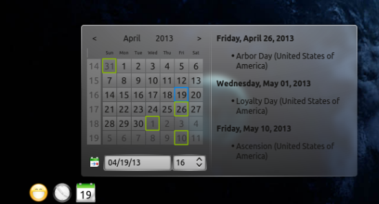
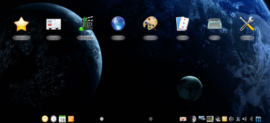
This workspace may surprise you a little, but within minutes you will begin to appreciate its ingenuity. One, you retain the standard panel with its plasmoids and the system area, if you want, or you can whisk them away. Two, there’s a big, airy space in the center, where menu categories are displayed. The icons are big and evenly spaced and will fit your index finger just nicely. See where I’m getting? Then, if you click on any one of those icons, a sub-category will open with a card deck slide-like animation. Hit Backspace to return one level up. Translate this one Backspace button to what you may have seen on any smartphone. And remember, we are still not talking about touch, at all.
Customize SAL
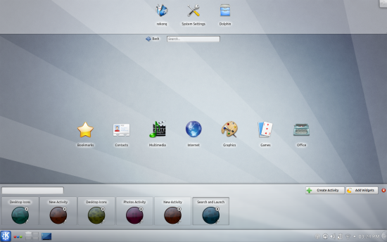
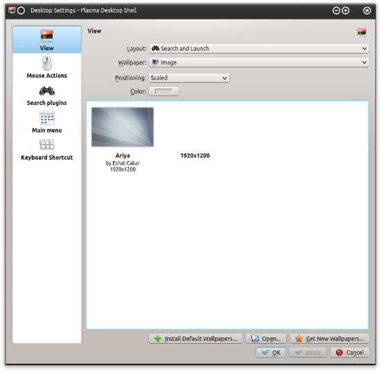
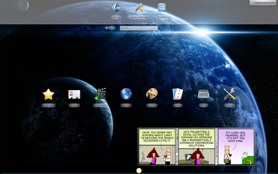
Then, you can go about making your SAL shine. You can change the desktop image or the way SAL displays its content. You can switch between the default view to a newspaper-like reel, with widgets being displayed in near columns; in the default view, the widgets will be arrayed at the bottom of the screen.
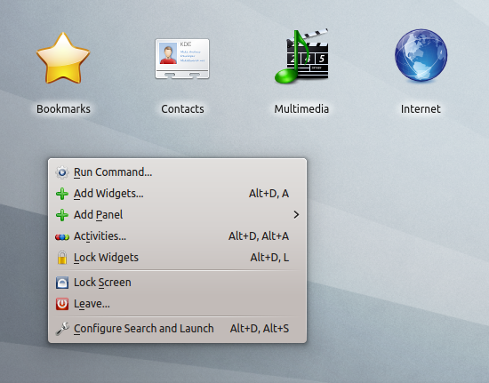
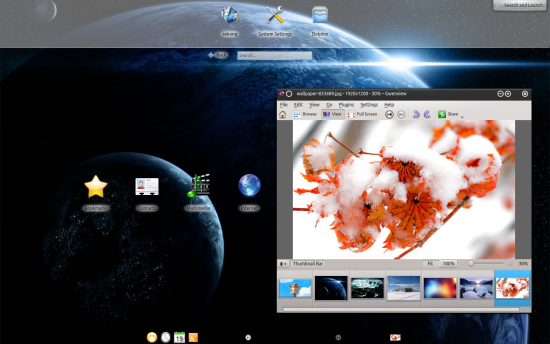
Oh, imagine for a moment you have no mouse. How would you access that right-click menu? No worries. In the top right corner, there’s that banana shaped plasma configuration button. When expanded, it will give you all the options you need. Remember, no hands! Magic.
Speaking of widgets, you can really go wild with what you add and sprinkle on your screen.
Style
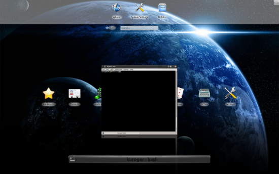
You also get a healthy dose of beautiful effects. For example, Alt-Tab works like the desktop effects switch. If hidden, the bottom panel edge will glow to indicate it’s lurking there and waiting for you to pop it up.
Touch me, touch me, I wanna feel your KDE
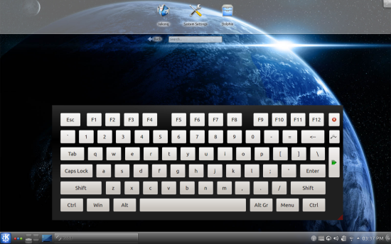
Remember this great 80s song? Anyhow, yes. KDE Plasma Netbook is maybe a transitional name, but you can see how this workspace makes total sense as the stepping stone between the conventional desktop and touch. While SAL is designed to be operated using the standard keyboard & mouse input, it is ever so slightly infused with a touch potential. You have those big icons, all centered, showing up with a very smartphone-like effect. You have the back button. Options can be accessed without having to right-click on your workspace. You have widgets. And you also get a fancy virtual keyboard as a standard component of the whole package.
Imagine you had a device with a small touch-capable screen and no keyboard, no mouse. Do you think you would be able to use KDE on such a computer? The answer is, probably yes, with an immediate, surprising ease. Never forget that we are talking about a desktop environment. Should you dislike this activity for any reason whatsoever, just hi the three-color icon near the K-Menu button and switch to any other view you like. It’s as if SAL never existed, and if you go back, it will there, unique, separate, and yet part of the same framework.
So what’s next – Plasma Active
Now you can see where this leads. Into the smartphone and tablet space. A natural continuation of the brand across the whole spectrum of devices, while maintaining that clear, easily identifiable brand. Compare this to what Microsoft is doing with Windows 8, and you will see a difference in how the idea of multiple form factors and input methods is realized.
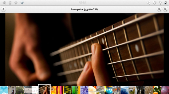
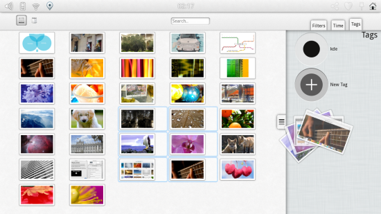
Here are several images from the official Plasma Active press kit. There’s no KDE name spelled anywhere, and yet, you know you are using a product that is a member of the same family like your typical Netrunner desktop or the small netbook device. You like this, because humans have this internal mechanism and need for association and familiarity, and on a sub-conscious level, you are reacting to a highly professional exhibition of a clear, practical design.
Not all is rosy
Sure, there are problems. Like for example, the fact I tried loading the Plasma Netbook on an actual netbook, my Asus eeePC running Xubuntu, and I ended up with a black screen. Not the best tech demonstrator there. On the other hand, KDE works fabulously on desktops and laptops. So it’s probably the matter of some extra optimization and ultra-rigorous QA to make it spotless, so that we do not end with a rainbow with some of its colors missing.
Conclusion
KDE may have reached its current state by chance, but I doubt it. Methinks there’s a proper vision out there, and it combines everything, from a 35-kg desktop that can raise the room temperature by a whole degree, to tiny smartphones you operated with your thumb plus a squint of utter concentration. In between, anything you want, spread across a range of convenient, flexible activities.
The Plasma Netbook and SAL are probably the most visionary component of the KDE framework, and you can see a very subtle, gentle nod toward different form factors and technologies, without compromising either one. You want your traditional tools, no problem. You want something a little more touchy feely, that works too. Thinking of potential rivals and comrades, perhaps Canonical/Ubuntu is trying to achieve the same thing with Unity. People do not like drastic decisions. You must keep them in the familiar, and slowly add or remove tiny bits and pieces. KDE is doing it right. The only question is, whether this right can translate into a real business success. But we will discuss that in the coming weeks.

I installed Debian with the KDE desktop (not netbook) on my first generation Samsung netbook without any issues at all. I tried the netbook version of the UI but simply prefer a standard desktop interface. It’s not speedy, but it’s perfectly usable.
I’ve been running Debian (Wheezy) KDE for about a year now, and I have finally found my winner combo. Solid and beautiful.
Running Debian Jessie/Sid with KDE 4.8.4…… No Issues
As a former GNOME user, I gave up watching features vanishing from one release to another. Now I am running Debian Wheezy with KDE and what a surprise! I do not understand why KDE is not the default DE on Debian. It is full of resources, stable and allows me to make any change I want. Congrats to KDE team.