Linux desktop environment showdown

Normally, at the end of the year, I do my usual Linux distro showdown. But I have never really done a proper desktop environment comparison, regardless of which operating systems run them, even though in the Linux world, quite often, it is hard to separate the two. Well, it seems to me, this is a great opportunity to give you a comprehensive head-to-head clash between the leading desktop environments that bless our distros.
Before we begin, it is important to make a humble statement. There’s desktop environment, there’s desktop manager, and there’s window manager. Sometimes, the definition and distinction of these three is not entirely clear. And then, there’s the shell to make things even worse. So if you feel I am blatantly disregarding scholarly terms, please be tolerant. After all, it’s all about what the user sees.
We will begin by outlaying the basics, some pros and cons, my subjective observations throughout the years, as well as the expected future growth prospect. Then, we will declare a winner, the one desktop environment that combines all the necessary elements, stability, practicality, ease of use, and no less important, fun.
Gnome 2
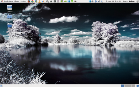
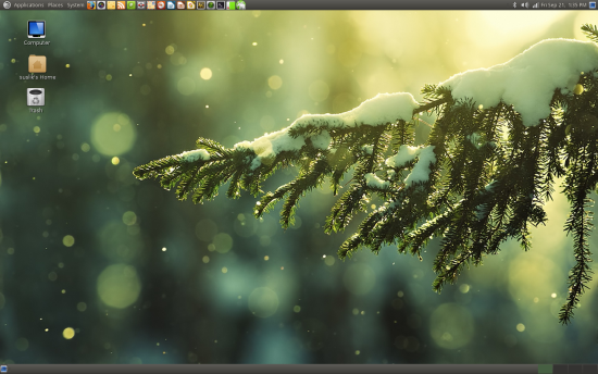
This used to be the darling desktop environment of the Linux world. It probably still remains the most task-efficient desktop for the widest range of users. The combination of good situational awareness and clear presentation of desktop elements, including, in its traditional configuration, the top panel with its three-level menu, the bottom panel with the open windows and the workspace list, and a handful of desktop shortcuts, remains unbeatable from the practical and functional perspective.
Moreover, Gnome 2 was always extremely stable and light on system resources. Debian and CentOS proved they could easily and still can manage on as little as 150MB worth of memory, which is often less than half the resources that most counterparts require. If there’s a downsize to Gnome 2, it is the fact the simplified interface requires digging into the command line or specialized configuration editors to make advanced changes.
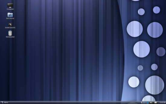
The one big problem with Gnome 2 is that it has sort of been officially discontinued. Regardless, a small number of new distributions continue using the environment, like SolusOS, for instance.
Moreover, Gnome 2 will continue receiving updates and bug fixes until the end of support cycle for RedHat Enteprise Linux 6, which will be around for at least another 5-6 years. If you are keen on preserving the look & feel of Gnome 2, you might want to consider trying the MATE fork, which we will discuss shortly. On paper, Gnome 2 was succeeded by Gnome 3.
Gnome 3
The successor to Gnome 2 is everything that Gnome 2 is not. Designed as the next, modern continuation of the earlier desktop environment, Gnome 3 broke its simplicity paradigm by making things so simple they became either too difficult or just plain irrelevant.
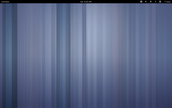
Gnome 3 was created as an interface that might bridge between the classic keyboard-and-mouse computing platform and a future generation of touch device. However, blending the two proved and continues to prove to be extremely difficult and controversial, resulting in user alienation and the creation of numerous alternative solutions, intended to fill in the gap left by the Gnome 3 departure from the old Gnome philosophy. A prime, and somewhat radical example would be the removal, and subsequent inclusion following negative feedback, of the power off button in the system menu.
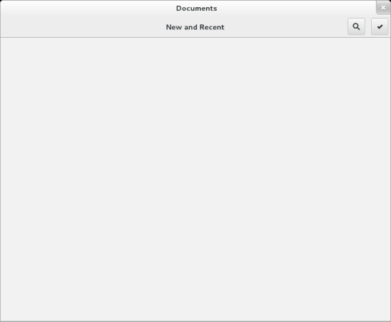
At the moment, Gnome 3 is not very friendly in its vanilla form, and usually requires numerous extensions and tweaks to restore some basic behavior, including the management of shortcuts and icons. The layout of the new user interface demands more actions to achieve the same level of functionality like Gnome 2, which leads to a loss of productivity. From the stability and performance perspective, the new environment severely lags behind its predecessor. Finally, many applications designed around the Gnome 3 desktop also suffer from a significant degradation in visibility and usability. A good example is the Documents program, which features nothing more than an empty gray screen with borders.
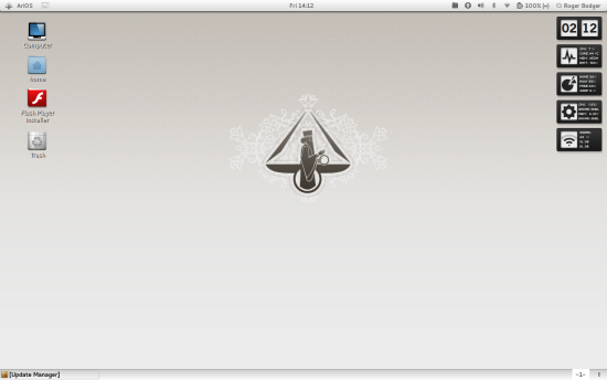
Several prominent distributions like Linux Mint decided to abandon Gnome 3 altogether after several unsuccessful attempts to create a usable work environment. On the other hand, AriOS 4 uses Gnome 3 heavily modified with extensions, offering a decent compromise between functionality and looks.
It is hard to foresee the future of Gnome 3, and it will probably remain around for as long as the big players in the Linux world continue offering development and support, the chief among them being RedHat and Novell. However, with the rising success of Unity and Cinnamon, specifically created to replace Gnome 3, the question whether this desktop environment will survive into the next decade remains open.
MATE
MATE was designed as a fork and replacement for the controversial Gnome 3 environment. From the visual standpoint, MATE is almost identical to Gnome 2, with several core components being renamed. From the functional angle, MATE inherits all the goods and bads of its cutlery parent.
MATE features prominently in the Linux Mint releases, as one of the two desktop environments offered by the development team, alongside Cinnamon. Personally, I have found MATE to be quite useful in making distributions that struggle with Gnome 3 regain their good looks and performance.
KDE
This is one of the older Linux desktop environments, and once a bitter rival of Gnome 2. While it is very similar in looks and functionality to Windows, it has not succeeded in making Linux become a popular alternative to the Microsoft operating system, mostly because the application stack and games in Linux cannot directly replace the needs of most people.
Nevertheless, KDE marshals on full steam, going through its version increments. Unlike Gnome, KDE seems to have weathered its major release change from KDE3 to KDE4, and since, has seen numerous improvements, both aesthetically and functionally.
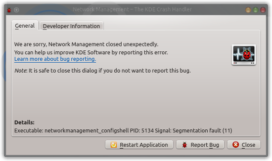
KDE is notable for presenting almost all of its options to the user through a variety of menus and sub-menus, and this used to be its major weakness, luckily recent editions tend to slim down on the very cluttered presentation layer. Performance is solid, but the resource usage is usually higher than Gnome, although the guzzler competition has been evened out with the release of Gnome 3. Moreover, KDE components can sometimes be buggy, and you will often encountered crashing applications when using the desktop environment.
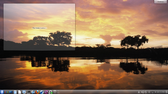
Alongside possible bugginess, you do get an almost absolute freedom in tweaking your desktop any which way you like. KDE can indeed be modified to look like any other desktop environment, and it can emulate Windows behavior quite well. For new users looking for a painless transition from their Microsoft experience, KDE can be a suitable candidate. It is also very popular in the Linux world and offered with virtually every distribution.
Cinnamon
The Linux Mint development team spawned Cinnamon as an answer to their dissatisfaction with Gnome 3. Since, this desktop environment has flourished into a beautiful and robust product, and has met with praise among the users. Cinnamon tries to blend the best features of the older Gnome 2 environment with more modern looks and new functionality. Moreover, it is quite stable and light of resources.
While Linux Mint is the prime consumer of Cinnamon, the desktop environment is available for many other distributions, with surprisingly good results. For example, both Ubuntu and Fedora gain massively from using Cinnamon, in terms of looks, stability and usability. Cinnamon comes with the classic layout, which is similar to what KDE and Windows offer. You get the classic menu, open windows and system area division of the single bottom panel, which seems to be the prevalent and possibly most efficient layout for most users of conventional computing devices.
My prophetic acumen tends to lean toward Cinnamon gaining more focus and popularity in the Linux world, mostly because it is extensible and non-intrusive and can be integrated with other distributions without any major overhaul of their internals.
Xfce
This lightweight desktop environment used to be treated as a no-choice alternative for heavier Gnome and KDE desktops for machines that could not handle them. It is hard to get rid of labels, but recently, Xfce has seen a lot of improvement, turning away from its spartan image into a more fully fledged, practical and fun environment. The invention of Unity and Gnome 3 seems to have turned a large number of users toward Xfce, and in turn, it has developed a fresh new attitude.
Xfce is somewhat similar to Gnome 2 in its workflow. In the past, Xfce suffered from separate management for its various setting, creating massive clutter and confusion. Lately, the various options have all been merged into a single, consistent menu. Moreover, the distribution is trying to offer a pleasing and efficient environment to a variety of users. At the same time, Xfce retains its performance and stability.
One relatively weak side of Xfce is that it comes bundled with so-called lightweight programs that are not as well-known or useful as some of the mainstream solutions, which can cause alienation with common users, although there is nothing to stop you from using the exact same programs on this desktop environment. But the way things are, Xfce is definitely gaining in practicality and popularity.
Unity
At the moment, Unity is used solely by Ubuntu. The desktop environment was developed alongside Gnome 3 as the future solution that could serve a hybrid work model, that of the conventional desktop and touch devices. Like Gnome 3, Unity met and continues to meet with controversy, although the environment manages to maintain a fairly good balance between modernistic looks and practicality.
The big difference to most other desktop environment is that it offers a side panel called Launcher, somewhat similar to the Favorites menu in Gnome 3 Activities. Unity also uses a global menu, akin to OSX. Another interesting part is the system menu with integrated online search. The combination of somewhat rigid desktop management and new visual element could pose a problem for most users. However, it is also the closest formula to a touch or pseudo-touch interface that might one day feature on smartphones and tablets using Ubuntu.
Looking at the last two and a half years of Unity development, it is evident the environment has undergone numerous improvements. Whether it will succeed on a larger scale also depends on many other factors that are not strictly related to its quality and functionality, namely the success of Ubuntu in the gaming sphere, the application stack, and the smartphone craze. If Ubuntu takes off in any or all of these spaces, Unity will flourish. And as we have seen earlier, superior workspace layout does not necessarily mean popularity or success, as evident in the long history of KDE, Gnome 2, and other desktop environments.
Significant others
The list above is far from complete. There are many other desktop environments. To name a few, Enlightenment, OpenBox, FVWM, LXDE, Trinity, and more. We are hitting that narrow line between environments and standalone window manager, but you will forgive me.
Anyhow, all these might be useful, beautiful or both, however I did not think it wise to include them in the showdown. The major reasons include their popularity, availability, as well as relevance to wider public. While Enlightenment might be considered a very aesthetic and lightweight environment, few distributions offer official support for it, which could deter potential users focused on productivity.
Likewise, some of the very spartan environments might infuse new life into very old machines that cannot support the modern desktop environments, but usually the price is one of a higher skill level required to setup and use them.
And the winner is …
Now, the tricky part. How does one declare a winner? First, there’s the matter of taste. Aesthetics. Needs. Practicality. Long term support can also be important. Stability is also rather crucial. And we cannot ignore the question of future growth. Some desktop environments might have it all, but they are not destined for any greatness, or even living into the next decade, because they will not be financed and sponsored properly.
With all these factors taken into consideration, Dedoimedo feels that Cinnamon offers the best overall blend, followed by KDE and Xfce and narrowly shadowed by Unity and MATE. It is quite possible that Unity will overtake all the rest by the sheer force of its numbers, but that does not change the fact that some of its rival do offer genuinely superior experience.
Cinnamon combines looks, functionality, stability, and low resource usage in an unbeatable recipe. It is also highly popular, which helps, and it is sponsored by Linux Mint, currently the most popular Linux distributions around for quite some time. My belief slash hunch is that we will see a wider adoption of Cinnamon in the coming years, and that any future growth of Linux directly or indirectly inspired by laudable Ubuntu efforts will also most positively reflect on Cinnamon. So it comes down to spice, like in that awesome RTS game. And the books. Spice? You know what I’m talking about, right. And I guess, that brings this article to a close. Happy holidays and such.
Now, what do you have to say?
Cheers.

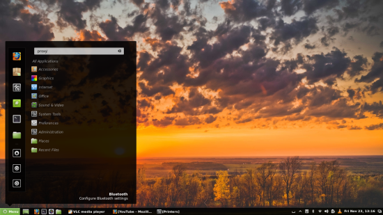
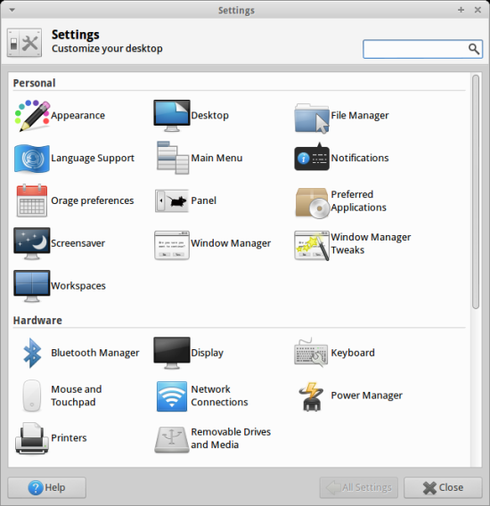
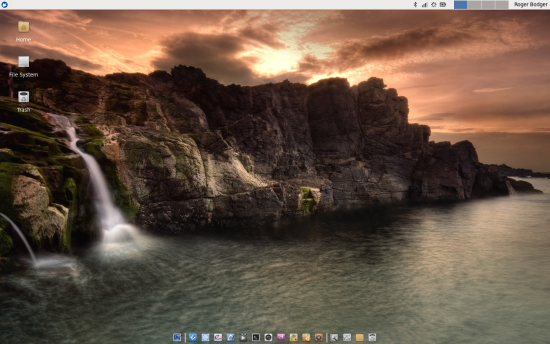
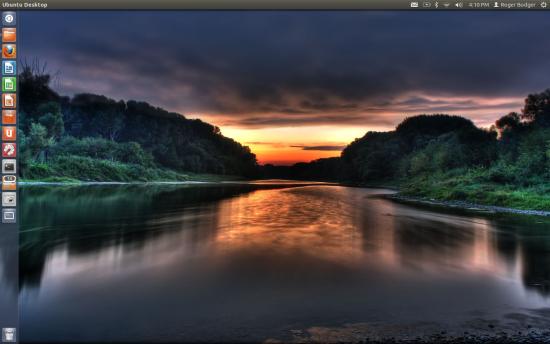
KDE.
I think it’s a shame Unity had to exist at all. I wish Ubuntu could have figured out their differences with the GNOME team, instead of duplicating effort and wasting resources. Not-invented-here syndrome and a lack of upstream sharing of code makes it difficult for me to like Ubuntu.
GNOME 3 seriously isn’t as bad as everyone says. Check out Phoronix’s poll: http://www.phoronix.com/scan.php?page=article&item=gnome_2012_res&num=1
Most people are satisfied by it, although they were more satisfied with GNOME 2.
Cinnamon is the way to go nowadays.
1- Cinnamon
2- Cinnamon
3-Mate
4- LXDE
5- Unity
6-XFCE
7- KDE
there are missing the desktops that i love the most: panthaleon/elementary os and openbox/crunchbanglinux :)
the one is the most beautiful desktop and the other the most efficient.
crunchbang linux uses for me only about 60 mb of ram!
+1000 to you, sire.
MATE.
Openbox & Tint2 for the win. Basically I go Crunchbang style on every distro I use.
It all depends on the user and the machine.
I have gnome 3.4 shell installed on my laptop, everything is maximized, keybindings optimized for ergonomics. (I used to have corral tunnel and still have bad eyes)… and it is fast.
Why would I want to use Cinnamon with a pop up menu that only uses the third of a screen? Gnomes “activities” smartly uses the whole screen.
Gnome 3 also has the smartest workspace changer… unlike other DE’s that use static workspaces, Gnomes is dynamic. If most of your windows are maximized, this works brilliantly.
If I was using a desktop rig with a mouse and big monitor, if I had better eyes and fingers (which is another reason i am using linux in the first place) , maybe I would use Cinnamon, or MATE. For me its Gnome 3.
Unity is doing the job for me — never mind the spectrum of reactions Canonical’s business venture is eliciting from people, which is not the point here. For quite a while it was Cinnamon (on Ubuntu 12.04). I loved that desktop and I still love it. I think it’s one of the best ideas coming out of the Linux world in recent years. Once in a while I’d try Unity, but I couldn’t get used to it. It seemed kind of alien to me. Then, last summer, I decided to give it a real try. I learned how to work it, I tweaked it to my liking and I’ve been on it since. I’ve come to appreciate it as much as I appreciate Cinnamon.
Cinnamon is very simple in its appearance but its reputation for low resource usage is undeserved. One of the reasons I can never settle into having Mint as main system is that it’s as conservative as Xfce but is still heavy on the CPU owing to its Gnome 3 base. So it’s simplicity without efficiency.
I like cinnamon a lot but.. currently I use ubuntu 12.04 with unity. Having removed appmenu and tweaking it highly including compiz and it’s effects. I find compiz makes the desktop more fluid. In cinnamon I often see jerkiness moving windows. If cinnamon gains some more control over stuff in the vein of gnome 2 it’s going to be a major player in the coming years. But the biggest annoyance in cinnamon is not having an option to pin window positions where I want them to open, where as in compiz I can achive this but not the same degree as in kde.
I recommend Mint w/Cinnamon for newbs. There is no learning curb as it’s very XPish, it runs great and I love how it handles sound/media player integration. Nice weather applet too. I like it a good bit.
That said, I use Unity.
Why?
Because I work faster in it. The addition of quicklist is what made the launcher very usable. Also I used Ubuntu Tweak to add a bottom right hot corner that displays all opened windows… that fixed a major flaw with Unity. The me menu is great too and I miss it in cinnamon. I save a few clicks when opening a folder vs Cinnamon. I also like my Desktop panel on the top (how I have Cinnamon and my Win 7) but the left side launcher gives me a workflow that is like a letter: top to bottom, left to right. Universal menu is not an issue, I actually prefer it because…. HUD has replace most menu surfing for me.
My big negative is the Dash, it sucks but I never use menus. Besides, the launcher is like a menu when you have the icons arranged the way you like them. The wheel on my mouse helps me scroll the launcher quickly… much faster then the menu in Cinnamon.
I will add that I use NEMO as my default file manager. The Mint team did a great job with that.
I also will be curious to see how Pantheon will be taken in. I have some very minor issue with it but dang… it’s snapy. Pantheon Files also flies!!! My favorite files manager but it took away some the usability of Unity when I tried it there.
I am not sure about what hardware configuration was used to test the desktops, but for me, Cinnamon is slow, unpractical and consumes way too much power.
Actually, the only two desktop environments which achieve a power consumption under 20W on my laptop (with AMD graphics) are KDE and Pantheon. Pantheon however loses on power consumption because the GNOME 3 forked window manager uses 4-5x more CPU than its KDE counterpart when moving windows. I found KDE to be the fastest desktop on capable machines if storage and memory usage are not an issue. That means basically every system from the last 5 years runs it well. However I do agree that sometimes it is a bit unstable, and it’s not easy to find a distro which makes good use of it. For me, Kubuntu runs best with some modifications, but Arch with KDE packages gives a great KDE experience on less powerful machines. However, Mint with MATE is also a nice option performance-wise, and its boot time and memory footprint are smaller than KDE.
When Unity appeared, I left Ubuntu for Mint. I recently tried Ubuntu again, and now I’m happy with it. Unity is clean and simple (and now it’s stable!). When you use always the same few programs, you can have them aligned in the launcher and you don’t miss the menu.
very good write up and I tend to agree barring some new environment I think Cinnamon is likely to gain more and more popularity into the future. I like Unity in many ways but use it for awhile and seem to return to cinnamon. Also like kde but again when push comes to shove Cinnamon tends to win me over.
Thanks for the write up enjoyed reading it :)
I prefer KDE on my desktop but Cinnamon has made my laptop with Ubuntu usable again. I can’t abide Unity. There is very little customization allowable there and it just isn’t very versatile. It looks nice, but that doesn’t count for much with me if it just gets in my way. I don’t like Gnome 3. I don’t want my computer to look or behave like a tablet or phone. XFCE is not a bad little DE. I’d use it over Ubuntu or Gnome 3.
For me KDE Plasma is by far the best. Flexible, configurable, powerful and gorgeous. No other desktop on computers comes close to it.
Too many choices. It’s a mess. I guess KDE is the most practical because you can customize so much of it but it is often a huge resource hog and I find it unstable (at least Kubuntu was).
That is something you see and read a lot. openSUSE has an excellent reputation for delivering a stable KDE, which is its default desktop. Try it…
I find this pervasive sentiment confusing honestly. KDE’s footprint is actually extremely impressive these days, on my systems at least. I wonder if it’s power hungry reputation is a lingering stigma from the older 3.x days. Unless comparing litt with light weight window managers, I find it to be the perfect blend of power, speed, and personalization on the desktop.
I have given up on Linux but I have a faster laptop now with more ram and will probably give her a go again. I did prefer KDE but it was sluggish on my other one and buggy.
I think it’s a horrible “showdown” as it’s just one guy’s random opinion — there’s really zero objectivity or even the pretense of attempt. Very shitty “journalism”.
I did say it’s one guy’s opinion, not random.
Objectivity does not exist.
Dedoimedo
LOL @ “objectivity” and “just one guy’s random opinion”. What fairy-land are you living in, buddy? Would voting fix this “shitty” showdown for you: the majority opinion that Windows 7 is the best desktop trumps the experience of individuals who’ve actually used alternatives? Or do you imagine that “real” journalists do more research than this guy has done? Grow up: this article’s flawed like any other, and useful nonetheless; probably very useful for some who aren’t familiar with these DE’s.
This is my own take.
Colors sell cars. Ask anyone with a
pink Audi Quatro and you’ll understand my meaning. Similarly, new
movers to Linux who have managed to not have their head explode
during the research phase will mostly pick something on looks. This
hasn’t been lost on some of the fork developers such as Voyager and
Luninux. Even the standard offerings such as Xubuntu now have a tap
fitted to most of their sinks too, enabling a more complete visual
experience from the outset.
KDE is what it is and in terms of looks
mostly unbeatable. The implementation of it in some distros is more
fragile than others and things are prone to break during upgrades
definitely and updates maybe. :)
Gnome 3 brought Windows to Linux in a
big way by forcing stuff folks didn’t want onto their desktops. The
only difference was, you didn’t have to pay anything to get it. :D
The good news is this, together with the mutants it spawned, now
offers a usable experience with mostly good reliability.
The exception in my mind is Mate
because I just don’t see the point of it. Clinging to the past seems
a bit odd when it still exists. Distros like Solus Eveline for
instance still use Gnome 2 and as I understand it, Solus 1 will be
supported for another 1.5 years from the point at which Debian Wheezy
migrates to “stable”, so plenty of time yet to enjoy a rock solid
platform without using something new and less stable that looks just
like it. There is also CentOS too.
In general terms I agree that Cinnamon
is the future. It is already greatly improved, functionally stable
for 95% of users and no doubt the feature set will continue to grow.
I accept the reasoning behind the “also
rans” but IMO Enlightenment would have a stronger following if :
a) It was promoted better
b) Bloathi Linux had arrived instead of
or at the same time as Bodhi Linux.
KDE.
E 17 “ZERO” kicks a s s. You NEED To use it for one month exclusively. Its simply THE BEST!
I like Cinnemon and KDE
Cinnamon
Gnome2
Unity
Gnome3
Thank you for a fine overview of linux desktop environments. KDE with Linux Mint has been my favorite, owing to its high degree of customization, functionality, and aesthetics. However, recently I had to install linux on an EFI IBM server; the only thing that worked was Ubuntu Server 12.04.1. From the command line, I installed KDE, but I had difficulties with networking and audio. Consequently, I uninstalled KDE and installed Ubuntu desktop and Gnome classic. Because Unity lacked customization, I went with Gnome classic. I find that this DE is similar to Cinnamon and Mate, but it feels like a more mature product with better overall integration of components. KDE is better at certain things, such as individual control of desktops on multi-monitor setups, but Gnome classic has a simple beauty and “just works”. Highly recommended.
I don’t seem to be able to find a distro that does the two things I need, as a simpleminded person who doesn’t want to spend a lot of time under the hood: support dual monitors without a lot of horrible digging among clueless posts in forums; and stay out of my way. Centos 6.3 does the monitor thingy fine – so does Fuduntu. But Fuduntu is a tiny distro, with a teensy-tiny forum – and I’m sure to need help. And upon reboot after a successful install, Centos crashes and freezes before it loads. And Mint/LMDE can’t run my monitors correctly out of the box. Configuring them with the built-in Monitor utility works will until I reboot – and then the Panel is gone, gone, gone. Sigh. Well, I guess it’s down to installing Mint 14 Cinnamon and crawling through the forum on bleeding knees, after taking a handful of GABA Calm.
P.S. My second beef with Mint is that it’s downhill from Ubuntu, and over the years I’ve just seen too much crap slide downhill from the Mothership. Well, isn’t that some mixed metaphors.
It is nonsense that Mint is the most popular Linux distribution. Mint is ONLY the most clicked distribution on Distrowatch. Ubuntu has 25 million users globally and is with a far distance the most popular distro. The whole desktop discussion has also to be seen under the light of form-factor convergence. Unity – still in its infancy – might not be the best desktop (I personally prefer KDE) but looking to the big picture Unity is the only approach with a promising future.
what about Pantheon? i think pantheon is the best of all. its snappy, elegant and just awesome :) do update this post.
it’s just like gnome 3. only difference is slingshot. no desktop icon and it is boring. you must install nautilus for desktop icons. i prefer gnome 3 over pantheon.
Mate
LXDE, XFCE & co
TTY
—nothing for a long time—
KDE, Cinnamon
—again: nothing for a long time—
bottom of the list
—nothing again—
Gnome3 and Unity.
I say: Unity and Gnome3 killed Ubuntu.
After using Mint 13 LTS 64-bit with KDE for some time, I ran into conflicts with Qt libraries while trying to run OpenEye molecular modeling software. Consequently, I switched to Xfce and now everything runs beautifully. Like KDE, I found Xfce to be highly configurable. However, Xfce is leaner, cleaner, faster and less buggy than KDE. On the other hand, I have found KDE second to none when it comes to separate management of multiple monitors. For example, in FolderView mode, desktop icons stay put on the primary monitor, even when the primary is on the far right.
LXDE guy here, with Lubuntu 16.04 installed on both a desktop and a laptop, both of which have 4GB of RAM, because I still believe that RAM should be used for applications, and not the desktop environment. I’ve always loved Xfce too, but since they’re going to migrate completely to the GTK3 toolkit starting with their next release (4.14), that’s where Xfce and I are parting ways. It absolutely angers me whenever I have to redo a GTK theme every time an upgrade to GTK comes out — can’t wait for Lubuntu to get LXQt instead, and I definitely plan to try that out. I have also been tempted to switch to Trinity, since KDE 3.x was my first introduction to Linux desktops, too. I just wish the Xfce devs would follow LXDE’s lead and migrate to a Qt base.