Plasma 5.2 review – Fire all weapons!

Today is going to be an exciting day. We will be testing the official release of Plasma, on top of an early version of Kubuntu. This shall be a teaser of what we might expect to see in April. Given my excellent experience with a beta release on top of Utopic last year, my hopes and expectations are very high.
Plasma 5 has the potential to revitalize the Linux world, it’s that important and meaningful. Of course, we must not forget that applications play their critical role, but if you need to sell your product, the first look, the very first impression is important. And in that regard, Plasma has everything to gain and lose. After what happened with Gnome, it’s the one remaining bastion of sanity in the Linux desktop world. And so we begin.
Setup & install
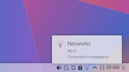
Vivid booted fine from a USB. Everything was peachy. All the peripherals were properly detected, and I was able to connect to both my 2.4GHz and 5GHz routers, but I guess that has more to do with Kubuntu rather than Plasma itself. Still, the network manager is that much more elegant than before, and the flow needed to connect to Wireless access points is that much simplified, with an extra click or two removed. It may sound trivial, but it’s a first step after a great start. The installation also worked well, and I had no problems setting up the distribution in a quad-boot setup.
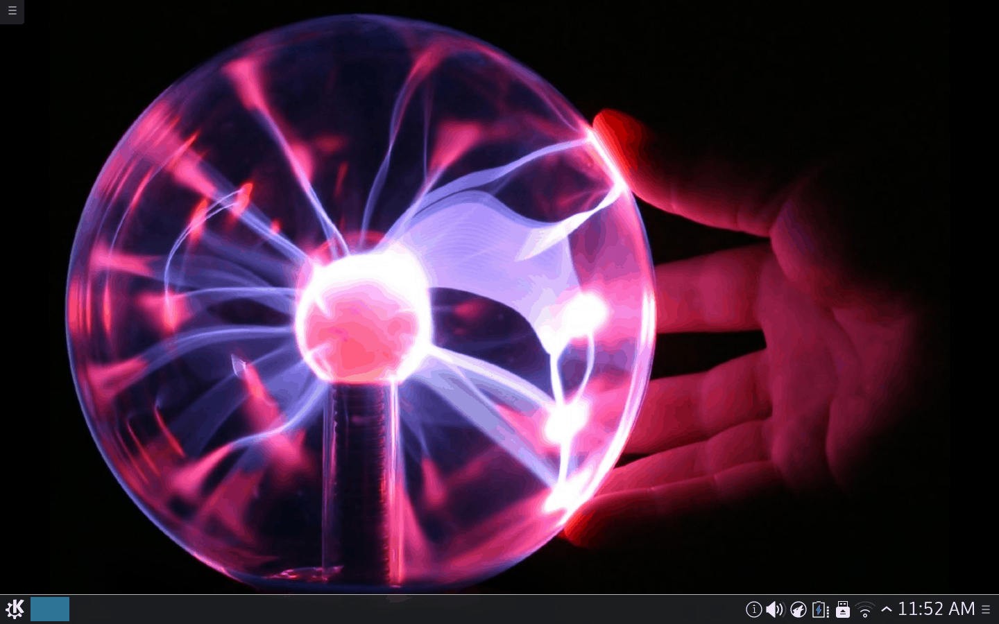
Visual appeal
There’s no way you can argue the splendid way Plasma 5 realizes its presentation layer. The flat looks are somewhat similar to recent versions of Windows, and yet, they feel livelier, friendlier, more accessible. The Breeze theme, both in its light and dark schemes, is simply gorgeous, and the window decorations add appeal. My initial reaction was somewhat like all the way back in 2010, when I first tested Lucid Lynx, and it came with its Ambiance and Radiance themes.
The development team has invested a lot of effort in making this new KDE product behave in a slick, expensive, exciting manner. It’s not just another composition of colors and lines. The gray color palette could be boring, but it avoids the trap, and all the little effects and transitions are pleasant and classy. Not in your face, not underwhelming, just right. The fonts are also beautiful, and the contrast is also quite decent. Whoever sat at the design table did a proper job of making Plasma coruscate and sizzle with fun. I know I’m coming across as a fanboy, but that’s how it is.
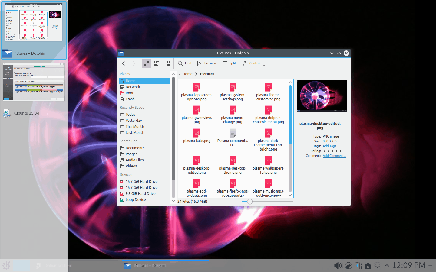
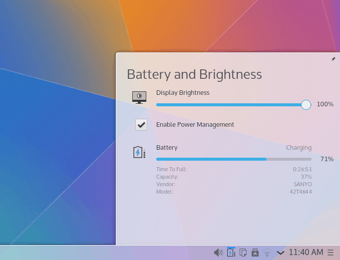
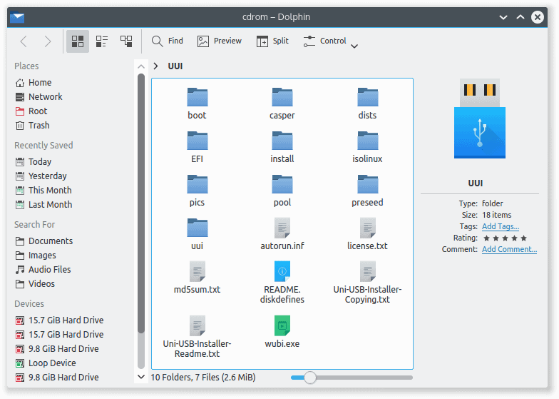
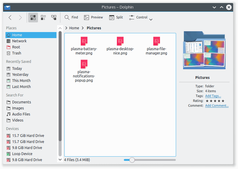
Everything is just right. Popup windows, notifications, system tray applets. Silky smooth. Really nice. Dolphin has also seen some nice improvements and tweaks. The file menu bar is inactive by default, and the system uses its customary one-click to select items, but you can easily change this. All the necessary functions are there, and despite its modernization toward what we might call a somewhat touch-oriented design, none of it has been realized at the expense of usability. Very nifty.
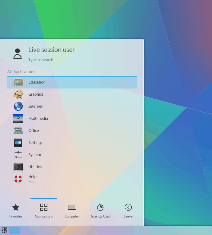
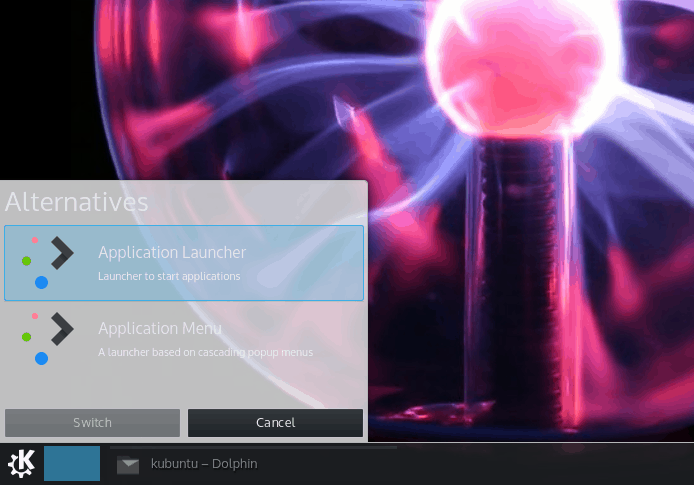
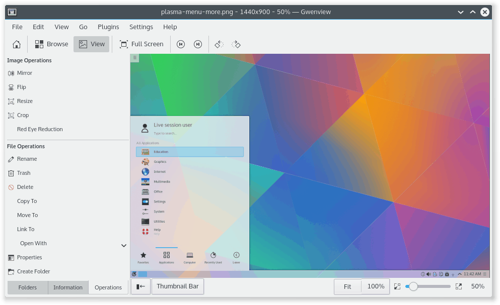
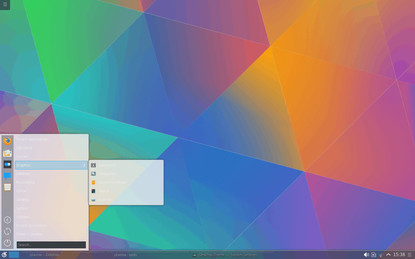
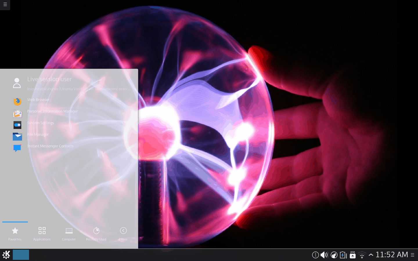
The system menu is also great. Crisp, clear and easy to navigate. Essentially, there’s nothing new there, but it’s joy seeing how the same idea can be implemented in different ways to achieve a fresh new experience. However, if you are not satisfied with how it works, you can switch to a more classic look, the kind that is used in Netrunner.
Widgets
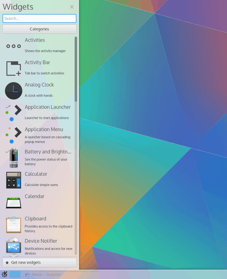
The desktop comes with a rich repertoire of widgets. This is a popular feature of all KDE releases, and it’s here, too, with a vertical alignment. Most of the stuff has a useful purpose, so it’s not there just to add volume. Again, it’s done with the typical KDE approach, which means you can do pretty much anything, which makes it a little overwhelming for new users, but it is easier than in the past.
Usin’ and cruisin’
Plasma feels natural in daily use. It’s no different from KDE4, and it’s very similar to Windows, so if you’re a Windows convert, you’ll be fine, and if you’re a KDE fan, you’ll be fine, too, and there should be none of the trauma that happened during the KDE3.5 to KDE4 transition, where people found themselves struggling to learn a whole new set of concepts.
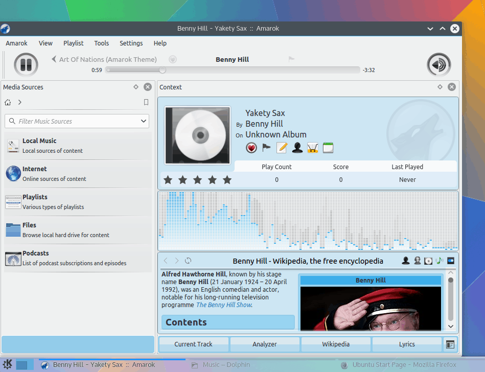
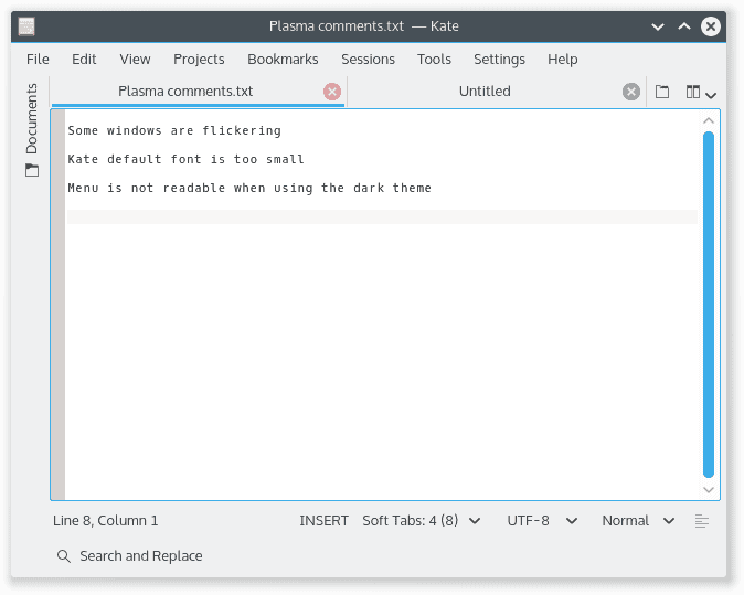
Various applications and programs you like and need are there, and they work just fine. To my surprise, Amarok played MP3 out of the box, which is lovely. Firefox does not support the theme fully yet, but that’s a minor issue that ought to be fixed soon. The majority of KDE software has been tweaked to use Breeze, though, and it looks rad. Amarok, GwenView, to name a couple. Well, most of the time. For instance, the fonts used in Kate and Konsole can be improved. Made bigger, perhaps?
Stable and Stability
There’s a Blackadder reference for you. Now, not everything worked perfectly or smoothly. We must remember that Kubuntu 15.04 has still not been officially released, and the problems we see here can be attributed to the beta bits and pieces under the hood. Still, it is important to mention them, so that they may be fixed toward the product launch date.
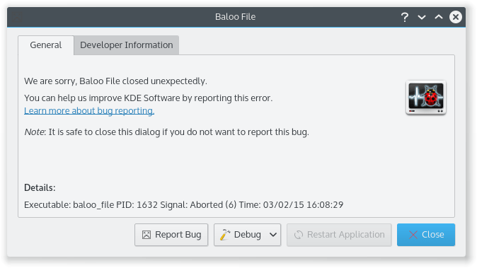
One of the things that suddenly stopped working well was Baloo File. I do not know what this thing is, or how the sudden crash came to bear. I just closed the dialog window and continued working normally, without any apparent problems. A crash is a crash, and it should be fixed. In the past, KDE was notorious for its SIGSEGV, including programs like Marble and Kicker, but recently, the issues have been resolved, so I believe we will be fine with Kubuntu come the spring testing season.
Theme problems
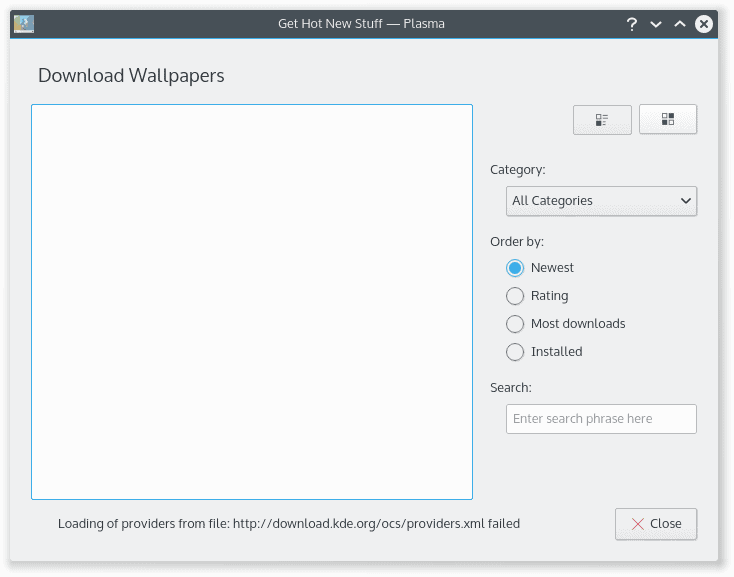
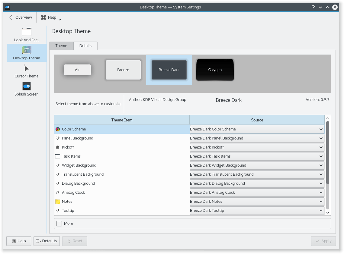
Another bug seems to be related to the whole appearance and theme management. First of all, at the moment, it is impossible to download new themes or components, because the repository data has not been properly updated. Second, it is also not possible to tweak existing themes. For instance, if you want to use the standard Breeze theme, but with the panel background borrowed from its Dark cousin, it can’t be done yet. The buttons respond to your clicks, but the actions are not translated into any visual change.
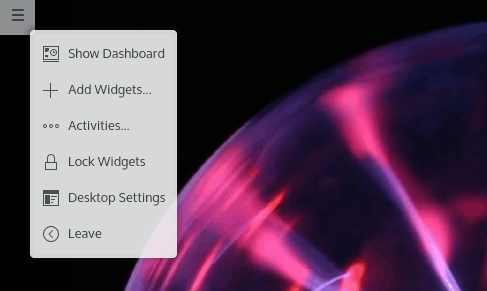
This presents a different kind of problem, because if you’re using the dark theme, the font color changes to white, but the system menu background remains light-colored, which means it is virtually impossible to read the text in the menu entries. I tried to solve the problem by running a full update of the system, but this didn’t quite work out as expected.
After the full system update, I logged out. When I started a new session, all the windows would open in the top left corner, with the windows decorations missing. Keyboard inputs did not work, but the mouse did respond. Furthermore, the system theme had a proper dark shade and no transparency, and the menu matched the change. Unfortunately, this felt like a bug, and I had to kill and restart the windows session to get back to a working state, which means a still somewhat wonky behavior with the Breeze and Dark Breeze returned, where it’s impossible to customize themes, and the menu font contrast is bad. Not a biggie, waiting for the next update. Beta, remember. We’re being merciful.
System control
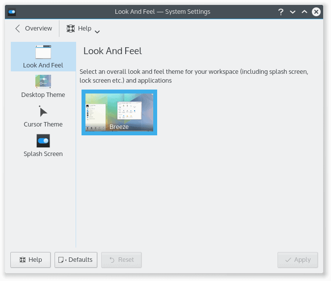
Should you feel like tweaking and taming your Plasma desktop, you get the familiar KDE system settings applet. Except that this new version is one step closer to being perfect. It’s easier to use, it’s cleaner and clearer, and new users will welcome the simple, intuitive approach.
Final looks
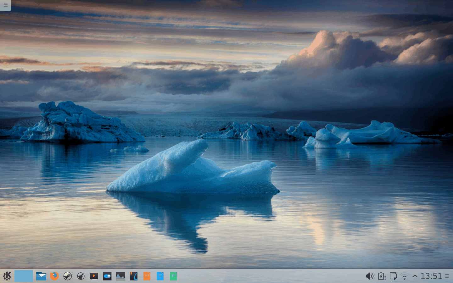
And after some hard work, Voila, presto, whatnot:
Conclusion
Worry not, the future is rosy. Plasma 5 delivers, and it’s a handsome, majestic delivery. The desktop environment is stylish, beautiful, rich, both in terms of what it can give to its user as well as its virtual price. Because you need to shell out some significant money to get the likes of it elsewhere. If you ask me, it beats Windows.
There are still quite a few rough edges and niggles, and some of those are because we tested using an early beta version of Kubuntu, which definitely introduces its own quirks and complexity. Still, overall, Plasma 5 was highly usable, and the testing experience was glamorous. I am confident this new desktop will make big waves through the community, and it may even upset the market, in a good, positive, disruptive way. Perhaps the utopic year of the Linux may yet come, or it may never come to be, but slowly and surely, our favorite operating system will become a household name, without anyone noticing. Best of all, it has a new champion, and it’s Plasma 5. I’m mightily pleased, and I welcome you to test and see for yourself. We’re done here.




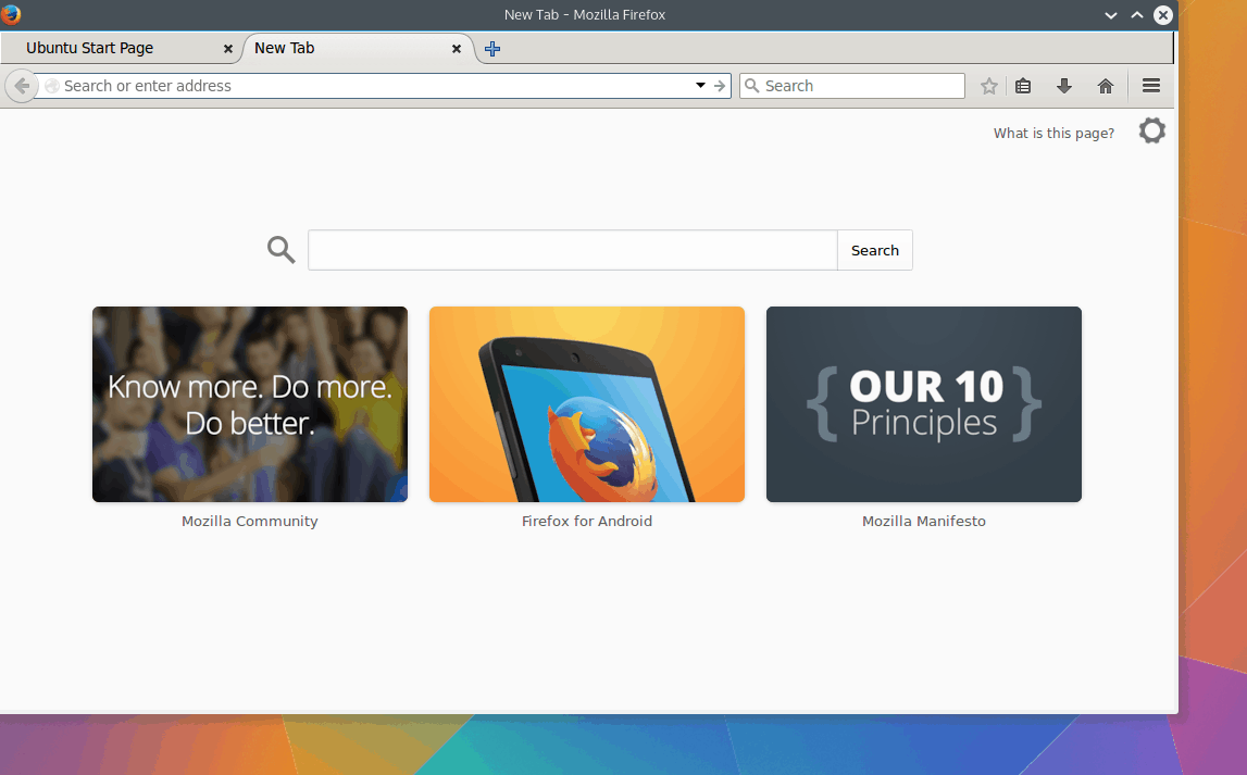


About Firefox, It’s either not configured or Ubuntu lacks kcm-gtk-frameworks. It’s mixed bag for me, I deployed it on my main PC anyway. Good thing I have Nvidia, at least I can use coolest Vsync option to compensate…
What about the ‘Color’ icon in system settings, is it now working for .icc profiles?
Thanks in advance. /Saverio
Fire all weapons, what an extremely silly title, especially with conflicts escalating all over the world, is there a DE war going on too?
You obviously missed the Flash Gordon reference, and the fact that plasma guns are a popular sci-fi weapon. So it’s indeed silly yet witty, classy and sophisticated.
Cheers,
Dedoimedo
The only time Flash Gordon (whoever that is and whatever he has to do with Plasma5) is mentioned on the whole page is in your comment, so yes, I obvioulsy missed it in your article. Wondering what people in the midddle east, Ukrainia or Nigeria think about “fire all weapoms” these days
Ahh, showing psudo “respect” to the country by misspelling it. What an irony…
Being a person from a similar country I take more offense in this stupid misspelling than obvious silly joke title that has no political intentions at all.
C’mon Jeannie, relax. This post is about an open source desktop environment and that has absolutely nothing to do about anything else. Just that. Please try to stick to the topic at hand. The title was harmless. A sci-fi reference only.
By the way, Flash Gordon was the “good guy” in an early comic book series and then an early science fiction TV series. Very hokey compared to sci-fi these days but that’s what Dedoimedo was referring to. Probably something that only us sci-fi junkies, old(er) folks or maybe even a comic book collector would remember.
C’mon! This phrase even made it to a song . “Flash” by Queen ! (they wrote music for the film).
https://www.youtube.com/watch?v=LfmrHTdXgK4
We only have a few crash reports regarding the `baloo_file` and all of them seem to be related to a corrupted database. However, since you were just trying it out, the database should have been fine.
If you can reproduce the crash, it would be nice if you could report it. You can either reply over here, or email me, though bugs.kde.org, would be the ideal place.
Thanks
PS: Press `Alt + Space` and try out the new krunner interface.
I should preface my comments with, I am currently using KDE 4.14 and WANT to use KDE.
With that said, Plasma 5 is still, at least in my view, very far from where it needs to be to be THE Linux desktop. I know, I know. Plasma 5 looks a lot better in many ways when compared to the previous versions, but there are many nagging things that I feel hold it back.
1) Defaults. KDE still lacks sensible defaults in many areas. The new font is nice, but the sizes are inconsistent throughout the system. Also, just looking at the screenshot of Dolphin. It lacks quick shortcuts to the standard folder selection (Documents, Music, Pictures and Videos), but has eight smart search categories by default. Why? I know people use that feature. I never have. Those that use it know how to implement it while, I would venture to guess, more standard users rely more on the standard layout that is found in many of the other major file managers out there. Not a huge issue, but something seems over complicated and not in line with the new clean look KDE is going for.
2) The hard stuff is easy, but the easy stuff is nearly impossible. KDE is big. KDE is powerful. That’s why a lot of us use and like it, but some things make you scratch your head. I’m certain that somewhere, deep within there is a button in KDE settings that would launch my desktop to Mars, but I still can’t assign the meta key to launch the menu or KRunner without implementing a hack. With Gnome, Unity and Windows all using the meta/Windows key to toggle a launcher, the fact that it isn’t even possible in KDE seems odd, given the fact that KDE is championed as the king of customization.
I’d argue that this problem extends into the applications as well. Just look at KMail. Once you get it setup, it can do wondrous things, but Frodo had an easier time getting from point A to point B than many people do with KMail. Compared to something like Thunderbird that is set and forget, it has a ways to go. Also, Amarok suffers from this. It is immensely powerful and I can do so much with Amarok, except view my entire collection in the primary window, ala Rhythmbox or iTunes. I actually found myself listening to my music less because I couldn’t just open it, set it to random and let it roll. Maybe that’s possible, but I’ve never found it in all my looking. Again, maybe that isn’t how Amarok is designed, but it seems like a glaring omission to not have a simple view of all of your music to go along with all the advanced features in Amarok.
The best I have found is to drag the entire collection to the playlist and set it to single like mode, but that’s me. If I gave Amarok to a normal person, would they be able to do that? Probably not.
3) The dance of Pulseaudio and Phonon. That’s car crash is always fun to watch. Inevitably something goes wrong.
There are others, but they only serve to further highlight what I still feel is wrong with KDE. I also don’t say these things to be mean or hurtful to the KDE people. I think they make good stuff, I just wish there was more simplicity and smoothness to all of their stuff.
Maybe they will get there. If the new KRunner search is any indication of what they are planning to do to the entire desktop, we should feel good about things to come.
I wish them the best of luck and am looking forward to using Plasma as default when it ships in a few months.
I didn’t have any closed sourced drivers on this laptop.
I will extend my testing soon.
Cheers,
Dedoimedo
Looking forward to it.
Heh, I couldn’t even get the latest build to install. The installer would fail out when writing GRUB to the root of the test partition I was installing Kubuntu Vivid into. I have an older Intel core 2 quad machine w/8 GB DDR2 and a traditional BIOS. I have 2 test partitions for distro testing along with the primary partition that holds my main OS (Linux Mint/Cinnamon) which holds the GRUB install in the MBR. For any test distro I install into one of the test partitions I also install that test distros’ GRUB into the root that partition as well. I just update the control GRUB from Linux Mint whenever I install or make changes to a test installation. It’s always worked well in the past but Kubuntu Vivid wasn’t having any.
Since there’s no way to not install GRUB with the Vivid installer then I guess I’m stuck. Strange that the NEON 5 project installed fine but not Viivid.
Plasma 5 rocks!!!
Left Linux when KDE4 pig entered the room – KDE3.5 was excellent – maybe MS owns KDE
Ah, the troll arrives. (I’m sure everyone here can pick him out without a problem).
Hello, i also had te same problem with the flickering windows, you have to change the composition render to OpenGL 3.1 (default is 2.0) ;)
Still no bloody weather widget
Crashes at times with a multi monitor setup. Used a Lenovo laptop with Radeon swtichable graphics and a Samsung external monitor. Maybe the Radeon graphics driver was the problem. Overall look are very good indeed.