Review: GNOME 3.12
For a brief period of time GNOME was the princess of desktop environments. The most popular distribution out there, Ubuntu, used it. Distributions perceived as being very professional such as those from Novell or Red Hat, used it. Even the “alternative” distributions like Linux Mint used it. Later with KDE making the transition from 3 to 4, GNOME 2 solidified its position as the darling of desktop environments.
And then something happened. Canonical decided to create its own desktop environment, Unity. Linux Mint switched to Mate, a GNOME 2 fork, then they forked the most recent version of GNOME to create Cinnamon. Elementary OS was also born and using some of GNOME’s technologies Pantheon was built. Novell still uses the old GNOME 2. What happened? It can be described with a single digit, 3. Gnome 3 happened. The following is a review of the latest version of the very criticised GNOME.
The good
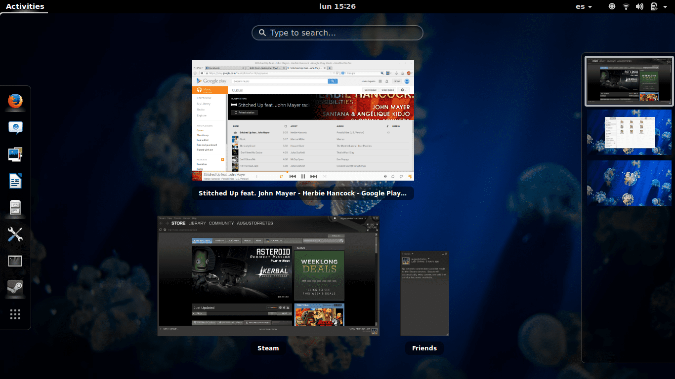
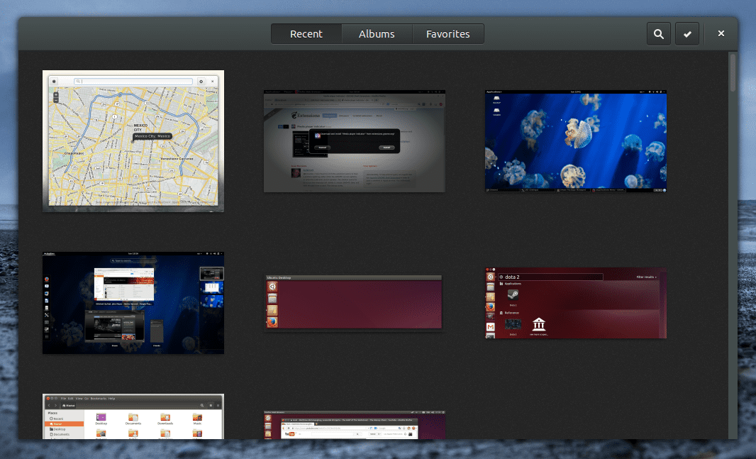
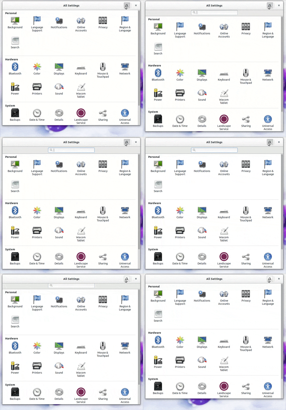
Despite all criticism towards GNOME 3 there’s a lot, and I truly mean a lot, of things it does very well. In fact, although many seem to think gnome-shell is so misguided no other group of developers would ever make something similar, it’s a lot like Apple’s mission control. Here’s gnome-shell’s activities overview:
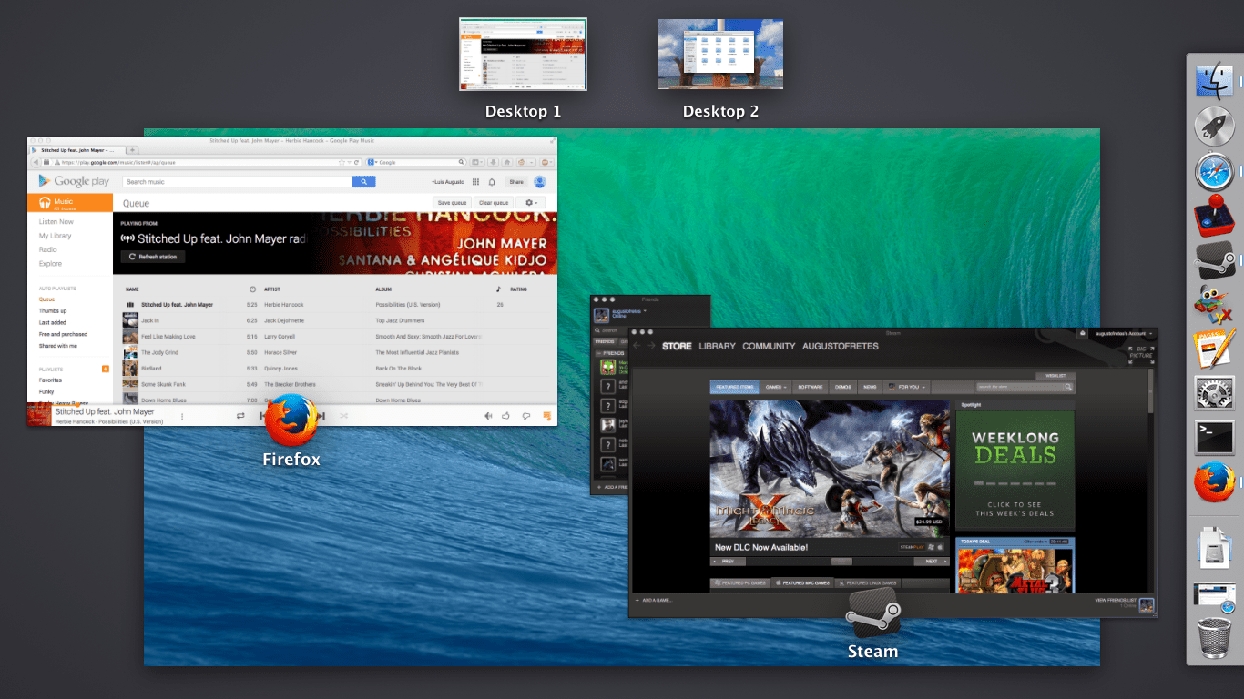
Here’s Mission Control on Mac OS X:
GNOME developers came up with this kind of interface before Apple did, so they did not copy Apple (before someone claims that they’re just ripping them off). KDE’s Plasma original goal was to be able to offer many different kinds of interfaces to users and letting them build their own pretty easily. This has for the most part stayed in the ether of promises.
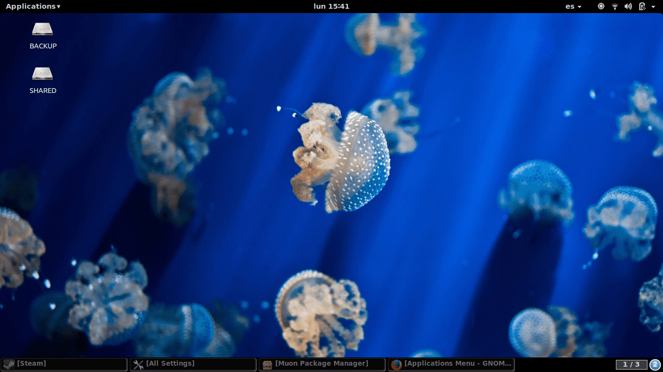
Yes, there are a few variations (like the Netbook interface) but nothing particularly important for desktop users. Moreover is not actually easy to build new ones (is hard enough that there’s not even a dock for KDE 4 after 6 years). Ironically it was GNOME the one to provide a system which enables developers and users to change how it behaves easily. Since is all done using JavaScript and CSS making new extensions is really, really simple. Thumbs up for its developers. Reproducing the interface of GNOME 2 is a rather trivial task (not to mention an option to login to a session with GNOME 2’s style is available by default).
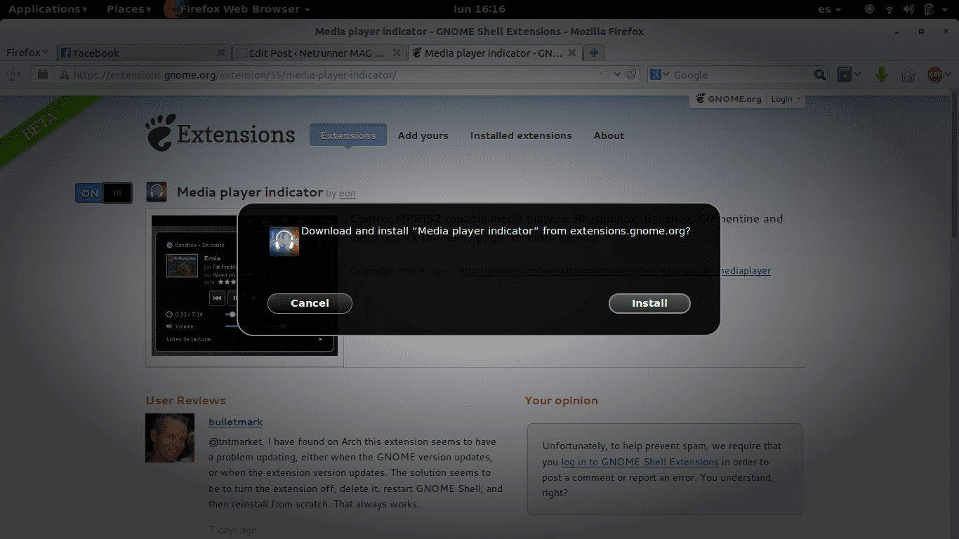
Just as cool is the process of installing extensions. It’s dead simple. Similar to KDE’s system “Get How New Stuff” except even easier to use (compared to installing widgets), you just to go online and move the switch from off to on. You’re asked if you really want to install and enable it… and that’s it. You can even manage what extensions are on and off from the site.
Gnome-shell can be criticized for many things, not offering customizability is not one of them (in its current incarnation, it was a valid complain for a long time). However, while it does allow the user to change settings to better fit his or her taste, the default settings are not particularly good, as we’ll discuss later.
Obviously GNOME 3 is much more than just gnome-shell. For example, one of the new additions are what are known as Header Bars (introduced on 3.10). They integrate window control actions to the main interface (as opposed to having a window border that contains the name of the window and the controls). It looks really nice.
Most of GNOME’s new applications are among the most visually pleasing programs on any operating system or desktop environment (mobile, desktop, Windows, KDE, Android, iOS, it doesn’t matter). There’s clearly a lot of cooperation between designers and developers (or perhaps the developers themselves are good designers) and it has a very standardized look.
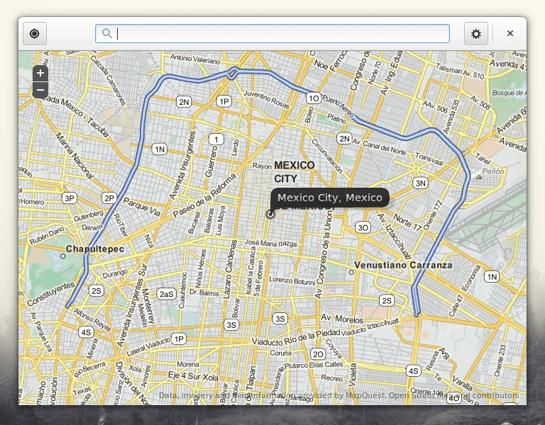
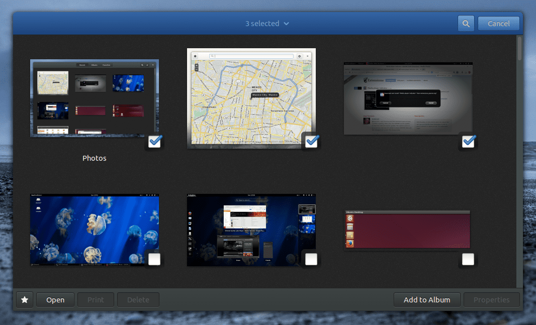
Some dialogues are implemented in a beautiful manner with the header bar changing form to fit the situation.
Everything is animated. Animations are pleasing (although some are a tad slower than they need to be). Windows automatically resize if necessary, something I’ve complained KDE doesn’t always do correctly (and doesn’t do at all outside of Plasma).
GNOME 3.12 is not just filled with decent decisions, there are a lot of superb choices. A lot like what happened with KDE 4, much of the criticism got addressed as time went by but some of the critics never caught up. Most of us whom actually use it, can say that KDE 4 is better than KDE 3 without any reservations. GNOME 3.12 is perhaps the tipping point for GNOME 3: When GNOME 3 becomes unambiguously better than GNOME 2 was.
The bad
The default behaviour is not good. Yes, gnome-shell is in fact very similar to Mission Control but Apple didn’t strip all other window management out of OS X. You can still minimize applications, use the dock to bring them to the front, know which applications are active, etc. And that’s faint criticism, Apple’s window management is not particularly good. Compared to Window’s or KDE’s, GNOME’s (default) window management is just pathetic.
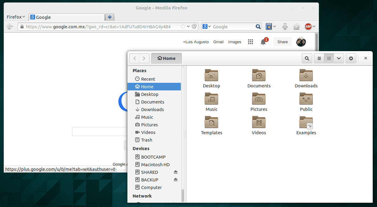
And even when you put a little effort to customize it, GNOME’s very good looking applications don’t follow your settings regarding minimize and maximize buttons on windows. Take a look:
Nautilus absolutely ignores the fact that I want a minimize button. You can still minimize it if you’re using a GNOME 2-style taskbar or if you modify the normal behaviour of the dock. But is still a cryptic design choice, especially because it’s ignoring my very explicit requirement for a minimize button!.
There’s also this menu on the top panel:
Why this exist I don’t know. Why can’t it be integrated to their incredibly uncluttered and space available applications, I don’t know either. It’s there, is sort of a hybrid of Apple’s menubar and KDE’s button menubar on the titlebar without the advantages of either of them.
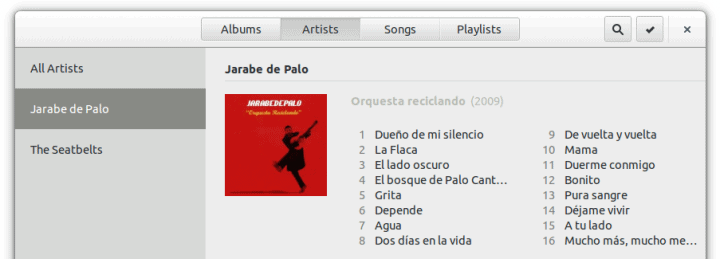
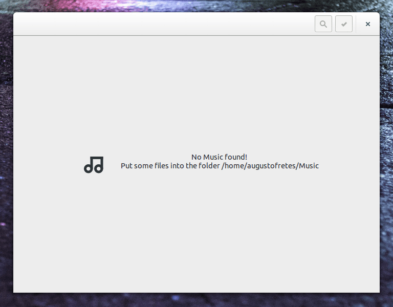
Gnome-shell aside, applications suffer from over simplicity. For example, here’s the Music Player:
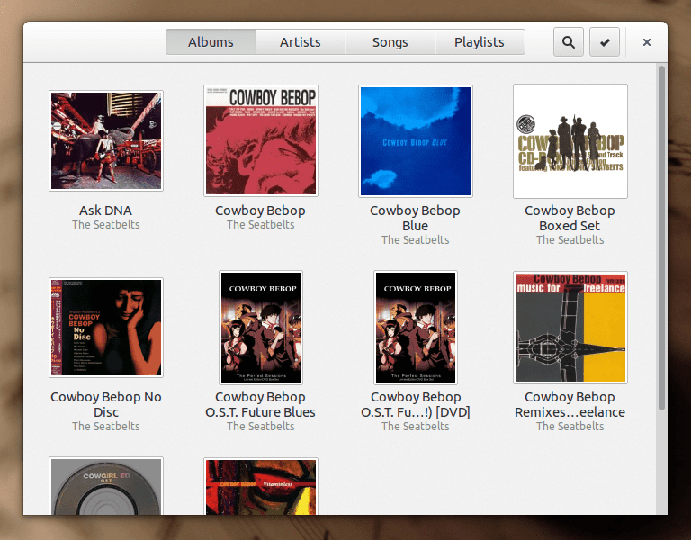
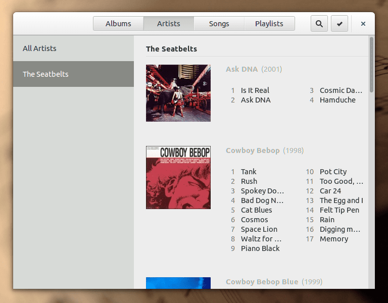
It tells me to put some music on my music folder. Here’s the thing: My music is on an external drive. There’s no setting that I can find (or settings at all!) to change the default location or to add another library. Therefore, GNOME’s Music Player may look good but it’s absolutely useless to me. Just to know how it looks with an actual library I took the effort to link some of my local music to my home folder.
I really like its design, I just wish it had more options. Considering it’s such a new application perhaps we can forgive it for missing some basic stuff. In any case, I greatly prefer the direction taken by it to that of the likes Rhythmbox and Amarok.
I love how GNOME’s scarce functionality is presented, but I also need the applications I use to be more functional. Adding a library is not a particularly big request, think of all the people that are using Linux alongside Windows, think of how many of them currently have their music on their Windows drive. Is not an obscure need at all, is a basic feature. This is the biggest problem with GNOME 3, the Music application is just an example of a bigger problem. Applications have very limited functionality.
In other words, what GNOME really lacks is functionality, the design direction is absolutely outstanding (except for the defaults concerning gnome-shell, but not, for the most part, gnome-shell itself).
The ugly
Maybe the functionality will never come. Sometimes it appears that offering very limited features is part of the GNOME Team’s philosophy. Good aesthetics and simple interfaces are also a part of their philosophy, I just hope they keep that without it being the cause of them crippling their own software.
Conclusions
GNOME 3 is very promising. It’s incredibly polished in many respects. I recommend any user that ditched or ignored it years ago to try it. Not because I think they will switch to GNOME, most users I think won’t switch to a system that’s still so limited in so many aspects, but I think they will come to appreciate what GNOME 3 does right. Credit to where credit’s due and criticism where criticism’s due.
Correction: A commenter correctly pointed out that although Mate is used by Linux Mint, unlike Cinnamon, it wasn’t started by them. It was started by an Arch user from Argentina known as Perberos. The article was updated to correct this mistake.


Nice review, thank you.
I have always used KDE, but the nice polishing of GNOME is very attractive.
Thank you. Indeed, GNOME is very visually polished. They really do that incredibly well. It’s all free software, so it brings me joy, even if I don’t personally use it, that there are so many quality desktop environments available.
Gnome, in parts, displays obvious similarities with Mission Control and LaunchPad in OS X. But, as someone who had a Mac sitting on the desk next to a Linux machine for more than 10 years, I can say there is one important difference: Use of LaunchPad and Mission Control is optional in OS X, while, without extensions, use of their Gnome counterparts is mandatory. When those new elements were introduced to OS X, users did not lose access to files and applications via the Finder.
I’m not a fan of hot corners in any fashion, so Gnome’s reliance on it to expose the dock, overview and workspaces annoys me.
Still, most people do little or nothing beyond opening and closing applications. Gnome is well suited to that kind of user. It’s emphasis on simplicity and uniformity of design across the platform has, individual theming tastes aside, resulted in an interface that should be less threatening to users more familiar with non-PC computing devices than they are with Windows 7.
I agree, for the most part. (Including your comments regarding Mission Control, that echo what I said in the article: “The default behavoirr is not good. Yes, gnome-shell is in fact very similar to Mission Control but Apple didn’t strip all other window management out of OS X.”.)
My concern with GNOME is that I think regular users have slightly more needs than are covered by their default applications, and I don’t think to most users benefit from stripping down all other window management from gnome-shell. However, with extensions gnome-shell is actually fairly decent.
i didnt think linux mint created mate, i thought it was originally made by some arch developers or something i cant remember
You’re correct. Although the Mint developers are its maintainers and current developers it was started by some Arch developers. Thanks for the correction! :)