Plasma 5 – Ano’er opinion
Several days back, when I saw an article covering Plasma 5, written by my colleague Luis, I immediately stopped reading. The reason was, I intended to write a piece of my own, and I did not want to taint my subjectivity with someone else’s. I promised myself I would read it, just a few moments before I conclude this review.
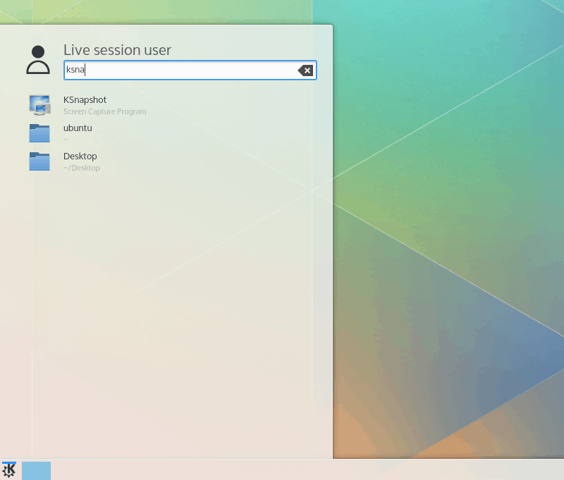
Anyhow, I tested the new KDE release while still in an early stage several months back, and it showed great beauty and decent promise, despite being rather devoid of any real functionality. Since, dozens of releases have been baked, each one introducing fresh new incremental changes, making Plasma that much better and ready for the grand Mk.V release. Maybe. Let’s see. This time around, we also have a Neon 5 live edition, built on top of Kubuntu. Follow me.
Touring in my 5.0
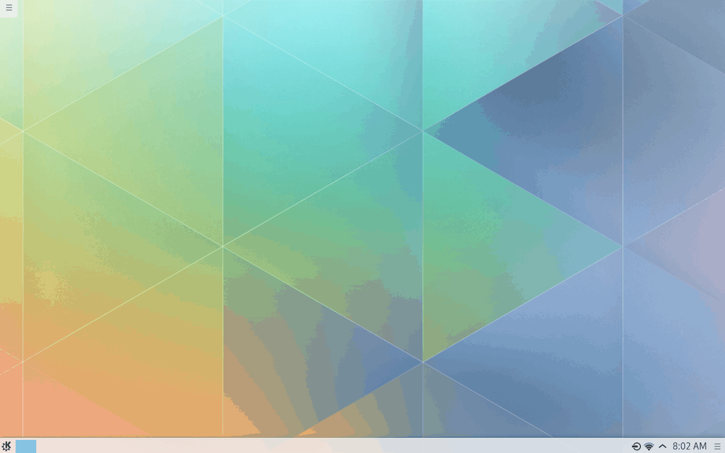
The lyrics from Ice Ice Baby have never been more relevant. Indeed, the Plasma-Five-endowed desktop is quite pretty. I like the clean, IKEA-like flatness. The color choice, the contrast, the fonts are all great. Windows 8 also has a pretty decent flat design, but this one beats it. There’s also a hint of abstract slash Android as seen on smartphones as such, and if KDE is aiming toward mobile devices, it makes sense, without compromising on the functionality. Sort of what Apples does with its range of products.
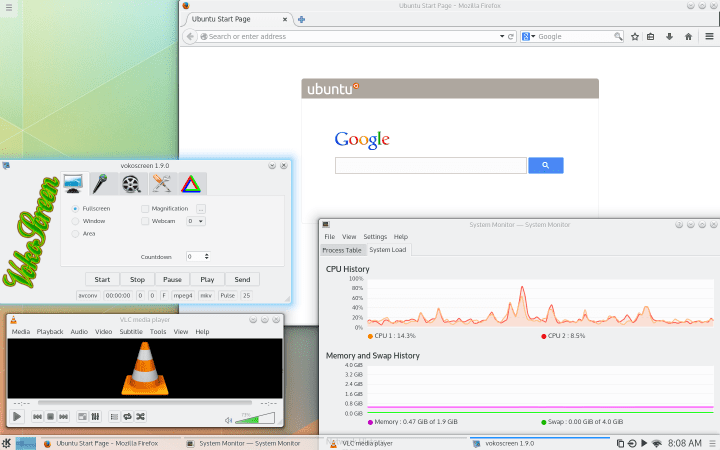
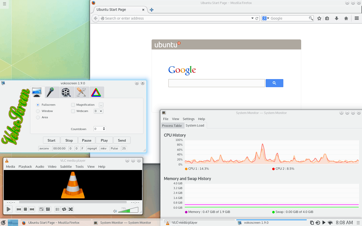
Now, the exploration is pretty straightforward. You start clicking things left and right to see whether they work. And yes they do. Much smoother and faster than before, with fewer errors. This is an almost fully operational system, and you even get a useful bunch of applications for testing.
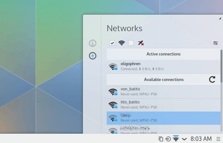
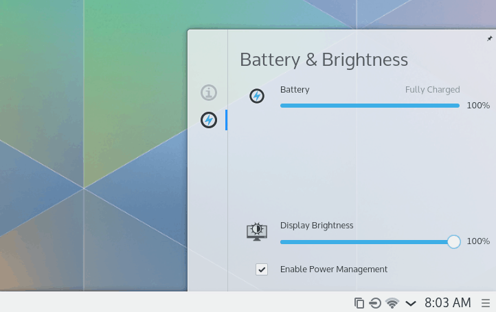
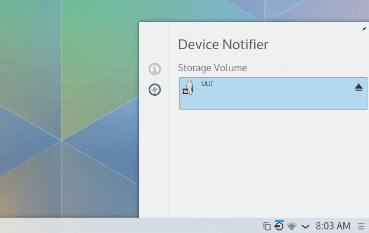
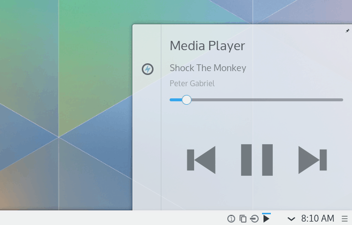
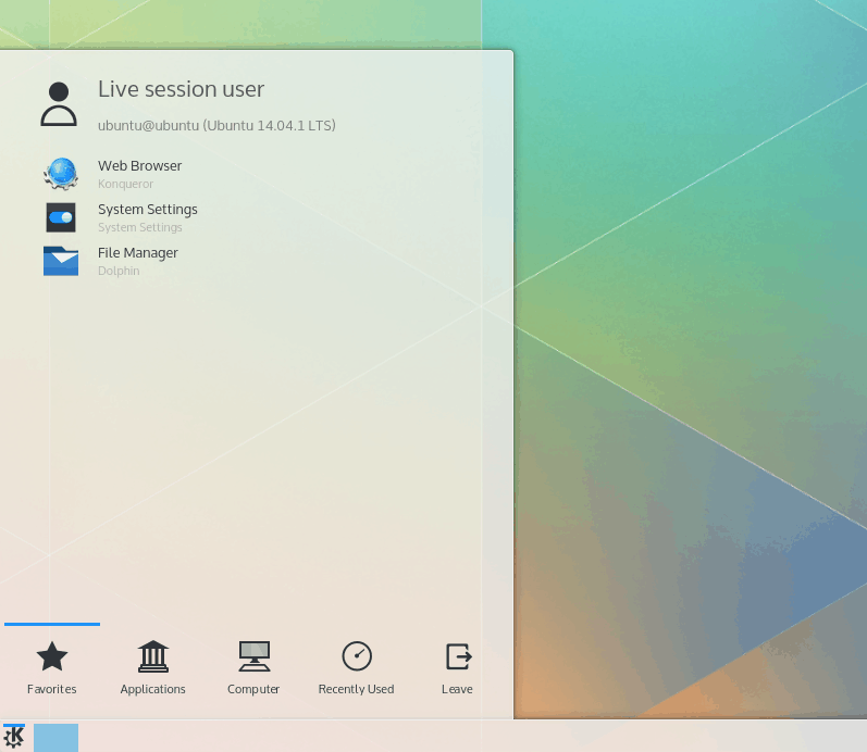
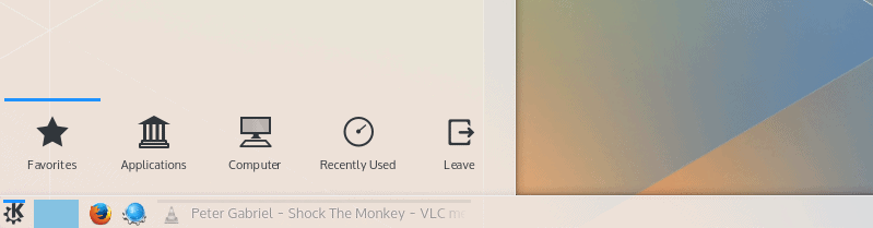
Starting in the right bottom corner, the system tray is elegant and practical. You can configure your Wireless networks, toggle the airplane mode on/off, tweak the brightness, play with your external devices, and more. There’s also the media player integration, so if you play songs, they’ll look pretty, too. Opposite that, on the far side of the galaxy, the menu takes your focus, and it’s a sharp, stylish product.
I had fun exploring the options. Again, the flatness prevails, there’s a nod toward touch, but the overall functionality has not been hampered with post-modernistic oligophrenia, which is nice. The icons are crisp, the text rounded to the full perfection of OCD. Quite decent, surprisingly so, in fact. It’s not that I doubted the guys working on KDE and Plasma, but they have taken the aesthetics two notches up above everything else.
You can also add shortcuts for your applications. Lovely. However, editing the panel is not trivial. It should work, but the buttons refused to translate mouse clicks into real actions. This is one of those beta bugs, which will undoubtedly be resolved toward the official release.
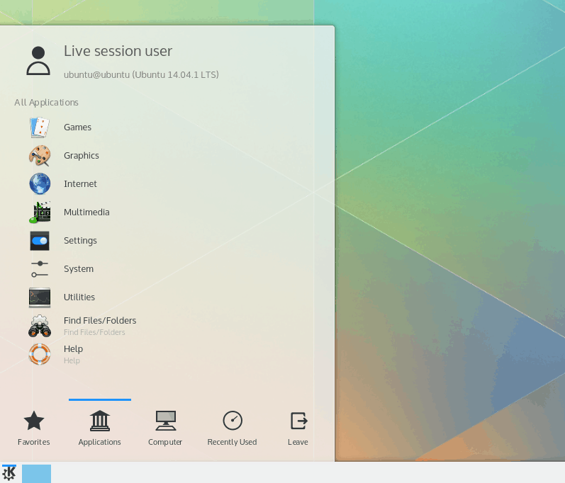
As always, Plasma lets you change the menu behavior. This is a new old trick, and it sits well in this whole ambiance.
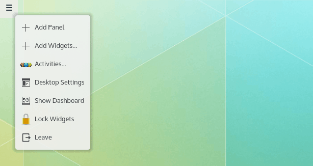
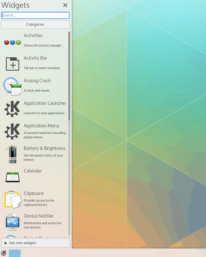
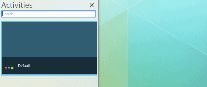
In the top left corner, the functionality that used to lurk on the starboard side (or the other, whichever one is left) now resides here. You can add widgets, panels and activities. The horizontal scroll has become vertical. Not sure if this makes sense, but it probably does, because it is easier to scroll up and down than left right. Something to do with how the human brain is wired, and elegantly, Plasma takes itself one step away from Windows 8, which sort of did not succeed with its horizontal placement of tiles. Smart move.
When you put the aesthetics aside, it’s a fairly functional system overall. Sure, there are some problems with some of the applications not yet fully conforming to the new framework, but that’s fine. Even the memory usage is fairly low, but the CPU can get spiky. However, remember this was all done in a live environment, and there will be some optimization before the product hits the proverbial shelves.
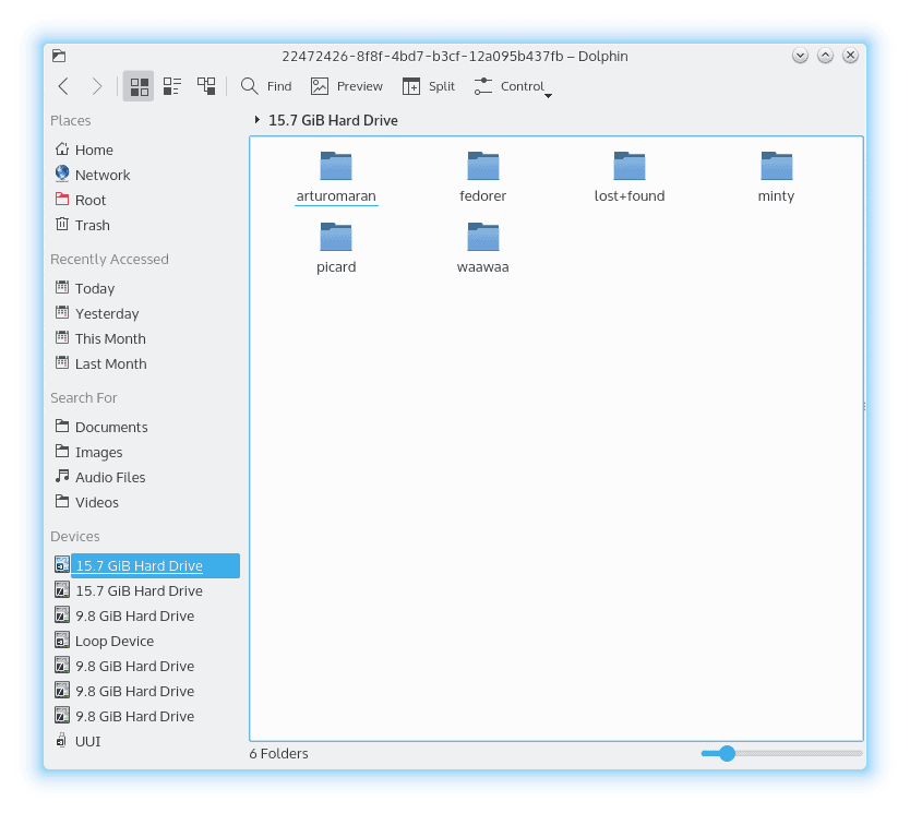
I also really liked the file manager. Dolphin looks neat. Modern and relevant and still very much familiar. The default selection of wallpapers is also adequate. Step by step, this is shaping up to be an excellent solution, with the latest technology bedded to great looks. And if you need to sell, it’s the latter what does the job. And now I can read what Luis had to say.

Conclusion
The text is different, the images are similar, although my taste in music wins, and the overall summary is going to be near identical. Sure, there were bugs and issues and not everything worked. But that’s not the point. This is an aperitif, a teaser, an early look of what’s to be and to be had. And enjoyed.
Without sounding like a fanboy, I do find the Plasma 5 framework to be the most sensible future environment for computing use currently available in the Linuxsphere. It’s pretty and elegant, and it works just like any old desktop, and that’s the most important thing. Sure, a lot can happen until you see this waving like a banner above the distro ranks, but for now, the project is on the right track. Very much so in fact. This could also be a big drive for the competitors to try harder, which makes the future all the more exciting. Plasma 5, second outing, jolly good. See you around.
Cheers.
I’m looking forward to Plasma/KDE 5, except the fad-chasing style, which looks (as it does on other OSes) like an oldschool mono LCD screen from an ancient PDA/cellphone. :-p Thankfully one of the wonderful things about KDE has always been that it lets us customize the daylights out of it. I’m really hoping that 5 will automatically have theme icons affect the system tray (and won’t move their location from one release to the next) — having to hunt down the latest location that KDE 4 has stashed the default systray icons, then manually replace them with what I prefer is kind of irritating.
Side note: I dislike the mono look in part because it’s so freaking dull, but more because it slows identification & reaction times. Decades of non-subjective usability studies show that people learn to identify & react to icons/images the fastest by far when there’s color and a concrete subject. Anyone can get an idea of the color/mono performance gap by staring a few inches away from a set of highly familiar color icons, just close enough to make out the colors but not the shapes, and identifying as many as possible, then try the same task using a collection of mono icons at a similar distance.
I only just discovered netrunner-mag in the past couple of days, and have *really* been enjoying the Plasma5 related articles.
Thanks very much to all of you for your time spent writing these enjoyable, informative pieces. :-)
Five, five, baby :-)
Hi, Igor, you talked about the “Ice ice baby” song, and I just could not resist singing it in my head, but instead of singing this part:
Dance, Go rush the speaker that booms
I’m killing your brain like a poisonous mushroom
Deadly, when I play a dope melody
Anything less than the best is a felony
it is surprisingly fun using those words from this article:
Again, the flatness prevails,
there’s a nod toward touch, the icons are crisp.
Quite decent, surprisingly so,
the aesthetics two notches up above everything else.
More adapted lyrics from this article are welcome in this page :-)
Glad it’s coming along. As 2 of my images where selected as default wallpaper. And like to give back to the community in my own way. Since I’m not a coder or programmer.
Personally am holding off and going to give it as a Christmas present to myself in Dec. And glad it’s coming along nicely. Looking for a list of my core apps that I use regularly have been ported over. K3b,Okular,Apper,Amarok or Clementine,LiberOffice,Gimp,Firefox,Calibre,VLC,Wine,Ktorrent,etc….
As it’s more about Function and Using then how it looks. When I first tried Dark themes were broken as prefer darker desktop for these old eyes.
.
Great review Dedo. Coming from you, I get even more anxious to see this going (you are picky, we know…) But yes, definitely since the meltdown of Linux desktop with GNOME 3 and Unity, this looks promising. KDE guys took the right path. I’ve abandoned Linux for about 2 years now. But with something like this to start dominating the game, this will be fun again, oh yes, Linux will be fun again.
I like darker menus, like Netrunner, PCLinuxOS (nice dark blue) and Ubuntu Studio. Style wise this looks nice and clean. But too bland for me. I hate white panels. I will stick to what I have for now.
I hope they give us a few good options with the final product, because I personally hate dark panels. :)
Yeah a whole pallette of colours and glossy,matte and pastel shades would make a nice choice.
I am using KDE4 on my desktop. But, I also have a new laptop with a touch screen feature. I hope this KDE5 can utilize this new feature so I can install my fav linux in place of Win8.1