KDE vs. Gnome system management

A few weeks back, we talked about KDE and Gnome in daily life, and how they fared from the applications perspective, when you pit programs developed for one environment against those created for the other. We learned a valuable lesson that technology and practicality do not necessarily go hand in hand, nor that you can easily draw a clear line between the two. Finally, we discovered the joy of freedom, in that you can mix software, regardless of whichever desktop you choose, and get the best of all worlds. Now, the big question is, does the same set of conclusions apply when you try to administer your box? Well, to answer that, we will check how easy and intuitive it is to manage Linux when you choose KDE or Gnome as your platform.
I will show you a handful of common activities, like Wireless card setup, printing, appearance bells and whistles, and a few other tasks, repeated in both of these desktop environments, and we will try to decide which one is better suited for the common user, I repeat common user. We will not discuss installations, package management or distro-specific items, because they ultimately eclipse and shadow the desktop environment. Anyhow, let us begin with KDE.
KDE combat trial
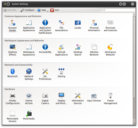
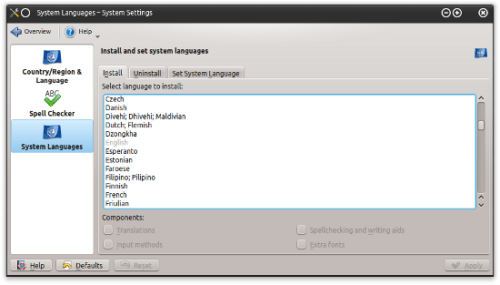
KDE used to be a busy environment, with a dozen different menus serving a hundred times more options, creating visual and functional chaos for the average user. With the creation of KDE4, things started to become more serene, more practical, with multiple and conflicting menus going away. The separate KDE settings wizard and the system wizard merged into one single entity, and numerous ambiguous and complex options were deleted or majorly simplified. Today, all of KDE settings are available in a single unified menu called System Settings. This applet lets you govern all components of your system, and dispense with the need to use custom control centers available in various distributions like SUSE, Mandriva, PCLinuxOS, and others.
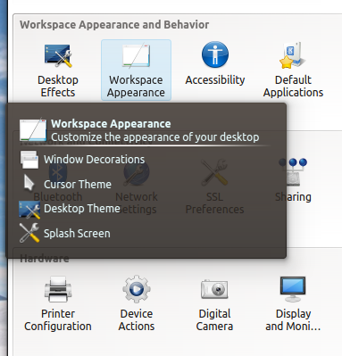
Nevertheless, for the first-time user, the System Settings menu might appear a little busy. You get application appearance versus workspace appearance and window behavior versus workspace behavior, and these terms could potentially confuse newbies. Luckily, each item comes with its own tooltip, displaying its purpose and sub-categories. You just need to hover your mouse over the relevant icon.
Appearance
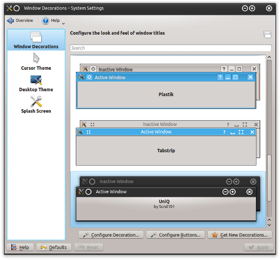
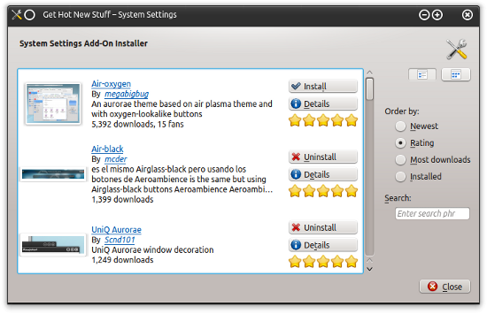
My first mission was to change the windows decorations. Note, it is different from the desktop theme, however the two things are closely related. Still, for first-time KDE-ers, the distinction might be blurry. However, once you get the hang of it, it’s a breeze – and pleasure. KDE comes with a solid array of default decorations, and if you want more, you can get them online without leaving the safe comfort of your settings menu. Not only you get to browse the master repositories from within the wizard, you can sort and rate your decorations, be they themes, wallpapers, icons, and more. Truly great.
Wireless
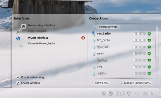
My second task. Not as great as you might like, but almost perfect. When the network is disconnected, you do not get any fancy indication in the system area that you ought to connect to a Wireless access point, you merely have a tiny bubble waiting for you to click on it. Once you expand the Network Manager list, it becomes easier. There, you just need to find your desired network and connect to it. You might be prompted for a password and asked to store it using a secure, encrypted password storage tool. In terms of ease of use, this is not the best workflow, but it’s decent.
Printing
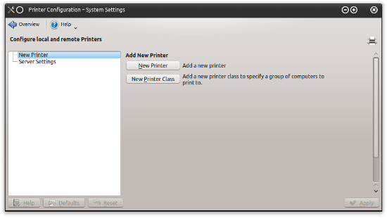
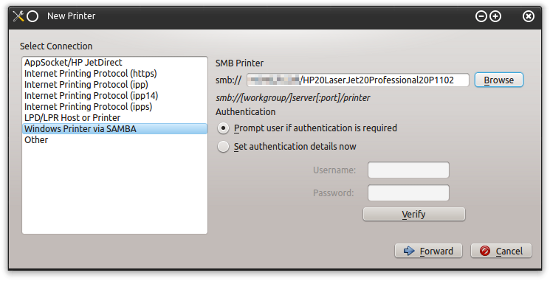
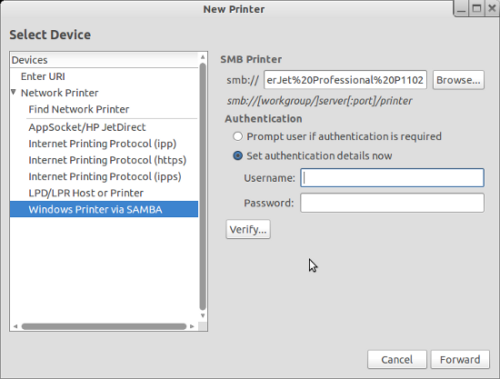
In the past, the KDE printer wizard used to be dreadful. In the latest version, it’s become extremely simple to utilize. It is similar to the older Gnome printer tool, in that it lets you choose what kind of printer you want to define, including printing over Samba. Indeed, in my example, I am connecting to an HP LaserJet P1102 printer connected to a remote Windows 7 host over encrypted Wireless. The applet found the printer without any worries. From there on, I had to choose the model and driver, and that was all.
Other things
There are many other aspects of the KDE administration we could discuss, but I am only going to show you a few more. The thing is, KDE is a champion of detail. More recently, the developers have figured out that you can have complex menus without exposing everything to the user at a first glance, so if you dig a little deeper and click on some of the more obscure tabs, you will find what you want. That way, you minimize visual clutter without compromising on quality or functionality.
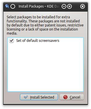
KDE comes with a lot of helpful items. For example it will suggest additional packages when you try to run your software, including codecs, language files, missing packages for enhanced experience, and more. It’s quite contextual and rather smart.
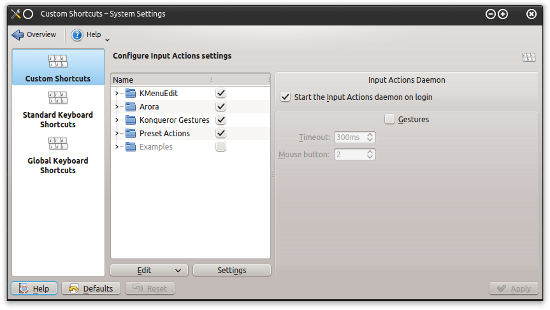
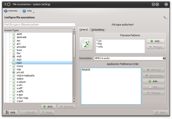
And if you’re a real control freak, you get your free share of everything:
Gnome test run
Simple and easy are the not same thing. When you talk about Gnome, there’s an obvious air of simplicity wafting around this desktop environment, however that does not necessarily mean that your life will automatically be easy if you opt for Gnome. The thing is, Gnome 2 did have an extremely reasonable workspace layout with a high level of ergonomics and functionality. With Gnome 3, an even more radical approach to making the interface clean and simple has created an adverse effect of making easy obscure.
Gnome is designed to let the casual user govern a small number of popular functions using intuitive, non-cluttered menus. For anything else, things become more complicated as you need additional tools and applets to expose hidden functions, or alternatively, you must head into the command line world. Moreover, making things more complex is the non-singular nature of the Gnome environment. While KDE is pure and does not have any variations and forks, Gnome is essentially an integral part of both Unity and Cinnamon desktop environments, which complicates things a little more, as you end up with several layers of logic and taste meshed into a single fabric.
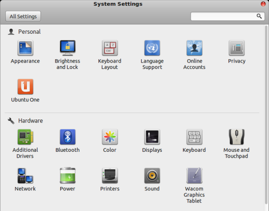
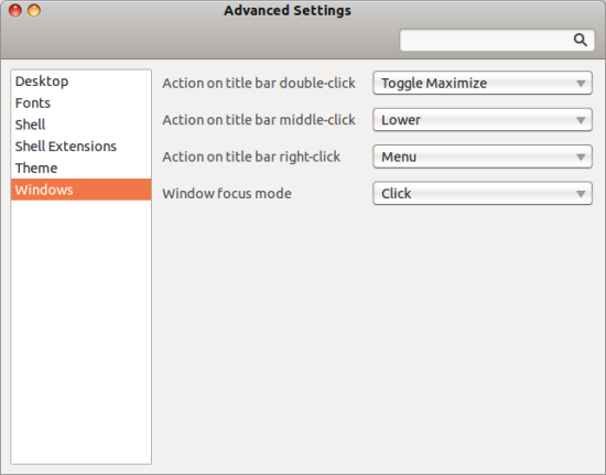
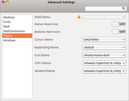
So let’s see what Gnome can do, in its latest, pure and spartan form. Like KDE, it offers all of its functionality using a single System Settings menu. But this is not quite true. While this program governs most of the stuff you might often need, it does not let you control ALL of the stuff. For example, changing themes and icons cannot be done using the settings tool, and you must install additional software. For example, using gconf-editor, dconf-editor, Advanced settings menu, and other tweaking tools is a well-familiar practice for Gnome users who need more control and flexibility over their desktop environment.
Appearance
Managing your appearance is the best example of the Gnome’s over-simplified simplicity. You can edit your wallpaper and a few additional items, but a completely different tool is needed to fine-tune the various aspects of the desktop’s look & feel. Not only is this counter-intuitive, the Systems Settings menu and the Advanced Settings menu use different logic flows and layout. On top of that, the installation of additional themes and icons is not automatic. While KDE does let you do that from within the wizard, in Gnome, you will have to manually grab the desired content and copy it to hidden settings folders inside your home directory. Moreover, this is a turn for the worse, since you did have some level of semi-automation in Gnome 2.
Wireless configuration
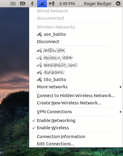
In this regard, Gnome is a little simpler than KDE, if only because it sports a network manager utility that resembles more the counterpart that users will have seen in Windows and Mac. It is that much more natural to configure your Wireless access points in Gnome. Like KDE, it will suggest storing your passwords in an encrypted utility. Unlike KDE, which sorts the access point based on the signal strength and quality, Gnome lists them alphabetically. The two are almost identical, with a small margin in favor of Gnome.
Printin’
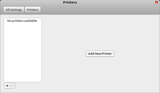
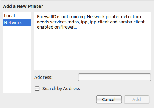
Gnome has a major problem with the printing applet. It is utterly broken. In most distributions running Gnome, it is virtually impossible to configure your network-shared printers. The solution is to use an alternative tool available in most distributions, which restores the older Gnome 2 functionality, but we will discuss that in a separate tutorial soon. At the moment, printing, when possible, is approx. identical to the KDE setup. Most of the time, it is simply not available. This is the best example of simplification gone wrong, version two. Previously, simplification led to complexity, and here, it caused a loss of functionality.
Other things
Gnome customization is sharply defined by the available items in the System Settings menu, and you will not get much depth or almost any flexibility beyond that. While it is definitely convenient to complete your system administration work in less than three mouse clicks, when things are missing, frustration can be fairly high. And in such cases, you end up with a significant overhead trying to combat the simplicity, which was designed to avoid these cases in the first place.
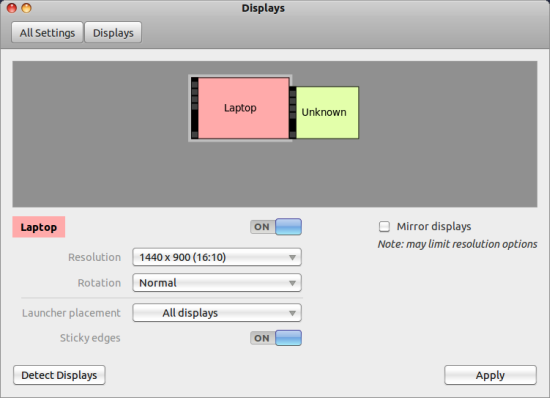
Multiple display detection works just fine in Gnome. And so does the older printing applet, which was restored in Ubuntu Quetzal, however the new and buggy one remains both in Linux Mint Nadia, as well as the entire older range of Ubuntu spring releases. And I’m pretty sure the same is true for most other Gnome-based distros.
Gnome can be governed fairly easily with additional tools, even without resorting to command line. Moreover, when you top the shell with something like Cinnamon, you end with an improved layout that compensates for the underlying weirdness. Still, with the stock settings and tools in place, Gnome will work quite well until you stumble upon the first problem or fancy your first customization.
Conclusion
Once upon a time, in the age of Gnome 2, I would have sworn that Gnome was easier to administer than KDE. Lately, I am beginning to formulate the exact opposite impression. On one hand, Gnome has regressed, making its simplicity a cold and alien affair. On the other, KDE is making huge progress in fixing its internal complexity and creating a work flow that is natural and plentiful without being confusing. It also makes far more sense for Windows converts.
While choosing which desktop you want to run your programs makes little difference, there’s a lot of weight in which environment you choose for managing and administering your system. True, most of the time, users do not need or want to dabble in the system configuration. But when they must, there’s a big question of how simple and fast that task is going to be. So you can run your Gnome and KDE programs any which way you want and build beautiful, bespoke arsenals tailored perfectly to match your taste and productivity, when it comes to taming your Linux box, the more complex KDE makes more sense.
KDE is not the clutter beast you once knew, and if you try it now, you will be amazed by the progress that went into throwing away the garbage and confusion that made its menus once. All of it’s been slimmed down, and you get an almost perfect blend of control and style. Gnome is still cleaner and easier to handle in the first five minutes you sit down, but down the road, the KDE predictability and precision will make your journey worth its time. KDE vs. Gnome, system management, KDE is a clear winner here.
Cheers.

I agree that removing basic interface customization from the Gnome settings manager was one of the dumbest things Gnome 3 did. However, after almost a year with KDE, I still don’t understand the split between application and workspace appearances and various other layout/behavior stuff.
I also notice that the Gnome system settings screenshot above has both ‘additional drivers’ and ‘graphics tablet’. These things are not available in KDE’s system settings. There was a settings plugin for tablets, but it wasn’t maintained as part of KDE proper, so it broke after some upgrade.
Anything on KDE4 v. MATE v. Cinnamon v. E17….perhaps with an addition of v. Windows 8 v. CLI?
Perhaps … although not sure about Windows 8 vs. CLI.
How’s CLI mutually exclusive with Windows? Or not.
Dedoimedo
GNOME has at this point 4 graphical tools and 1 command line.
There is the GNOME system settings, dconf-editor, the Tweak Tool which is just a more user friendly subset of the dconf-editor and gconf-editor is still around.
Then there is also a command line way to edit all of dconf’s gsettings.
This is just absurd and what is more frustrating is that GNOME developers say it is meant to be that way: https://mail.gnome.org/archives/foundation-list/2012-November/msg00174.html
http://www106.pair.com/rhp/free-software-ui.html
It was decided in April 2002 and it will stay that way! Period!
KDE3 + Compiz = Uber multitasking – is there any new replacement GIU that has that same capability ?
what useful multitasking thing can Compiz do which other window managers (like KWin) can’t?