Unity a year later
A year ago I wrote an article about the different directions taken by Unity and KDE respectively. Beyond describing them, I took a very firm stand: Canonical made changes for the sake of change and it was an inferior experience (KDE got its fair share of criticism too). A year later with a shiny new LTS release, I thought it was time to give Unity another chance. Obviously Ubuntu is more than Unity but is the main differentiator between it and other Ubuntu-based distributions. I will split the review in three cliché sections: The good, The Bad and The ugly.
The Good
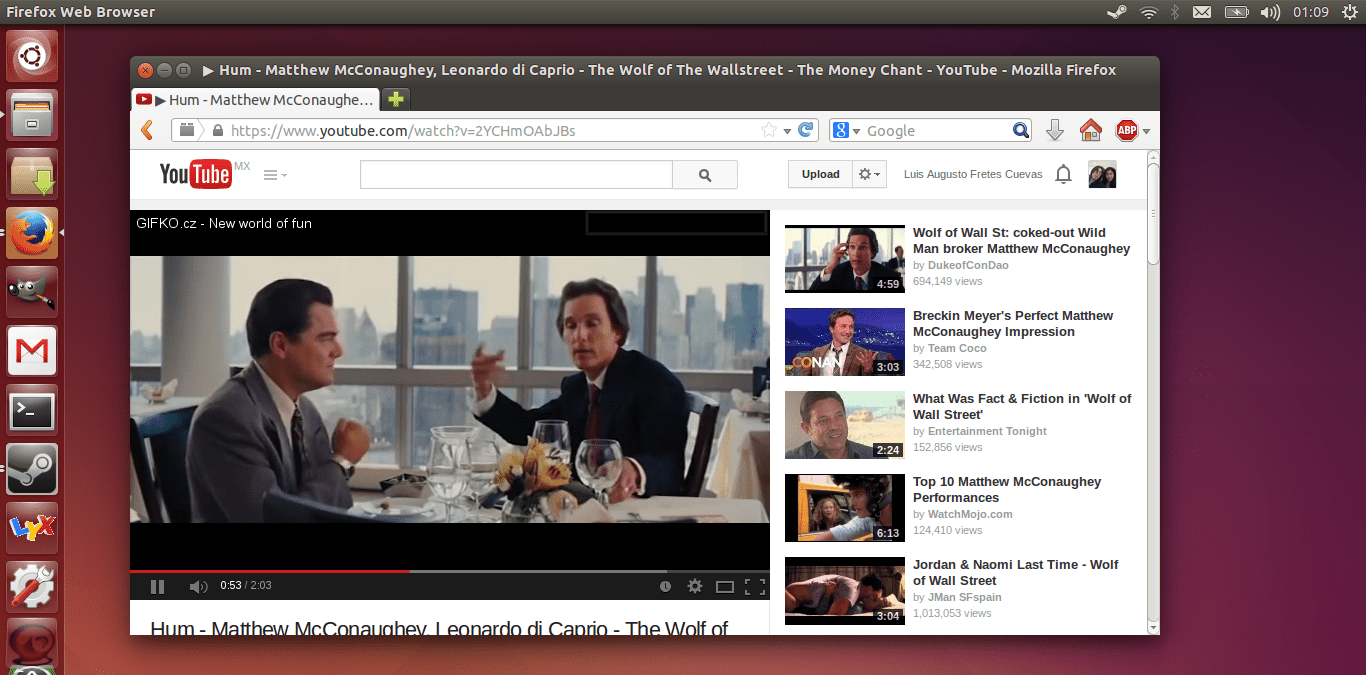
The visual design keeps improving. Despite sticking to its usual colour choice, Ubuntu 14.04 thanks to Unity manages to look pleasing. I also like the borderless design. Moreover, thanks to its weird colour scheme Ubuntu is instantly recognizable, which is what Canonical wants I’m sure.
A new animation has been introduced. Your lock screen fades in when you lock your computer and fades out when you unlock it. It looks really nice and it makes Ubuntu feel more polished. Another minor, yet pleasing tweak, is anti-aliased window borders. Canonical went with an Apple-style Menubar at the top, except they insist on hiding the actual menubar and only show it on hover. I discussed why hiding it was a terrible design choice a year ago. This time around there’s a slightly better option that moves the Menubar back to the windows.
The decision to move the menubars to the top by Canonical is almost Windows 8-like in its level of failure (ok, not really). Apple can have them in the top because menubars exist on a per application basis, while on Linux practically every application ever coded has per window menubars. Moving them back to windows solves a problem Canonical created for themselves and its users, sadly is not enabled by default (System Settings > Appearance > Behaviour > In the window’s title bar) . Neatly, you can still drag windows around without issue from the title bar.
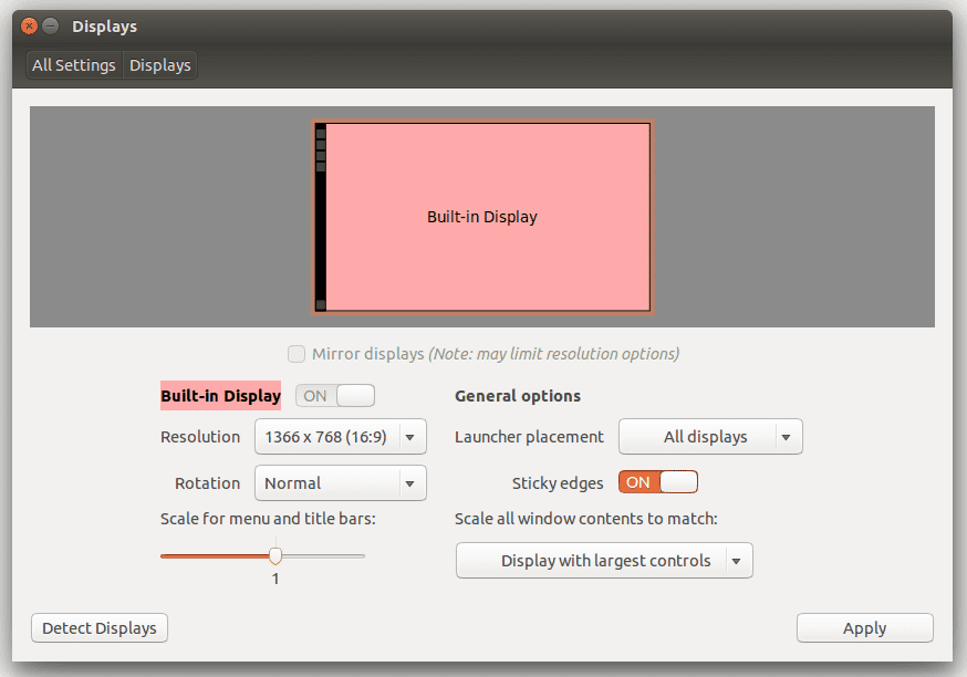
One thing desktop environments on Linux have yet to implement is proper support for HiDPI monitors (or in Apple’s marketing terminology, Retina-like displays). To be fair only Apple properly supports it, KDE is likely the only one besides OS X that can manage it decently. Also surprising is just how bad Microsoft Windows’ support for it is. Canonical added support for HiDPI to Unity on Ubuntu 14.04. It doesn’t change the fact that GTK applications still don’t scale at all, but it’s a step in the right direction.
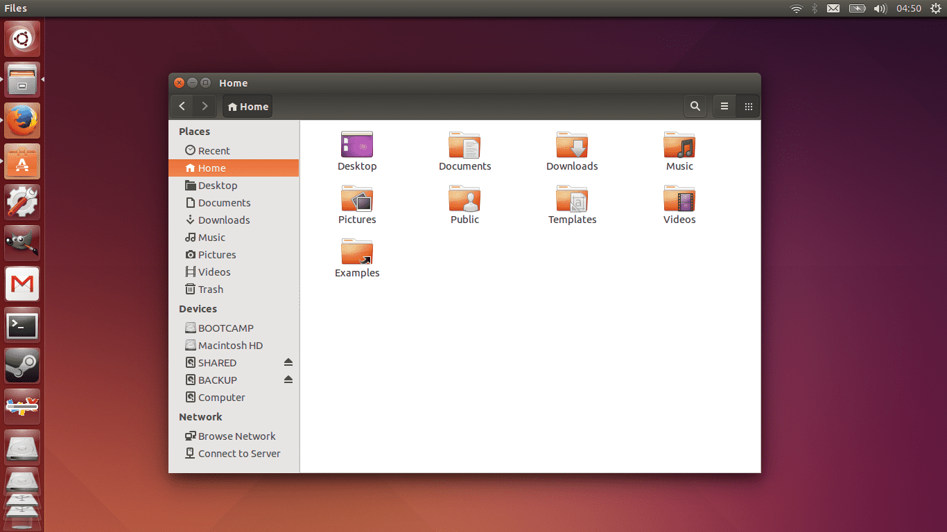
Obviously, there are many other good things about Unity. A few examples are the animation when you start downloading an application and the progress bar on Unity’s dock or how it changes colours based on the background, or the contextual menu it shows when you right click an icon. None of it is new though. But perhaps more importantly even settings look mostly well presented (if limited).
The bad
Sadly, almost everything wrong with Unity is still present. While moving the menubar back to the windows is a good option to have (and should be enabled by default), Canonical insists on hiding stuff for the sake of hiding it. The menubars couldn’t just return to the windows, they had to be placed on the title bar and only revealed on hover.
Why exactly? What advantage is there to this? Users still need to find out by trial and error if a menubar is present, although at least by putting it in the title bar they will find out by accident. The only reason the option is like it is, is because it maintains some consistency with another of Caonnical’s weird choices: moving windows controls to the top panel when a window is maximised.
Here’s Canonical thought process: (i) When people maximize a window is either because they want to focus solely on it or because their screen is small, so let’s maximize space usage (ii) People don’t use the menubar that much, so better move it to the top (i.e. is a waste to have it on every window).
Both seem reasonable, right? The problem is both of these require non-trivial modifications to existent applications. Coding and supporting a consistent fullscreen mode requires a lot of effort by a lot of developers on a lot programs. Applications were designed with an in-window menubar in mind, so menubars are window-specific. Unlike what happens on OS X, where every app has its own name as part of the menubar, here menubars don’t contain any reference to the application they belong to. Moreover, they mostly report the window name not the name of the application.
Moreover, even though it’s possible to display the name of the application in the menubar, the menubar is still window-specific, so it is misleading to put the name of applications as opposed to indicate what window it belongs to (especially if you put the windows management controls alongside it). Worse yet, window names can get very, very, very long (think: Firefox), so it becomes quite a usability problem if the menubar doesn’t fit or looks closer to the systemtray than anything else.
Canonical’s solutions: (a) Put the application name on top for non maximized windows and keep the window name on the window (b) put the window name on top for maximized windows (c) show the menubar on hover (d) instead of supporting or creating a standard for fullscreen applications, embed the window controls to the top panel (but don’t hide the dock, because horizontal space isn’t as valuable as vertical, wink, wink), but only show them on hover. Profit? These “solutions” Canonical came up with are at best worse than the problem, at worst pseudo-solutions to real problems and real concerns.
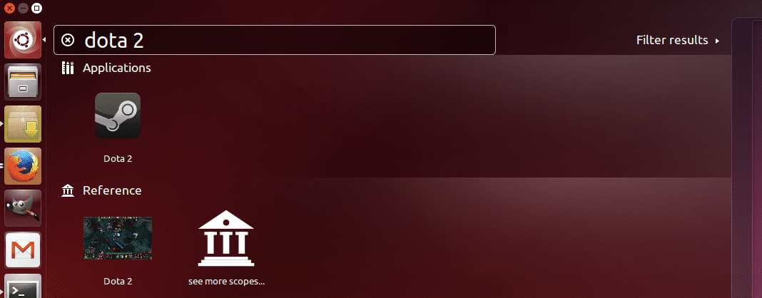
The Dash is still useless to find stuff manually and it only works if you resort to searching. That said, even for that is rather poor as you need to hit down twice to select the first option and left to select the second one (in the same category), so it’s not even consistent in that simple regard.
The ugly
Unity is what most Linux newcomers will experience first. An interface with many cryptic elements, wrong headed design choices and absolutely inefficient. Microsoft’s Window windows management is pretty decent (as opposed to Apple’s kinda bad window management that is saved only by cmd+tab and mission control + touchpad gestures, take that away and it’s a mess) and it isn’t cryptic (at least with basic GUI elements), so the jump can be jarring and discourage other users. In fact, Unity has been such a “controversial” change that the number of popular distributions offering an alternative has clearly grown (Linux Mint, Elementary OS, Netrunner, Kubuntu, etc). And I’m not even criticising Unity’s almost complete lack of customizability.
Final words
There are better options than Unity. Clearly KDE is now a very mature desktop environment and despite its flaws a much better designed one. Is fast, has fantastic window management (the best on any OS and any DE), is not cryptic (hard to believe this has become part of the check list) and if you don’t modify it much very intuitive. For more Apple-like environments Pantheon (Elementary OS) is a much better choice than Unity. XFCE and Cinnamon have evolved as the true successors of GNOME 2.
What about GNOME 3? We’ll take a look at the most controversial “upgrade” to a desktop environment since KDE 4 came to be in the near future.
Agree with most of your comments re:Unity. But I don’t think the window management issues mean all that much to most users, who simply move things around with a mouse, minimizing and maximizing like they learned in Windows.
Re: KDE — Want to use it and keep trying to use it, but… Font rendering quality is essential for me, and I can’t find a KDE that delivers what Ubuntu Unity does in 14.04 (I suspect that’s down to changes in freetype.) I spent a full day over the weekend installing, tweaking and reinstalling Kubuntu 14.04, but never managed to cajole its fonts to display as they do in straight Ubuntu.
I’ve had the same experience on several other KDE distros, including Netrunner. I suspect — guess, really — it’s due to differences in how QT and GTK handle font display. As far as I can see, Kubuntu and the other Ubuntu derivatives don’t mess with Ubuntu’s font stack, yet fonts do render differerently.
I’d also smile if I could find a quality non-dark theme for KDE that looked good with effects turned off and had a corresponding GTK theme. Oxygen and Oxygen-GTK work, but look pretty drab and nodescript with effects off.
Jon, have you tried to configure the Anti-Alias Settings? Use sub-pixel rendering to “RGB” and Hinting Style to “Slight” I always have wonderful fonts displayed on Kubuntu. I change to those settings every time I do an installation and the fonts are the best of any OS, I don’t know why doesn’t come as a default. Hope you like them.