What’s new in KDE 4.10

KDE’s transition from 3.5.x to 4.x was a traumatic experience for many users, many regressions happen and there’s a general consensus among observers that 4.x was released prematurely, an opinion not shared by some developers that argue they needed feedback and bug reports. Thankfully those times are behind us and I can assure you that the next big revision of KDE will not be traumatic at all, it will be exciting and stuffed with many new features.
We will talk about the move to framework 5 and Plasma 2 as they get more mature, but today let’s enjoy a new version of the so called “KDE Software Compilation”.
New Menubar styles
Windows and KDE have traditionally chosen to display the menubar in each window, while Mac OS X and Unity show a universal menubar at the top. I’ve never been a fan of universal menubar specially if every single application was not designed with them in mind and Unity’s idea of autohiding is one that I find absurd, as I clearly stated in my last article.
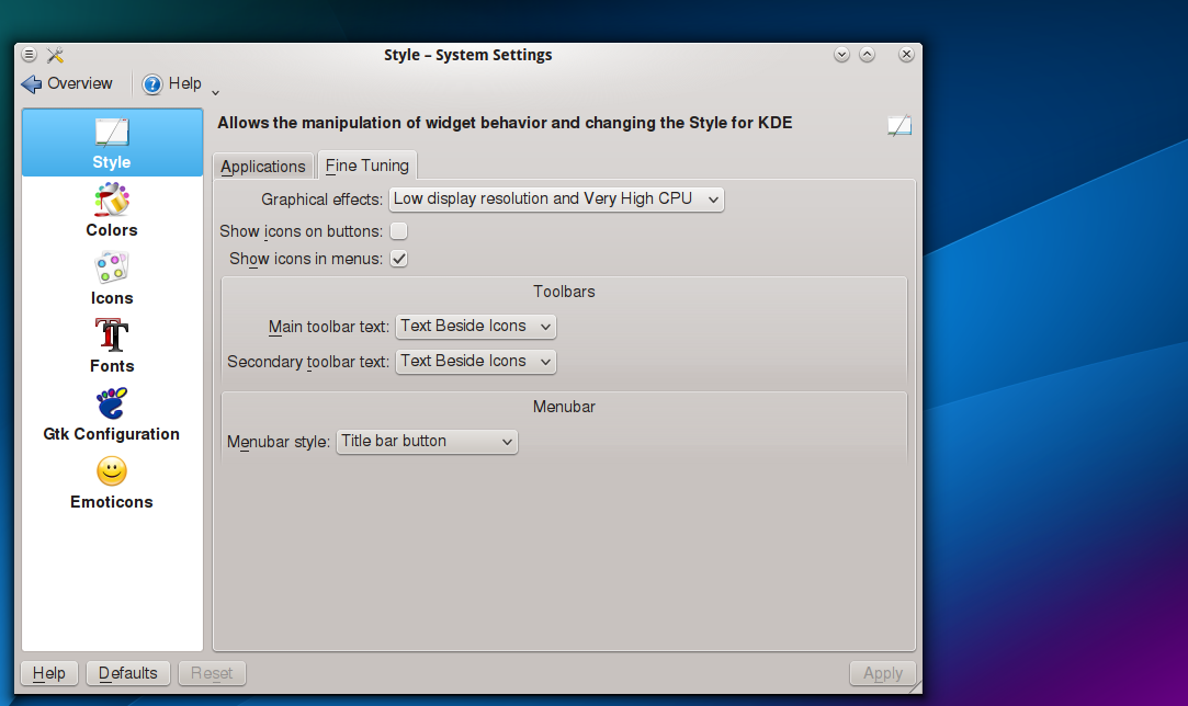
KDE has never embraced this idea of a universal menubar, although in the past there has been a few third party alternatives none has worked that well. With the creation of a new standard this has come to be fixed and in typical KDE-style instead of choosing one it lets the decision in the hand of the users (it of course, has a default behavior which is to show them in every window): Systems Settings > Application Appearance > Style > Fine Tuning > Menubar style.
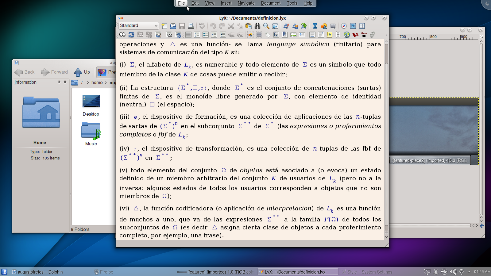
The option labeled Top Screen Menubar is, as expected, the universal menubar style. A bit like Unity it autohides (but unlike Unity it at least doesn’t take space when is hidden). The name of the application is not shown, something I believe is not a wise decision.
When the mouse get close to the top and a menubar exists the top glows in the region where the menubar is, the closer the mouse is, the brighter the glow:
One thing that helps identify which window the menubar corresponds to is the fact that KDE by fault uses a different shadow for the active window.
4.10 also bring us a new style of menubar, one that to my knowledge has never been done before. This new style boringly, but accurately, called Tittle Bar Button puts a small button in the title bar.
I love it. It has become the way I like my menubars, while is true it involves an extra click I appreciate the space and uncluttered look. The only thing missing to make this system perfect is the ability to select styles per-application. For instance: I would definitively prefer The Gimp to show the menubar.
KWin gets GHNS and a new animation
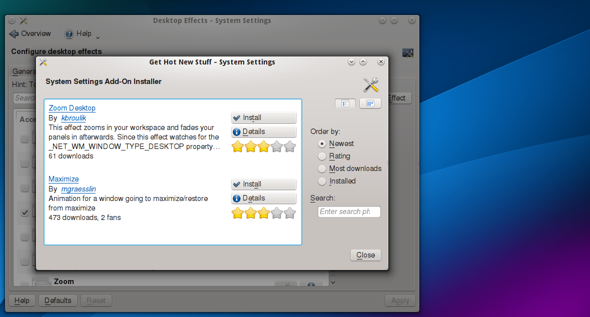
Get How New Stuff has been a nice feature since the very beginning, if you want a new wallpaper or color scheme or set of icons you just click the button labeled Get New (…) and you can download new ones, it couldn’t be any easier. KWin now joins the group that support GHNS by allowing the user to download new effects from System Settings > Desktop Effects > All Effects > Get New Effect
There’s not a lot yet, but that’s just a matter of time.
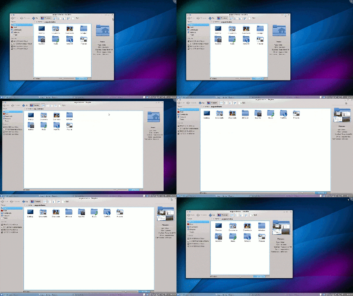
Also new is the maximize and un-maximize animation. I find it to be very pleasant and it makes sense, it feels natural (the next two images are animated gifs, they may take a few seconds to load):
Animated Wallpapers
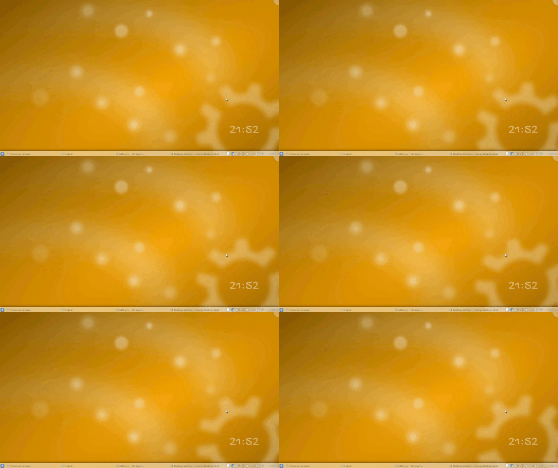
Using QML it is now possible to set animated wallpapers. Just click Plasma’s desktop cashew select Desktop Settings > Wallpaper > Animated Wallpapers.
Grouping Windows
The new Task Manager widget grouping of windows has been changed in a very subtle way: Instead of showing a number it now shows an arrow pointing up on top of the application icon.
One thing that was also changed and appreciable in the previous screenshot is that the name of minimized windows fades out, this makes it way harder to read.
Changes in Dolphin
Technically Dolphin now offers MTP support, but I can’t get it to work. I will keep trying and will report back if I manage to make it work.
Now is possible to change the size of icons in the places panel, in the past icons used to resize automatically when the panel changed sizes, but since 4.9 that’s not longer the case. On 4.9 there was no way to change it, responding to feedback an option to change it was added:
Renaming single files is done inline (since 4.9), before there was a small dialog even when you were changing just one, according to Dolphin’s developer some liked the dialog even for renaming a single file, so the option was added: Settings > Configure > Dolphin > General > Rename inline.
Plasma’s default theme ‘Air’ gets revamped
And you probably won’t notice. The only thing you will notice is that everything, for some reason, looks better. Basically, Air has adopted a more modern design. Today that means a flatter design (unlike a few years ago, when modern meant putting gradients in every possible spot).
The most polished KDE version yet
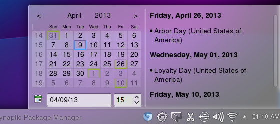
There’s many small changes in every corner of the desktop, little minor details. For example calendar that is displayed now when you click the digital clock widget is shorter and slightly wider, it looks much better and it avoid some issues the old one had:
Small changes in Kontact are everywhere, the most relevant perhaps are that it now resizes images and has auto-correction and spell checking. But more importantly this is by far the most stable and smoothest version of KDE I’ve I had the pleasure of using, and I’ve been using KDE for about 10 years.
I think is save to say, without being biased, that KDE 4.10 is the the best desktop environment available for Linux. It’s not perfect and there’s many things I would love to see, especially regarding cloud connectivity, things like integration between Dolphin and cloud storage services like Runners-ID, Dropbox or Google Drive, music players and online services like Spotify or Google Music. Of course, sometimes the limitations lie beyond the hand of the developers behind KDE.
If you want to upgrade to KDE 4.10 just add the following repository:
sudo apt-add-repository ppa:kubuntu-ppa/backports
And then upgrade by running:
sudo apt-get install upgrade
A few hundreds of megabytes later and you will be enjoying KDE 4.10, hopefully, at least as much as I do.





Yay, first comment!
I typically use linux only in the summer as I need windows and Microsoft Office for school during other parts of the year. It’s always amazing when I first come back to see how much progress has been made over the past 9 months. If KDE just had a more polished and functional Office Suite I might never leave.