Windows 8: How does it compare to Netrunner?

After 3 years Microsoft is ready, or so they say but Intel disagrees, to launch their new operating system. The old proverb goes keep your friends close but your enemies closer, so while Windows 8 isn’t literally an enemy it indeed is the competition, since most computers are sold with Windows included you need to be able to convince some of those users (normally relatively knowledgeable ones) to try, install and replace Windows with, what some of us believe, is a better alternative.
So it’s always important to know what’s happening in Redmond, however, more often than not changes to their operating system are relatively minor and unlike the past 20 years Microsoft is now changing the paradigm behind Windows in a pretty tangible way: They’re prioritizing the tablet paradigm over the desktop paradigm, even when you’re using it on a regular laptop or desktop computer.
So how does it stack to the latest version of Netrunner? I’ll be running a series of articles all week about the most common tasks and how they compare, but today we’ll look at the overall interface itself.
Diverging paths: Netrunner’s consistent interface vs Windows 8’s mess
You probably remember the famous taskbar or task manager, we’ve been using them for years and for good reasons.
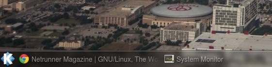
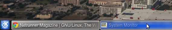
While there’s a few differences between Netrunner’s implementation and Windows 7’s it wasn’t really that different, Netrunner included the text alongside the icons, Windows 7’s didn’t, Windows 7’s automatically grouped instances of the same app together (you can enable this with a couple of clicks in Netrunner if you wish). Both approaches had their pluses and minuses, Windowss 7’s saves space, but at the cost of showing the name of the windows and making the process slower by forcing two clicks if there’s two windows of the same app (I personally prefer Netrunner’s approach), but it was comparable, so getting this right should be a piece of cake, right?

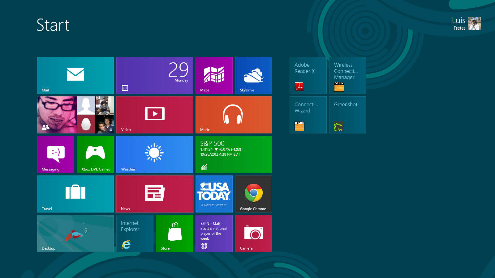
What’s that? Well, its Windows new taskbar you may think, it isn’t a big deal, it’s a just a screenshot showing the currently opened apps, right? Well no, because that would make too much sense. This is Windows’ new start screen:
And this is the desktop:
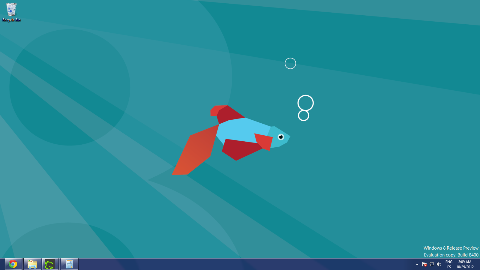
By now you probably noticed the old taskbar is still there, we’ll talk about that in a second, but look carefully at both of these, apparently unrelated, screenshots, how do you open the new taskbar? Good luck figuring that out. Now that we’re talking about hidden stuff, where’s the start menu? How do you get back to the start screen?
To access the start screen you need to put the cursor in the bottom left corner, a button will appear and then you can click it. To bring up the new “taskbar” you move the cursors as if you were going to go click the start button, then move it up without moving away from the left, and finally, you get Windows 8’s switcher.
So, why the old taskbar? Well, the new one only shows modern UI (Metro or whatever they decide to call it tomorrow) applications, desktop application don’t appear there. So indeed, Microsoft managed to break the taskbar. But hey, there are other cool features, for example, you move your cursor all the way to the left click and drag and the last modern UI app can be then dragged on top of the desktop or alongside the current application or desktop…
Why did Microsoft commit this kind of nonsensical design choices? Because they’re thinking about tablets first, you see to bring the new taskbar in a tablet you just drag from outside the screen, and then keep your finger close to the bezel (otherwise you drop the last app alongside your current app), and it appears… OK, they didn’t exactly nail that either. Oh, and Alt + Tab shows both, Modern UI and Desktop apps, so this design choice of splitting them into different taskbar isn’t even consistent all around Windows 8.
So, if the bottom left corner is a rare form of hot corner, does any other corner do anything? Yes, top left plus moving down brings the new taskbar, if you do the same gesture on the opposite side you get what Microsoft calls the charmbar:
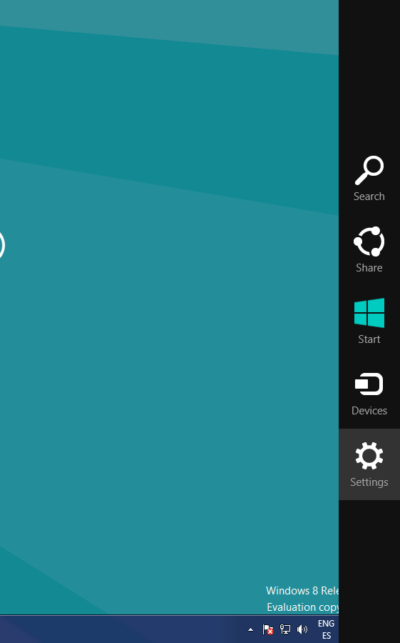
What does it do? Nothing really (unless you’re in a tablet, I was not kidding when I said Microsoft prioritized it), if you’re using Windows on a desktop and therefore completely ignoring all modern UI apps, it’s useless.
To recapitulate: Say you just booted your computer for the first time. To open any app in Netrunner you move your cursor to the menu, click it, pick your app, open as many as you wish, and switch between them by clicking on its name in the taskbar, simple, useful, fast.
1.
2.
In Windows 8? Click on some apps in your touch oriented start screen, and you get a fullscreen app designed to be use with touch input, click on some others and you jumped inside Windows’ traditional desktop, to go back, you need to guess there’s a magical button that appears on hover in bottom left corner, click it, back at the start screen designed for touch, click another app, and so on and on, to switch between them, well, if you’re switching among desktop apps that’s simple enough, click the corresponding icon in the taskbar, if you want to go back to a non-desktop app, go to a corner in the left, move your mouse up, pick your app, complicated, doesn’t add much, and slow.
In fact, unless you have a spiderman’s senses, is almost completely impossible to discover all of this gestures in Windows 8 by yourself.
Windows 8’s biggest changes, Metro and its start screen: Its biggest flaws
Look, I like tablets (I love them actually), but tablets aren’t desktop computers, picture the following in your 30″ 1080p display with a Quad Core i7:
So let’s makes this clear: Windows 8, the most popular desktop operating system biggest change is adding a kind of apps and a start screen completely useless and redundant on a desktop computer.
Every time you need to open an app you encounter the start screen, you can pin apps into it, but since it was clearly designed for touch, and almost for touch only, even a few apps take a lot of screen space and therefore require a lot of scrolling, if you want to see all apps you need to right click in the start screen, then hit all apps in a bar that appears at the bottom.
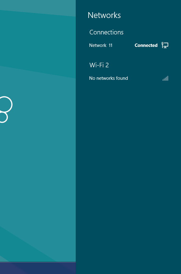
Compare this to Netrunner, it doesn’t matter which menu, classical, kickoff or homerun, it doesn’t matter, it just works better, you click, and all of your apps are right there. However, not content enough with breaking stuff like the taskbar, and adding useless features for desktop users, like the charmbars, Microsoft also decided it was wise to modify parts of their desktop OS that worked just fine, this is what appears when you try to see the available networks:
And that’s without even talking about Windows RT. How could it be worse? Well, it looks exactly like Windows 8, but it just runs on ARM. The desktop is there but you can only install applications from the Marketplace, that seems reasonable right? Well, it would be reasonable if the Marketplace had apps for the desktop, but it doesn’t (literally, it doesn’t support it). So in Windows RT (like Microsoft’s own Surface) you have a desktop but you can’t install any app on it. Can you imagine the sheer amount of confusion this will cause among regular users? They go to a store, they see a computer, everything looks normal, gets home, downloads Microsoft’s own Live Messenger just to be told it doesn’t work… on Microsoft’s own operating system, in fact if we assume that the majority of users are reluctant to change operating system because it doesn’t run the apps they already know, well, that problem is gone with Windows RT.
As you can see Windows 8 doesn’t constitute an improvement for desktop computers, which means it isn’t an improvement for all current windows users. In the following week we’ll see how Netrunner compares to Windows 8 beyond the basic interface, we’ll see how installing software compares, how the multimedia and internet experience differ, file managers, how customizable Netrunner is compared to it, and as much as possible, if you have any suggestion, please leave a comment. Also coming is an article about Linux’s stack, so newcomers don’t have to Google what Alsa, PulseAudio, X.org, among others are.
It’s okay to do an article comparing Win8 and NetRunner, but do we really need a whole series of articles about that? I don’t use Windows, and don’t intend to.
Also, some of the screenshots on this page are very large, which looks odd.
What about Gnome 3 and Ubuntity’s move to an interface that looks somewhat similar? I think this article would be more interesting if it compared all four of Gnome 3, Ubuntity, KDE(Netrunner), and Windows 8 at once.
Looking forward to the article about the Linux stack.
Oh, and a suggestion for a future article: How about writing about recent developments on Linux and gaming in a few months? Wine is still only so-so getting Windows games working on Linux, but the Humble Indie Bundles have been quite successful porting some games. Valve is getting close to making Steam on Linux a reality, but it seems they will be focusing on vanilla Ubuntu first. When it is released, an article about gaming on Netrunner would be nice.
That’s a great idea for a future article!
I also like your idea of comparing all desktop environments, I just think the article would end up being too long, and in my experience, people tend not to read those.
Perhaps I could skip some articles regarding Windows 8, but considering almost every PC sold is going to come with Windows 8, I think it’s important to show how they compare, and what Netrunner (KDE) does better, the vast majority of future users will come form it, and I think this kind of article comparing both approaches is positive, because it shows how is done in Linux while showing how it’s better than the competition (it’s a disguised tutorial). Since operating systems aren’t judged in a vacuum, it’s always good to contextualize it. For example, in the article regarding Virtual Desktops ( http://netrunner-mag.com/?p=1086 ) I showed how to take advantage of KDE’s customizability while showing how it’s more extensive and powerful than Apple’s solution, I believe this kinda of article is a better way to teach people about Linux.
If you have any other suggestion or criticism, please share it :).
P.S. I changed the size of some images to improve readability, thanks for pointing that out.
be careful not to let windows 8 distract netrunner from its focus
Somewhat off topic, but can someone explain what happened with Netrunner home site ? Their forums and others are offline for days.
I have the same problem :(. The new beta is very nice, I like it, woks well, better then Mint KDE :)
I feel the same way about winders 8, it’s junk for a desktop or laptop. Before I checked out the preview for 8 I had tried out Mandriva 2011 and it was setup some what the same, I didn’t like it and as soon as I tried the preview edition of 8 I was laughing cause it looked like they were trying to copy Mandriva. Rosa uses the same kind of setup as Mandriva 2011 too, but both are better than windows 8. Then there’s Unity, sorry but that one sucks too. I’ve installed Netrunner and Magiea2 on my box, but have to admit I also have XP & 7 on the other hard drives. I try a lot of different Linux distros in virtuial box also.